Let The Light In. Painting in egg tempera on gesso by Ray Ward 435 x 300 mm.
This recent painting of Ray’s (above) intrigued me, I couldn’t quite work out what the woman shielding herself behind the TV was up to. It is based on a black and white drawing, as they often are, which I thought made the situation clearer. In that version (below) the discarded wall bracket is more obvious and the composition more open, she is offering up the TV with her arms outstretched. This drawing, in its turn, was based on an annunciation angel in a carved relief that Ray photographed in St Martin of Tours Church, Chelsfield (bottom).
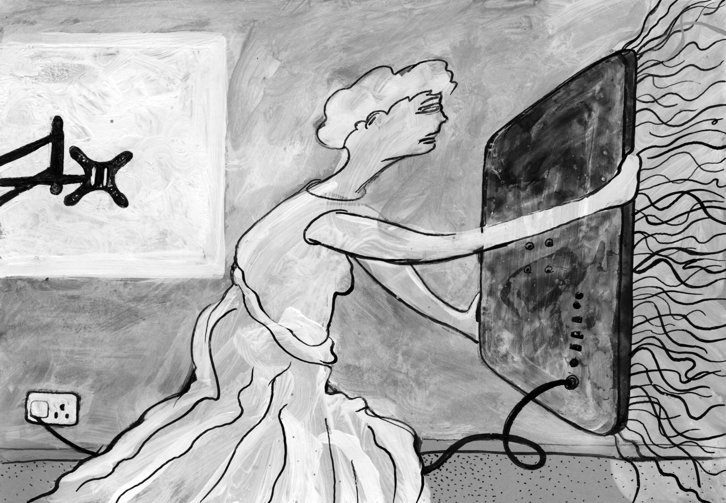
You Light Up My life. Drawing in indian ink and white acrylic on black card by Ray Ward

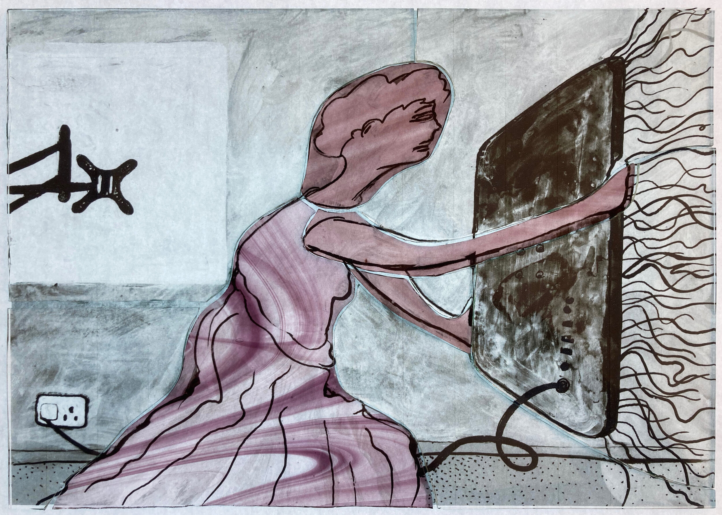
The interesting history of Ray’s painting made me want to add to the chain by making a stained glass version. I based this on the black and white drawing, only changing it by using a pink and yellow colour combination which is a classic in stained glass angelology. The glass pieces (below) show that the only pieces of coloured glass I used were two types of streaky pink on the angel, the yellow being a thin wash of silver stain fired on the back of the glass. As in all the panels I’ve made in this series most of the details are done with sandblasting and/or painting with black, brown and grey iron oxides.
Glass pieces cut and laid over an enlarged photocopy of Ray’s drawing

Finished panel on the lightbox, 250 x 360mm.
The finished panel is shown above on the lightbox and below on my windowsill in the sunshine. Its title also has a history - Ray had called his painting ‘The Teacher, Look in Here and All Will be Revealed’ but then forgotten that fact. When I asked him for one he came up with two song titles, ‘You Light Up My Life’ which I used for the stained glass panel and alternatively ‘Let The Light In’ which he used as the new name for the painting. By then I’d been calling it TV Angel, so this little image actually has four names.

Finished panel in the sunshine