glass design

Volcano Club by Sasha Ward

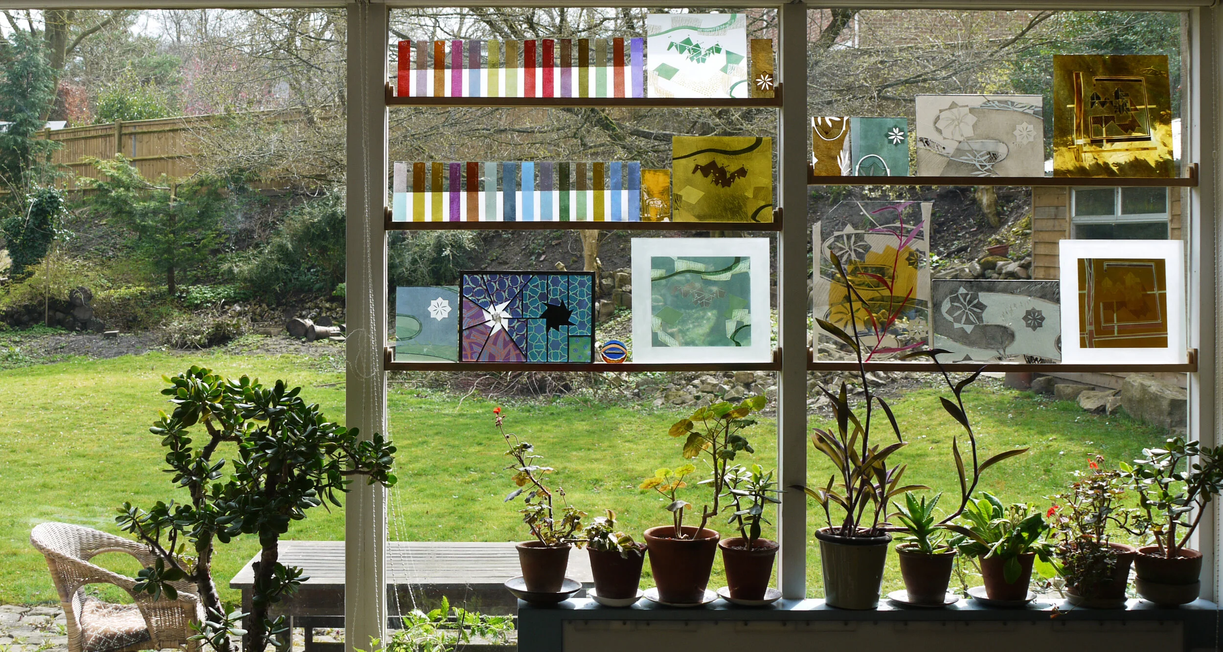
Volcano Club Magazine: Top row, pages from first issue (1995), bottom row, pages from later issues (2010).

I’m making a fanlight window for the founder of Volcano Club, established in 1995 and chiefly known for the zine produced by Augusta Ward at very irregular intervals until 2013. The pages above show the original volcano cover image, some dot to dots (including a pack of cheddars which featured heavily in the first issue) and some very concise instructions for crafting (as we would now call it), for example ‘get rocks and wash’. A later issue celebrated eyjafjallajökull which erupted in 2010 and wrecked the windows of aeroplanes, much like a sandblaster would; inside the zine there was always a wordsearch and a quiz. Augusta also made a stained glass window in 1995 of alternating volcanoes and pyramids, sadly no photo of this exists.

Volcano from a window in St Andrew’s church, Halberton by G Maile and Son, 1931. It is dedicated to Sir Robert Harvey who made his money in South America.

On the hunt for other volcanoes in stained glass I remembered two that I had seen, both made in the 1930s. One was in a Devon church (above) and one was in a huge and fabulous window at Airbus headquarters that I worked on during the restoration of the building in 2013 (below).

Volcano in etched and enamelled glass from the staircase window by Jan Juta, 1936, at the headquarters of the British Airplane Company, now Airbus, in Filton, Bristol.

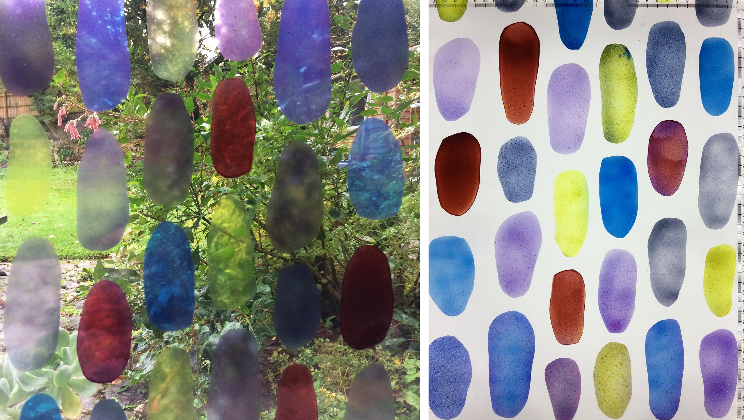
Design for a fanlight window 2025: Miniature glass sketches, initial design, and full sized final drawing.

Of course we know that the angle of the sides of a volcano should never exceed 45° but sometimes this doesn’t fit in to the format of the picture, for example the vertical zine cover and the window in Devon. This new window (see designs above) is horizontal and the volcano has a more realistic shape that is based on Mount Fuji. It is also influenced by a grid of 48 picturesque views of Vesuvius that we saw in Compton Verney’s 2010 Volcano exhibition, the source of most of my volcanic facts.

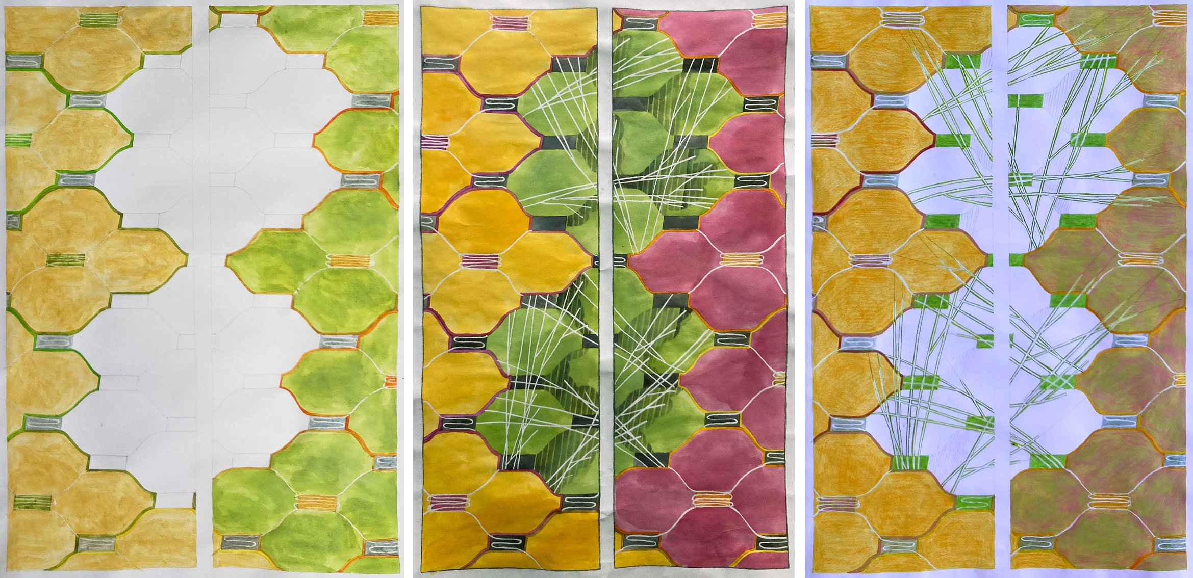
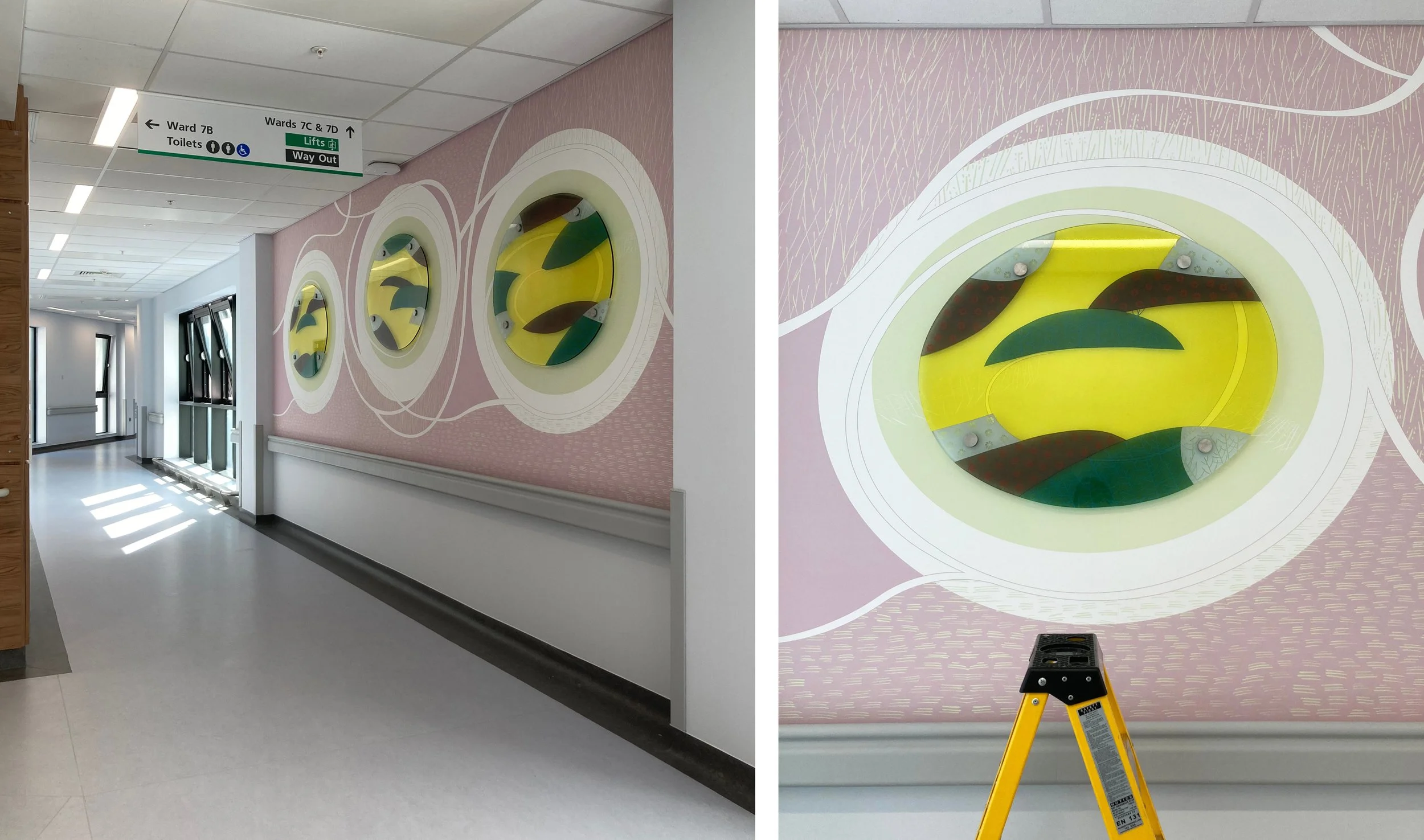
Then I remembered a window I made in 2002, a period when I was particularly busy and particularly bad at getting photos of completed commissions in sensitive spaces - this one is in a mental health unit at St James’ Leeds. I just have the tiny and lovely piece of glass for the 1:50 model that I made (below left) and a couple of drawings (below). I rather sneaked the volcano image into the fantasy landscape which was the result of workshops I held with local service users. Amazed that I came up with the same colour combination 23 years later and that I’m still using the same pot of purple enamel, Ferro 77396, which is actually a vibrant and very transparent pink.

Design for a window at St James’ Hospital, Leeds 2002: Miniature glass sketch (54 × 90 mm) for model, design, and full size collage (700 mm square) of the volcano.

Drawing branches by Sasha Ward

Design for back door window panels, 3 versions, 2022.

The design for my latest commission, glass panels in a back door, was going well but there were large spaces in the middle of it that needed filling. In the end, I went with a motif I use a lot and that is based on tree branches (above). These days I don’t feel the need to go to the forest and draw the shape of the branches, instead I make them go in whatever direction is best for the design.

Illustrations by Jan Pienkowski for The Kingdom Under The Sea by Joan Aitken, 1971

Ray reminded me that we have been having the same discussion about how best to draw branches since we were students in the early 1980s. It’s one thing to go out drawing in the summer when leaves add more detail while also simplifying the shape of the whole tree, but quite another thing in winter when the shape of the branches are defined against the sky or the landscape. We came to the conclusion then that the Jan Pienkowski route, where branches are silhouettes, was a good way to go. These illustrations (some examples above) were favourites from our childhoods, and looking at them now I consider him to be an artistic influence.

I said Tell me the Truth, drawing by Ray Ward (left) stained glass by me (right) 2020.

Take this Ray Ward drawing (above) where the trees were from a memory of a scene in Cornwall. When I came to do the stained glass version I didn’t want to change a twig, so I painted the branches on a piece of purple streaky glass placed on top of a photocopy of the original drawing.

The Prophecy of Anguish, painting by Ray Ward, 2021.

Ray’s black and white egg tempera painting on gesso (above) has a design for bare branches that I find even more impressive. The curviness of the ancient tree with its feeble looking branches is offset by a web of sharp twig lines behind and a pattern of vertical lines over the trunk in the foreground.

The State Hospital, Carstairs, detail of glass screen and design, 2011.

Looking for examples of branch techniques in my own work led me to a screen I made for the top security State Hospital in Carstairs, Scotland (above). In this design the pine branches cross bands of vertical lines that descend at a 90° angle from the pitch of the roof as if they are part of a woven cloth, where small twigs alternate with patterns of squares in the white cloudy sections.

Premier Inn, Liverpool, detail of corner window and design, 2012.

Sometimes when the work is for a public commission, the subject matter needs to be optimistic and a few leaves are required to indicate that spring is on its way. Leaves don’t suit my style as much as branches do, but I found an example of cherry tree branches from a large corner window I designed for the Premier Inn on Hanover Street, Liverpool - an area once full of market gardens and ornamental trees but now much in need of any type of greenery.

Royal Liverpool University Hospital by Sasha Ward

This was a commission that I thought would never get finished. A new Liverpool Hospital has been built next to the old one which is due for demolition. During the course of its construction, the main building contractor, Carillion, went bust, faults were discovered in the building and with the cladding that had been used causing further costs and delays which were added to by the pandemic. The selected artists, who had been contracted to Carillion, stored their work and waited to see what would happen next. Understandably, my enthusiasm for the project started draining away as the seven oval glass panels I had made were stored behind my kiln for five years.

Drawing for glass and wall design at Ward 7A, 2015.

The selected artists had each been asked to design work for walls next to the four ward entrances on their allocated level, mine was the seventh with bright green accents. Hospitals often ask for artwork that is organic and curvy, definitely not geometric, a look that I have struggled with over the years of doing commissions for health care settings. On this occasion I decided to go for no straight lines or interlocking patterns, taking inspiration from the natural world rather than the urban environment. For each location I designed a swirly drawing that would be printed on vinyl wallpaper with shaped pieces of glass mounted on top of a pool of pale colour.

The wall next to Ward 7A (above and below) changed shape and colour during the course of the years, with a piece of glass that is the biggest and I think the best. It was hard to photograph on installation day with reflections from a screen opposite and equipment stored up against it (below).

Ward 7A during installation, left wallpaper, right with glass on top.

Ward 7D, from drawing to glass, 2015 & 2022.

Ward 7D is similar, and for this one my first drawing (above left) shows the initial concept where lines and circles spiral into the pool of overlapping colours. However, the blank wall had been too much for someone to resist, and when I visited just before installation I saw that a square access hatch had been cut into it so I moved the glass up and some white lines around on the design. This wall is opposite a window which provides some great reflections of the the new building (below right) which is white and grey and spiky in design.

Details of wall and glass at Ward 7D.

Drawing for Ward 7C, 2016.

The wall leading up to Ward 7C had room for two glass panels above the crash rail. My watercolour drawing for this one (above) is closest in feel and colour to the work installed. The changes I made to the shape of the lines and the positioning of the panels happened because of a fire alarm that I had to keep well away from. The detail (lower right) shows how the ceiling lights are effective in picking up the lines sandblasted on the edge of the glass and mixing them with fine white lines printed onto the background vinyl.

Entrance to Ward 7C

Details of the glass at Ward 7C

Drawing for Ward 7B

The wall leading up to Ward 7B, six metres long, is the one that didn’t change so neither did the lines on my watercolour drawing (above). It’s a piece of wall between bays of windows - wouldn’t it be lovely and simple to be able to go back to doing windows again! This series of three looks the simplest and cleanest with an unfortunate resemblance to a row of washing machines.

Wallpaper and glass for Ward 7C

Corridor at Ward 7C and detail of glass panel during installation.

Overall, I am delighted with my last hospital commission. The no straight lines design looks effortless and was very easy to alter over the years and to install. Above all the colours look great, the transparent enamels on the glass are strong against the pastel coloured wallpaper and complement the tricky green on level 7. It’s hard to find your way around this building, hopefully this commission will help you remember the way and give you a boost of energy as you watch the patterns swirling around.

Adding without ruining by Sasha Ward

Windows made from scrap pieces of glass are a stained glass staple. In churches old pieces are leaded together in a different formation to make new windows, and in my own work I have always used offcuts, samples and broken pieces to make patterned windows, patchwork style. However, most of the samples I make for larger commissions are on thicker glass with large scale designs, not great for chopping up but ideal as the first layer in a new piece of work.

Experiment 1 with drawing and collage on top, 500 x 260 mm

Experiment 1 with drawing and collage on top, 500 x 260 mm

Experiment 1 (above and below) started with a leftover computer cut stencil from a large scale project which I stuck on an old piece of float glass to try out a coarse sandblasting grit. The first bit of enamelling, the red and purple on the left, was another leftover, this time from a bit of very runny spray painting. After firing the effect was so nice that I added another layer, or maybe two, of hand painted enamel enjoying the way that the grainy texture on the glass affected the colours. I spent a long time after these unphotographed stages drawing, collaging and photoshopping to find shapes that would add to the composition, hiding the muddled sections, keeping the best parts and not ruining what I already had.

I like the finished piece so much that it’s still in my studio window months later. The four narrow windows that I added to the design were sandblasted out, then each filled with a different enamel colour with a lot of flux in the mix to make them very pale. What was underneath slightly comes through and the new enamel colours perfectly compliment the ones that were already there.

Experiment 1 completed and detail.

Experiment 1 completed and detail.

Experiment 2 in the window and on the light box, 470 x 450 mm

Experiment 2 in the window and on the light box, 470 x 450 mm

Experiment 2 (above and below) presented a different set of challenges. I had a large piece of glass where I’d tried out old glass enamels in rough ovals, there were some lovely qualities in the different enamel mixes but no overall shape to the composition. I decided to use it as the first layer of a new piece, 300 mm square, for the online exhibition of work by members (I’m a new one) of the British Society of Master Glass Painters as these marks and colours seemed to celebrate the joy of glass painting. I spent an even longer time on the next stage of this one, planning patterns around the shapes and additions to them inspired by the effect of the overlapping offcuts in my window (below left).

I know by now not to rush into things, I was very conscious that I mustn’t ruin the piece by interrupting the stillness at its centre. Instead I thought about the concept of tessellation and added more ovals where they were needed to make the tile roughly tessellate while creating just a few areas of overlapping colour. It looks much better on its own than when I did tesselate it as you can see below.

Experiment 2: Left, overlapping pieces.  Right and below, turned into a tessellating tile.

Experiment 2: Left, overlapping pieces. Right and below, turned into a tessellating tile.

blob 3.jpg

Here is a link to lots of great contemporary stained glass squares in the exhibition on the BSMGP website.

Studio window by Sasha Ward

Winter 2020

Winter 2020

Do you ever get sick of the sight of your own work? In my case, samples and fragments of it are sitting on shelves in my window, blocking a view of our beautiful garden. The up side is that even in the gloom of a winter afternoon (above) there were interesting coloured reflections cast on the work I was doing on the lightbox. As this piece of work was a geometric composition, I ended up with a window full of striped colour samples and a more coordinated look in the studio (below). However, I was tired of that look and resolved, as we were going into lockdown, that I would end up with a completely different window at the end of it.

Winter 2020

Winter 2020

Autumn 2015

Autumn 2015

I found an autumnal photo with no coloured glass on the shelves from another year when I must have needed a change (above) and one from the following spring where I had painted the shape of one of the pink leafed plants on to a sample I was doing for a house in Italy (below).

Spring 2016

Spring 2016

Spring 2014

Spring 2014

Further back in time (above) I had the shelves in the same positions and a similar mix of geometric test strips and slightly organic patterns which were sample pieces for the commissions on the go. I recognise fragments from a wall panel for St James Hospital in Leeds, a plane propellor from Pegasus House in Bristol and colour variations for windows in Liverpool and Derbyshire. I only remember one occasion when I wanted to fill all four windows with samples (below). This was the last time we held an open studio event and the samples were labelled showing which commission they were made for. (Ten years ago I thought this was a terrible picture of me, now I can only see how much younger I look.)

Summer 2010

Summer 2010

Which brings me to the same window today and work that does look pretty different from anything I’ve put in front of it before (below). There are two main themes; self portraits which are on the bottom shelf and which I think I’ve done enough of for now, and stained glass panels from Ray Ward’s drawings which are on the top shelf and which I’ve described in previous blog posts. These have been a welcome return to making leaded panels and this is something I hope to continue doing both to commission and for exhibition.

Summer 2020

Summer 2020