Ray Ward

Other Peoples' Subject Matter by Sasha Ward

Ray Ward, Fred Baier and me on stage after our talk on 13/04/2023.

Ray and I were asked by our friend and Artworkers’ Guild Master Fred Baier to give a talk together at the Art Workers’ Guild in Queen Square, London. He wanted us to talk about our so called collaborative stained glass panels, a daunting prospect as I didn’t initially think I had much to say about them.

When we planned the talk it took us right back to the beginning of our partnership, after we met in art school in 1981. Ray remembered being impressed with the things I made that had a use, such as my patchworks and the stained glass that is shown in my sketchbook drawings (below centre). I remembered clearly the moment when I saw a poster for Ray’s performance on the wall at Trent Poly (below right) and recognised in it decorative qualities in the brushstrokes that were hard to find in a fine art department in 1981.

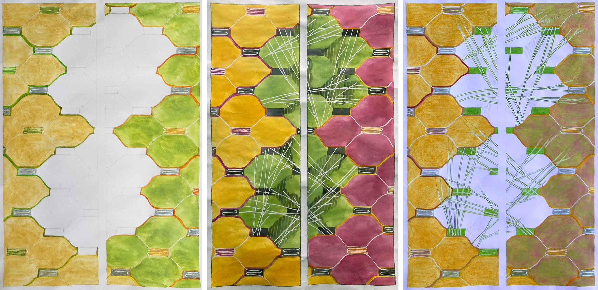
Left, our student union cards; centre, my sketchbook; right, Ray’s poster.

I also talked about the way that Ray’s paintings remind me of the things I like about the best stained glass, for example the little painting below left that shows an artist lounging in his studio (with echoes of Matisse’s Red Studio) where the carpet and clothes are really devices to fill with pattern. Ray’s recent work is mostly in black and white with good titles that are funny and poignant; examples that he showed in the talk include ‘Technically I didn’t throw the baby out with the bath water as it wasn’t in the bath at the time’ and ‘Today is all filled up with yesterday and tomorrow’ (below centre and right).

Three works by Ray Ward

Left, window at Frimley Park Hospital; centre, during the manufacture of panels for Central Liverpool’s Premier Inn; right, my lightbox with the last panel I made before lockdown in progress.

It was quite easy then to find links from Ray’s work that enabled me to talk about ten of my commissions from the intervening years, starting with an early screenprinted panel for Frimley Park Hospital (above left). I emphasised themes that come up when you work to commission such as using other peoples’ subject matter and having to present a design from which you cannot deviate.

I’ve described the making of our so called collaborative panels in previous blog posts here and here. I’m still making stained glass from Ray’s black and white drawings and, as I see myself as the technician on this project, I talked mostly about the techniques involved in making them. What I hadn’t realised was the link between the subject matter of the pieces I’d chosen to interpret in glass, from ‘I said Tell me the Truth and You Gave me a Lie’ (prompting one of our friends to send us the message “Are you guys OK?”), to two scenes of tension between couples in ‘That’s not really a question is it, more of a statement’ and ‘Just Another Story’ all shown below.

Ray is used to being plagued with comments from friends (for example ‘I didn’t know you were depressed/ill/rightwing’) who mistakenly think his work is autobiographical, this is something I don’t usually have to put up so I think I’ll choose a funnier piece next with a picture of a less downcast figure.

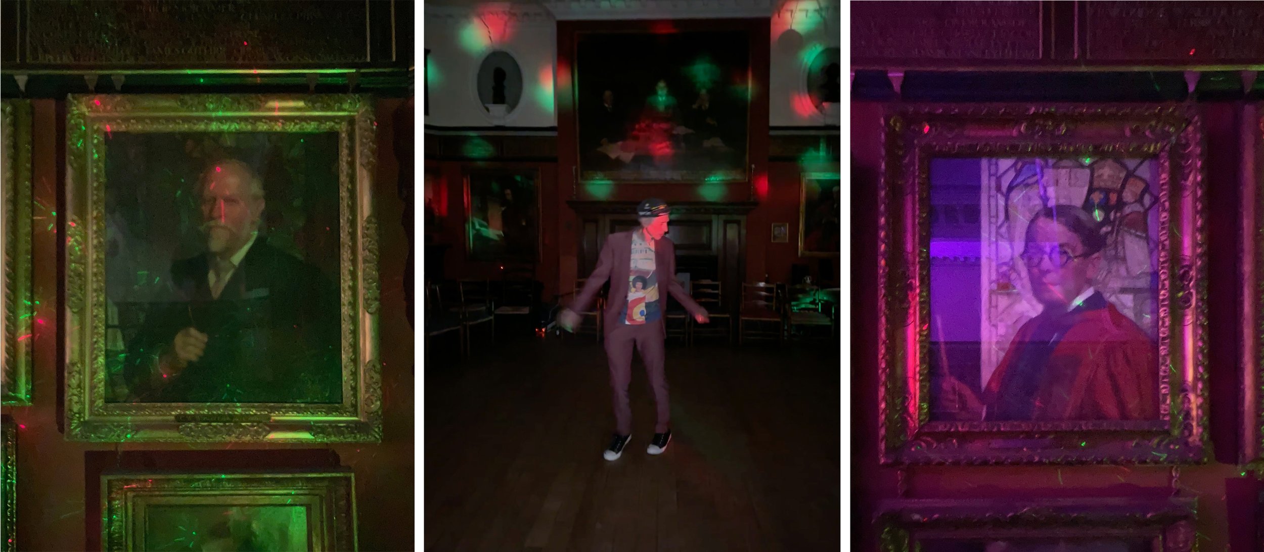
Under the disco lights that followed our talk, portraits of two greats of stained glass Christopher Whall (left) and Robert Anning Bell (right). Ray wasn’t the only person dancing (centre).

Drawing branches by Sasha Ward

Design for back door window panels, 3 versions, 2022.

The design for my latest commission, glass panels in a back door, was going well but there were large spaces in the middle of it that needed filling. In the end, I went with a motif I use a lot and that is based on tree branches (above). These days I don’t feel the need to go to the forest and draw the shape of the branches, instead I make them go in whatever direction is best for the design.

Illustrations by Jan Pienkowski for The Kingdom Under The Sea by Joan Aitken, 1971

Ray reminded me that we have been having the same discussion about how best to draw branches since we were students in the early 1980s. It’s one thing to go out drawing in the summer when leaves add more detail while also simplifying the shape of the whole tree, but quite another thing in winter when the shape of the branches are defined against the sky or the landscape. We came to the conclusion then that the Jan Pienkowski route, where branches are silhouettes, was a good way to go. These illustrations (some examples above) were favourites from our childhoods, and looking at them now I consider him to be an artistic influence.

I said Tell me the Truth, drawing by Ray Ward (left) stained glass by me (right) 2020.

Take this Ray Ward drawing (above) where the trees were from a memory of a scene in Cornwall. When I came to do the stained glass version I didn’t want to change a twig, so I painted the branches on a piece of purple streaky glass placed on top of a photocopy of the original drawing.

The Prophecy of Anguish, painting by Ray Ward, 2021.

Ray’s black and white egg tempera painting on gesso (above) has a design for bare branches that I find even more impressive. The curviness of the ancient tree with its feeble looking branches is offset by a web of sharp twig lines behind and a pattern of vertical lines over the trunk in the foreground.

The State Hospital, Carstairs, detail of glass screen and design, 2011.

Looking for examples of branch techniques in my own work led me to a screen I made for the top security State Hospital in Carstairs, Scotland (above). In this design the pine branches cross bands of vertical lines that descend at a 90° angle from the pitch of the roof as if they are part of a woven cloth, where small twigs alternate with patterns of squares in the white cloudy sections.

Premier Inn, Liverpool, detail of corner window and design, 2012.

Sometimes when the work is for a public commission, the subject matter needs to be optimistic and a few leaves are required to indicate that spring is on its way. Leaves don’t suit my style as much as branches do, but I found an example of cherry tree branches from a large corner window I designed for the Premier Inn on Hanover Street, Liverpool - an area once full of market gardens and ornamental trees but now much in need of any type of greenery.

Passersby Passing By by Sasha Ward

Drawing 1 by Ray Ward, ink and acrylic on card.  236 x 320 mm

Drawing 1 by Ray Ward, ink and acrylic on card. 236 x 320 mm

It was time to choose which of Ray’s drawings I wanted to turn into stained glass. Nothing he had on the walls in his studio jumped out at me, so I looked through some of his boxes of old drawings - sorted by size and paper type - to find some that did. The last panel I made (that’s not really a question…) had featured a waterfall, so I thought the river scene (above) would make a good companion. However, I mostly make my choice by finding a figure I want to do in glass and the man looking at the river was a bit small and sketchy. The figure in another box of slightly coloured drawings (below) looked perfect for glass painting, once I’d got Ray to add a pattern to her coat, and I thought the two drawings would combine together perfectly setting up an interesting story between the two figures.

Drawing 2 by Ray Ward, ink and acrylic on card.  210 x 297 mm.

Drawing 2 by Ray Ward, ink and acrylic on card. 210 x 297 mm.

Painted and sandblasted glass pieces on the lightbox

Painted and sandblasted glass pieces on the lightbox

The resulting glass panel was quick to make. I saw her as a redhead and had the perfect piece of glass for that. The other colours, in the restricted palette that works best in these small pieces, followed from there. The completed panel (below) is practically opaque because of the heavy sandblasting combined with the types of glass I used and looks great photographed in my studio window, where normally too much green grass shows through.

‘Passersby Passing By’ Stained glass panel in daylight.  280 x 400 mm.

‘Passersby Passing By’ Stained glass panel in daylight. 280 x 400 mm.

Detail of the redheaded figure showing different types of glass, some heavily sandblasted.

Detail of the redheaded figure showing different types of glass, some heavily sandblasted.

In a continuation of this collaborative process Ray then did a new painting, with a new title, of the same scene (below). I had imagined the setting as the mouth of a river with a boat going out to the sea which their eyes are gazing at. But the new barges and the more elaborate balustrading place the figures on the embankment somewhere along the Thames, and she’s got a quite different look in her eye.

Painting by Ray Ward ‘The universe shall pass away as a scroll’  Egg tempera and Indian ink on gesso ground. 310 x 435 mm.

Painting by Ray Ward

‘The universe shall pass away as a scroll’ Egg tempera and Indian ink on gesso ground. 310 x 435 mm.

The Cloud of Unknowing by Sasha Ward

correctpostersmall.jpg

This is the poster for our exhibition at Norwich Cathedral, as you can see from the dates it has just finished. Despite the lower visitor numbers to the cathedral and the extra restrictions imposed during the second lockdown we felt lucky to be showing anywhere this year. The exhibition centred around a series of panels made during lockdown when I turned some of Ray’s drawings into stained glass. Although we have worked alongside each other for over thirty years, we have never collaborated or exhibited together before.

Wall of glass: Four cabinets of glass panels with samples and drawings on the lower shelves & two larger panels on easels.

Wall of glass: Four cabinets of glass panels with samples and drawings on the lower shelves & two larger panels on easels.

The basic idea was to have a wall of Ray’s black and white paintings meeting a wall of my coloured glass panels. These panels were the ones I made during lockdown and will be familiar to readers of my blog. At the far end were the self portraits, at the near end were the collaborative pieces, and in the middle was the series of enamelled decorative panels called "‘Theme and Variations’. On the bottom shelves were enamelled samples from previous projects which showed up well just lying on white paper and on the shelves above were print outs of my blog entries which describe the making of my glass panels.

Cabinets 1&2: Self portraits, fragments, glass paints and the start of the Theme and Variations series.

Cabinets 1&2: Self portraits, fragments, glass paints and the start of the Theme and Variations series.

Cabinets 2,3&4. Theme and Variations and the collaborative panels.

Cabinets 2,3&4. Theme and Variations and the collaborative panels.

I thought visitors to the cathedral would be interested to learn about the technical side of stained glass, as the guides and volunteers you get in such places are always more interested in a window’s history and iconography. In the cabinets I showed samples of all the types of glass paint I use (yes - it’s still called stained glass even if it’s heavily painted), the tools of the trade and a new panel in progress. I made this just before the exhibition opened and I’ve been looking forward to seeing it again as I think it may be an important bridge between the work I’ve been copying from Ray and my own artistic path (below).

Panel in Progress:  Left, glass pieces cut, painted and fired. Right, in the exhibition showing the leading up process.

Panel in Progress: Left, glass pieces cut, painted and fired. Right, in the exhibition showing the leading up process.

Wall of black and white pictures: 46 paintings in indian ink & egg tempera on gesso hanging together in a cloud. 

Wall of black and white pictures: 46 paintings in indian ink & egg tempera on gesso hanging together in a cloud. 

The pictures are written from scratch, I have no idea what they are going to be when I start. I have displayed them in groups on the wall forming clouds which you can see as a whole. But if you look harder you can always see something else in the cloud whether it is a camel, a weasel or a whale.” Ray Ward

ray 3.jpg

Ray decided to hang his paintings, a recent series of egg tempera and indian ink on gesso, in a cloud formation hanging from a hidden bar where the wall meets the ceiling. A lovely shadow was created by the shape, which swayed slightly in front of the ancient stones and flints. One reason for hanging the paintings like this was to provide a space for the titles to be written up, large enough to read from a distance. Covid restrictions led to this solution which proved to be a lot better than the handouts you might normally provide as it put the words alongside the pictures, forming verses in your head:

Why are girls so obsessed with cats I really don’t think there’s much we can do. The problem is everything will be alright They’re wrong I’m more scared of success then failure. We will talk but have nothing to say The wind plays recalling madness, heartless cold reproof. Is anyone here enjoying this? An echo is not a reply.

A full catalogue of Ray Ward’s work in the exhibition can be found on his website, link here

ray wall 2 copy.jpg

Paradise Lost by Sasha Ward

This is the drawing (below) used for our first collaborative stained glass panel commissioned as a window, chosen by the clients because of its proportions and its suitability for a bathroom window. It’s a small black and white ink drawing called “There is a Grain of Sand in Lambeth that Satan cannot find” and is based on a famous story told by William and Catherine Blake's friend Thomas Butts. At the end of the Blakes’ garden in Lambeth was a small summer house, and coming to call on them one day Butts was shocked to find the couple stark naked: "Come in!" cried Blake; "it's only Adam and Eve you know!" The Blakes were reciting passages from Paradise Lost, apparently "in character." As is usual in the work of Ray Ward, the inspiration is hidden - it was an added bonus to find out who the characters were when the commission was underway and we were able to decipher the title, which is a quote from Blake’s poem “Jerusalem”.

Ray’s drawing, “There is a Grain of Sand in Lambeth that Satan cannot find” (170 x 275mm) and stained glass interpretation of the same (320 x 600 mm).

Ray’s drawing, “There is a Grain of Sand in Lambeth that Satan cannot find” (170 x 275mm) and stained glass interpretation of the same (320 x 600 mm).

The glass was installed in the top half of a ground floor loo window. It provides privacy from next door’s windows without blocking the view of plants on the windowsill. There are two bonus reflections - in the mirror on the left and in the opaque glass door panel to the right in the photo below, and in front of you when you’re seated on the loo.

The panel installed in the bathroom window.

The panel installed in the bathroom window.

Stages of making

Stages of making

This window uses every type of glass and technique in a sequence of steps that I photographed throughout the process (above) as follows.

Stage 1, the straightforward bit, choosing and cutting the glass. Stage 2, shows the glass pieces laid on top of Ray’s drawing which has been scaled and shifted to fit the window proportions. Stage 3, the first layer of iron oxide painting into lines I’d sandblasted to provide definition. Stage 4, 2nd layer of painting in some areas, pink glass masked out for sandblasting, table and steam lines already blasted out. Stage 5, pink flashed glass sandblasted, took ages! Stage 6, the most fun part was the final painting - silver stain on the chairs, enamel on the mugs, iron oxide on the book and the faces. I traced these directly from Ray’s drawing. As you can see in the detail below, I think I got their expressions quite well. The only elements I changed were on the book, I didn’t mind the crazy perspective but thought I could do with some better lettering, and the shape of the mugs became the type they use in the house which are made by one of its occupants.

Detail comparing drawing with glass

Detail comparing drawing with glass

In my line of commissioned work I’m used to getting the colours and the composition right for a particular place, but the figurative element in these joint pieces is something I haven’t touched since I was a student. For me, they are all about the people. Ray always denies that there is anything autobiographical going on in his drawings, but we had our portraits taken underneath the window on installation day, just to check.

Window from the outside and the inside.

Window from the outside and the inside.