collaboration

Woman in an Opera Dress at a Prison Camp by Sasha Ward

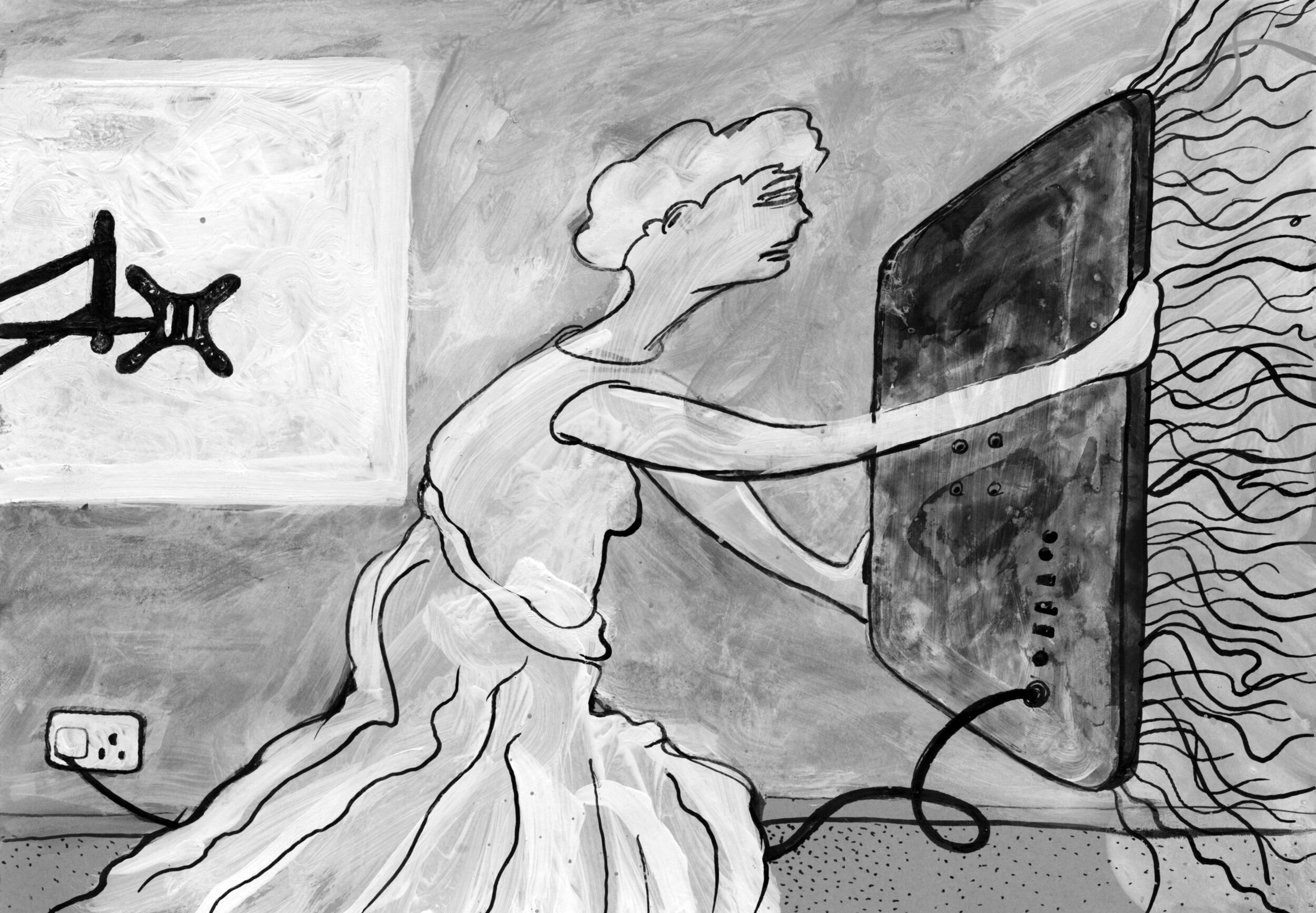
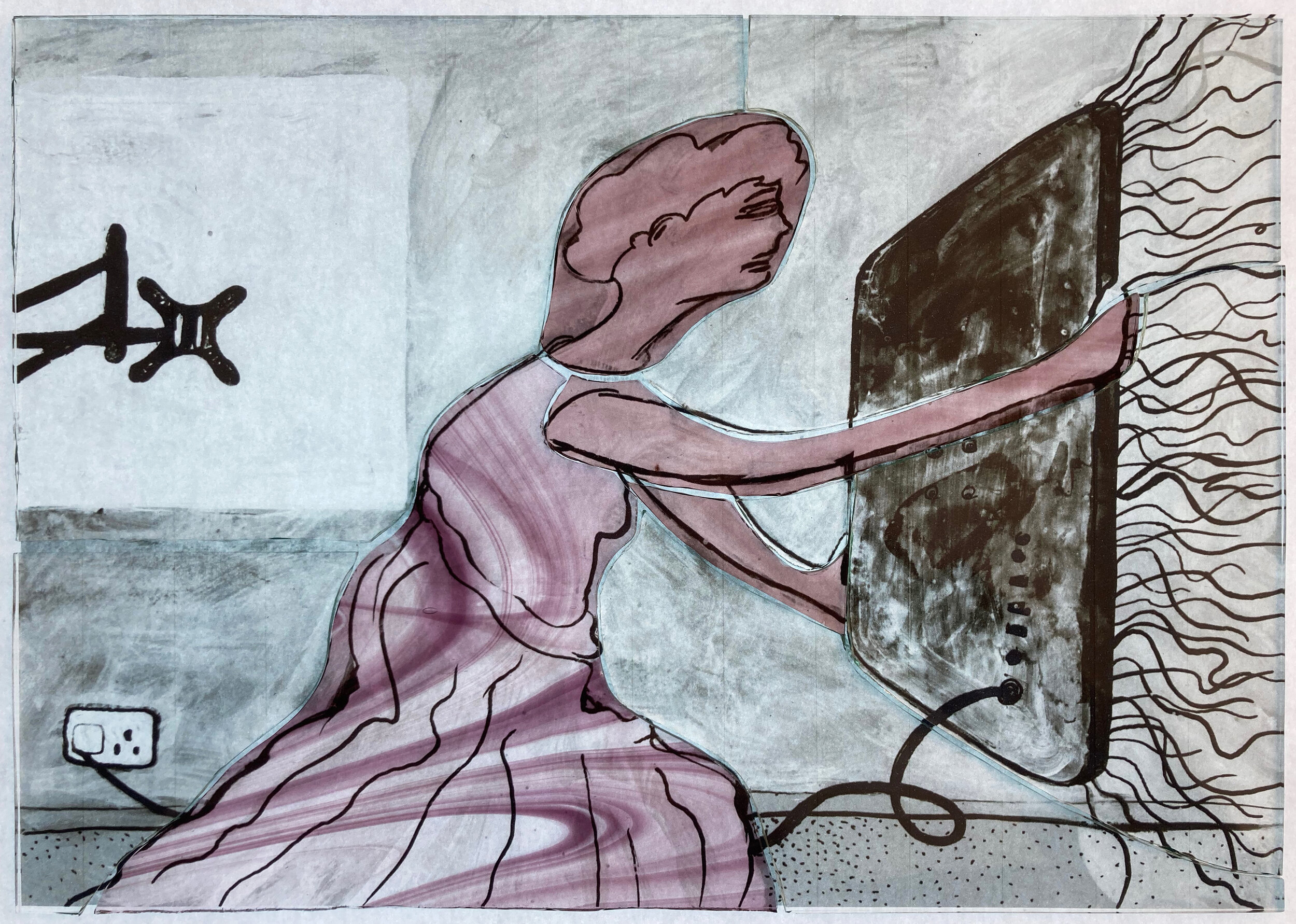
Left, Ray Ward’s painting, egg tempera and indian ink on gesso. Right, my stained glass interpretation of Woman in an Opera Dress at a Prison Camp, 420 x 360 mm.

This is the latest in my series of so called collaborations with Ray, made as a request by one of his collectors who missed out on buying the original black and white painting (above left). Sometimes Ray’s characters are adapted from visual sources, like a snapshot, but this one comes from a story told in her memoirs by Evgenia Ginzburg who served an 18 year sentence in labour camps at the eastern edge of the Soviet Union. Here she met women who arrived at the camp in their tattered finery because they had been arrested while at the opera. This was a great choice of painting to interpret as it is covered in lines and textures, with the dress and her flesh that is visible through it seemingly the focus of the piece.

Although I trace directly from a photocopy of Ray’s work, I have to do the lines in a completely different way - too many black lines on coloured glass would look like a load of dirty scribbles. Instead for the dress I chose two shades of streaky pink flashed glass and sandblasted the colour off to make fine white lines. You can see in the photo of the dress detail above how deep I had to go to get to the white, creating a texture that looks pleated and scruffy, as I imagine the original dress was. I covered the background in fine sandblasted lines and smoky paintwork too, with the only bit of sgraffito scribble on the ground behind the figure. All this talk of detail makes me think I should concentrate less on the technique and more on the subject matter.

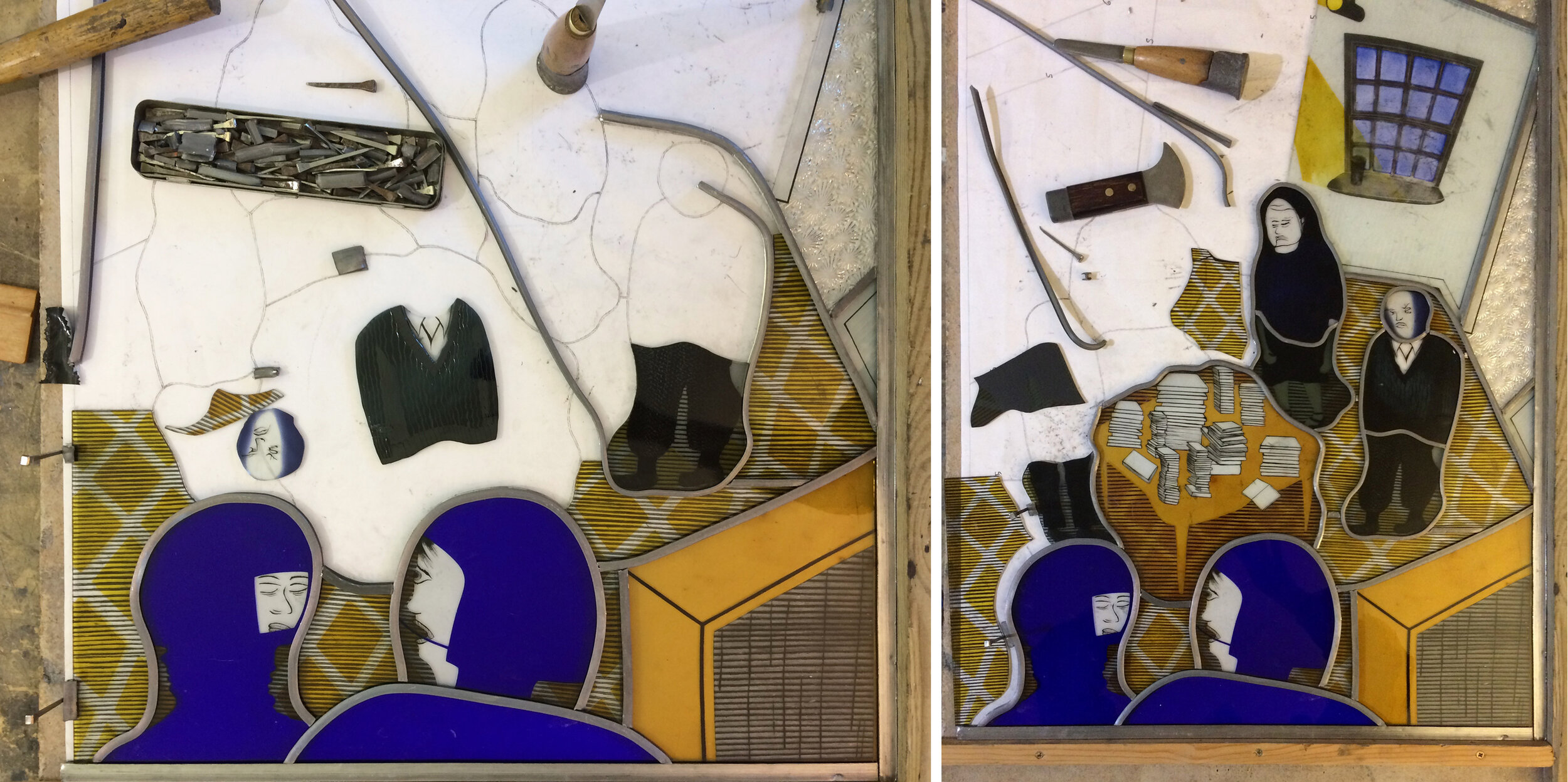
Choosing the glass, painted pieces on the lightbox.

Evgenia Ginzburg survived her ordeal in the gulag, as did my mother’s cousins. She met them for the first time when we went to visit the family in Gus-Khrulstany in the year 2000, a photograph (below) marks the happy occasion The two cousins are in the back row in the centre of the photo, I can see that I could have used either of their faces for the portrait of the woman. Next to them sits my mother Elizabeth (wearing glasses) with me in the right foreground.

In the 1990s Anastasia, the granddaughter of my mother’s cousin Natasha and therefore my second cousin once removed, brought the branch of the family that had stayed in Russia into contact with the branch of the family that had gone to England at the Revolution. She is in the centre of the photo above and on the left below with her parents and grandmother Natasha. We have a wealth of family stories, diaries and photographs from the pre revolutionary period, then a big gap except for one story from the late 1920s or 30s. My great aunt Lena travelled to Gus in an attempt to bring little orphaned Natasha back to England with her, but the grandfather wouldn’t let her go. As Natasha recounted the familiar story to us she said, ‘think how different my life would have been then.’

Two more stories by Sasha Ward

Just Another Story Two black and white drawings by Ray Ward, the second one shows the same scene from inside the room.

Just Another Story Two black and white drawings by Ray Ward, the second one shows the same scene from inside the room.

Just Another Story is an old drawing of Ray’s that he had a copy of on his studio wall with the intention of using it as inspiration for a painting, however I managed to grab it first. In my glass interpretation of the drawing (below) I focused on the architectural setting of the scene, using a white sandblasted line on dark red glass for the exterior and the opposite, a dark red line on white opalescent glass, for the interior. I didn’t want to confuse the lovely simplicity of the lines by introducing lead lines into the picture and I couldn’t quite decide which glass to use for the thickness of the wall between the hopeless man and the sagging woman. I tried the muranese glass (below left) which makes every composition sparkle and which I’ve been overusing, but finally settled on an olive green strip (below right).

Just Another Story Stained glass panel in progress

Just Another Story Stained glass panel in progress

As soon as I put those three colours together, I saw that I could extend the piece by making a leaded border to suggest the extension of the cross section through the house using glass of different tones and textures in the same colour combination. This gave the figures more space and also provided a place to write the title, something I’d intended to do on one of these pieces before but never found the right place.

Just Another Story Final version 385 x 300 mm and detail showing glass textures in natural light.

Just Another Story Final version 385 x 300 mm and detail showing glass textures in natural light.

MememememeME Egg tempera on gesso 375 x 530   Bad Shadow Ink on Paper 420 x 596 mm, both by Ray Ward

MememememeME Egg tempera on gesso 375 x 530 Bad Shadow Ink on Paper 420 x 596 mm, both by Ray Ward

The other drawing of Ray’s that I chose to work from at the same time was one of several versions of a bathroom scene viewed through a window. The most recent version (above left) looks exactly like our old house on Five Stiles Road, but as it’s too hard for me to work from a coloured original I went back to an earlier drawing (above right) where the picture is more extreme, both emotionally and in its lines of perspective. In case you’re wondering what it’s all about this is a quote from Ray.

“For the record, he is seeing a reflection (shadow) of someone he dislikes, any sort of hate being self hate being the sub text. I should know.”

So is this “There is generally some idea behind them all but sometimes knowing that ruins the picture so not always worth knowing”, which is an attitude I adopt as I get on with choosing and cutting the glass.

Bad Shadow: Left, glass pieces cut & laid over copy of drawing. Right, first attempt at stained glass panel.

Bad Shadow: Left, glass pieces cut & laid over copy of drawing. Right, first attempt at stained glass panel.

This panel turned out to be tricky, I had an idea for the bricks which took two layers of sandblasting over a complicated stencil to match the sharp dots in the original drawing. The shading and painting on the bathroom pieces also took two goes, the first time I leaded up the panel (above right) there wasn’t enough sense of space so I added more dark lines and shading, then refired and releaded the pieces (below). This panel is one that looks much better and richer in the natural light of the window rather than on the even light of the lightbox, which to me is a sign of success.

Above, Bad Shadow, final version 325 x 385 mm. Below, detail of Bad Shadow.

Above, Bad Shadow, final version 325 x 385 mm. Below, detail of Bad Shadow.

IMG_1914.jpg

TV angel by Sasha Ward

Let The Light In. Painting in egg tempera on gesso by Ray Ward 435 x 300 mm.

Let The Light In. Painting in egg tempera on gesso by Ray Ward 435 x 300 mm.

This recent painting of Ray’s (above) intrigued me, I couldn’t quite work out what the woman shielding herself behind the TV was up to. It is based on a black and white drawing, as they often are, which I thought made the situation clearer. In that version (below) the discarded wall bracket is more obvious and the composition more open, she is offering up the TV with her arms outstretched. This drawing, in its turn, was based on an annunciation angel in a carved relief that Ray photographed in St Martin of Tours Church, Chelsfield (bottom).

You Light Up My life. Drawing in indian ink and white acrylic on black card by Ray Ward

You Light Up My life. Drawing in indian ink and white acrylic on black card by Ray Ward

IMG_2537.jpg

The interesting history of Ray’s painting made me want to add to the chain by making a stained glass version. I based this on the black and white drawing, only changing it by using a pink and yellow colour combination which is a classic in stained glass angelology. The glass pieces (below) show that the only pieces of coloured glass I used were two types of streaky pink on the angel, the yellow being a thin wash of silver stain fired on the back of the glass. As in all the panels I’ve made in this series most of the details are done with sandblasting and/or painting with black, brown and grey iron oxides.

Glass pieces cut and laid over an enlarged photocopy of Ray’s drawing

Glass pieces cut and laid over an enlarged photocopy of Ray’s drawing

Finished panel on the lightbox, 250 x 360mm.

Finished panel on the lightbox, 250 x 360mm.

The finished panel is shown above on the lightbox and below on my windowsill in the sunshine. Its title also has a history - Ray had called his painting ‘The Teacher, Look in Here and All Will be Revealed’ but then forgotten that fact. When I asked him for one he came up with two song titles, ‘You Light Up My Life’ which I used for the stained glass panel and alternatively ‘Let The Light In’ which he used as the new name for the painting. By then I’d been calling it TV Angel, so this little image actually has four names.

Finished panel in the sunshine

Finished panel in the sunshine

Passersby Passing By by Sasha Ward

Drawing 1 by Ray Ward, ink and acrylic on card.  236 x 320 mm

Drawing 1 by Ray Ward, ink and acrylic on card. 236 x 320 mm

It was time to choose which of Ray’s drawings I wanted to turn into stained glass. Nothing he had on the walls in his studio jumped out at me, so I looked through some of his boxes of old drawings - sorted by size and paper type - to find some that did. The last panel I made (that’s not really a question…) had featured a waterfall, so I thought the river scene (above) would make a good companion. However, I mostly make my choice by finding a figure I want to do in glass and the man looking at the river was a bit small and sketchy. The figure in another box of slightly coloured drawings (below) looked perfect for glass painting, once I’d got Ray to add a pattern to her coat, and I thought the two drawings would combine together perfectly setting up an interesting story between the two figures.

Drawing 2 by Ray Ward, ink and acrylic on card.  210 x 297 mm.

Drawing 2 by Ray Ward, ink and acrylic on card. 210 x 297 mm.

Painted and sandblasted glass pieces on the lightbox

Painted and sandblasted glass pieces on the lightbox

The resulting glass panel was quick to make. I saw her as a redhead and had the perfect piece of glass for that. The other colours, in the restricted palette that works best in these small pieces, followed from there. The completed panel (below) is practically opaque because of the heavy sandblasting combined with the types of glass I used and looks great photographed in my studio window, where normally too much green grass shows through.

‘Passersby Passing By’ Stained glass panel in daylight.  280 x 400 mm.

‘Passersby Passing By’ Stained glass panel in daylight. 280 x 400 mm.

Detail of the redheaded figure showing different types of glass, some heavily sandblasted.

Detail of the redheaded figure showing different types of glass, some heavily sandblasted.

In a continuation of this collaborative process Ray then did a new painting, with a new title, of the same scene (below). I had imagined the setting as the mouth of a river with a boat going out to the sea which their eyes are gazing at. But the new barges and the more elaborate balustrading place the figures on the embankment somewhere along the Thames, and she’s got a quite different look in her eye.

Painting by Ray Ward ‘The universe shall pass away as a scroll’  Egg tempera and Indian ink on gesso ground. 310 x 435 mm.

Painting by Ray Ward

‘The universe shall pass away as a scroll’ Egg tempera and Indian ink on gesso ground. 310 x 435 mm.

These People Are Intellectuals by Sasha Ward

‘These People Are Intellectuals, They Live in Houses Full of Books and Have Nothing Worth Stealing’ is the full title of Ray’s large black and white drawing (below). When I decided to make a larger stained glass panel from one of his drawings, I had no hesitation about choosing this one, partly because of the fabulous title that tells you what is going on in the picture. The shadows of the two helmeted robbers are seen in the back window and then repeated in the foreground, medieval style, so you really know who is talking.

These People Are Intellectuals… 880 x 680 mm. Acrylic and indian ink on card. Ray Ward 2019

These People Are Intellectuals… 880 x 680 mm. Acrylic and indian ink on card. Ray Ward 2019

The photos below document the making process starting with the choice of glass colour and texture. In stained glass dark colours come to the front, unlike in easel painting where they appear to recede. The blue flashed glass I chose for the foreground talking heads dictated the rest of the colour scheme. I’ve learnt from the previous collaborative panels to keep the colours restrained, so stuck to the purple side of blue contrasted with sandy yellow. I used clear glass for the back wall and textured glass for the ceiling and open doorway. Ray said he had no idea who the legs in the doorway belonged to, so I decided to leave them out.

Left, 32 Cut pieces laid on top of a photocopy of the drawing. Right, First layer of sandblasting, painting and staining.

Left, 32 Cut pieces laid on top of a photocopy of the drawing. Right, First layer of sandblasting, painting and staining.

Left, Detail of completed foreground pieces, showing silver stain diamonds on carpet.  Right, Work in progress on big and small light boxes - the bookcases needed a second layer of black (iron oxide) paint.

Left, Detail of completed foreground pieces, showing silver stain diamonds on carpet. Right, Work in progress on big and small light boxes - the bookcases needed a second layer of black (iron oxide) paint.

Left, Four figures in progress with an alternative, less sandblasted, head.  Right, Back wall has been double sandblasted with wallpaper stripes and fired with black iron oxide for window, skirting and lights. Blue enamel panes and silver stain beam…

Left, Four figures in progress with an alternative, less sandblasted, head. Right, Back wall has been double sandblasted with wallpaper stripes and fired with black iron oxide for window, skirting and lights. Blue enamel panes and silver stain beams of light in unfired state.

Left and Right, Leading in progress.

Left and Right, Leading in progress.

Left, Cementing, the lovely stage where the window comes together.  Right, Sunshine through the completed panel shows the sandblasted areas as shadow.

Left, Cementing, the lovely stage where the window comes together. Right, Sunshine through the completed panel shows the sandblasted areas as shadow.

Completed panel 700 x 540mm

Completed panel 700 x 540mm

The panel is on show alongside Ray’s original drawing and the notes and lists I made during the process in our exhibition at Norwich Cathedral ‘The Cloud of Unknowing’ until December 12th.

Click this link for the full exhibition catalogue