Sasha Ward

These People Are Intellectuals by Sasha Ward

‘These People Are Intellectuals, They Live in Houses Full of Books and Have Nothing Worth Stealing’ is the full title of Ray’s large black and white drawing (below). When I decided to make a larger stained glass panel from one of his drawings, I had no hesitation about choosing this one, partly because of the fabulous title that tells you what is going on in the picture. The shadows of the two helmeted robbers are seen in the back window and then repeated in the foreground, medieval style, so you really know who is talking.

These People Are Intellectuals… 880 x 680 mm. Acrylic and indian ink on card. Ray Ward 2019

These People Are Intellectuals… 880 x 680 mm. Acrylic and indian ink on card. Ray Ward 2019

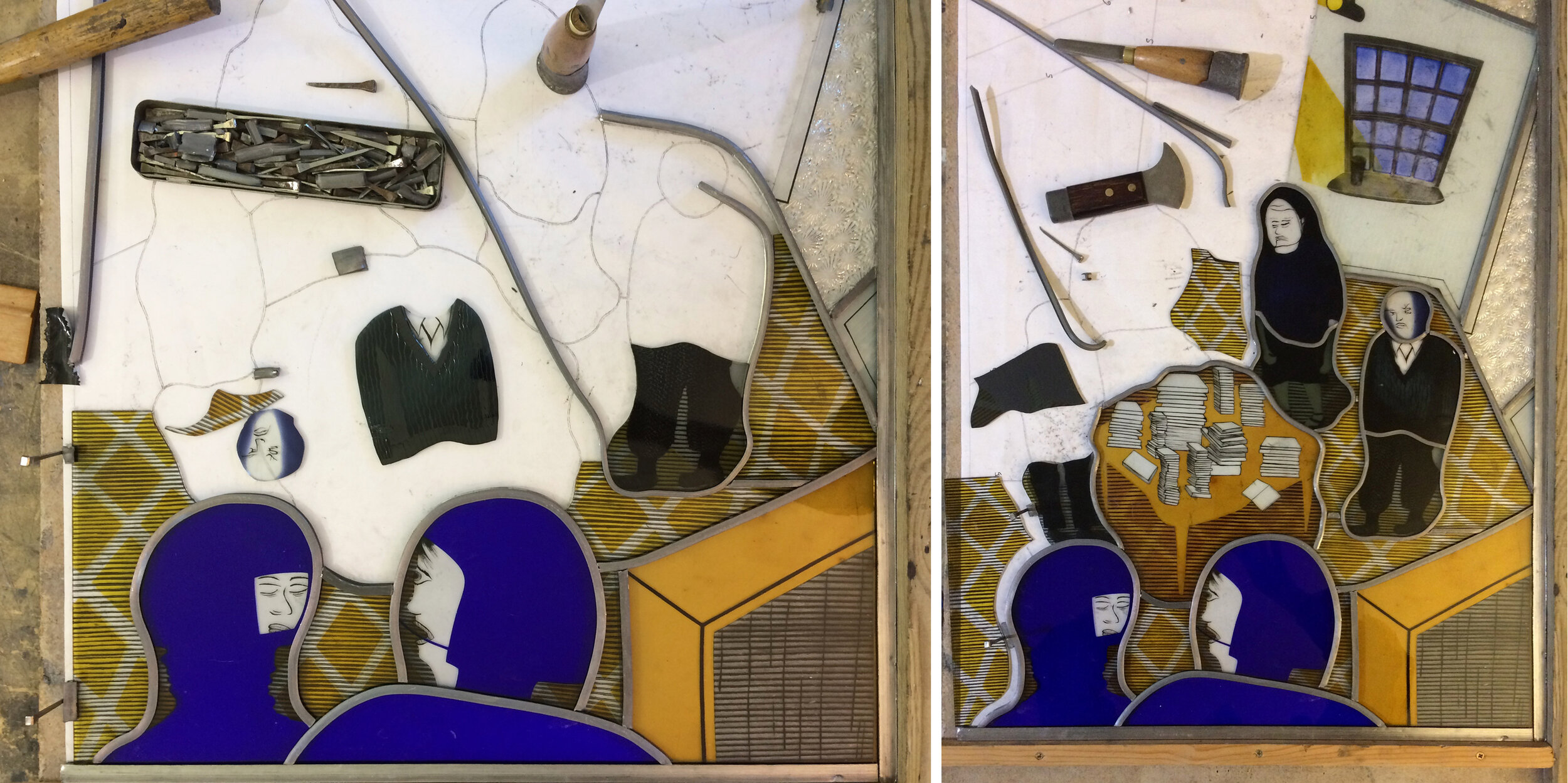
The photos below document the making process starting with the choice of glass colour and texture. In stained glass dark colours come to the front, unlike in easel painting where they appear to recede. The blue flashed glass I chose for the foreground talking heads dictated the rest of the colour scheme. I’ve learnt from the previous collaborative panels to keep the colours restrained, so stuck to the purple side of blue contrasted with sandy yellow. I used clear glass for the back wall and textured glass for the ceiling and open doorway. Ray said he had no idea who the legs in the doorway belonged to, so I decided to leave them out.

Left, 32 Cut pieces laid on top of a photocopy of the drawing. Right, First layer of sandblasting, painting and staining.

Left, 32 Cut pieces laid on top of a photocopy of the drawing. Right, First layer of sandblasting, painting and staining.

Left, Detail of completed foreground pieces, showing silver stain diamonds on carpet.  Right, Work in progress on big and small light boxes - the bookcases needed a second layer of black (iron oxide) paint.

Left, Detail of completed foreground pieces, showing silver stain diamonds on carpet. Right, Work in progress on big and small light boxes - the bookcases needed a second layer of black (iron oxide) paint.

Left, Four figures in progress with an alternative, less sandblasted, head.  Right, Back wall has been double sandblasted with wallpaper stripes and fired with black iron oxide for window, skirting and lights. Blue enamel panes and silver stain beam…

Left, Four figures in progress with an alternative, less sandblasted, head. Right, Back wall has been double sandblasted with wallpaper stripes and fired with black iron oxide for window, skirting and lights. Blue enamel panes and silver stain beams of light in unfired state.

Left and Right, Leading in progress.

Left and Right, Leading in progress.

Left, Cementing, the lovely stage where the window comes together.  Right, Sunshine through the completed panel shows the sandblasted areas as shadow.

Left, Cementing, the lovely stage where the window comes together. Right, Sunshine through the completed panel shows the sandblasted areas as shadow.

Completed panel 700 x 540mm

Completed panel 700 x 540mm

The panel is on show alongside Ray’s original drawing and the notes and lists I made during the process in our exhibition at Norwich Cathedral ‘The Cloud of Unknowing’ until December 12th.

Click this link for the full exhibition catalogue

Maternity Dorchester by Sasha Ward

MAT WINDOWSm.jpg

I’ve just installed printed translucent vinyl on 16 windows - that’s 98 panes - in the delivery rooms of the Maternity Unit at Dorchester Hospital. It was difficult to design (I started this project almost a year ago) and even more difficult to photograph the results. The designs are laid out in a block above, they are on a landscape theme with curved lines cutting across the unattractive window frames. The details within these curved shapes are mostly borrowed from things I’ve done recently and liked, but translated into a colour pallet that works with the pinks, purples and pale blues on the walls of the rooms.

Room 31 - before and during installation

Room 31 - before and during installation

You may wonder why you need to block a lovely view (above right), but where there is a view there is also a balcony covered in debris and privacy is what a woman who is giving birth wants. Some of the windows (below right) are overlooked by windows across the courtyard, so in both of these situations even the tops of the windows need to block the view while letting the light in and sending the curtains packing.

Room 12 - before and after, showing both windows against a pink wall.

Room 12 - before and after, showing both windows against a pink wall.

Room 1 - the curtains are going.

Room 1 - the curtains are going.

Room 27 - bed very close to the window, glow of light through the pale colours.

Room 27 - bed very close to the window, glow of light through the pale colours.

Working with digitally printed vinyl throws up its own surprises, obviously different from glass painting but with lots of qualities that translate across the two media. Room 25 gave me a shock similar to the one I get on opening the kiln and seeing that a coloured enamel has done its own thing, different from the sample. Often this oddity makes the work more interesting. So Room 25 with its block of luminous pink ended up being my favourite - the success of works like these is dependent on the colour combinations and I think that I’ve got that part right here.

Room 25

Room 25

Transformation by Sasha Ward

Offcuts standing sideways in my studio window, each 1 metre tall

Offcuts standing sideways in my studio window, each 1 metre tall

I had a commission to make two fanlight windows for a friend's house in Poland. She said offcuts would do, so I put two leftovers sideways in my studio window and waited for inspiration. I had made the glass in 2000 for an exhibition, the pink one broke and I remade it in yellow but was never satisfied with the results. You can see in the pages below from my 2000 sketchbooks that there was a lot going on here - how could I add something while also making sense of a poor composition ?

Meanwhile another friend, the artist Wendy Smith who I met when we were students together, came to stay. She had a lot to say about the process of transformation, you can read about it on her blog. Her ideas spoke to me about the danger of overworking versus making a fresh start. I have often tried to make new pieces on top of old samples and all I got was a struggle made visible.

The new panels in my studio, finished last week.

The new panels in my studio, finished last week.

This time, I sandblasted across the glass backgrounds with star/flower shapes, as if embroidering figures across a patterned and pleated fabric ground. The yellow ground got pink details, the pink ground got yellow and a fantastic rich amber made from a mix of enamels. You can see the depth of the old lines under the surface of the glass in the details below. 

WM in Wimbledon by Sasha Ward

Although I like to imagine William Morris walking through Wimbledon when he went from his house in Hammersmith to his works at Merton Park by foot, that is not really the subject of this piece.

In the background of my parents' lives and my childhood in Wimbledon were William Morris designs. The earliest one I remember is Marigold in olive green on the sitting room walls, it looked very good with the tartan sofa the great aunts are sitting on (below) and with my tartan dress. When I saw the Marigold design used on the cover of Volume II of WM's Collected Letters last year, the memory made me shiver.

Dagmar, Clara and Norah (the great aunts)                                                   Sasha - Marigold …

Dagmar, Clara and Norah (the great aunts)                                                   Sasha - Marigold wallpaper designed by WM, 1875

The photograph below of my mother's best friend Inge and a dog visiting her top floor flat in Wimbledon for tea is quite a recent one. It would be fantastic even without Pimpernel on the sloping wall - this wallpaper has lasted for as many years as I can remember.

Dog and Inge - Pimpernel wallpaper designed by WM, 1876

Dog and Inge - Pimpernel wallpaper designed by WM, 1876

Chrysanthemum, seen on the chair below, is not such a favourite of mine. Maybe it's because the fabric on this chair deteriorated over the years, ending up completely hidden by shawls and cushions covered in oriental patterns. Shoving lots of different patterns together is something I am quite used to.

Ray and Kate - Chrysanthemum fabric designed by WM, 1877

Ray and Kate - Chrysanthemum fabric designed by WM, 1877

I found countless pictures of family members around the dining room table with the Golden Lily curtains in the background. When I brought home my college stained glass panel "Dual Carriageway" in 1985 (below right), where better to put it than next to another set of rich, clashing patterns. The stained glass remained, then moved house with my mother, but the curtains soon went and were turned into drapes for other armchairs.

Peter, Elizabeth, Kate - Golden Lily fabric designed by J.H. Dearle for Morris and Company, 1899

Peter, Elizabeth, Kate - Golden Lily fabric designed by J.H. Dearle for Morris and Company, 1899

Glass Network Questions by Sasha Ward

Today "Glass Network", the quarterly magazine of The Contemporary Glass Society arrived - here is my page. The questions I wrote about in this piece may be familiar to people who work to commission, or to those who have read my posts from Kelmscott Manor when the questions most frequently asked by visitors were spinning in my head.