public art

Design Process by Sasha Ward

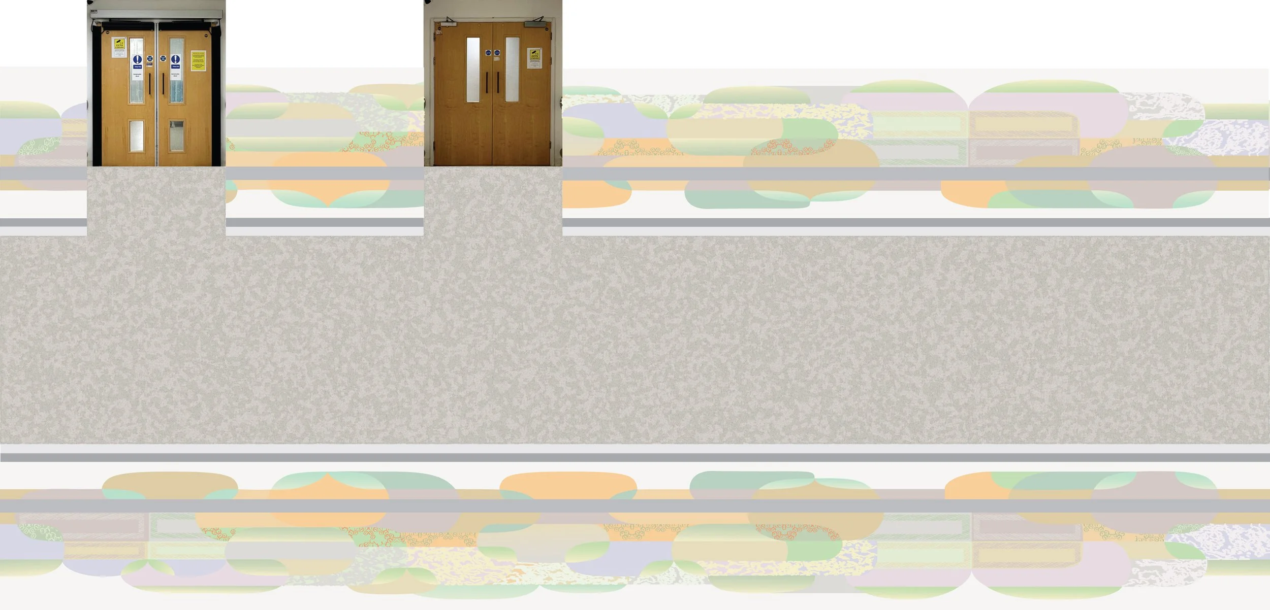
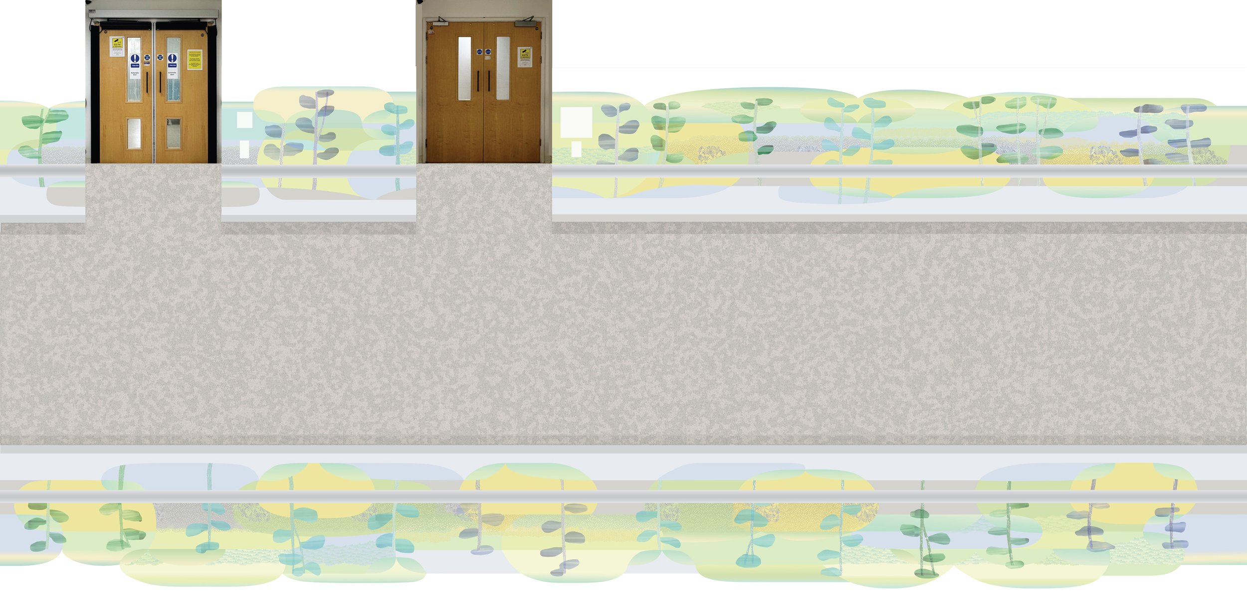
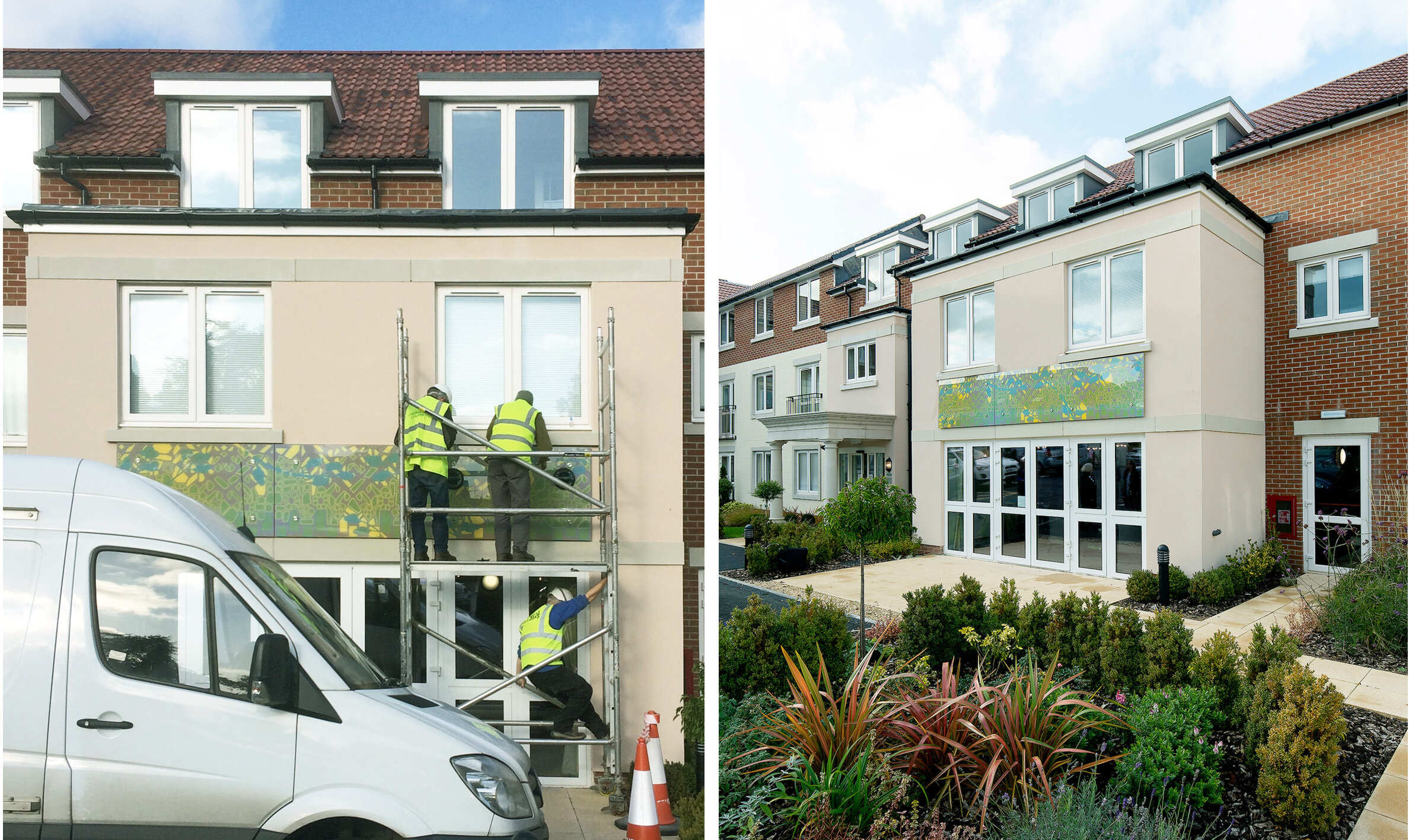
These squares show a small part of a large work that I have designed to cover an 18 metre long hospital corridor, from floor to ceiling on both sides. The squares illustrate the design process in 15 stages - a process that is interesting to me because of the way it shows the design developing, and that is unlike a traditional work in progress piece that illustrates the stages of making.

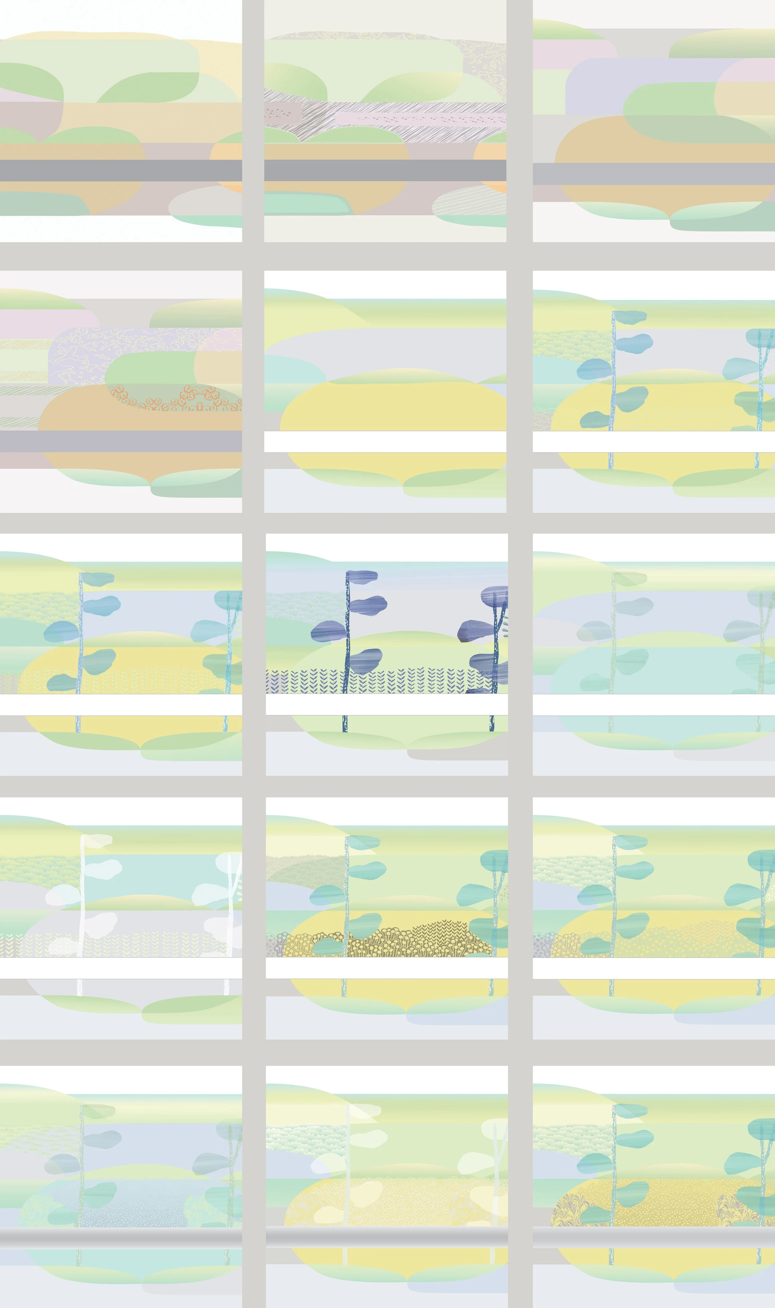
15 stages in the design of one square, from floor to ceiling, taken from the centre of the design. The solid band 2/3rds down represents the crash rail.

This is a commission for a public place with many interested parties involved in the discussion about the artwork. So not all the decisions to alter or add things are mine - which is as it should be. Colours were changed completely, geometry was reduced to a minimum, detail and texture were introduced, and the interpretation of the given theme, which was ‘nature’, ended up more pastoral than patterned. There are lots of things - and echoes of things - that have to be avoided when you’re making work for a space as sensitive as the approach to a mortuary.

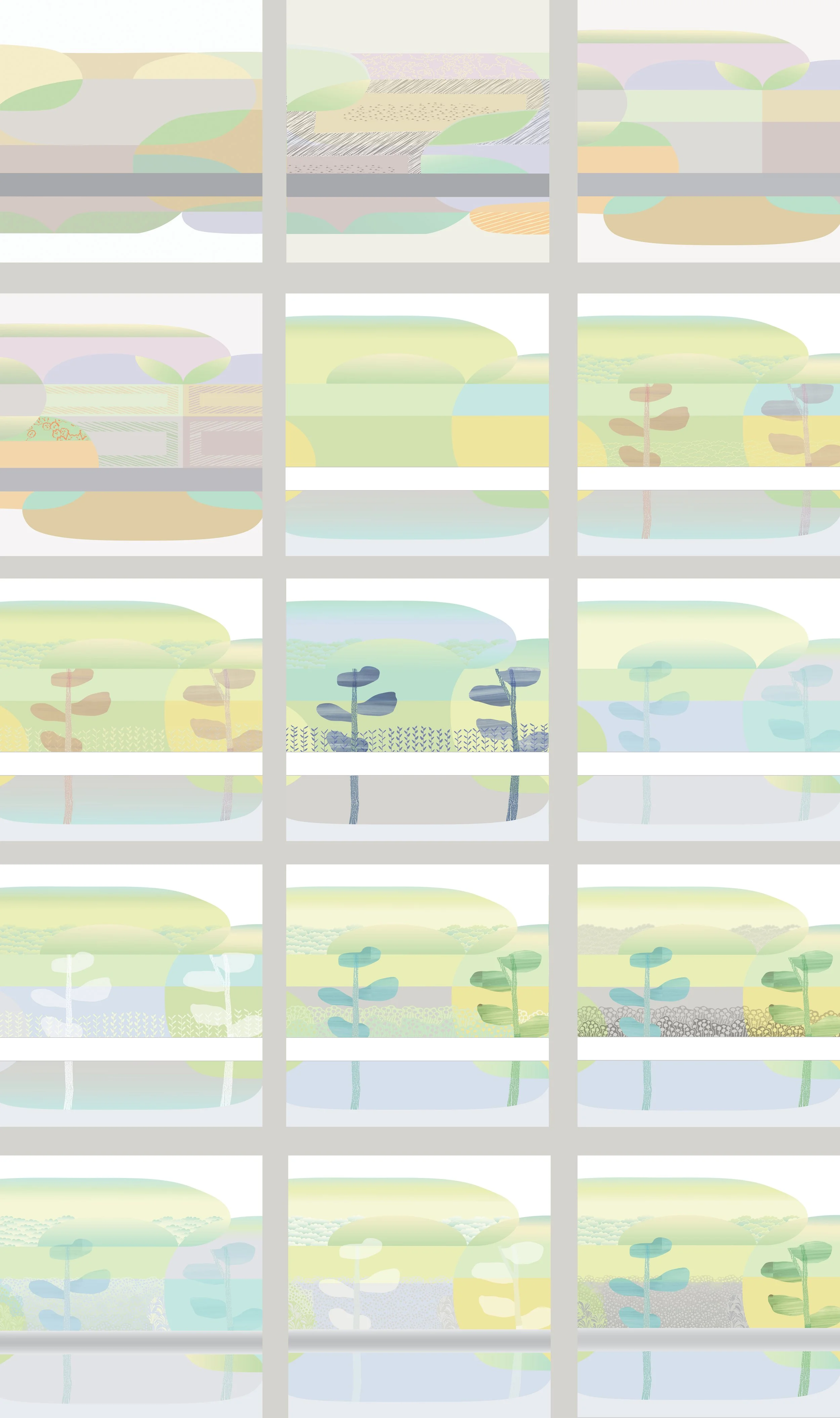
15 stages in the design of another square, from floor to ceiling, taken from the end of the design.

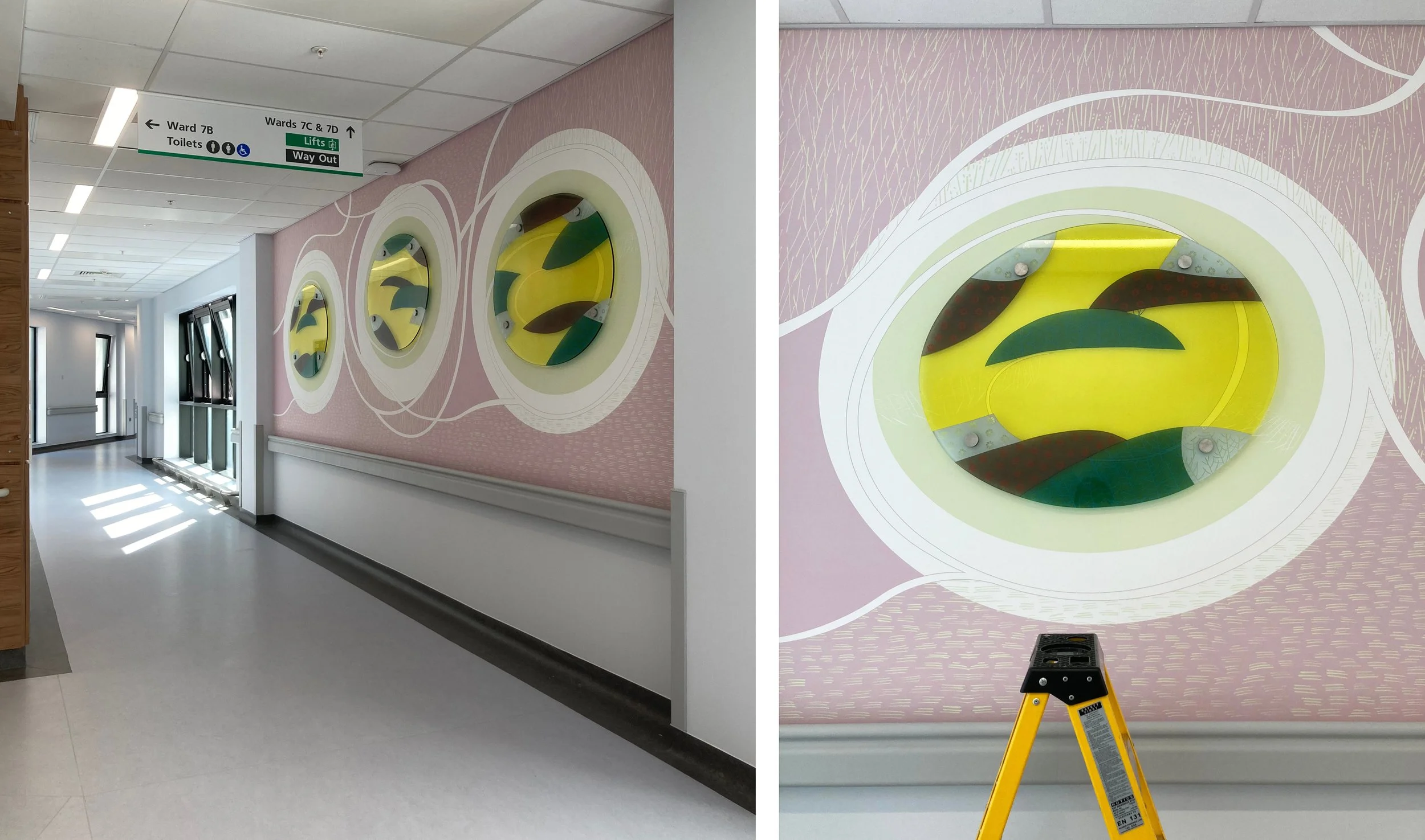
However there are discarded aspects of the design that I miss - the sharp straight lines to contrast with the ovals that went after square 4: the empty spaces in square 5: the simple patterns in square 6. I made paper models of some of the stages to help us look at the design - below are the versions that include squares 4 and 15. The design will be printed on to PVC panels and installed in the corridor soon. Fingers crossed.

Royal Liverpool University Hospital by Sasha Ward

This was a commission that I thought would never get finished. A new Liverpool Hospital has been built next to the old one which is due for demolition. During the course of its construction, the main building contractor, Carillion, went bust, faults were discovered in the building and with the cladding that had been used causing further costs and delays which were added to by the pandemic. The selected artists, who had been contracted to Carillion, stored their work and waited to see what would happen next. Understandably, my enthusiasm for the project started draining away as the seven oval glass panels I had made were stored behind my kiln for five years.

Drawing for glass and wall design at Ward 7A, 2015.

The selected artists had each been asked to design work for walls next to the four ward entrances on their allocated level, mine was the seventh with bright green accents. Hospitals often ask for artwork that is organic and curvy, definitely not geometric, a look that I have struggled with over the years of doing commissions for health care settings. On this occasion I decided to go for no straight lines or interlocking patterns, taking inspiration from the natural world rather than the urban environment. For each location I designed a swirly drawing that would be printed on vinyl wallpaper with shaped pieces of glass mounted on top of a pool of pale colour.

The wall next to Ward 7A (above and below) changed shape and colour during the course of the years, with a piece of glass that is the biggest and I think the best. It was hard to photograph on installation day with reflections from a screen opposite and equipment stored up against it (below).

Ward 7A during installation, left wallpaper, right with glass on top.

Ward 7D, from drawing to glass, 2015 & 2022.

Ward 7D is similar, and for this one my first drawing (above left) shows the initial concept where lines and circles spiral into the pool of overlapping colours. However, the blank wall had been too much for someone to resist, and when I visited just before installation I saw that a square access hatch had been cut into it so I moved the glass up and some white lines around on the design. This wall is opposite a window which provides some great reflections of the the new building (below right) which is white and grey and spiky in design.

Details of wall and glass at Ward 7D.

Drawing for Ward 7C, 2016.

The wall leading up to Ward 7C had room for two glass panels above the crash rail. My watercolour drawing for this one (above) is closest in feel and colour to the work installed. The changes I made to the shape of the lines and the positioning of the panels happened because of a fire alarm that I had to keep well away from. The detail (lower right) shows how the ceiling lights are effective in picking up the lines sandblasted on the edge of the glass and mixing them with fine white lines printed onto the background vinyl.

Entrance to Ward 7C

Details of the glass at Ward 7C

Drawing for Ward 7B

The wall leading up to Ward 7B, six metres long, is the one that didn’t change so neither did the lines on my watercolour drawing (above). It’s a piece of wall between bays of windows - wouldn’t it be lovely and simple to be able to go back to doing windows again! This series of three looks the simplest and cleanest with an unfortunate resemblance to a row of washing machines.

Wallpaper and glass for Ward 7C

Corridor at Ward 7C and detail of glass panel during installation.

Overall, I am delighted with my last hospital commission. The no straight lines design looks effortless and was very easy to alter over the years and to install. Above all the colours look great, the transparent enamels on the glass are strong against the pastel coloured wallpaper and complement the tricky green on level 7. It’s hard to find your way around this building, hopefully this commission will help you remember the way and give you a boost of energy as you watch the patterns swirling around.

My wallpapers by Sasha Ward

My designs for wallpapers are one offs - digitally printed for a specific place. This aspect of my practice has developed alongside the glass panels I make, sometimes the wallpapers are seen through a glass wall panel, sometimes they are a solid wall to contrast with a coloured window.

In my commission for the paediatric mortuary at the Royal Manchester Children's Hospital, the wallpapers played an important part in linking together a series of rooms that we decorated with new colours and artworks in glass and vinyl. The project was completed last year when I described the vinyl door vision panels here and the main glass artwork here. After a recent visit to check out the new furniture that completed the scheme I saw how well the wallpapers worked in the tricky spaces.

Model of the tricky spaces - five rooms with no external windows

Model of the tricky spaces - five rooms with no external windows

I designed the wallpapers to a brief that asked for abstract artworks, with little reference to the outside world. Because of the unique nature of the space and the sensitivities of the people who would use it, they needed to be nothing like you would have in your home, and nothing like you would ever see again. The designs followed a series of workshops with staff and bereaved families who gave their opinions forcefully. Back in my studio I made a series of watercolours and collages that drew on the workshops and formed the basis of my designs.

A favourite collage, I tried not to stray too far from this in the following designs for five wallpapers.

A favourite collage, I tried not to stray too far from this in the following designs for five wallpapers.

Design for Room 2. Waiting Corridor. 2.6 x 6.8 metres

Design for Room 2. Waiting Corridor. 2.6 x 6.8 metres

Photos of the trickiest narrowest space, the waiting corridor.

Photos of the trickiest narrowest space, the waiting corridor.

Design for Room 3. Children's Viewing. 2.6 x 2.6 metres

Design for Room 3. Children's Viewing. 2.6 x 2.6 metres

Photos through the viewing window to the viewing room wallpaper.

Photos through the viewing window to the viewing room wallpaper.

Design for Room 4. Children's Bedroom. 900mm x 6.4 metres

Design for Room 4. Children's Bedroom. 900mm x 6.4 metres

Photos from the viewing room to the Children’s Bedroom wallpaper and glass panel.

Photos from the viewing room to the Children’s Bedroom wallpaper and glass panel.

Design for Room 5. Babies’ Viewing. 2.6 x 1.8 metres

Design for Room 5. Babies’ Viewing. 2.6 x 1.8 metres

Photos into babies’ viewing room and through the viewing window.

Photos into babies’ viewing room and through the viewing window.

Design for Room 6. Babies’ Bedroom. 900mm x 6.4 metres

Design for Room 6. Babies’ Bedroom. 900mm x 6.4 metres

Photos through viewing window into the babies’ bedroom with wallpaper and glass panel.

Photos through viewing window into the babies’ bedroom with wallpaper and glass panel.

Screen printing by Sasha Ward

Left, glass panel in the factory before lamination. Right, glass samples in hands, installed glass behind me.

Left, glass panel in the factory before lamination. Right, glass samples in hands, installed glass behind me.

I get large or external commissions screenprinted by protoglassstudios.com . Although they have been making my work since 1992 and have always done a good job, there are so many things to worry about when you hand over the manufacture to somebody else. For this one, commissioned for Alexandra Lodge which is a new development by Churchill Retirement Living in Thornbury, South Gloucestershire, it was the colours. I had the design worked out (described in my blog “Cobbles” in July) and a combination of four opaque colours agreed - you can see the factory sample showing the glass version of these colours in my left hand (above right). In my other hand is a painted sample with an earlier colour palette which ended up being rather similar to the final version.

The colours I use are usually paler, and I would say subtler, than the average. In this case, I was persuaded that the design wouldn’t show up outside and from a distance unless we boosted the colours. Imagine my surprise on visiting the factory after printing but before lamination, to see how dark the colours looked (this stage shown above left) - I was convinced I hadn’t chosen that blue but it was too late to do anything about it other than start again with all three panels. But the same finished panels, as you can see installed on the face of the building below, are somewhere in the middle in terms of the colour range and look just right with the building and the planting scheme.

Left, installation of glass at Alexandra Lodge, Thornbury. Right, official photo showing glass above lounge doors.

Left, installation of glass at Alexandra Lodge, Thornbury. Right, official photo showing glass above lounge doors.

I visited the glass factory on one day during manufacture to photograph the process as far as I could. An all out yellow layer had been printed first, this background brightened the whole piece and gave the exposed laminated edges a lovely yellow and purple two tone appearance. On the day, the green cobbles had already been printed and they were doing the blues which went around the edges of some cobbles and cut across the design in flowering branches. The purple layer would be the last to be printed, you can see this stencil on the screen below right and also as the black on the films that we laid on top of the other printed colours in the bottom picture.

Left, panel 2 in front of screen for blue. Right, screen for panel 3 purple.

Left, panel 2 in front of screen for blue. Right, screen for panel 3 purple.

Left, preparing to print blue on panel 3. Right, panel 3 going through the dryer.

Left, preparing to print blue on panel 3. Right, panel 3 going through the dryer.

Left, films for screens in the factory. Right, panel 1 with film for purple overlaid.

Left, films for screens in the factory. Right, panel 1 with film for purple overlaid.

Maternity Dorchester by Sasha Ward

MAT WINDOWSm.jpg

I’ve just installed printed translucent vinyl on 16 windows - that’s 98 panes - in the delivery rooms of the Maternity Unit at Dorchester Hospital. It was difficult to design (I started this project almost a year ago) and even more difficult to photograph the results. The designs are laid out in a block above, they are on a landscape theme with curved lines cutting across the unattractive window frames. The details within these curved shapes are mostly borrowed from things I’ve done recently and liked, but translated into a colour pallet that works with the pinks, purples and pale blues on the walls of the rooms.

Room 31 - before and during installation

Room 31 - before and during installation

You may wonder why you need to block a lovely view (above right), but where there is a view there is also a balcony covered in debris and privacy is what a woman who is giving birth wants. Some of the windows (below right) are overlooked by windows across the courtyard, so in both of these situations even the tops of the windows need to block the view while letting the light in and sending the curtains packing.

Room 12 - before and after, showing both windows against a pink wall.

Room 12 - before and after, showing both windows against a pink wall.

Room 1 - the curtains are going.

Room 1 - the curtains are going.

Room 27 - bed very close to the window, glow of light through the pale colours.

Room 27 - bed very close to the window, glow of light through the pale colours.

Working with digitally printed vinyl throws up its own surprises, obviously different from glass painting but with lots of qualities that translate across the two media. Room 25 gave me a shock similar to the one I get on opening the kiln and seeing that a coloured enamel has done its own thing, different from the sample. Often this oddity makes the work more interesting. So Room 25 with its block of luminous pink ended up being my favourite - the success of works like these is dependent on the colour combinations and I think that I’ve got that part right here.

Room 25

Room 25