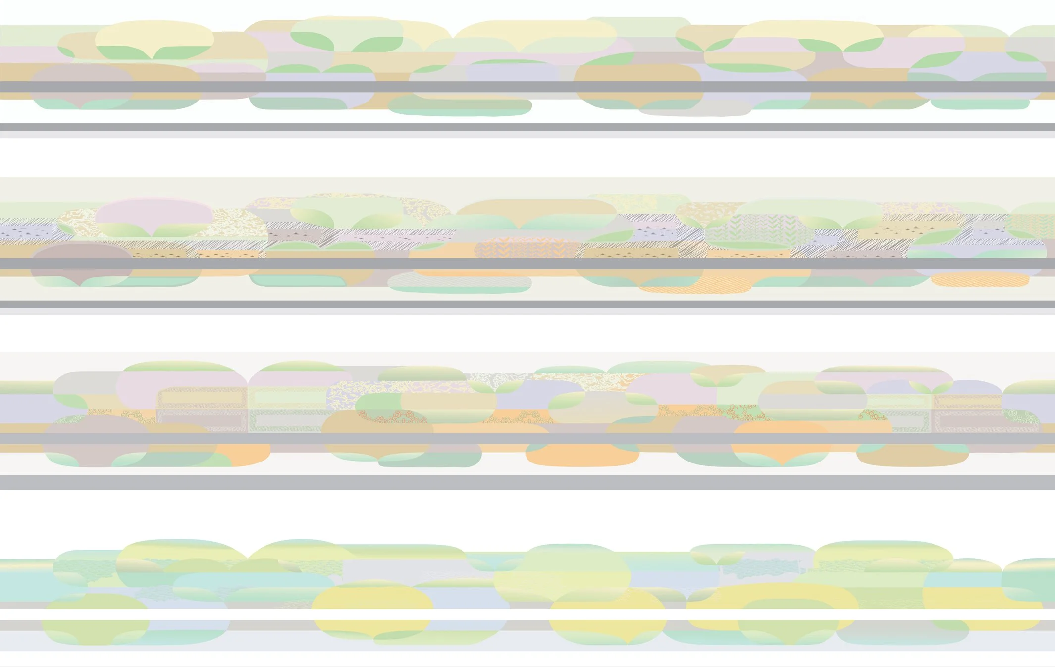
Above: 4 stages of my design for UCHL. Below: latest version with both sides of the corridor design.
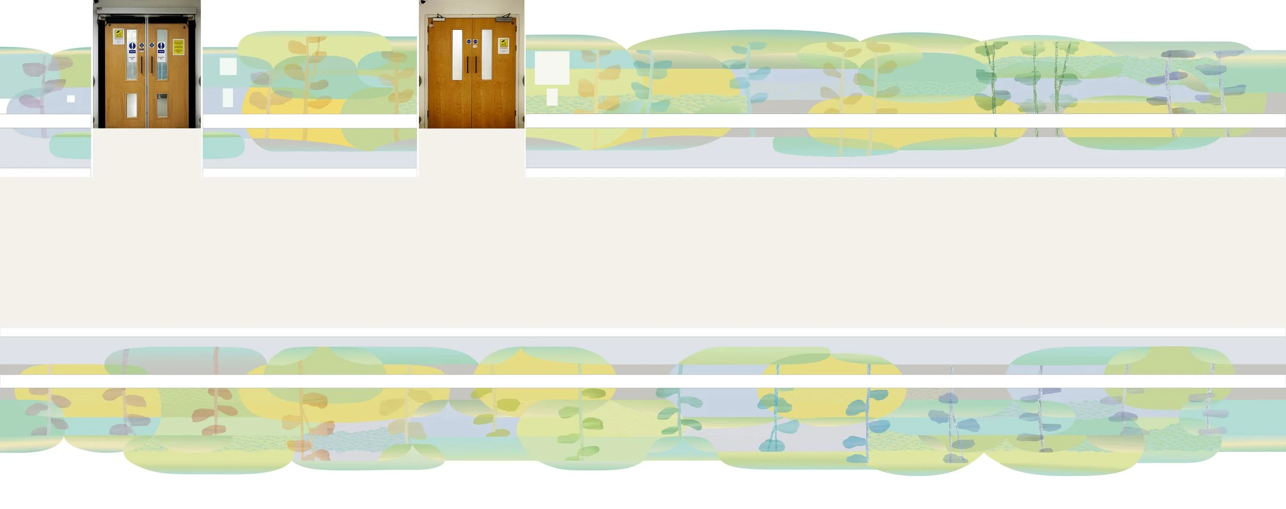
So far this year I have been fully occupied with the design of a wallcovering for both sides of an 18 metre long corridor leading to the mortuary in University College Hospital, London. There are many things to consider when doing a commission like this. I’m now at the stage where I’ve responded to the brief (nature inspired but with lots of caveats), to the feedback on my design ideas from the working group and then to the different opinions on the latest version of my design (above). I was in need of inspiration to fortify myself for the next stage of the process, and happened to be in Brighton so I paid a visit to The Royal Pavilion.
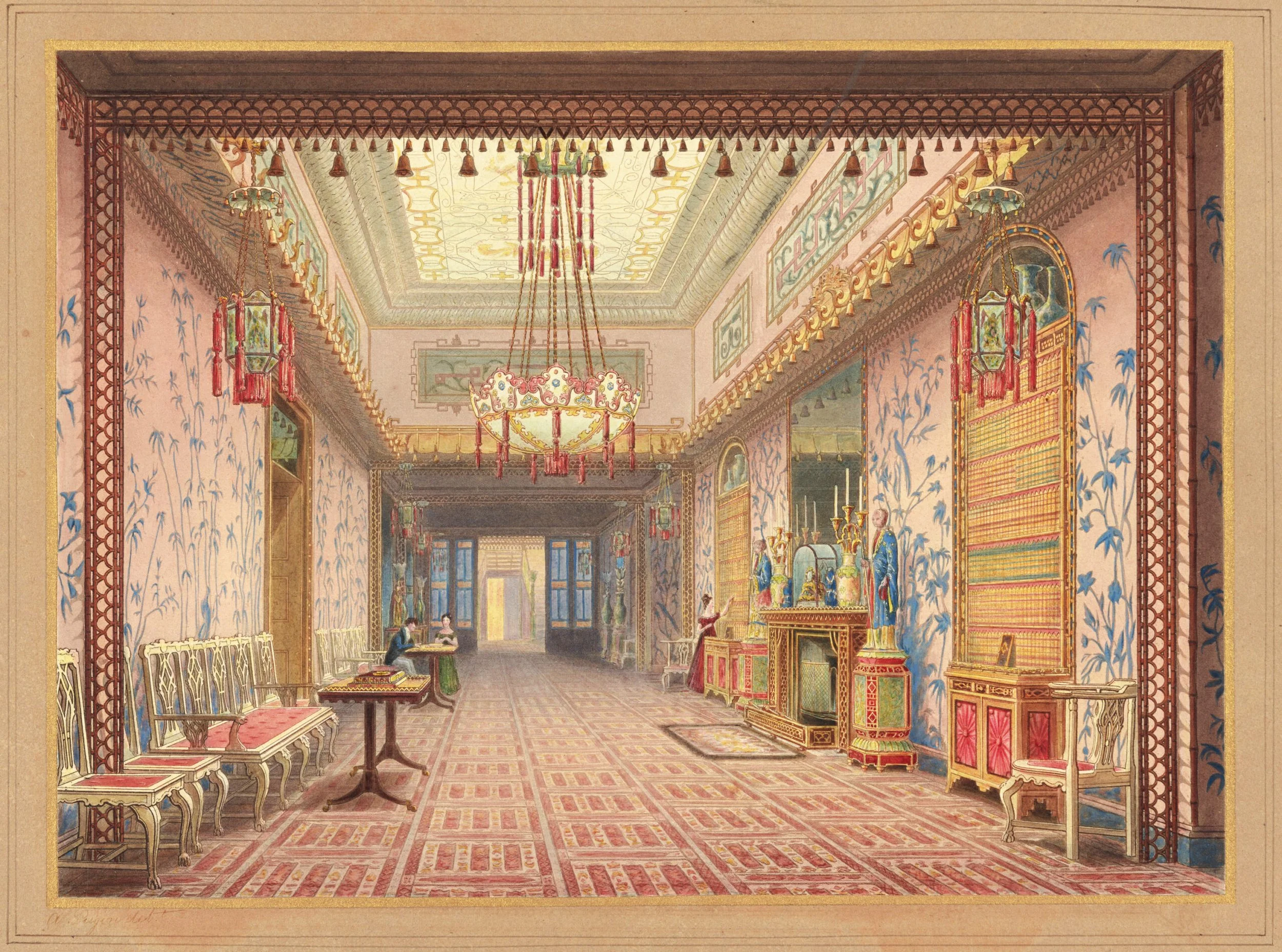
Aquatint of The Long Gallery, Brighton Royal Pavilion published in 1826
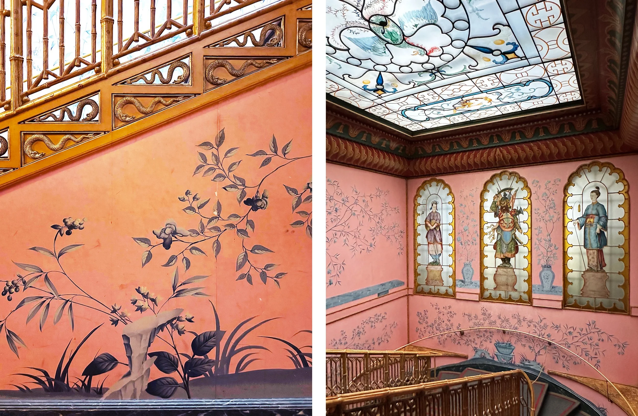
Here, nature inspired wallpapers are everywhere, enlivened by geometric patterns on borders, carpets and ceilings. The blue and pink paper that covers the walls of the Long Gallery and the staircases at either end is a hand painted copy of the original, which was probably hand-painted in distemper by Frederick Crace around 1815, so produced in Britain but strongly influenced by work exported from China and seen elsewhere in the pavilion.
In 1823 local historian Richard Sickelmore described the Long Gallery as “one of the most superb apartments that art and fancy can produce and which, for richness in effect, and dazzling brilliance of decoration and design, is not to be equalled, perhaps, in Europe, if [not] the world”.
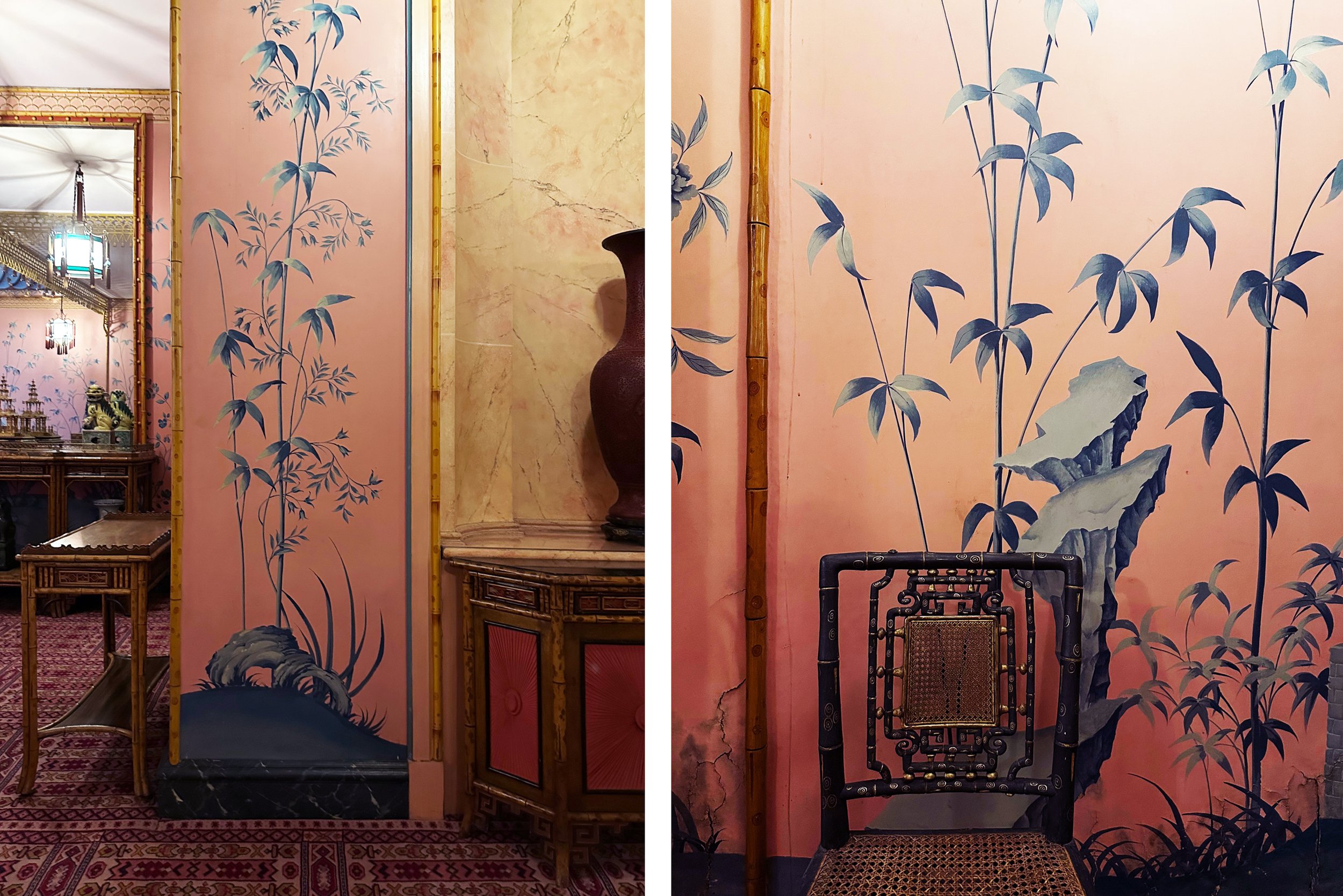
Brighton Royal Pavilion, details from the Long Gallery wallpaper (above) and from the staircase (below). Just shades of greyish blue on a pink background that glows and changes with the light conditions.
Brighton Royal Pavilion, The King’s apartments and detail of wallpaper
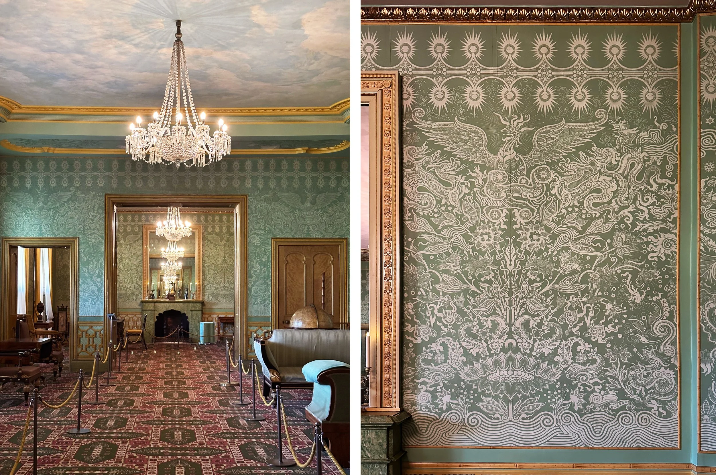
The other wallpapers that I like are in the bedrooms. White on green in King George IV’s apartments (above) and yellow on gold in his brothers’ bedrooms (below). These are also copies, but of designs from a slightly later date when the King was moved to the ground floor during John Nash’s transformation of the pavilion. The paper is a hand-painted copy of decorator Robert Jones’ original printed wallpaper from the 1820s - you can see brush marks in the white paint. This design features dragons and birds as well as flowers and a wonderful stripy scroll along the bottom.
Elements of the design are repeated in the version in the upstairs bedrooms that uses the chrome yellow that was a new and popular colour of the period - the colour of joy and madness that I often have to avoid (or sneak in small amounts of) in my designs for hospitals. Here bamboo is used as an edging, there is a trompe l’oeuil pattern at the bottom and, best of all, there are actual Chinese paintings on the yellow walls that are a series illustrating the production of cotton and tea.
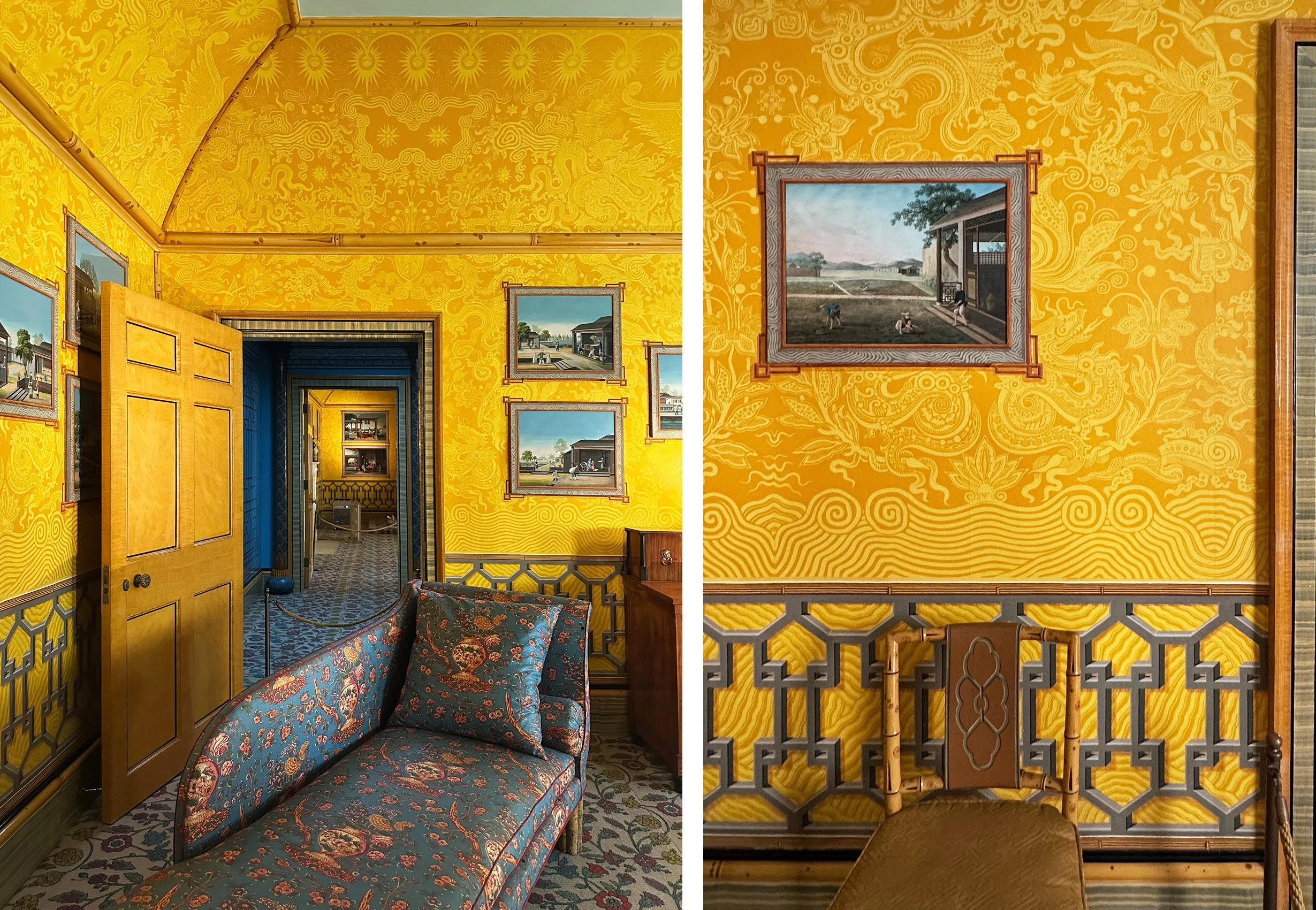
Upstairs in Brighton Royal Pavilion, The Yellow Bow Rooms and detail of wallpaper.
So the next steps for me - try a version with dark foliage and then one with white. Like the plants in these papers, mine are not intended to be realistic but to break up the expanses of wall in a way that combines geometry with nature - nature being the source of so much pattern-making.