A row of windows - view from the outside at night.
Last Monday we delivered, installed and unveiled a row of windows that Rob and Lorna Ryan had commissioned for the front of their workshop in Bethnal Green, London E2. I’ve written about making them in a previous blog post here, all without showing how the design joined up, flying from one end of the sequence to the other where you find the number 110.

Window 1 on the workbench : In my studio window : Windows 1 & 2 installed.
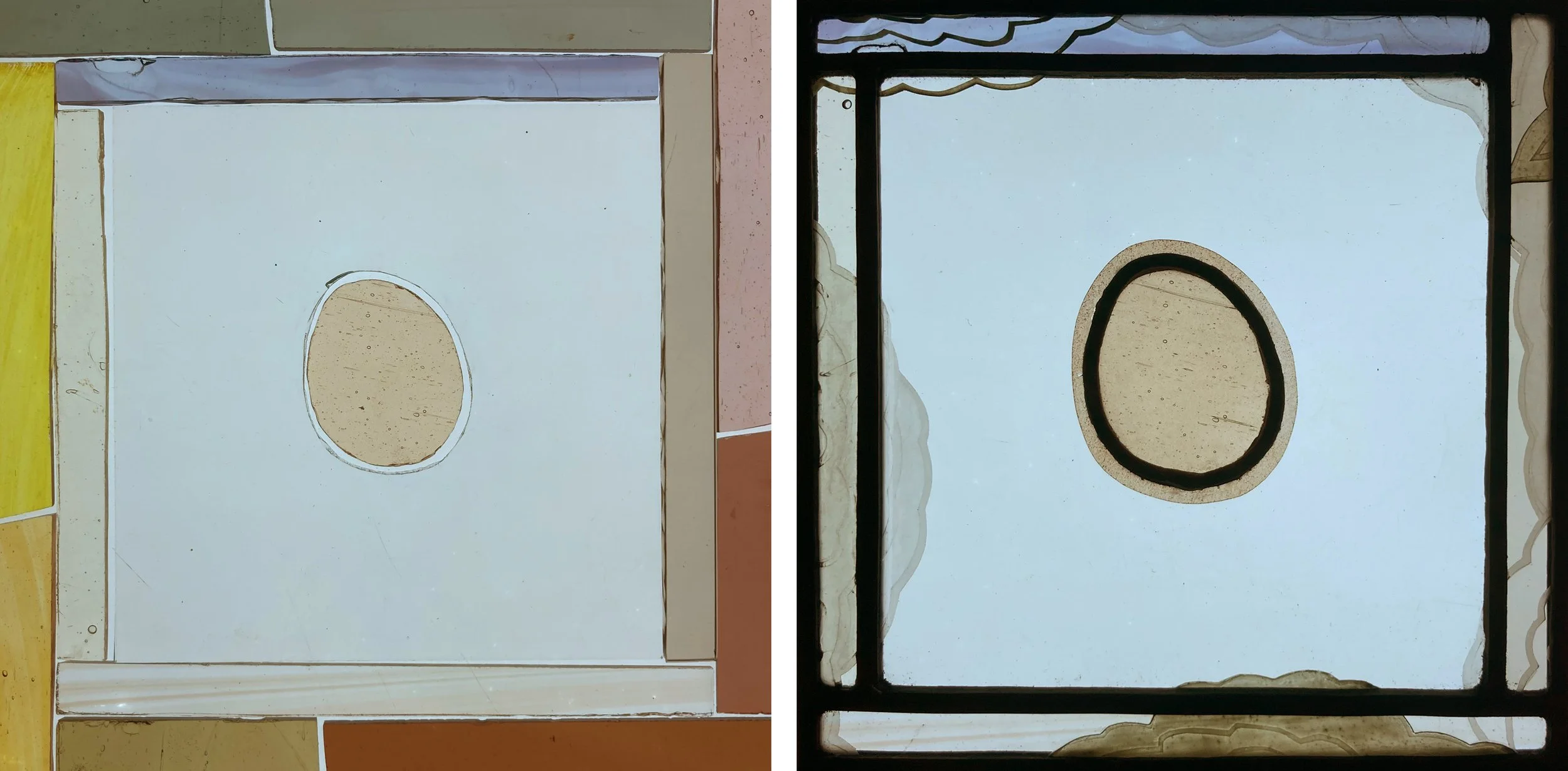
Window 1 (above) is designed around a floating oval which was the last piece of glass I cut. I agonised over which of the streaky colour combinations to use, in the end going for the most vibrant glass I had, golden yellow with green to tie in with the pale green that runs through the design. The painting stage took a long time as I worked out the best way of tying the shapes together with black and grey oxide and enamel painted across the lead lines - you can see this in a ring around the number 110 below and the same pieces of glass on the lightbox before painting and sand blasting. When we installed the last two windows the sun came out casting a shadow of the number on the wall and a flash of the bright pink glass above it.

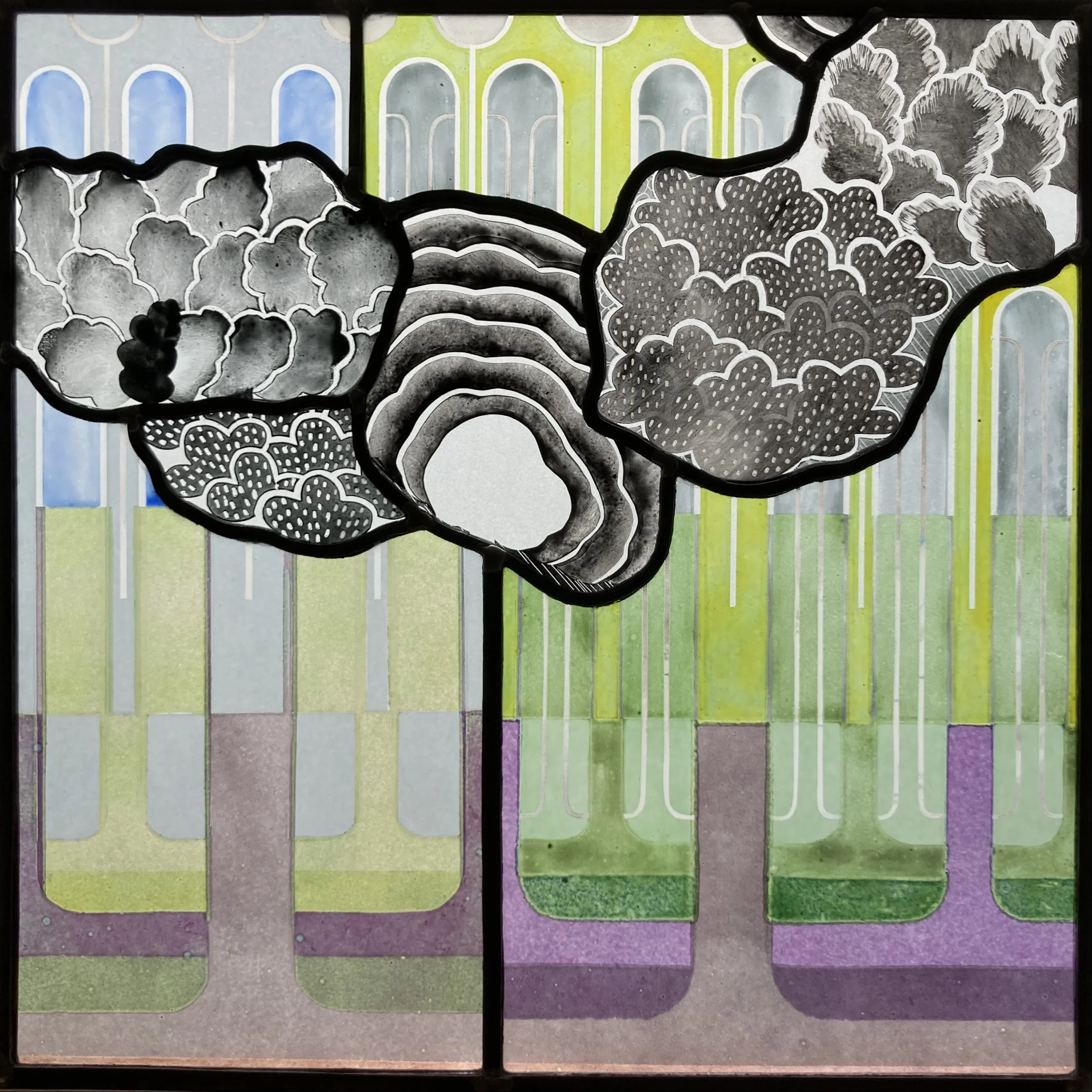
Window 4, working out the painting : Detail of the number in my studio window : Windows 3 & 4 installed.

A row of windows - view from the inside in the daytime.
Approximately one third of the glass in the row of windows is clear, this maintains their connection to the large windows below them and also to the world beyond the windows with its blocks of flats, tree tops and big patches of sky. Previously the glass in the windows was opaque so now we are letting more of the outside in.
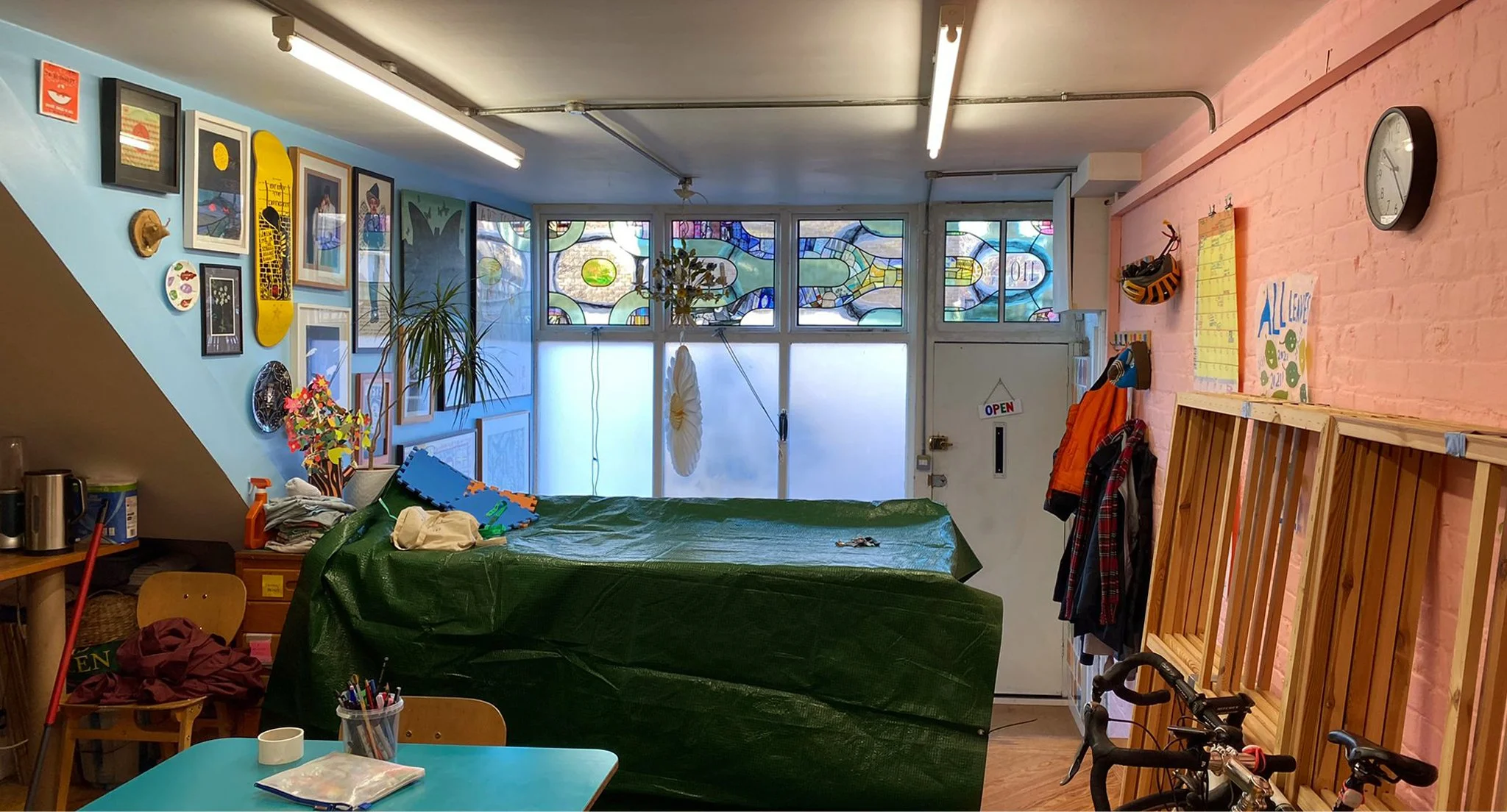
These photos (above and below) show the row of windows in the context of the workshop. It wasn’t too hard to fit in with their aesthetic as I’ve known Rob and Lorna for more than forty years since we were at art college together. If you’re not familiar with Rob Ryan’s work you can find it on this website and there are examples of his drawings and Lorna’s paintings on the green wall in the sitting room (below). Next to the green wall is the curtain made of a patchwork of silk scarves, a wonderful thing that inspired the spirit of my glass design. The blue wall (above) is equally crammed with art - I’m very happy to have my work added to this generous collection of drawings, paintings and photographs by friends and fellow artists.

The sitting room part of the workshop : wall of pictures and window with Rob’s vinyl design and silk scarf curtain.
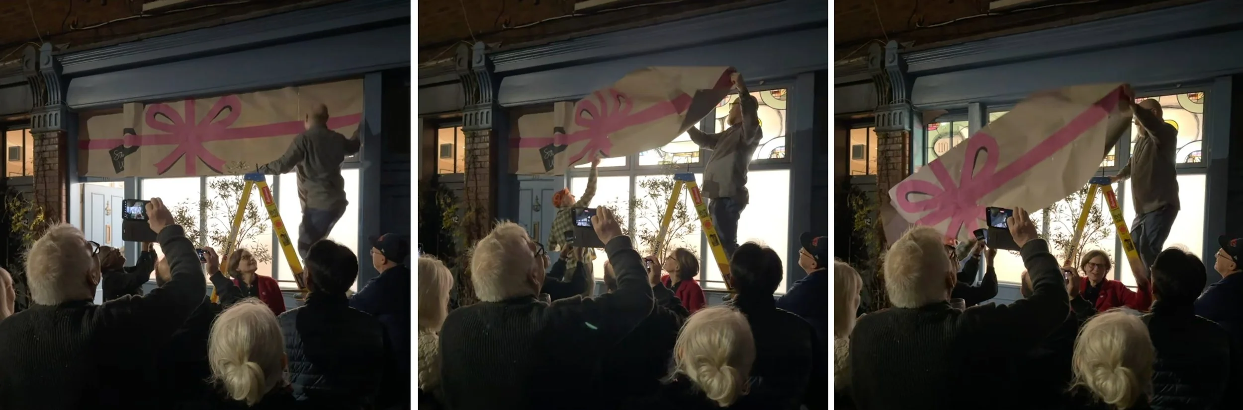
The unveiling ceremony.
The friends and fellow artists turned up that evening for a proper unveiling ceremony where the wrapping came away without a hitch. The bright lights of the workshop spread a perfectly even light with the bonus of a reflection or two in a big black car bonnet.

Reflections in a car bonnet and invitation card by Rob.