stained glass design

My First Commission by Sasha Ward

Left: Interior with fanlight window, Wimbledon, summer 1979. Right: the same window on my lightbox 46 years later.

This is the first window that I made as a commission for a place, which was the house opposite us in Berkeley Place, Wimbledon. The window came back to me for restoration this summer because the original commissioners want to take it to their new house, and with it came vague memories and nice surprises. The surprises were how much I liked the window and how aspects of it, in its slightly wrecked state (above right), were well made with neat soldering and the thinner than average lead cames that I still tend to use.

Left: Numbered pieces. Right: cutline with broken pieces.

Left: Leading underway. Right: leading and soldering completed.

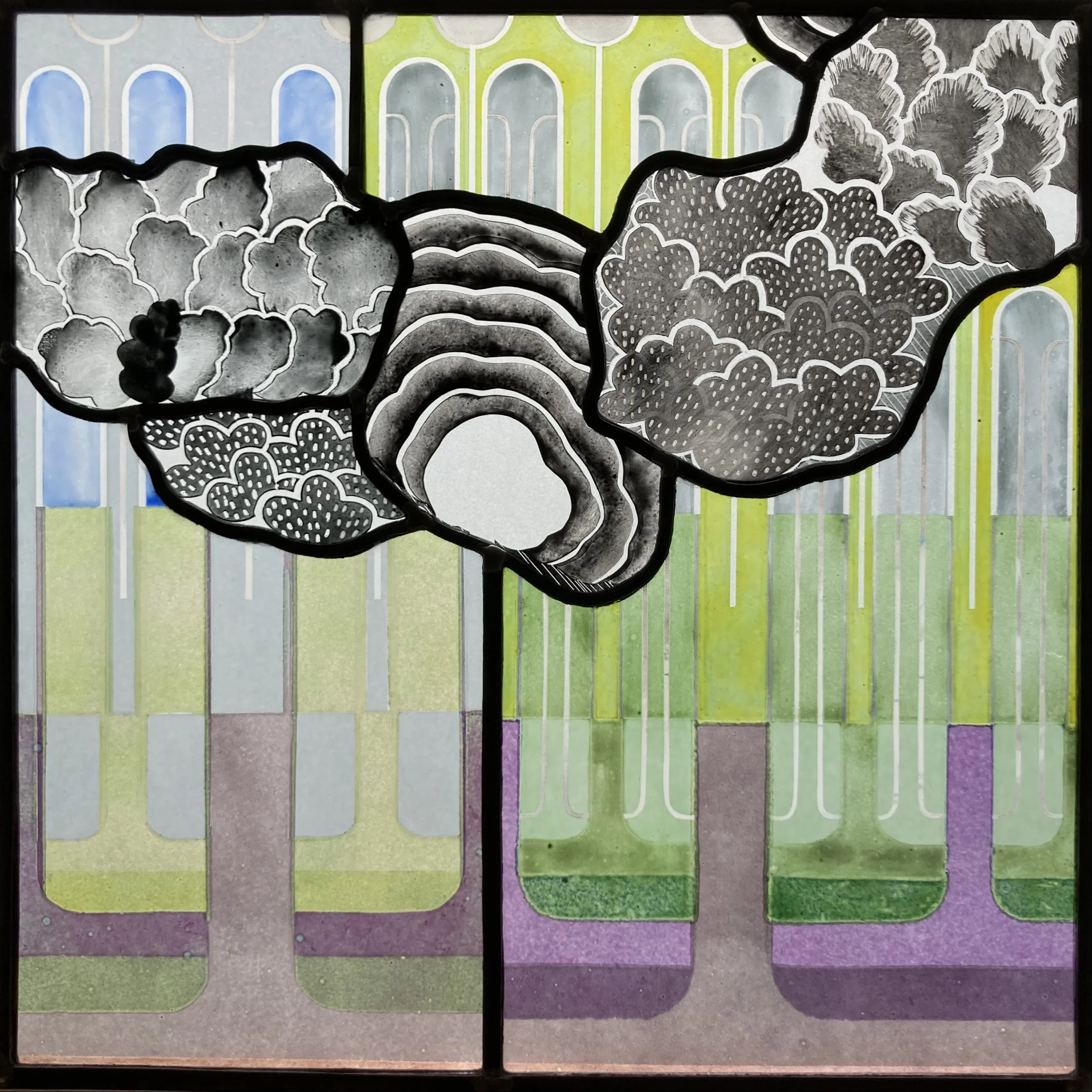
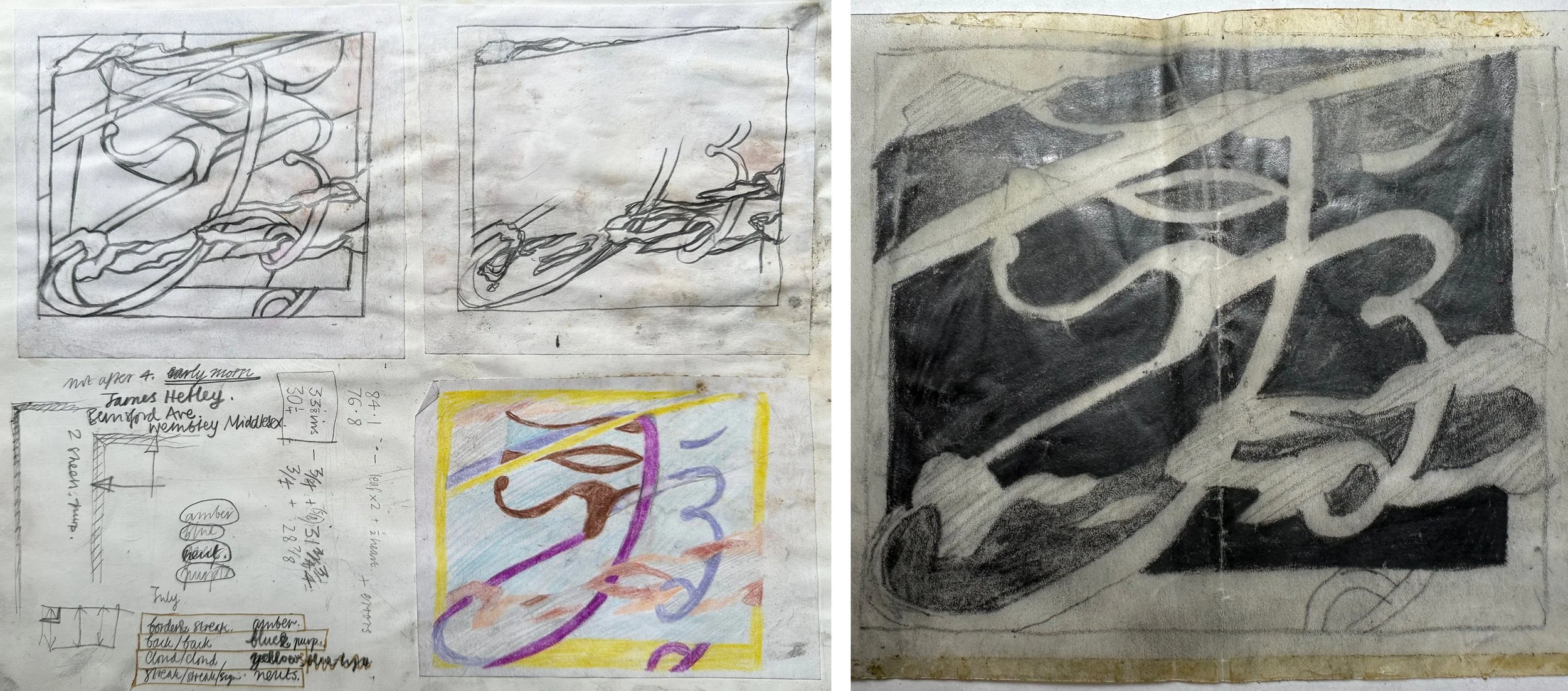
I ran through the stages of pulling it apart, recutting the broken pieces and leading it up again, using thicker lead in some places and keeping my soldering neat. I could remember clearly the design and its origins in calligraphy combined with vapour trails. It was one of a series of pieces in patchwork, collage and glass, all documented in my big sketchbook from the year 1979. I found the related dimensions, ‘architectural’ drawing and versions on tracing paper sellotaped in to the book, along with notes on how to measure up and when to go and buy my glass from Hetley’s in Stonebridge Park, Wembley. The glass I chose, carefully worked out on a page of the sketchbook, is beautiful and a big contributor to the success of the piece, however its uneven thickness made the leading quite difficult, as did the rather rough way that I’d cut it.

What I can’t remember is where I made it - was it the last thing I made at The Central School of Art (and then how did I transport it to Wimbledon?), surely I didn’t make it on my bedroom floor, surely my parents didn’t let me turn the sitting room in to a mess of broken glass pieces and pungent, messy cementing?

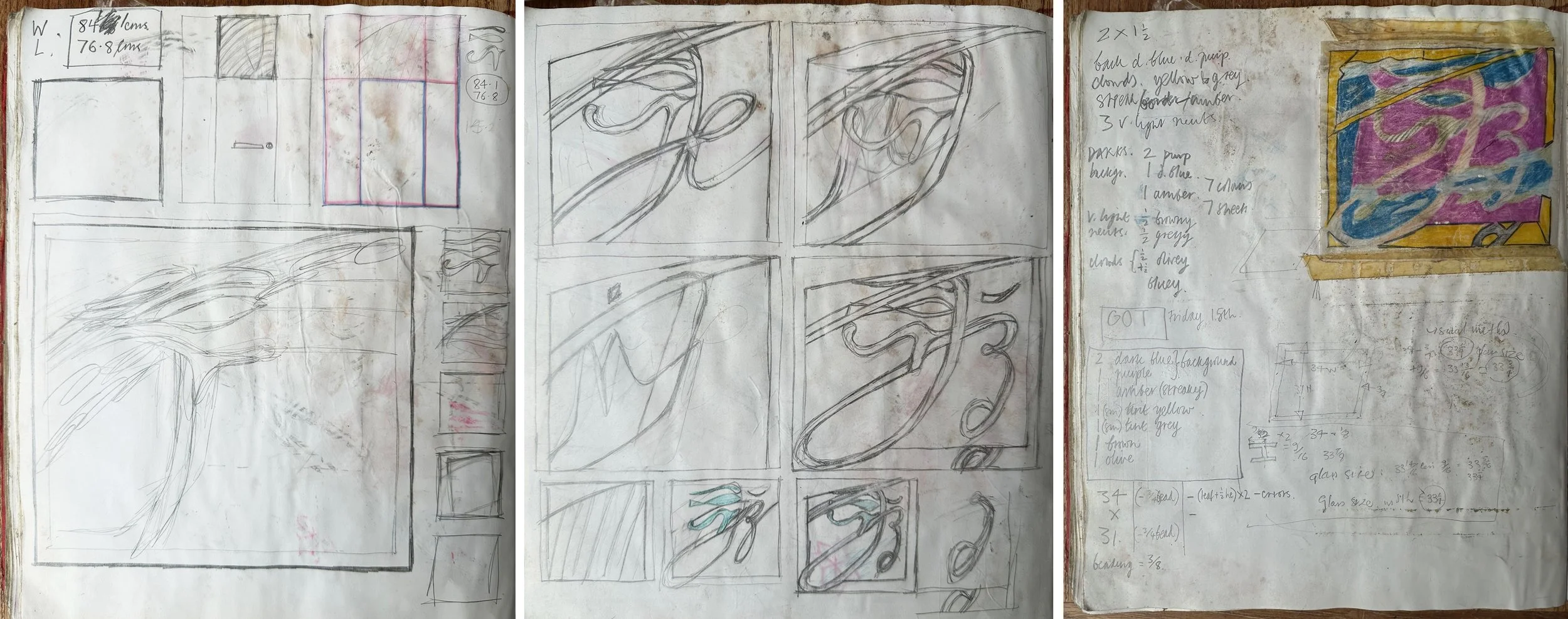
Above and below: pages from my 1979 sketchbook.

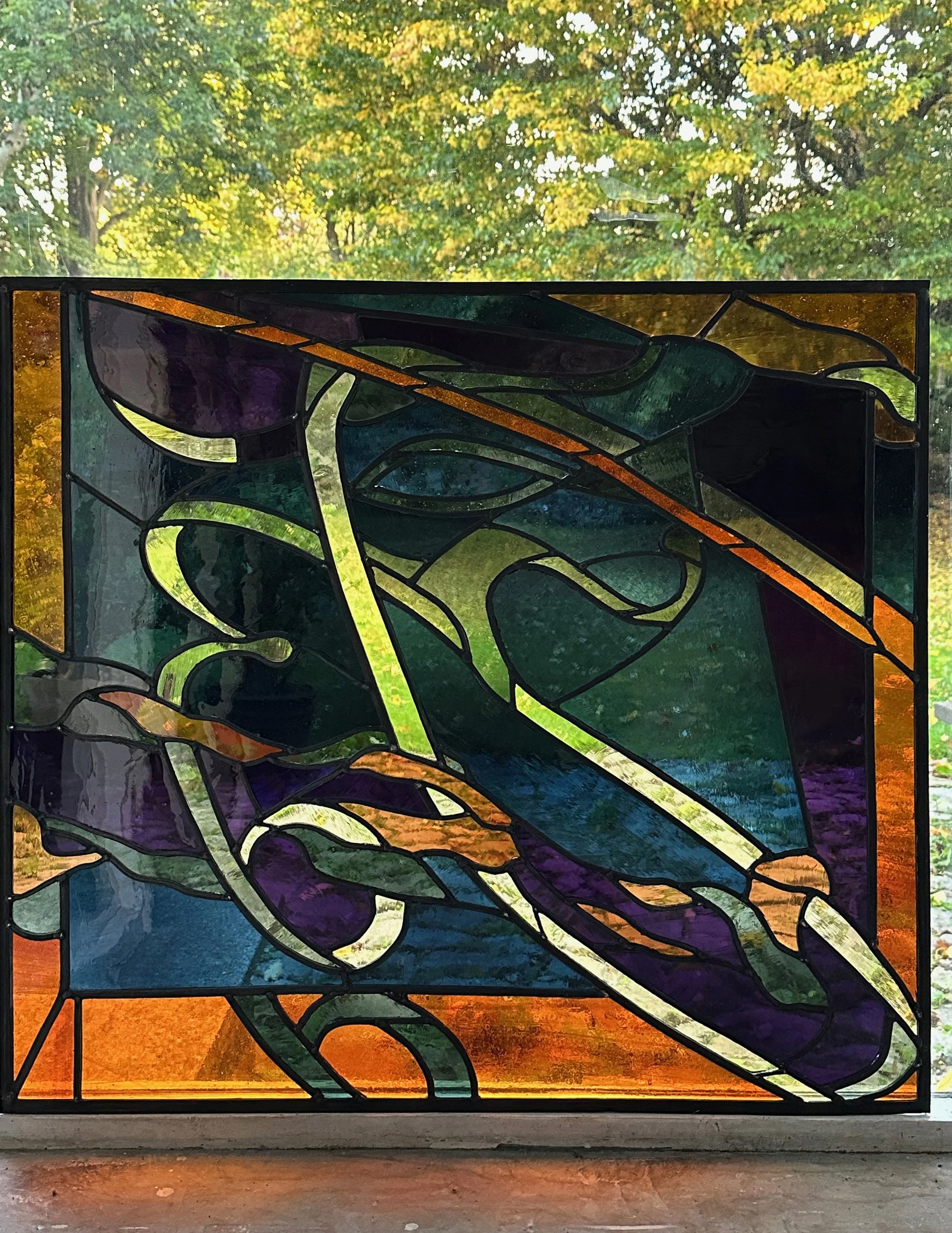
There will be an update when this large piece (84? x 768 mm. according to the sketchbook) is redisplayed in a different house in Wimbledon. In the meantime I’m enjoying a few days of its glowing presence in my studio window: without sun (above) and with autumn sun (below) where the purple glass is even more lovely than the orange.

Volcano Club Headquarters, Levenshulme by Sasha Ward

Installation day at Volcano Club HQ, glass always looks brighter reflected in the mirror.

A new front door and surround made the installation of this fanlight an easy job, with pop in plastic beading and two extra pairs of hands to help. The hallway is narrow and we didn’t want to lose much light, so the fanlight is mostly done with transparent enamels and the colours on the vinyl door panels fade off towards the top where they line up with the clear bottom of the fanlight. Of course it doesn’t look clear in the photos as you can always see what’s through the glass and the colours change accordingly. Much of the day was spent waiting for the black and blue cars parked right outside the house to move so I could get a good photo.

Afternoon light and black car through the fanlight and door panels

The design links the windows together with two straight pine trees that peep into the bottom of the fanlight like eyes with sandblasted, therefore very white, brows above them. The colours are the house colours of pink, orange and green with blue for the lake above and to give the illusion of a blue sky when really you are looking at the white inside of the porch.

Details of the vinyl door panels

The textures are just as important as the colours. The rippled side of the glass is on the outside of the door panels, leaving a flat surface to stick the vinyls on to and no need to make any of the colours opaque. The textures on my fanlight glass were so good that I decided to put the decorated side of the glass on surface 4 of the double glazed unit - that is facing in to the interior rather than protected inside the unit (on surface 2) which is the usual practice.

Details from the fanlight: textures made with sandblasting, brushes, rollers and the qualities of the different enamels I used.

In case you’re in doubt, it’s Mount Fuji. There is a selection of Fuji merchadise in the Volcano Club collection, including the crumpled t-shirt, face mask, sweet packet and enamel brooch shown below, next to the hair clip which makes the best use of the distinctive triangle with the white top, which on my glass is clear.

Mount Fuji merchandise

Vertical Landscapes by Sasha Ward

The rug page in my June 1983 sketchbook, and the centre of the rug itself.

The threadbare rug in my studio is an inherited one and has fascinated me for years, as documented by a drawing of it in my 1983 sketchbook (above). I loved the way that the landscape had been turned into a vertical pattern of loosely drawn scales, one of which is a lake rather than a mountain. I’ve been thinking about vertical landscapes recently because I’m designing a set of vinyls for very tall windows, 4.6 metres high. Although I could ignore the divisions between the windows and float the design across the window frames, I’m more inclined to emphasise the vertical and treat each as a separate window.

Left: Installing the fake windows in the new Lidl. Right: The drive-by commission I did for Lidl in 2017.

Left: St John Hospital Chapel, Lichfield 1984. Right: All Saints, Farnborough. Memorial window for John Betjeman 1986.

These two approaches are evident in rows of windows from many different periods of stained glass design. The first pair that I thought of are by John Piper (above). On the left hand window the shapes in the design link up, with the mullions cutting through the figures, whereas the window on the right consists of a separate picture in each opening, with the result that the fish confined to the right hand window seem to float up into the air.

The second set of examples (below) are windows in Wiltshire from the nineteenth century. In the crucifixion scene on the left, it’s not the figures that cross over the mullions but the landscape and sky behind them which become a row of coloured bands. The Warrington window on the right uses all sorts of decorative devices - borders, columns, canopies - to split up the shapes while still keeping enough room in the middle for some spectacular rocks, clouds and trees.

Left: St Mary, Nettleton, Wiltshire, Crucifixion window by E.R. Suffling 1892. Right: Christ Church, Bradford on Avon, window by William Warrington 1857.

Easy to keep photos vertical with the camera phone.

The subject matter for this commission is based on the local South Gloucestershire landscape. On my walks and drawing trips around the area I’ve been looking for features that split up the landscape, obviously trees which are also useful as borders, but also fences, buildings and paths. I’m aiming to make a composition that is richer than a stripy landscape and is something that you can’t mistake for an advertising banner.

Not to so easy to keep my drawings of hillsides, parks and paths vertical.

Tree patterns by Sasha Ward

Combination Trees 350 x 350 mm.

As you can probably tell, I made the panel above by leading together glass pieces from two different styles of work, both based on trees. I happened to have the two painted pieces of glass shown below in a pile on my work bench and had a feeling they would go together well. The finished panel also uses other pieces of glass from the same two series as I fitted the two patterns together in the best and most treelike way.

Tree patterns, left from the Theme and Variations series 2020, right sample from front door window 2023.

The original background tree pattern, the tops of four windows for a private house, 2018.

The coloured tree pattern is one I invented to show a woodland scene (I don’t think I stole it from anywhere) for a commission that I never got a great photo of, the one above was taken in my studio window before installing it. I then made a series of panels that were deliberately a cross between a design and a colour sample (below). Three years later I made the black and white trees pieces as samples for a front door commission where I tried out different blacks and greys as well as different methods for making the foliage patterns.

Theme and variations 2020

Some of the samples for a black and white front door commission 2023.

With my leftover pieces I made a second and opposite combination panel (below) where the coloured pieces float across the black and white sample like patches of light in a woodland scene. I’m able to chop these pieces up into complex shapes and then lead them together because it is the right type of glass - i.e. 2 to 4 mm thick whereas most of my work from the past thirty or so years has been made of glass at least 6mm thick and often toughened or laminated, as are many of my samples. These are not commissioned pieces and it’s a wonderful novelty for me not to have to get a beautifully drawn design agreed by a client before starting the making stage. The downside of this spontaneous way of working is that I don’t see mistakes (in the design) until the glass is cut, leaded and soldered so I have to pull the panel apart and change things, aiming for the sort of perfection that happens very occasionally.

The Opposite Combination 375 x 360 mm.