glass enamels

Tree patterns by Sasha Ward

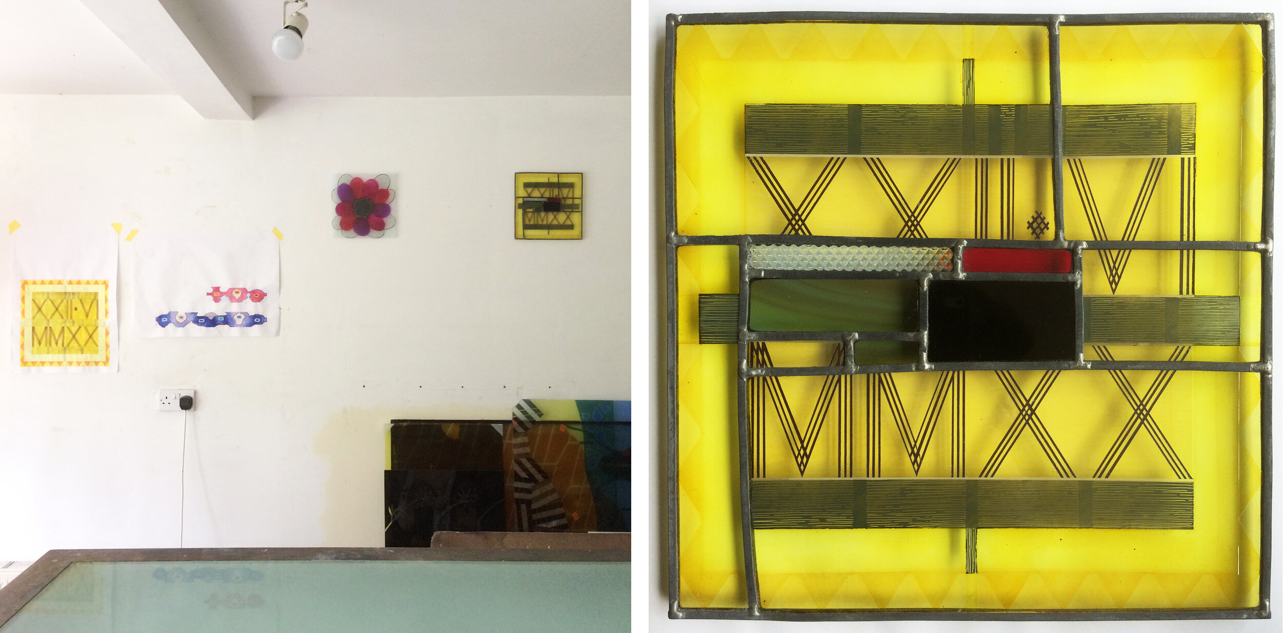
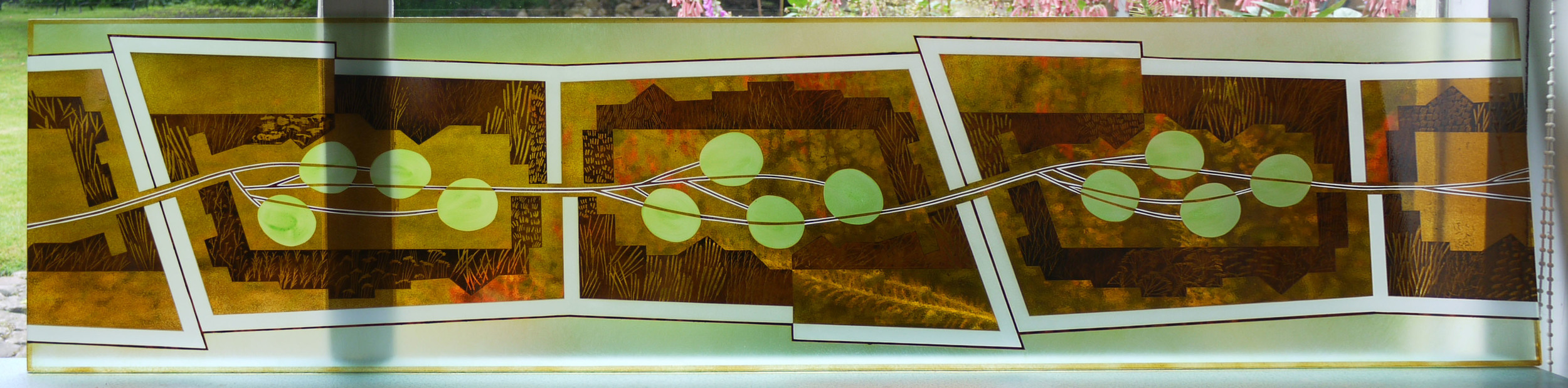
Combination Trees 350 x 350 mm.

As you can probably tell, I made the panel above by leading together glass pieces from two different styles of work, both based on trees. I happened to have the two painted pieces of glass shown below in a pile on my work bench and had a feeling they would go together well. The finished panel also uses other pieces of glass from the same two series as I fitted the two patterns together in the best and most treelike way.

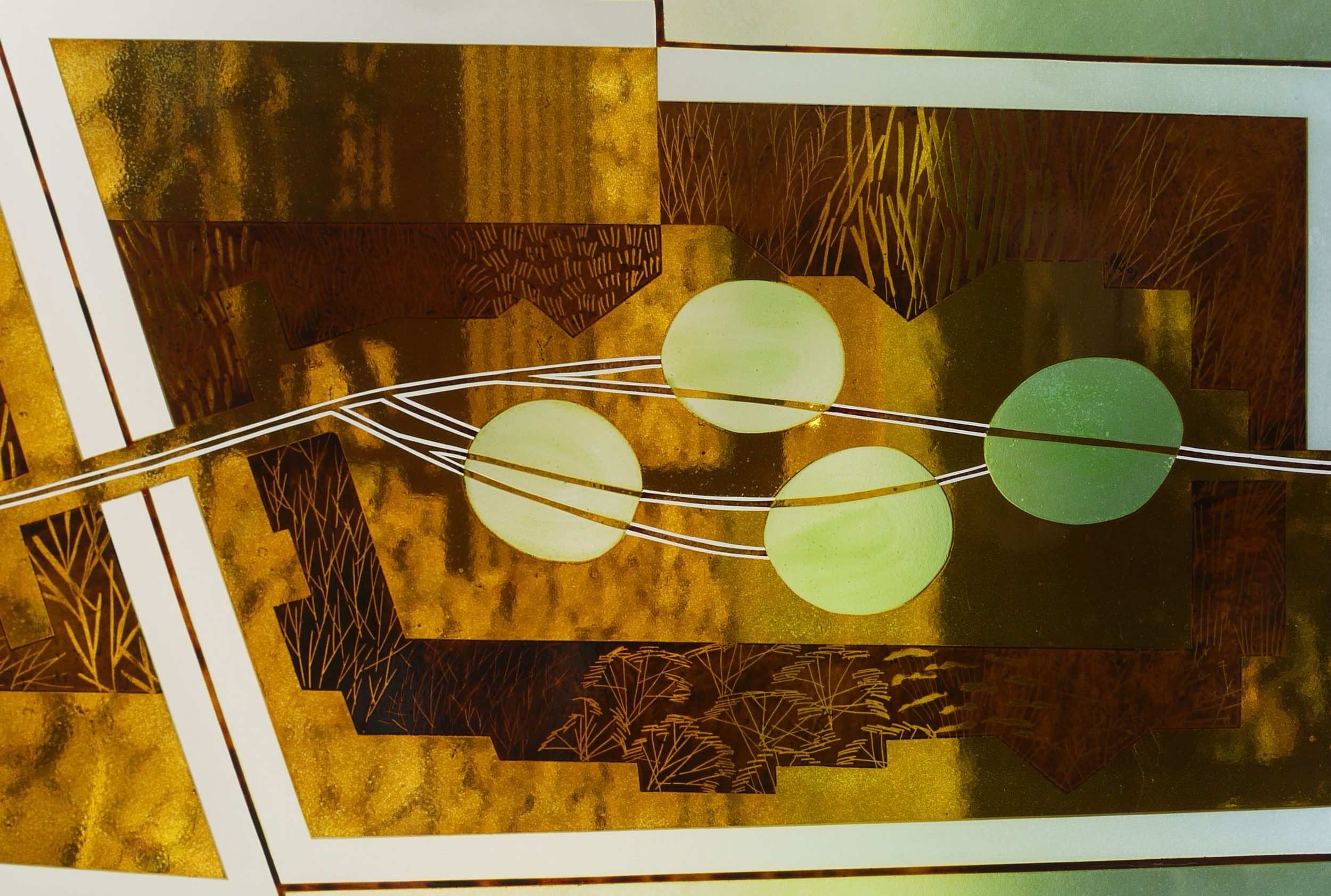
Tree patterns, left from the Theme and Variations series 2020, right sample from front door window 2023.

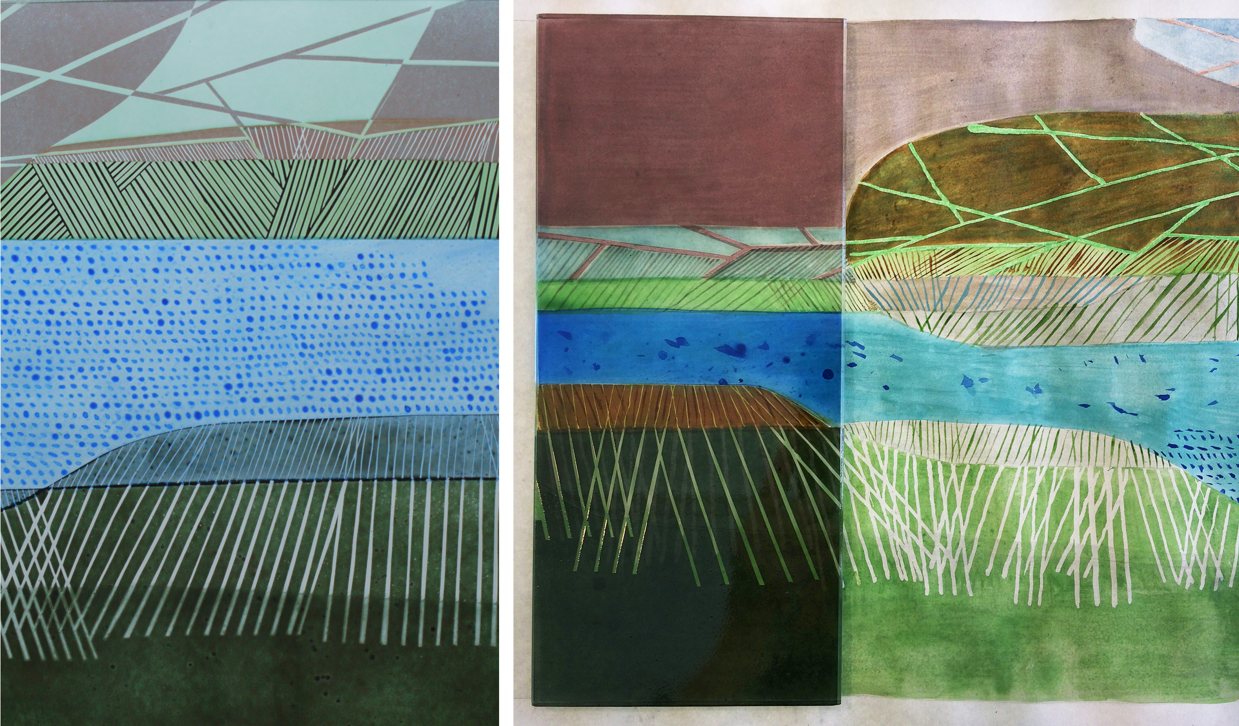
The original background tree pattern, the tops of four windows for a private house, 2018.

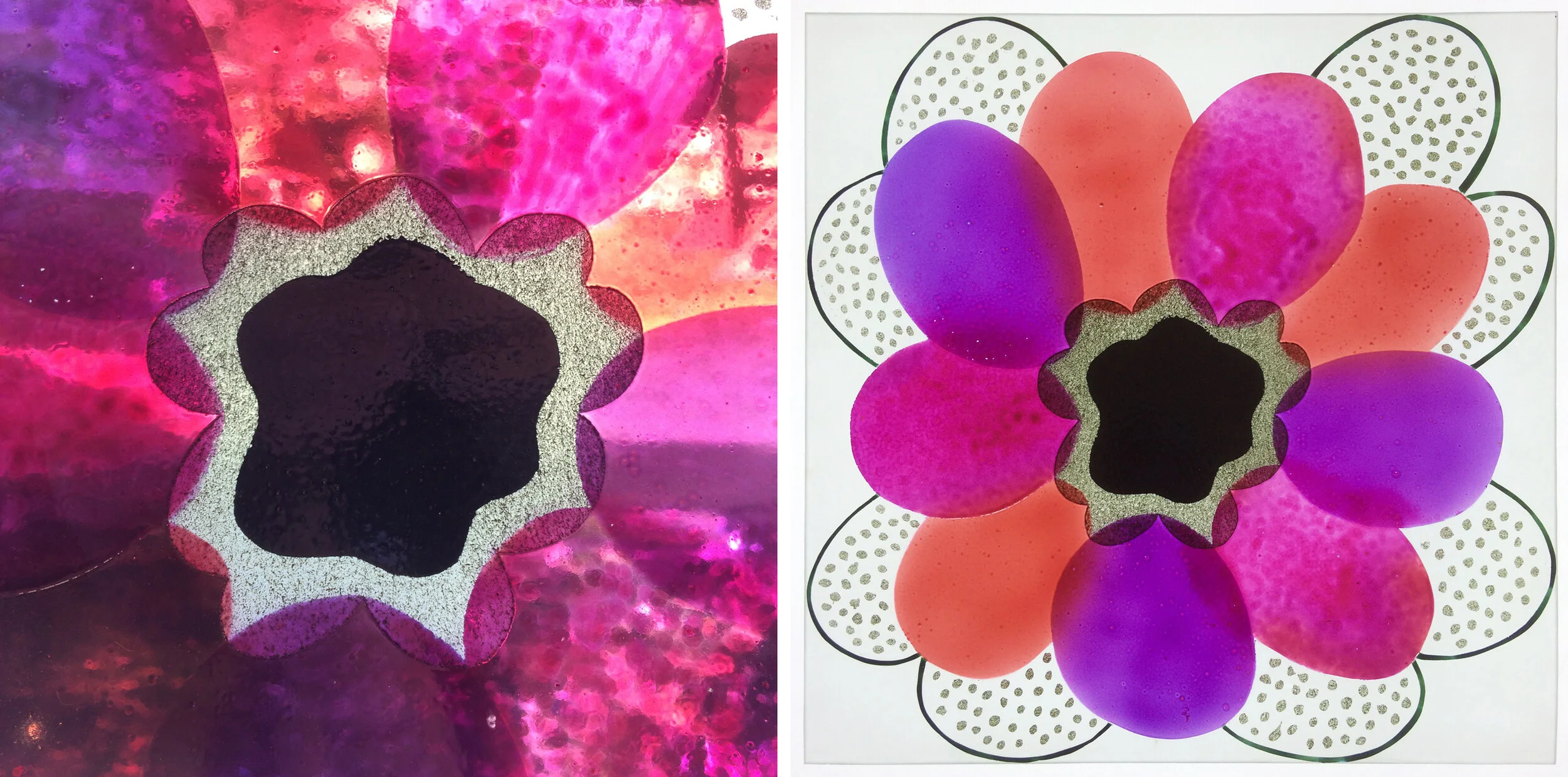
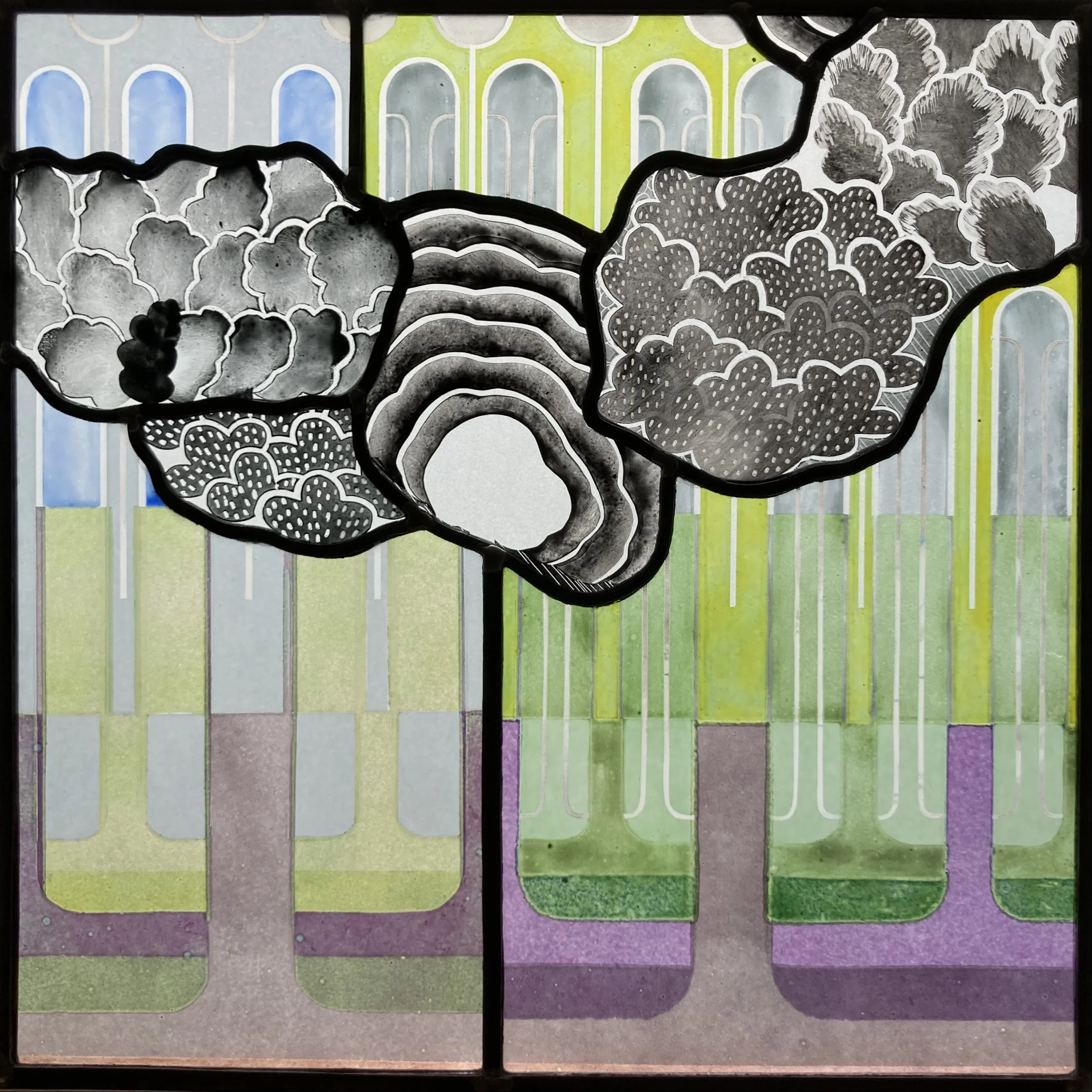
The coloured tree pattern is one I invented to show a woodland scene (I don’t think I stole it from anywhere) for a commission that I never got a great photo of, the one above was taken in my studio window before installing it. I then made a series of panels that were deliberately a cross between a design and a colour sample (below). Three years later I made the black and white trees pieces as samples for a front door commission where I tried out different blacks and greys as well as different methods for making the foliage patterns.

Theme and variations 2020

Some of the samples for a black and white front door commission 2023.

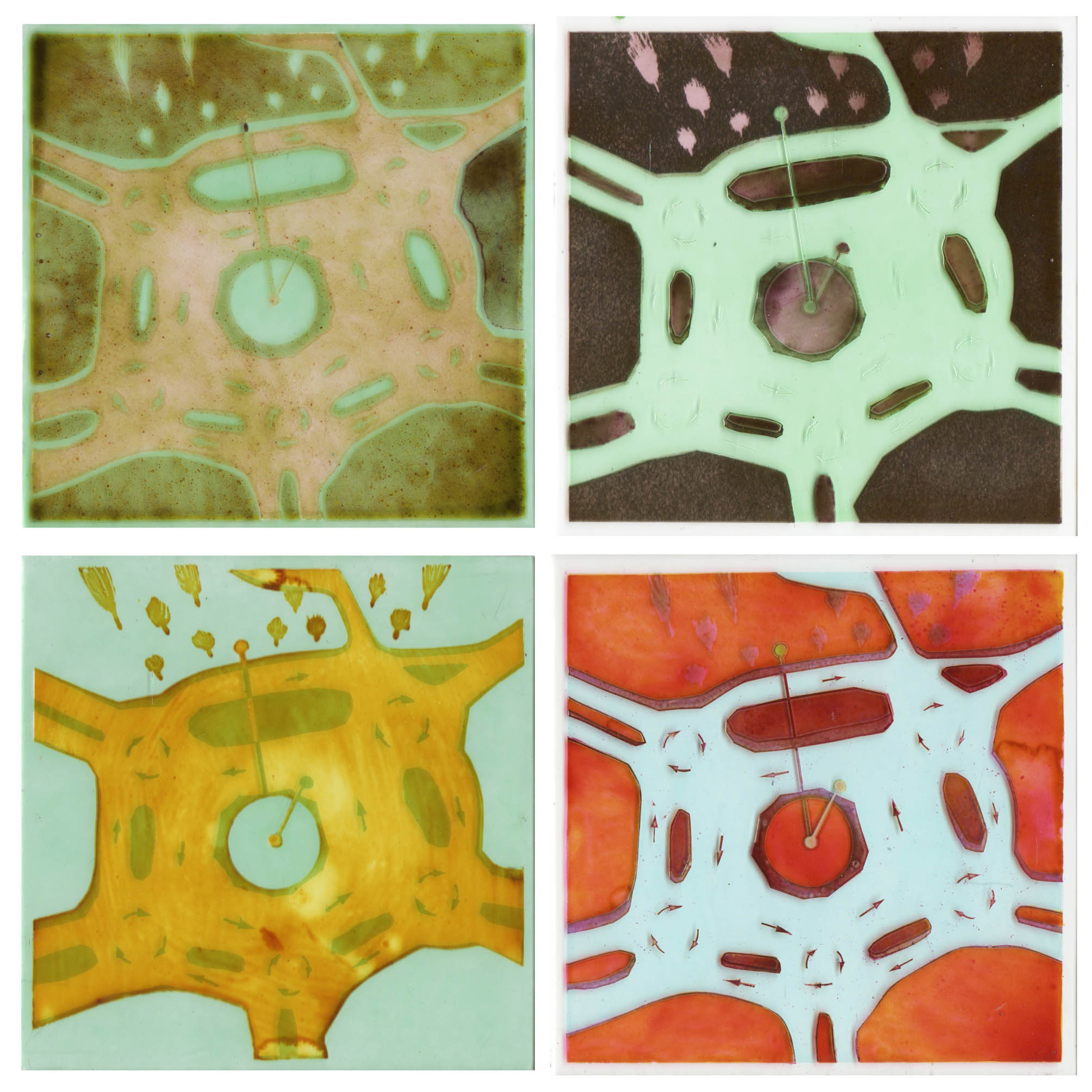
With my leftover pieces I made a second and opposite combination panel (below) where the coloured pieces float across the black and white sample like patches of light in a woodland scene. I’m able to chop these pieces up into complex shapes and then lead them together because it is the right type of glass - i.e. 2 to 4 mm thick whereas most of my work from the past thirty or so years has been made of glass at least 6mm thick and often toughened or laminated, as are many of my samples. These are not commissioned pieces and it’s a wonderful novelty for me not to have to get a beautifully drawn design agreed by a client before starting the making stage. The downside of this spontaneous way of working is that I don’t see mistakes (in the design) until the glass is cut, leaded and soldered so I have to pull the panel apart and change things, aiming for the sort of perfection that happens very occasionally.

The Opposite Combination 375 x 360 mm.

Three Squares by Sasha Ward

The small square glass panels I’ve made over the past fortnight were designed as wall panels - you can see them hanging high up on my studio wall (below left). I wanted to try out an invisible fixing which is glued to the back centre of the panel, that part of the glass has to be opaque to hide it.

Left: studio wall with original date stamp design and two glass wall panels at the top. Right: Square One, 265mm sq.

Left: studio wall with original date stamp design and two glass wall panels at the top. Right: Square One, 265mm sq.

Square One (above right) is a leaded elaboration on the date stamp painted piece I made on XXII.VI.MMXX that looked a bit pointless as a stand alone piece of glass. I added patches of colour to compliment the yellow and remind me of midsummer in the local countryside, with an all important black piece in the middle and a scrap textured with triangles to match the XXs on the yellow ground.

Square Two (below) was designed as an opposite to that geometric piece with organic, slightly out of control shapes in lush sprayed enamel colours that I rarely use all together. I sandblasted the surround and the edges of the glass so they look as if they merge into the wall. The light, bright colours and the different textures achieved by applying the glass paints in a variety of ways show up really well against a white (rather than transparent) background in both of these pieces.

Square Two: detail and full piece on the wall, 260 mm sq.

Square Two: detail and full piece on the wall, 260 mm sq.

Left: ‘One Way Out’ ink drawing on plywood by Ray Ward. Right: ‘One Way Out’ glass enamels, 260 mm sq.

Left: ‘One Way Out’ ink drawing on plywood by Ray Ward. Right: ‘One Way Out’ glass enamels, 260 mm sq.

The third piece was a continuation of my project to turn Ray’s drawings into glass panels (see my previous posts for more examples). The drawings have been going so easily into stained glass versions, but I wanted to try one using my usual enamelling and sandblasting techniques. I intended to give the figure (above left) a solid centre to hide the fixing, but that was one of the things that didn’t really work out. I saw how unpredictable the enamel colours, used in layers, can be as my gold turned green and the hand painted streaks looked so watery that I resorted to sandblasting stripes across the whole background. The result - 6 firings later - is the panel (above right) displayed in the window not on the wall.

Left: panel before firing no. 5.  Right: reverse side of finished glass panel.

Left: panel before firing no. 5. Right: reverse side of finished glass panel.

Another Return to the Thames by Sasha Ward

Fanlights for two upstairs bathrooms

Fanlights for two upstairs bathrooms

This set of windows are for bathroom fanlights for the same house (as my last post) in Oxfordshire. The shape of the windows, the function of the rooms and the local landscape all led me to return to the River Thames for my subject matter. Although I had walked, photographed and drawn along the path of the river a couple of years ago, I hadn't found a good enough way to show the reeds along the river banks and the general stripiness of the flat landscape before. 

Fanlight one

Fanlight one

The photos of the windows installed, above and below, show the different colour of the light coming through windows and skylights in the bathrooms . The colours of the hand painted enamels are the same for each window, with the image of the blue river flowing to join the pictures together.

Fanlight two

Fanlight two

I spent a long time on the design for these windows, struggling with my riverbank drawings. The designs look very similar to the finished windows, as is shown in the photo of glass on top of the drawing below. Back in my studio the drawings are still on the wall, giving me ideas for the next piece of work.

Detail from window two: sample for window one on top of the sketch design.

Detail from window two: sample for window one on top of the sketch design.

A Sense Of Place by Sasha Ward

so…-how-does-this-work.jpg

Guess which town is the subject of this post. There may be clues on the sign (above) which greets you as you descend from the Old Town to the spreading acres of the new. Confused? Maybe the graphics don't help, I think there are some arrows missing as there is an outer and an inner ring linking the five mini roundabouts that make up Swindon's Magic Roundabout. 

In my depictions of places it is my long term practice to combine drawings and photos from viewpoints with maps and diagrams, it helps me find my "sense of place". Although I am often asked to research a particular place for a public commission, in this case I am investigating the magic roundabout, twelve miles from where I live, just for fun. 

first-magic.gif

Nine drawings on thin paper (above) helped me work out what I needed to leave in and take out to make a satisfactory image that also explains the workings of a roundabout that is both logical and mysterious.

The first four glass roundabouts, sandblasting, enamels, oxides & silverstain on clear glass

The first four glass roundabouts, sandblasting, enamels, oxides & silverstain on clear glass

 Magic Roundabout number five, image size 100mm square.

 Magic Roundabout number five, image size 100mm square.

Going smaller for Magic Roundabout number six, image size 75mm square.

Going smaller for Magic Roundabout number six, image size 75mm square.

P.S. I hope I haven't overthought this one - I've never worried about navigating it before, let's see what happens when we get there for an evening out in Swindon tonight.

Enclosures by Sasha Ward

Holy City  St. George's, Hanover Square, London:  Old Town my panel from 1985:  Kelmscott Design No. 1  from 2014

Enclosures have turned out to be a major subject matter for me. I am drawn to walled cities, or really representations of walled cities, like the stained glass one I photographed recently (see last blog entry). I found a small glass panel called "Old Town" that I made in 1985 and a glass painting based on Kelmscott Manor in its walls garden from two years ago - these three images, lined up above, have obvious links. 

On my last visit to The National Gallery I was captivated by a large Velasquez painting, an enclosure but just of a piece of ground, no buildings. I realised that it was the actual enclosure that interests me, not only the way that it organises a picture but also what meanings it could have.

"Philip IV Hunting Wild Boar" 1632-7 Diego Velasquez 

"Philip IV Hunting Wild Boar" 1632-7 Diego Velasquez 

In my current work, I have been designing a long thin window which happens to have a series of linked enclosures. I like them to have open points so you can get in and out. I also like them to have straight sides - an oval or a circle makes you feel trapped like the wild boars above. The enclosures in this design are bordered by flower beds rather than walls. They started by containing a string of plums, this went as the design progressed but came back again in the final glass panel. 

Garden Plums, sketches showing development of the design

Finished window in my studio, 300 x 1300 mm. 

Finished window in my studio, 300 x 1300 mm. 

Garden Plums detail: gold and pale green enamel, the textures and colours look great.

Garden Plums detail: gold and pale green enamel, the textures and colours look great.

The window is on its way to Poland, the third one for the house of my friend & glass artist Frances Federer. Read her entertaining, informative blog about her journeys between England & Poland here