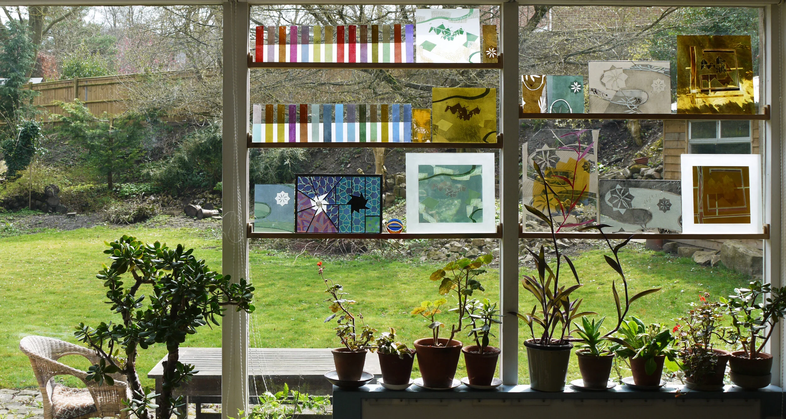
The small square glass panels I’ve made over the past fortnight were designed as wall panels - you can see them hanging high up on my studio wall (below left). I wanted to try out an invisible fixing which is glued to the back centre of the panel, that part of the glass has to be opaque to hide it.
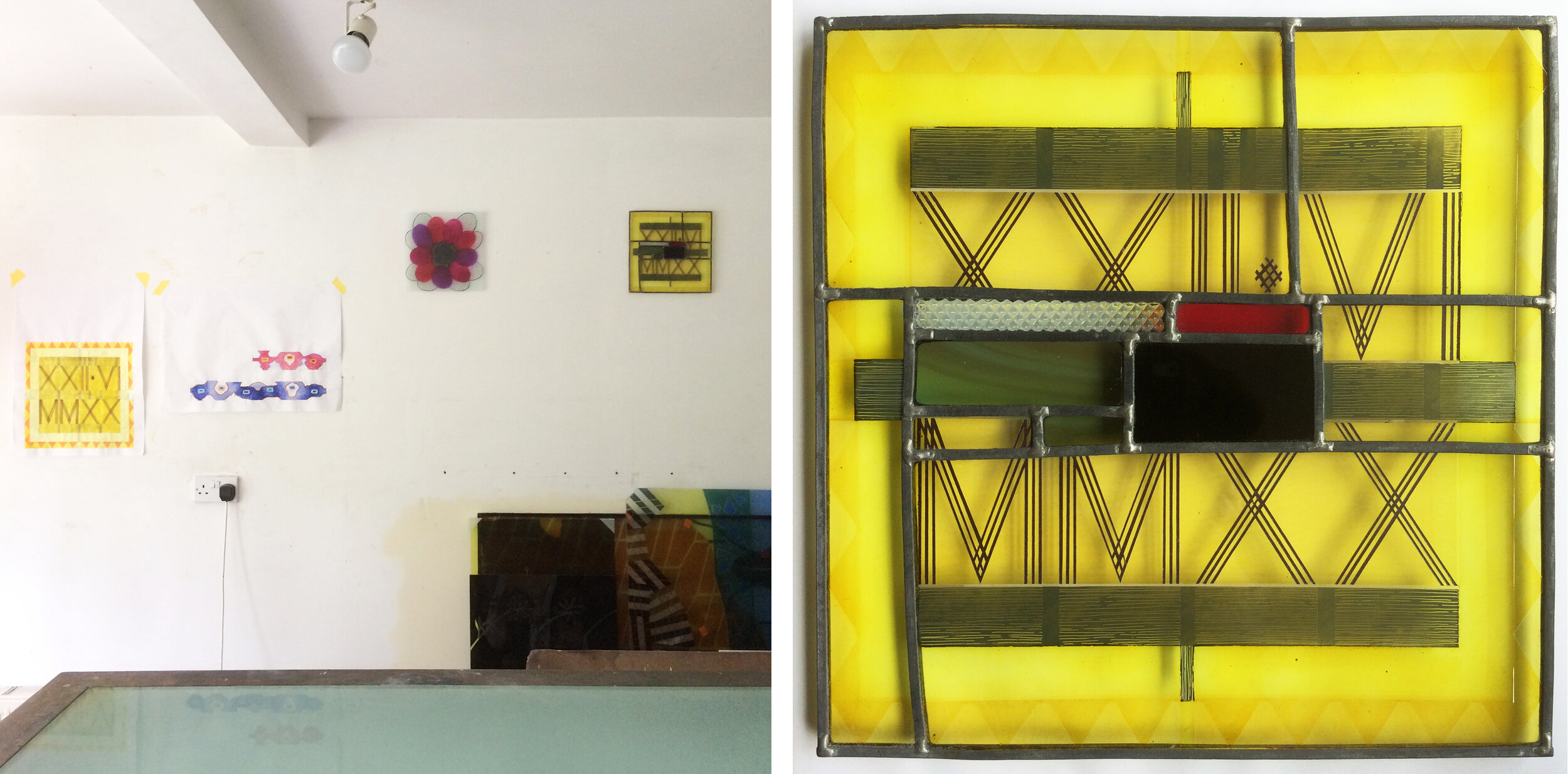
Left: studio wall with original date stamp design and two glass wall panels at the top. Right: Square One, 265mm sq.
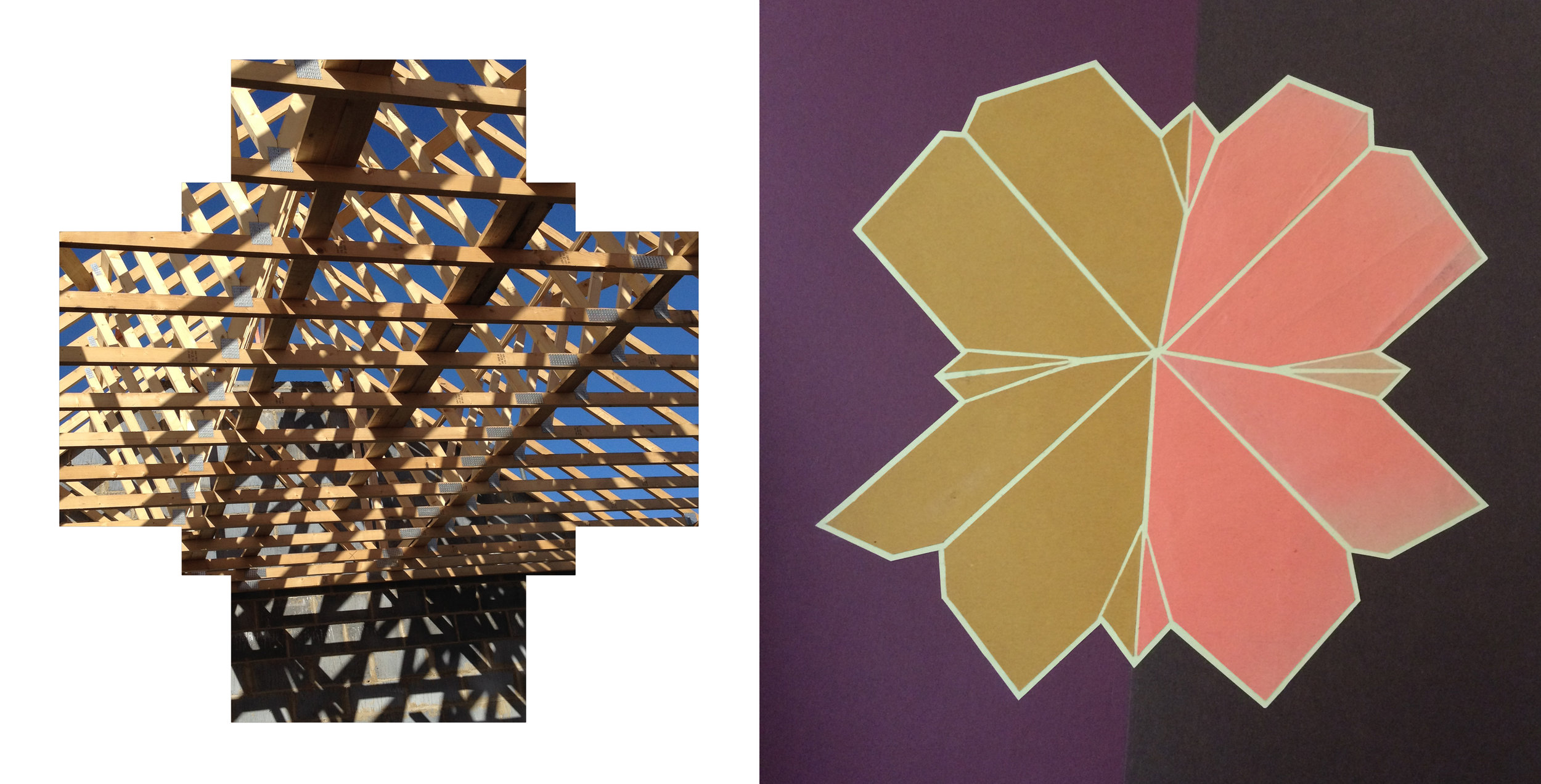
Square One (above right) is a leaded elaboration on the date stamp painted piece I made on XXII.VI.MMXX that looked a bit pointless as a stand alone piece of glass. I added patches of colour to compliment the yellow and remind me of midsummer in the local countryside, with an all important black piece in the middle and a scrap textured with triangles to match the XXs on the yellow ground.
Square Two (below) was designed as an opposite to that geometric piece with organic, slightly out of control shapes in lush sprayed enamel colours that I rarely use all together. I sandblasted the surround and the edges of the glass so they look as if they merge into the wall. The light, bright colours and the different textures achieved by applying the glass paints in a variety of ways show up really well against a white (rather than transparent) background in both of these pieces.
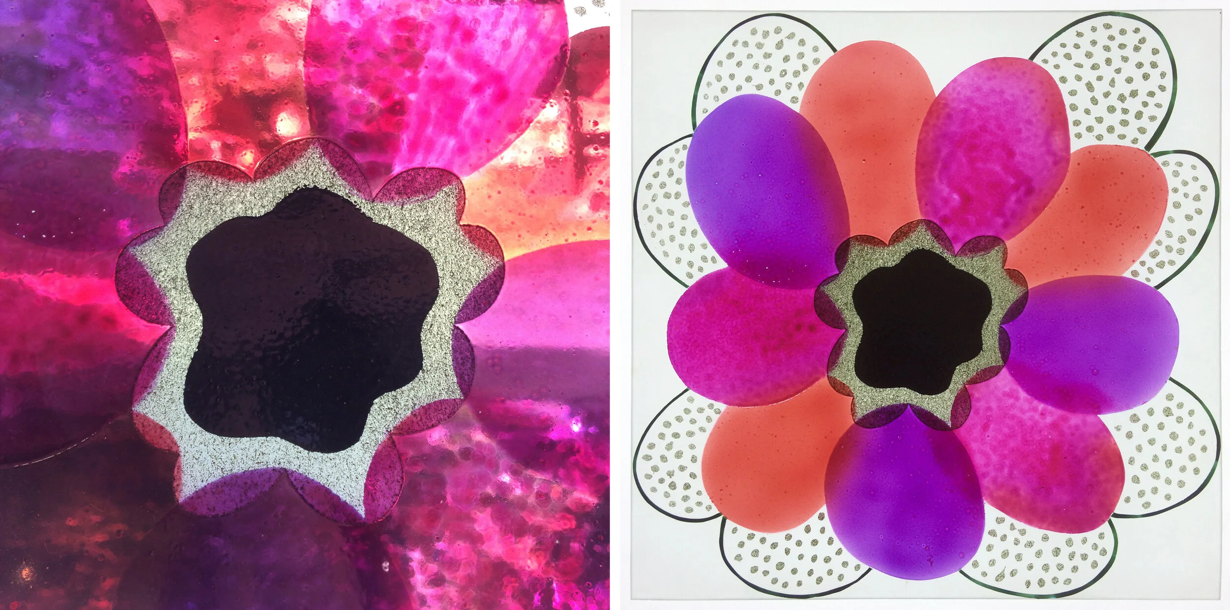
Square Two: detail and full piece on the wall, 260 mm sq.

Left: ‘One Way Out’ ink drawing on plywood by Ray Ward. Right: ‘One Way Out’ glass enamels, 260 mm sq.
The third piece was a continuation of my project to turn Ray’s drawings into glass panels (see my previous posts for more examples). The drawings have been going so easily into stained glass versions, but I wanted to try one using my usual enamelling and sandblasting techniques. I intended to give the figure (above left) a solid centre to hide the fixing, but that was one of the things that didn’t really work out. I saw how unpredictable the enamel colours, used in layers, can be as my gold turned green and the hand painted streaks looked so watery that I resorted to sandblasting stripes across the whole background. The result - 6 firings later - is the panel (above right) displayed in the window not on the wall.

Left: panel before firing no. 5. Right: reverse side of finished glass panel.