Left, roadside front window before. Right, kitchen window.
As you can see in the two pictures above, the windows in my friend’s new house have restricted views. At the back, the kitchen looks on to a concrete wall with tiles and objects positioned wherever they fit. At the front, there is a busy stretch of main road and a pavement close up to the low window. Although she has made it look great with her objects and stick on patterns, she wanted some pieces of my glass in front of the window to block the traffic in a more colourful way.
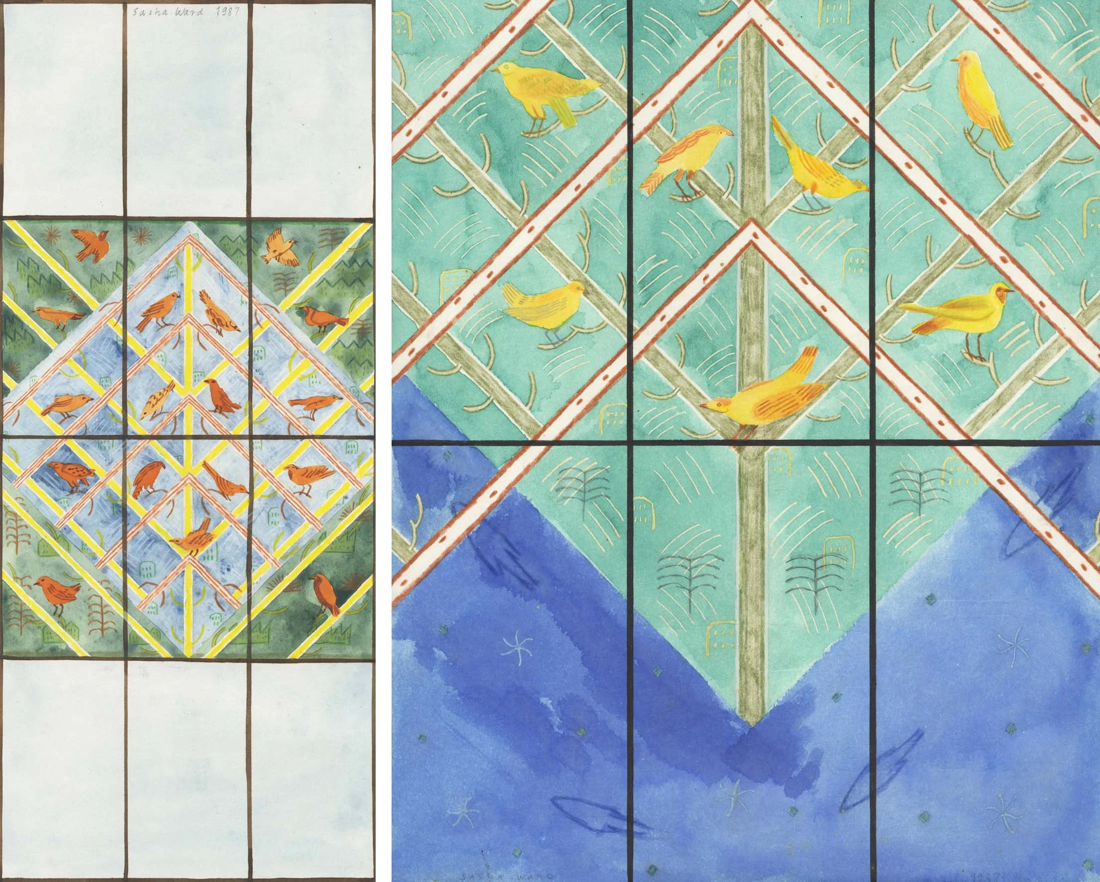
This was after seeing the rows of random samples I always have in my studio window, slotted into wooden grooves fitted across the window frames. At the moment (below right) I have my most recent samples, some colour test strips and a few samples that stay every time I have a reshuffle so I suppose they must be my favourites. I’ve used grooved wood for shelves in the window since I was a student at the Royal College of Art (years ago, picture below left), with a great view of the Albert Hall and a changing display of the pieces I was painting on top of a backlit piece of glass.

Left, my window at The Royal College of Art in 1985. Right, my studio window this week (2019).

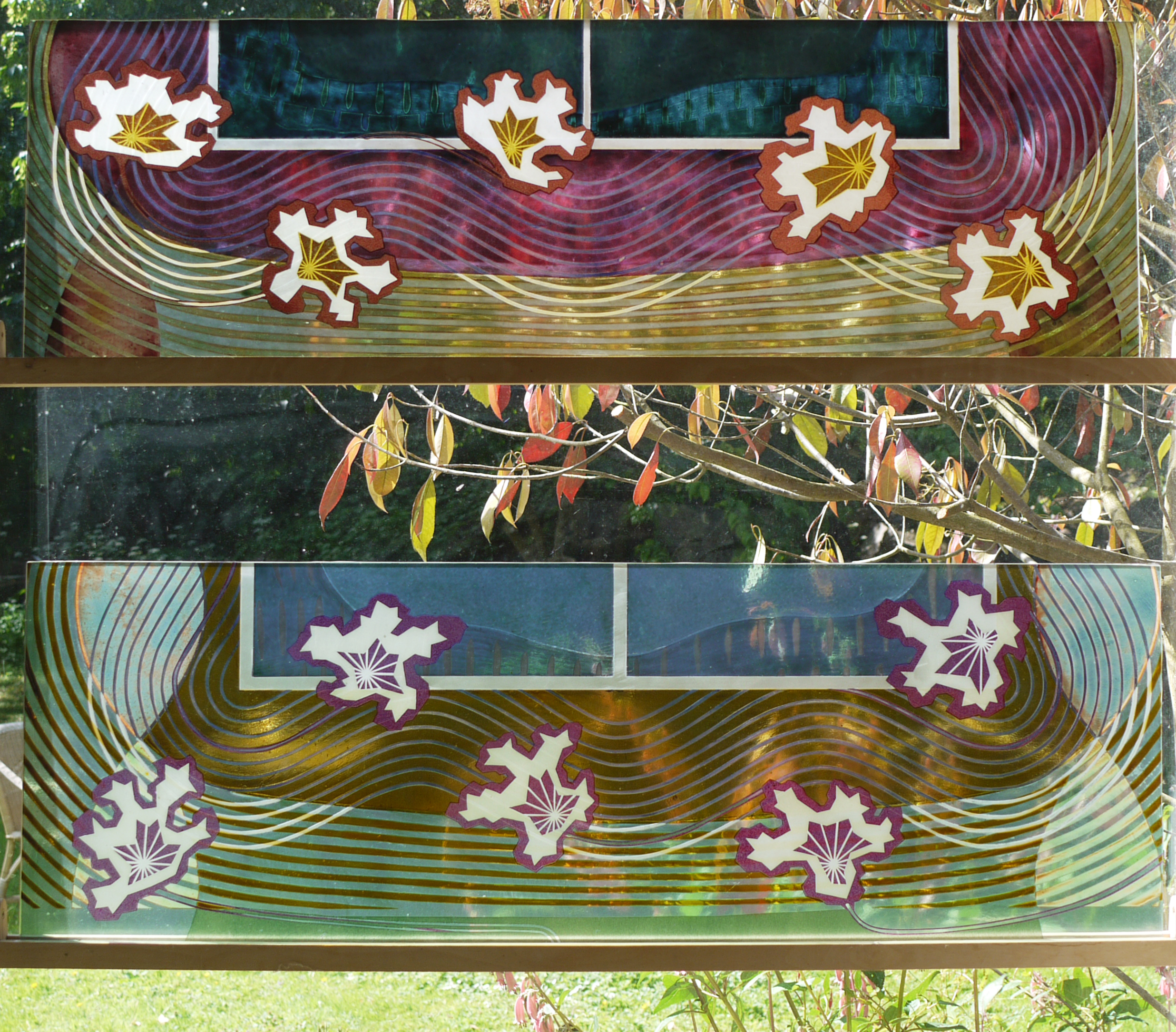
Left, roadside window after. Right, colours through the glass.
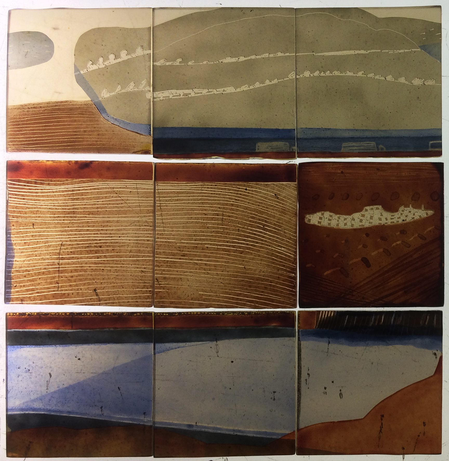
Choosing glass offcuts or old samples, cutting them up and arranging them in a row is like making a fragment-style stained glass window. That is, anything looks OK but there is an art to the ordering and cropping. These pieces are big at 400 mm tall, and from many different periods so I did a bit of work to unite them with two rows of circles sandblasted out and filled with green enamel. It means that you can still play around with the order and orientation of the pieces. The best part, as always, was seeing the colours projected through the glass on to the carpet in the afternoon sun (above right).

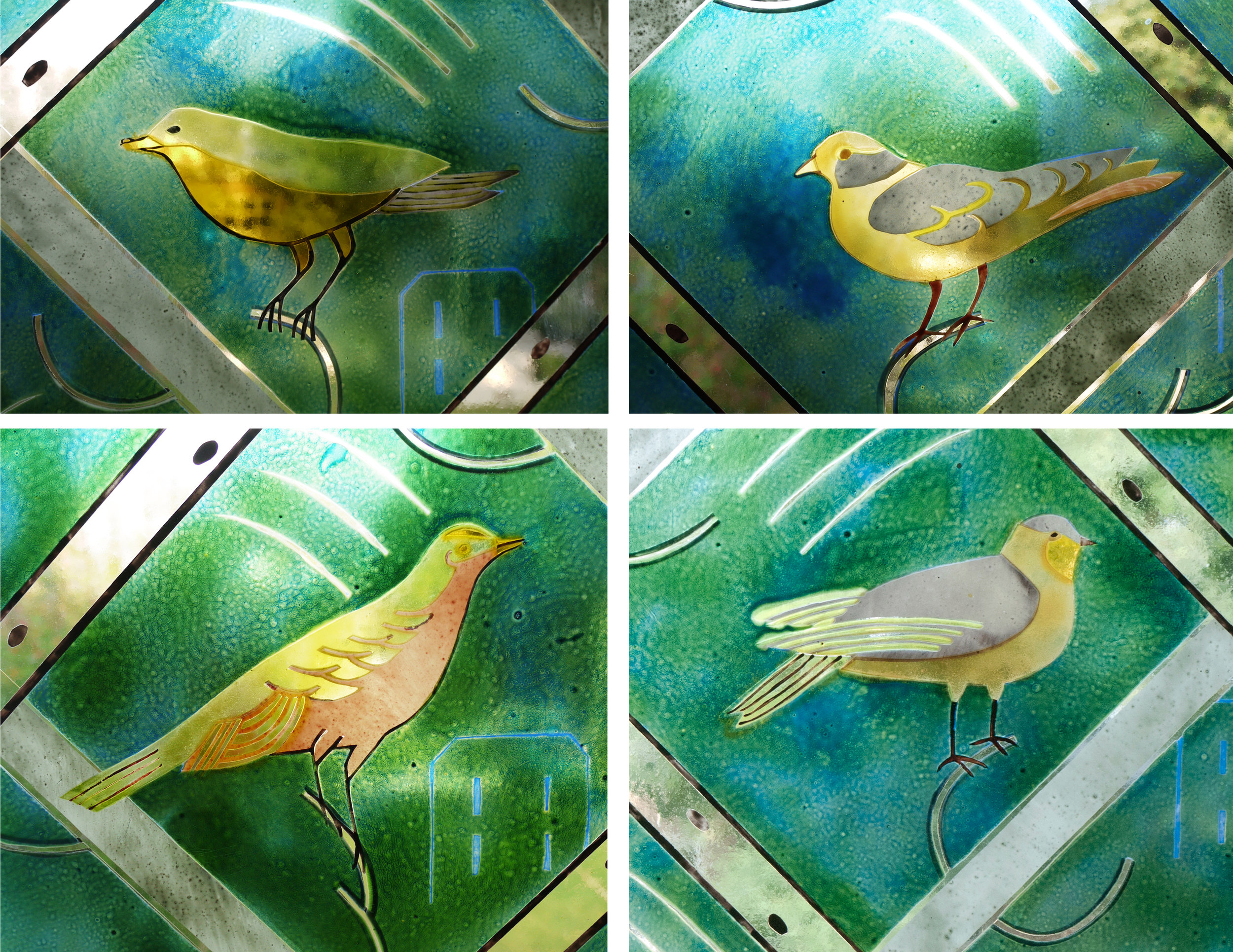
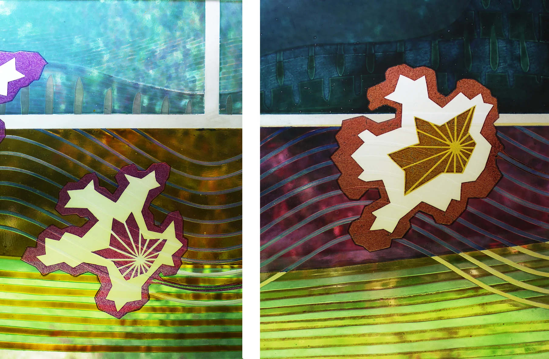
Detail of three panels, originally samples for The Centre Livingston, private house & Manchester Children’s Hospital.