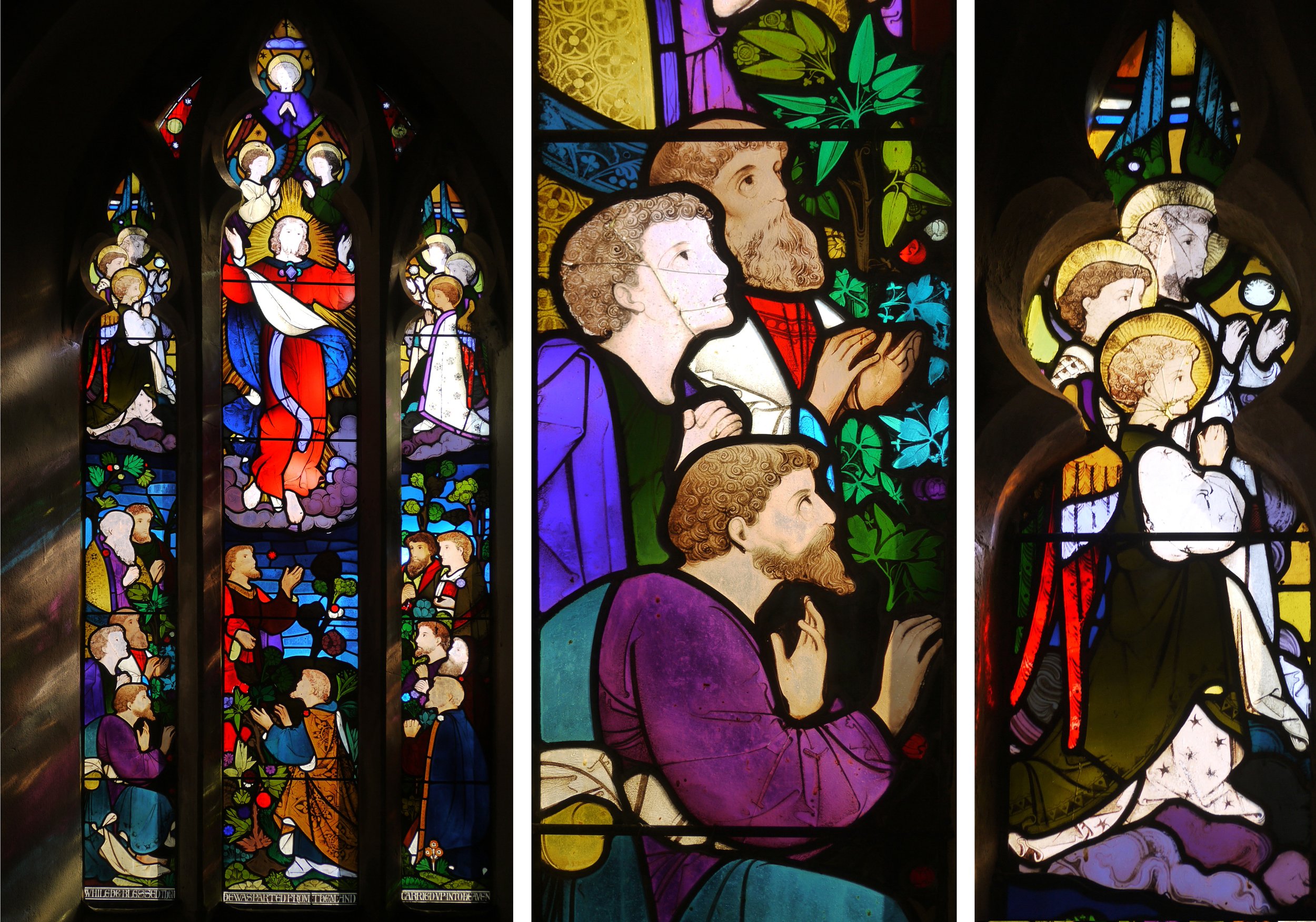
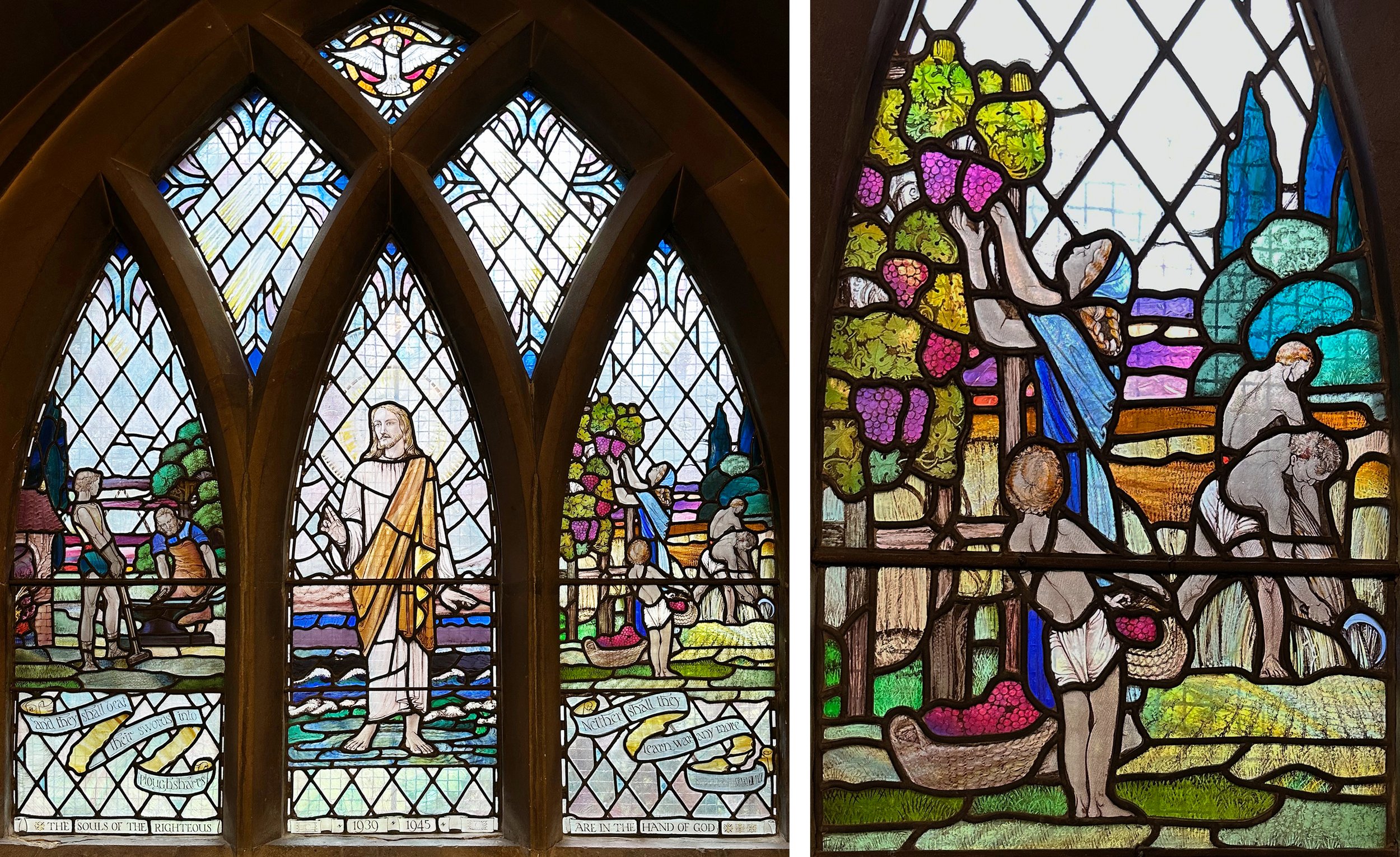
St Margaret of Antioch, Chilmark, Wiltshire. Ascension window by Heaton, Butler and Bayne 1866.
I’ve been on the lookout for early, that is mid 1860s, HB&B windows since I saw the ones in Kintbury, Berkshire and marvelled at their beauty and their colour combinations that glow even through the extensive paintwork - I wrote about them here. In late summer I visited the church at Chilmark, Wiltshire which is full of HB&B windows, but as the sun was glaring through the glass in the best one (the south facing Ascension window, above) the fine details, particularly on the faces, were difficult to make out. Painted hair - curly, flowing or facial is a speciality.
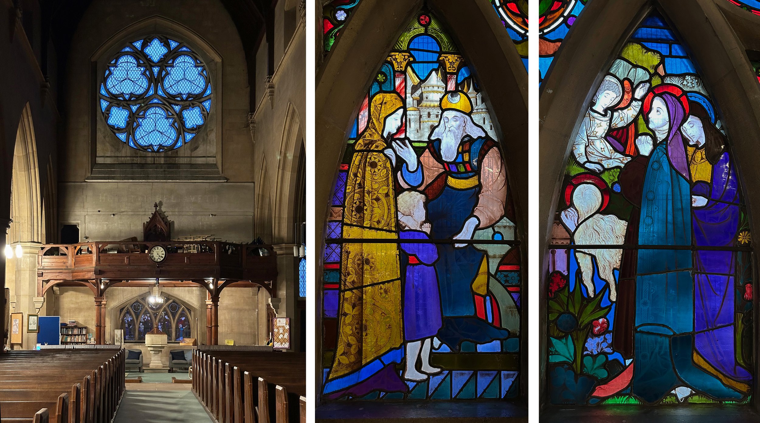
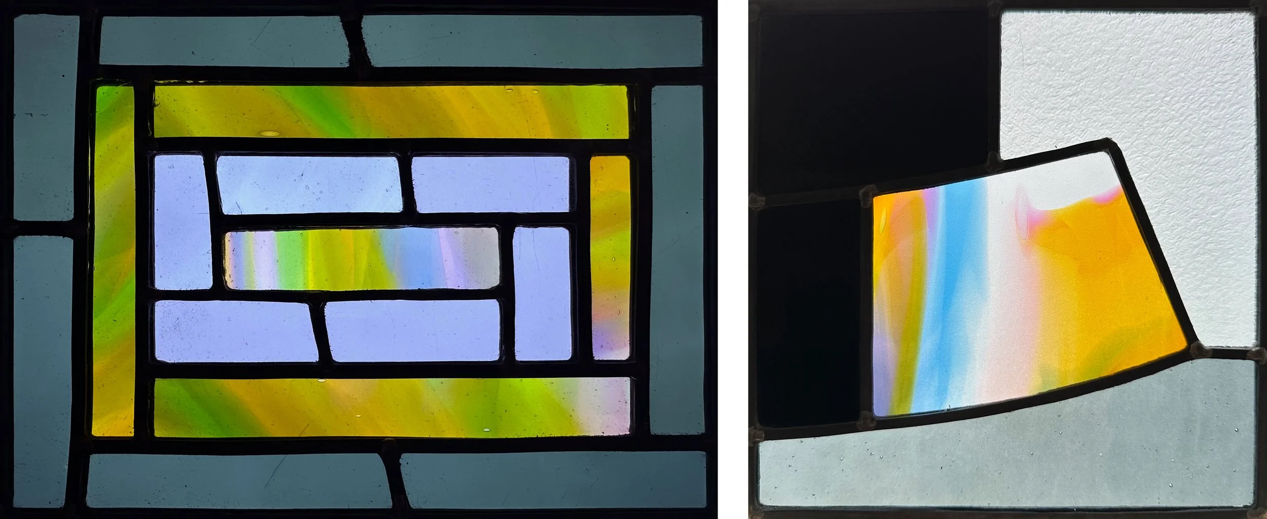
St Mary Spring Grove, Isleworth. West window, with details by Heaton, Butler & Bayne c. 1866.
Then I visited a large neo gothic church in West London, St Mary Spring Grove, with early windows by HB&B in the porch, west, east and side chapel windows - all of them magnificent and designed by Robert Bayne who was chief designer for the firm at this period. The west windows behind the font (above) are small and low down making it easy to appreciate the well drawn figures, the hair, and the patterns in the foliage and interiors. The scenes above show The Presentation and The Three Marys at the Tomb.
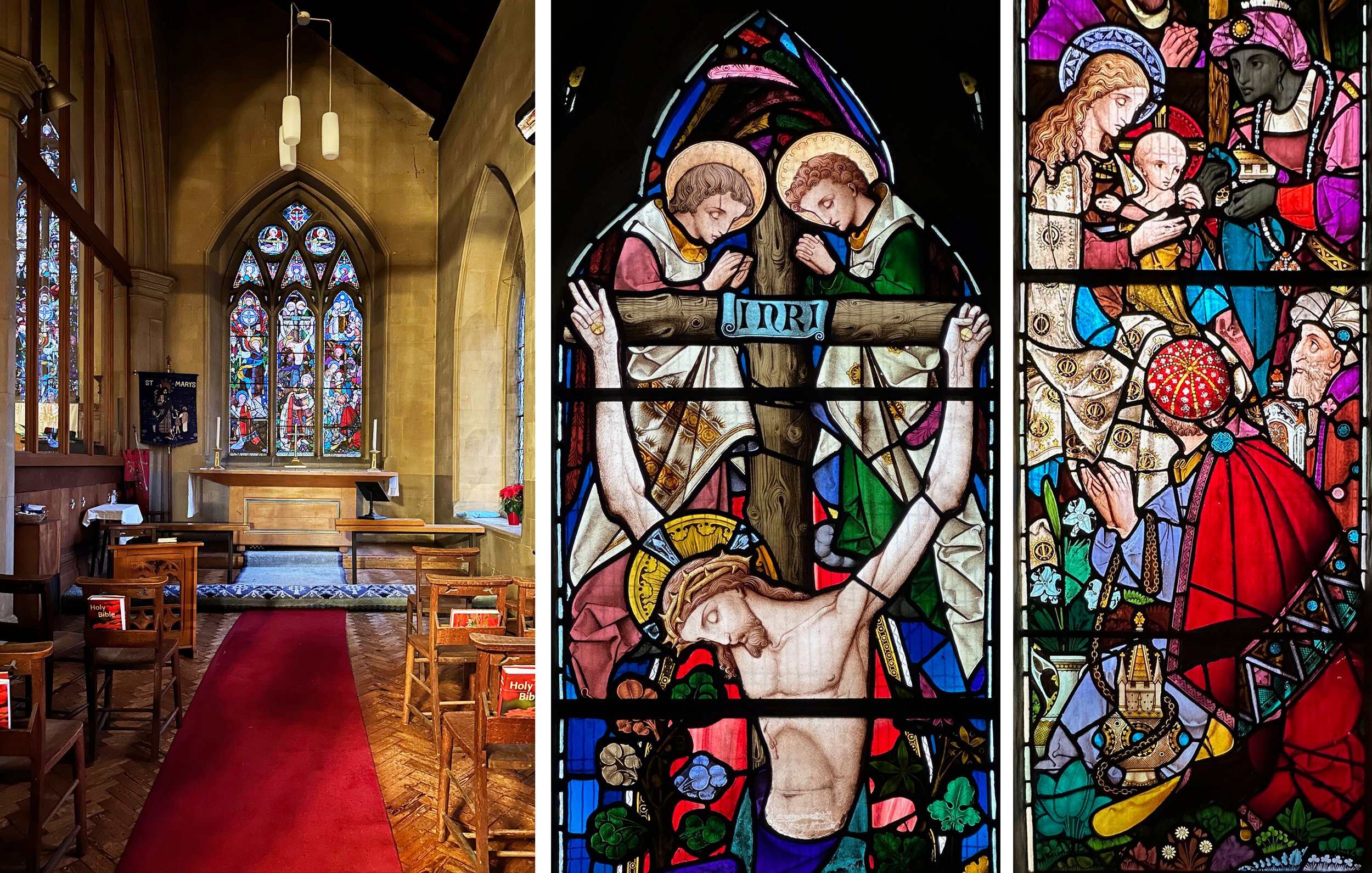
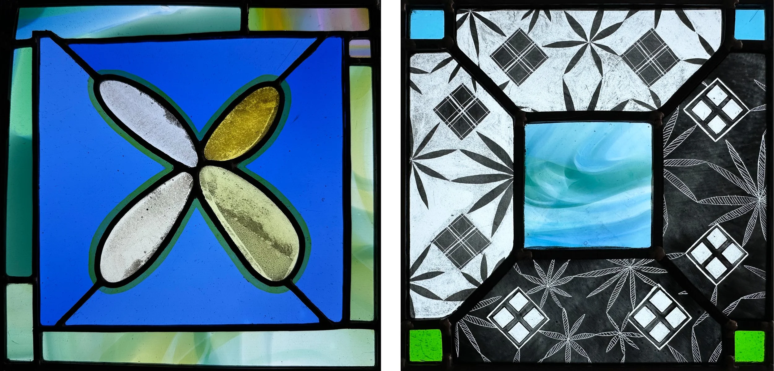
St Mary Spring Grove. South chapel, with crucifixion window by Heaton, Butler & Bayne c. 1866.
The crucifixion window in the south transept chapel (above) is also great. I’m starting to recognise the distinctive shape of HB&B heads in profile, like the angels above the cross and Mary in the nativity panel next to it. These and also some of the clothing, for example that red hat, seem to point forward to the elaborate stained glass of Harry Clarke.
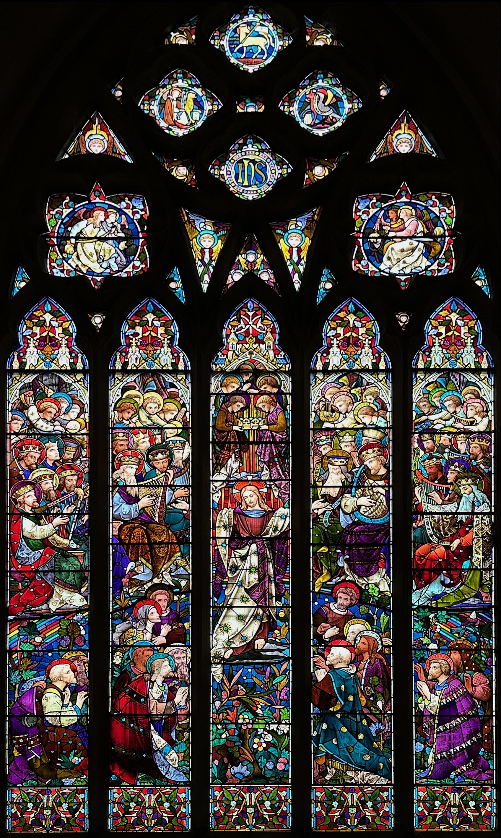
St Mary Spring Grove. East window. Below, details from the east window by Heaton, Butler & Bayne 1865.
The East window shows Christ in Majesty on a rainbow rising over a floral panel, with the haloed heads of saints and angels all around. There is the same purple, red and green combination that I loved at Kintbury Church. Although the details (below) are wonderful, it is really the composition of the whole enormous window that makes it work so well, it was effective even in the dim early evening light making it the best window that I’ve seen for ages.
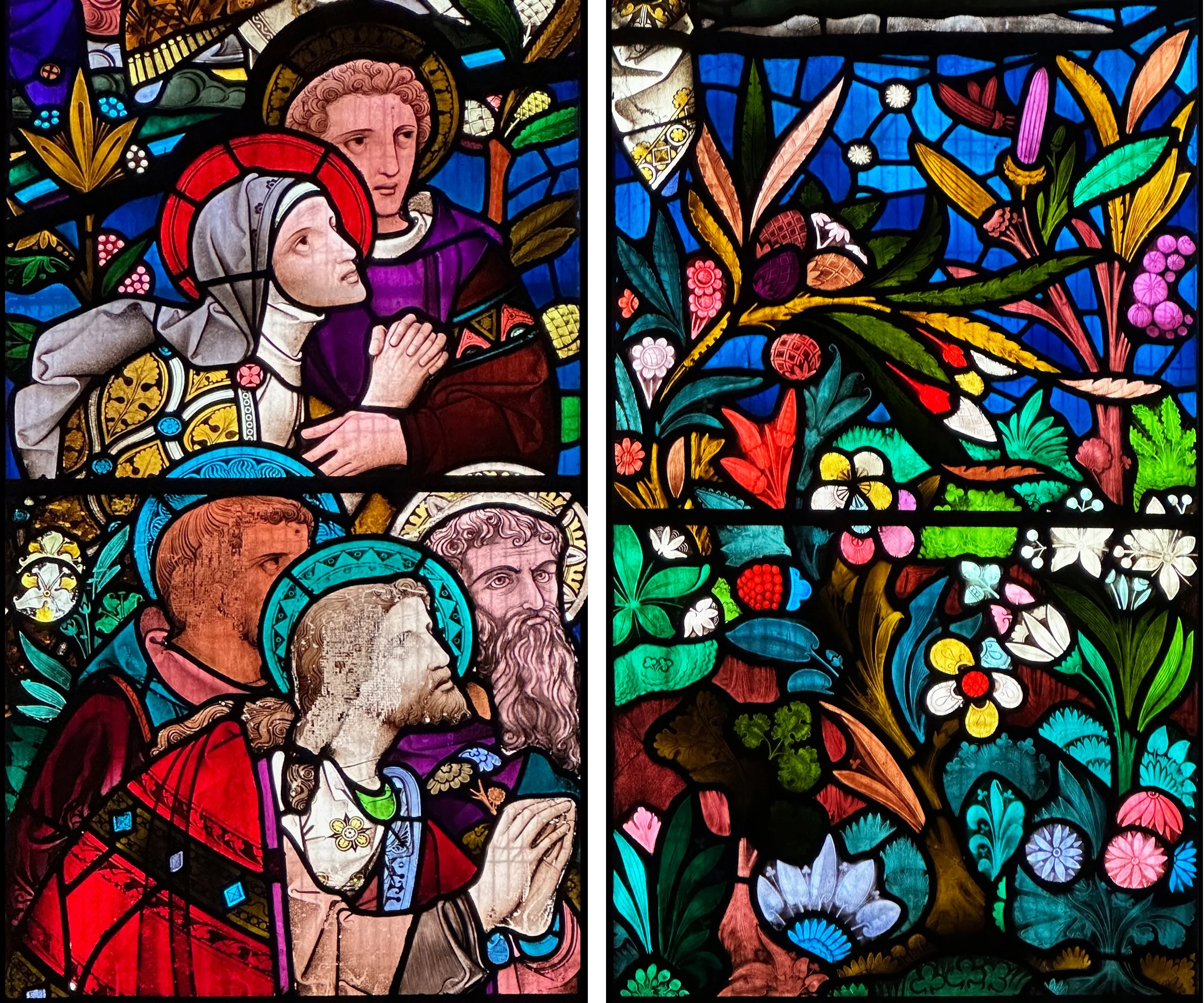
St Mary Spring Grove. Details from the East Window.
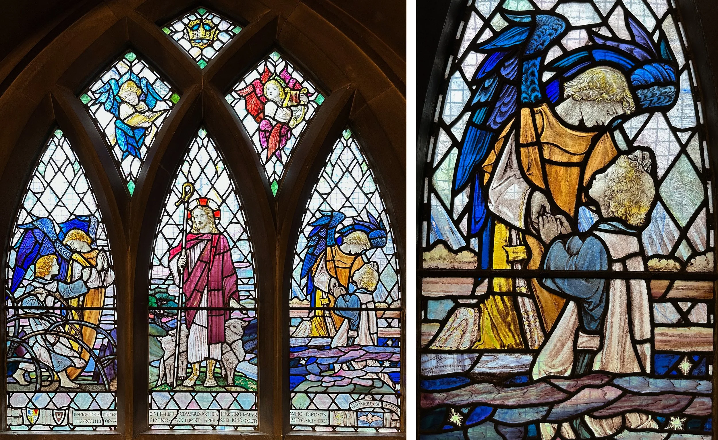
St Mary Spring Grove, north aisle window by Veronica Whall, 1948.
For comparison, here are two windows by Veronica Whall in the same church. People love Veronica Whall - because she’s the daughter of Christopher, and a woman working in the arts and crafts tradition? These two windows have plenty of great details and are made of gorgeous glass, but I saw passages of wishy-washy paintwork, particularly on those pale quarries - a background design device that I never like as it lets in so much light and leaves the (overly sentimental) figures stranded. These two windows didn’t work at all in the dim evening light - but the details, as always, look good on the screen (right, above and below).
St Mary Spring Grove, south aisle window by Veronica Whall, 1949.