glass painting

Postcard from the Past by Sasha Ward

Postcard from the Past.

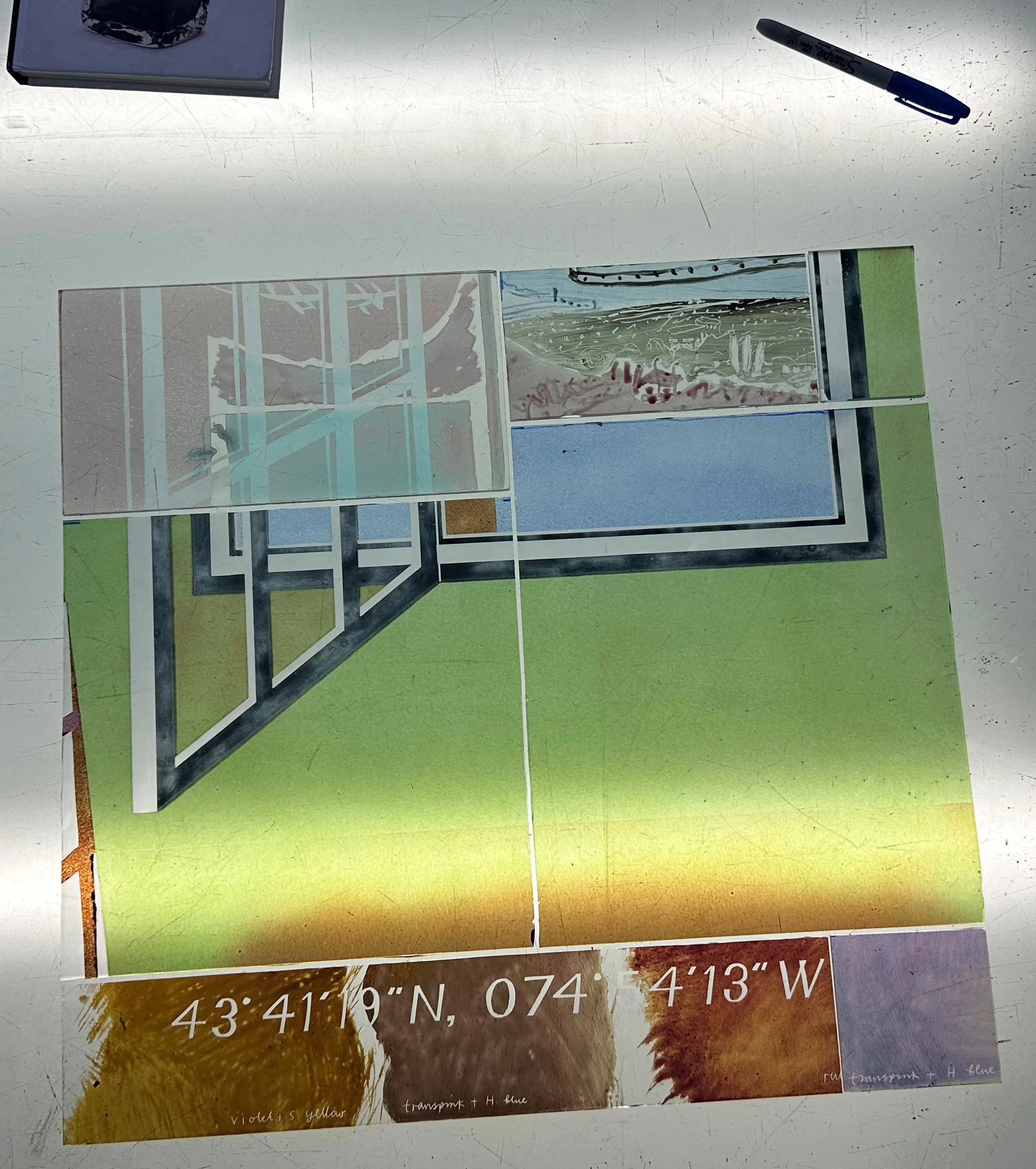
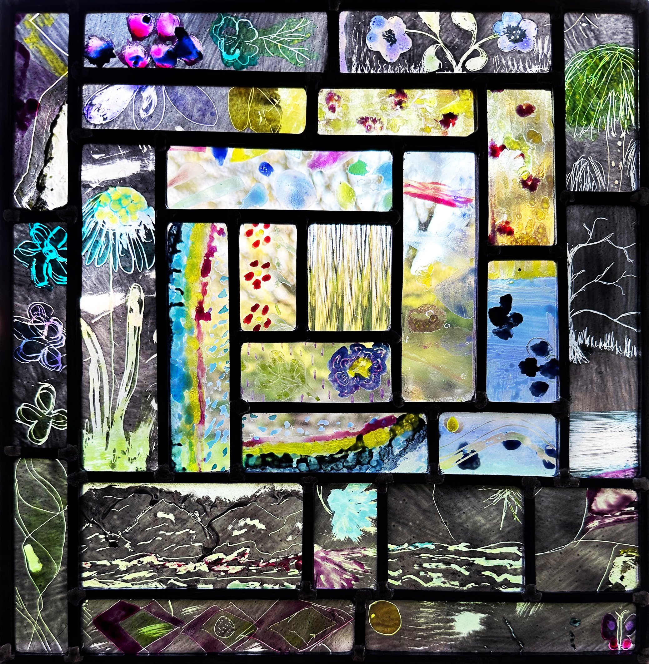
I hadn’t made anything out of glass in 2026 until last weekend when I chopped and assembled pieces together to make a window of a window as seen on the lightbox above with a pen for scale. On top of the desire to make something was the need to cut parts out of a large unsuccessful panel and combine them with samples and old bits to remind me of what I want from my work. In the sandblasted window is a view of a landscape I painted in 1983, like a postcard from the past. In the centre are the blocks of colour chopped out of the unsuccessful panel, a lovely blue and a green that turns brown on the tin side of glass (below right).
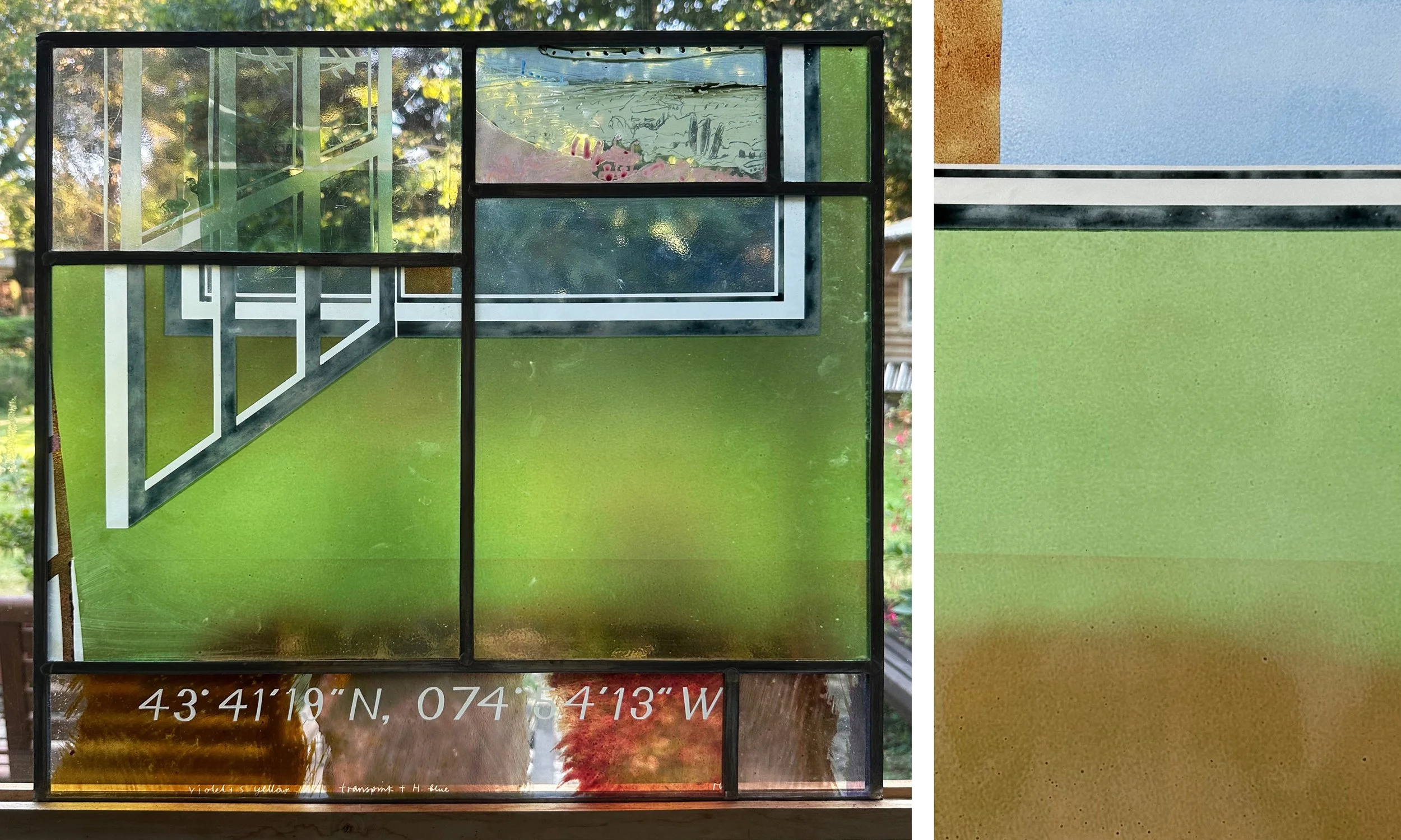
Sample window, 475 × 510 mm. and detail of the unsuccessful panel.

And at the bottom is the grid reference of the cabin in the Adirondacks that Juliet Goodden drew originally in 1982 (below left). That became a painting (below right) on which I’m intending to base a window for her new bathroom.
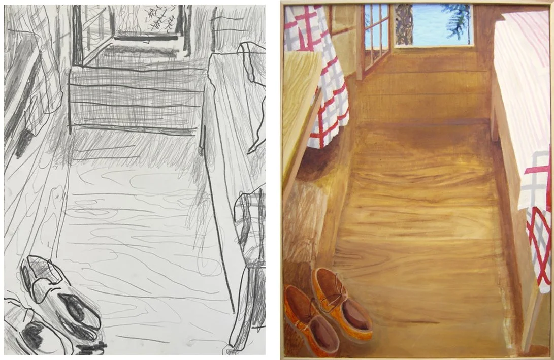
Drawing and painting by Juliet Goodden.
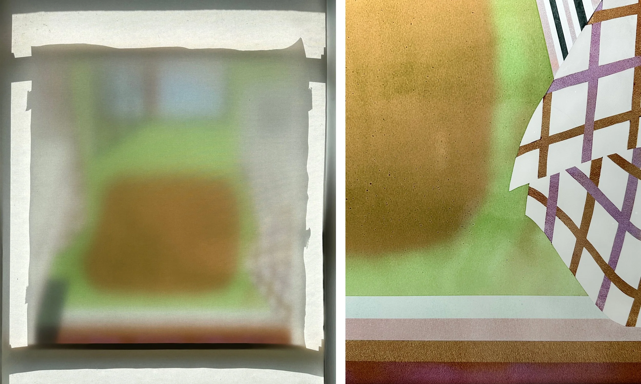
Left: Through the blind. Right: bottom right corner with colour stripes.

As soon as I saw the panel in the kiln after its first firing I knew that it hadn’t worked - the colours were wrong, the enamelling was too thick, therefore bubbly, and the sandblast grit was too fine. I could only stand looking at it through the blind (above left) or in little sections (above right) and was delighted to chop it up.
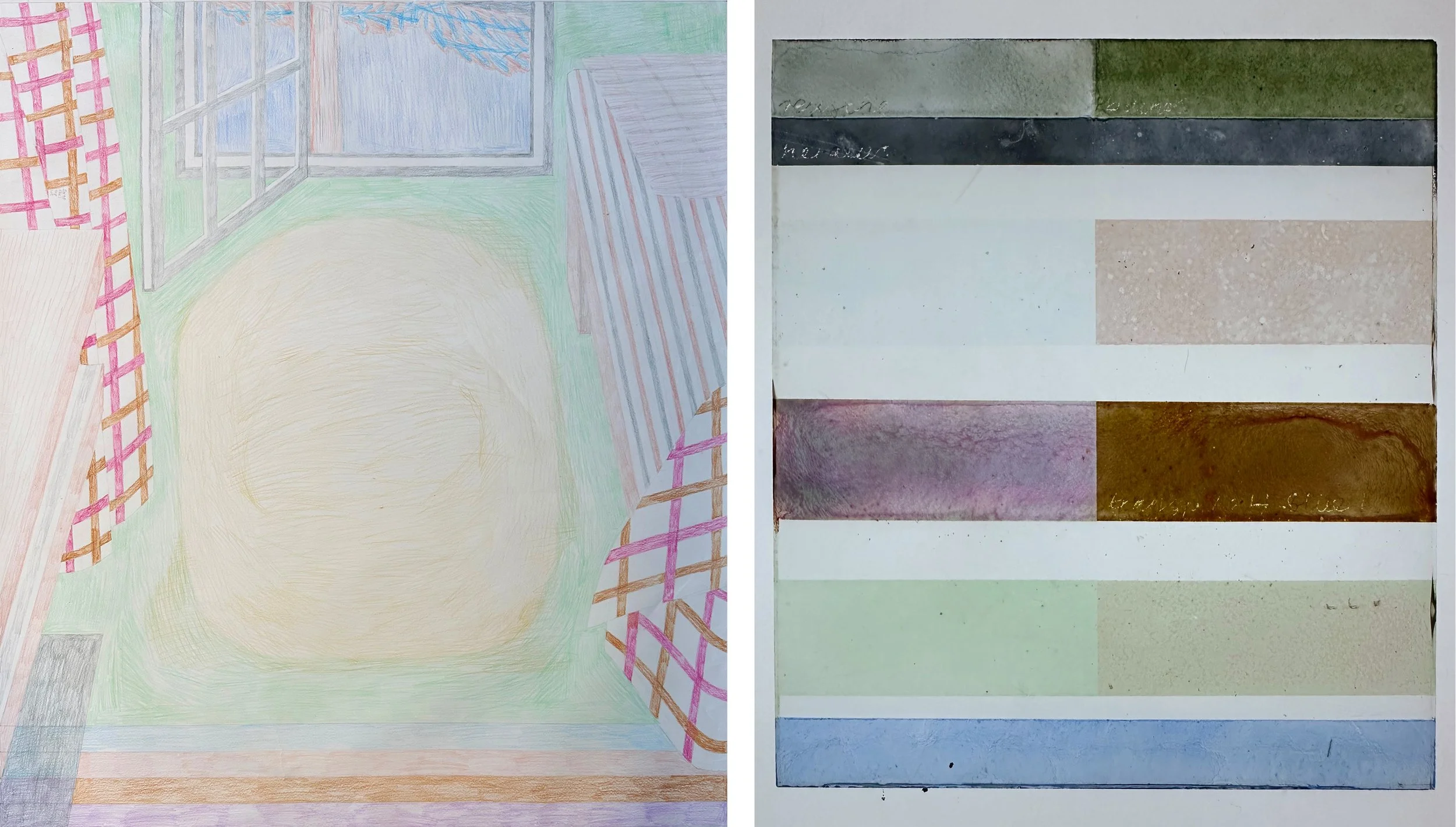
Full size drawing for the panel, 881 × 786 mm and sample of intended colours.

The other technical problem was the fact that all my samples (of which a lovely pale example is shown above) were on a different thickness and manufacturer of glass, so for the new attempt I’ll do my colour samples on a glass match. The mini versions of the design (below), like the new sample window, look best against daylight where the play of transparency and opacity really works. A new version of the cabin interior is now in development having become part of a series in the ongoing and enjoyable dialogue with my friend and fellow artist.
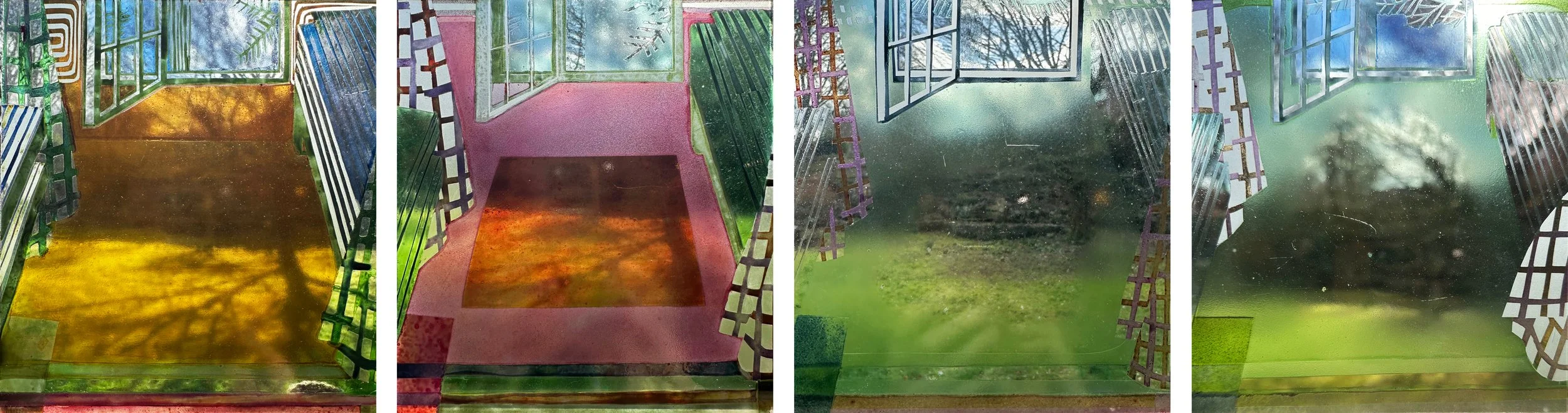
Four little samples showing the development of the design.
silk purse, sow's ear by Sasha Ward

Although it is true that you can’t make a silk purse out of a sow’s ear, I really don’t believe in the concept that this proverb expresses especially when applied to the making of stained glass. I’ve always used old scraps of glass - scratched, industrial, too thick or too thin - to paint on. I use old jars of powdered enamel that people have given me and ancient pots of iron oxide that I don’t spend hours grinding down (as I was advised when studying). I use these same materials when I run glass workshops, most recently for Arts Together in five different venues in Wiltshire, previously described on my blog here and here. So I’m not being critical of other people’s work when I describe the process of making a stained glass panel out of their painted scraps of glass in terms of the silk purse and the sow’s ear, but I feel as if this is what I have done with the discarded bits from the workshop sessions (above).

This small panel is a nice reminder for me of the project and the people who made the pieces, which were mostly samples to try out the painting techniques. It is also a reverse of the participants panels, which go from a dark centre to a bright and light border, as it spirals from a dark edge to a clear centre. I’ve laid out the group members’ finished panels below, all 71 of them, categorised mostly by subject matter.

Process by Sasha Ward

The concept was clear and simple, to make a panel 300mm square inspired by The Thames at Kelmscott via some old favourites - May Morris’ embroidery (top) and my drawings done along the same stretch of the river (above). I worked on it sporadically during a few disjointed weeks, making decisions along the way guided by the materials rather than making a detailed plan and then executing it.

During this process I continue to be amazed at my incompetence. I’m not able to see whether I like what I’m making until it’s leaded up, cemented and in the window. This small panel was leaded up four times, I reused the lead again and again resulting in a slightly chewed up appearance, a good description of how I feel after finishing the piece. In the final version (number 4) I have kept the best bits of painting with little lines that reference the embroidered stitches without copying anything in the picture.

Starting by finding the pieces of glass I wanted to use; on the lightbox you can see the textures of the central piece (Pilkington’s arctic) and the purple cast chunks; first attempt at painting.

Panel masked up for painting before the next firing: version 1 leaded up and in the window: the same panel with the tracing paper backing removed, electric colours and cauliflower textures. However, I should know by now that just copying a good drawing on to glass never works.

I pulled the panel apart and preferred it like this; version 2 repainted with the corner pieces I hated replaced by scraps of painted reeds - just looked like a mess; version 3 with a yellow border - composition is unbalanced and not what I wanted.

Pulled the panel apart again and chose some peaceful watery scraps of painted glass: version 4 in the window; version 4 with tracing paper behind.

At the Bowls Club by Sasha Ward

The Bowls Club window, week one.

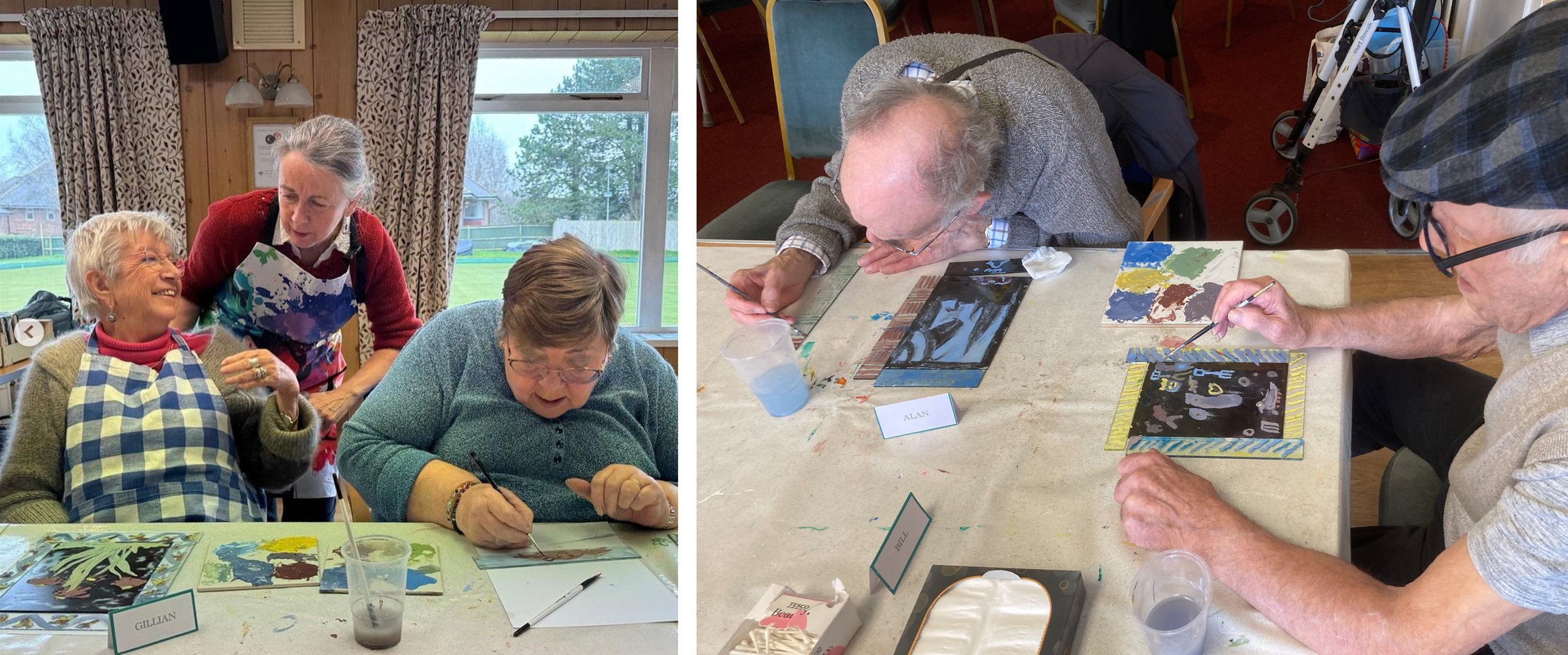
The Marlborough group of Arts Together, a charity that brings together professional artists and older people for weekly art workshops, meets in the Bowls Club. The windows there provided a good setting for the latest version of my glass painting project. At the end of week one we had a row of glass pieces on the window sill ready to fire, their black iron oxide paint having been textured and scratched off by the group members. Four weeks later, after sessions of enamel painting on the centre and border pieces, I returned with the panels that I’d leaded up in my studio, mostly to their specifications, and displayed them on the window sill again. The black and white pieces looked so good in the first photo, the question is have we improved them over the following weeks?

The Bowls Club window, week five.

Glass by Alan, week one and completed panel.

The example of Alan’s panel (above and below) shows the process from week one, with his enigmatic scraffito drawing on a layer of black paint that becomes the ground for further layers of painting in transparent enamel - harder to do and harder to predict the outcome. The borders are a mix of decorative and sample pieces that make it possible to link the pieces together into a solid stained glass panel, a thing that members might actually want to have.

Glass by Alan, week two before and after firing, week four choosing coloured glass to add in corners.

Glass by Gillian, week one, week two and completed panel.

The example of Gillian’s panel (above) shows an original drawing done with great confidence but not really improved by the enamelling, which she did in a ‘colouring in’ style. Her borders however, with speedy, drippy paintwork worked perfectly the first time, no coloured glass pieces were needed to help out the composition of the panel.

A finished stained glass panel represents several hours of work, with different techniques tried out, skills learned and choices made. In terms of the aims of the group, the activity is more important than the art, which should be enjoyable and sociable. You might think that the purity and simplicity of the black and white drawings are sacrificed during the process, but in this type of teaching it’s more about what you learn than what you make.

Gillian (on left) and friends: Alan and Bill painting.

Styles in glass painting and lettering by Sasha Ward

Left: West window by A.J. Davies at St Mary Magdalene Church, Crowmarsh Gifford. Right: Interior of St Lawrence, Warborough, Oxfordshire.

Since seeing his little east window at St Margaret’s in Herefordshire (described on my blog here) I’m getting more interested in the work of A.J. Davies of the Bromsgrove Guild. The first window I saw on this Oxfordshire trip was in the church at Crowmarsh Gifford (above left) high up above the west entrance door and slightly lost in its surroundings (my zoomless camera couldn’t capture the details). However St. Lawrence church at Warborough, only four miles away, has three A.J. Davies windows from different periods, therefore interesting to compare them with each other and to see their quiet impact on the whole church (above right).

Warborough: East window by A.J. Davies (1919) and details from the bottom lights.

The east window is dedicated to those who died in the First World War with large and small figures, badges and scenes united by patterned borders and quarries. The scenes at the bottom show how these quarries, covered in unconnected painted ornamentation, break out into different shapes with strong lettering incorporated into the design and his signature so usefully placed at bottom right.

Warborough: North nave window by A.J. Davies & detail (1924).

At the north east corner of the church is this slightly later work (above) of an organ playing monk next to St Hilary. In the background are the same sort of symbolic details that I’d admired in his St. Margaret window, angels and radiating light as well as a flock of cute bluebirds. The snakes and slipper detail below shows the technique of covering all the pieces of glass with paint, then removing it with textured strokes, scraping and stippling to let the light come through in a subtle way.

A.J. Davies made the third window (below), also visible in the photo of the church interior, twenty two years later towards the end of his life. Gone are the interestingly shaped background pieces, the patterns and the branches for borders. Instead we have a stippled background, realistic looking flowers instead of floral ornamentation and some cute children, all of which record changing fashions in the making or commissioning of stained glass.

Warborough: North nave window by A.J. Davies & detail (1946).

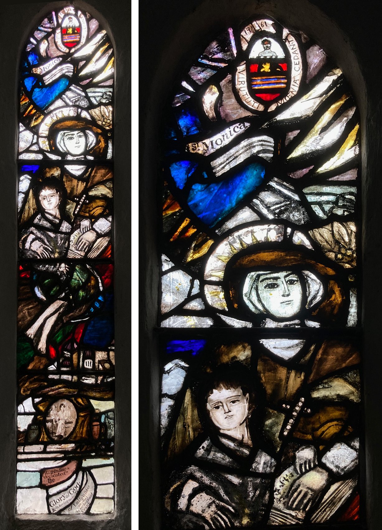
St Mary Magdalene Church, Crowmarsh Gifford, Oxfordshire. North chancel window by Charles de Vic Carey, 1961.

On the same trip I was thrilled by a small lancet window in the church at Crowmarsh Gifford, the only one I have ever seen by Charles de Vic Carey, the teacher at Wimbledon Art School of Pauline Boty and my first stained glass teacher, Tony Attenborough. In it, I recognised the way I was encouraged to paint, with visible brush strokes (so good to see some actual painting rather than the endless quest to find different ways of applying the paint) going across lead lines and uniting the pieces of glass to make a composition, as a painter would. At the bottom is a little, loosely painted portrait of Emily Wilder and children above the fabulous lettering that is collage like and totally of its time.

Details from the bottom half of the Charles de Vic Carey window.