window design

vinyl patchwork by Sasha Ward

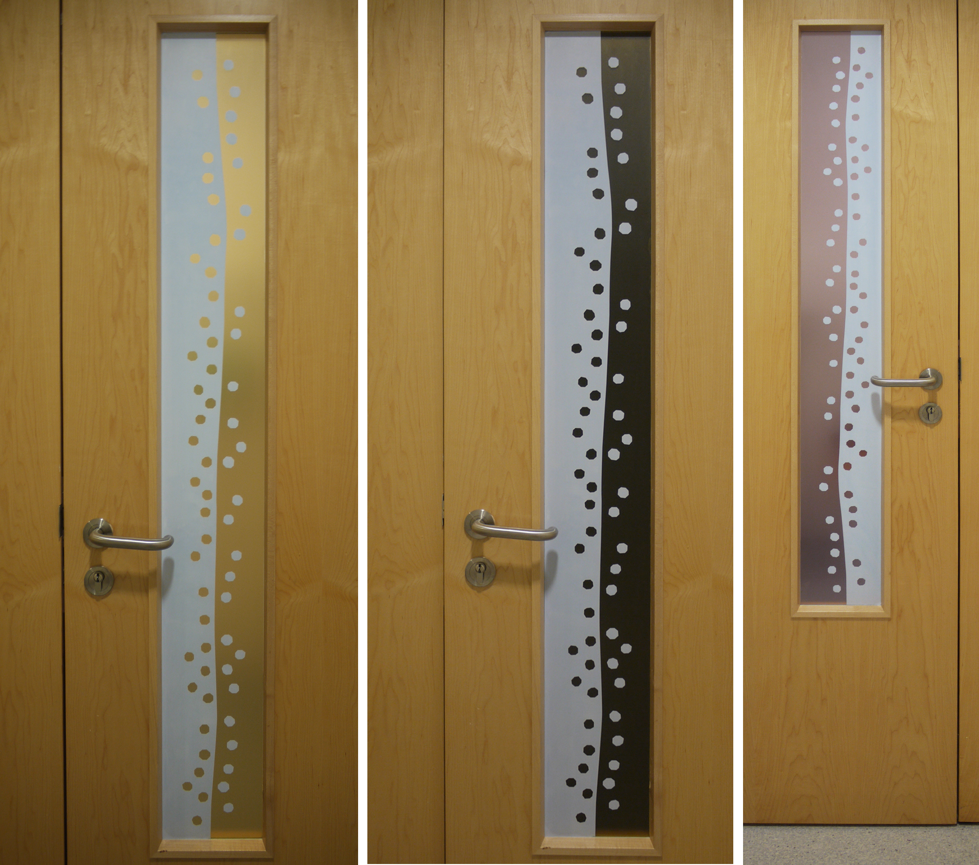
Scraps of sample adhesive vinyl.

The long term plan for blocking the view through the bay window and into the sitting room (below) is to make a stained glass window. The short term plan was to use scraps of printed adhesive vinyl, otherwise know as window film, to make a patchwork in the window so we could get rid of the hated lace curtain. The before and after photos show the transformation of the room (mostly by painting it) and the surprising way that the coloured vinyl works. It blocks the view more but lets light through, with none of the droopiness you got from the lace curtain.

Levenshulme window - before and after.

Levenshulme window - inside and outside.

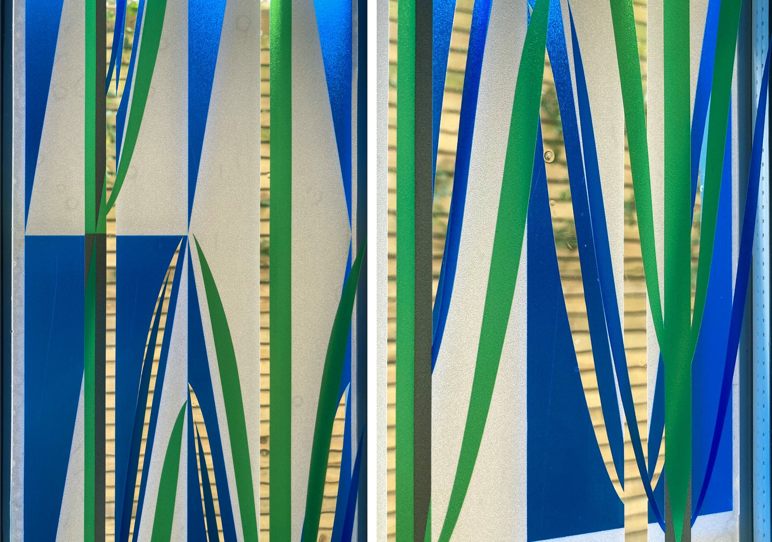
The easy part was the design, kept simple with repeated, accurately cut shapes that could be moved around later. The hard part was the installation, some of the vinyl was too old or bent to stick properly and some of it looked too pale against the opaque colours (which have a white backing that you can see on the photo of the window from the outside) and had to be discarded.

Hexagons are always good, they make the design feel open and slightly curvy, but the three ‘flowers’ we planned, each with a red centre, don’t stand out because of the different properties of the different types of vinyl - it’s like mixing cotton and silk and thinking you wouldn’t notice. This vinyl project is a useful step towards designing the future stained glass window which will be a collaborative effort (this is my daughter’s house). I’ll be advocating that some red stays in.

The red vinyl stands out because it’s the only sample that I didn’t design. The other pieces we used are samples from four projects shown below. One at Millbank House where the aim was to block a building right outside the windows with peepholes remaining, two at the entrance to the same building to cover an over bright lightbox, three next to a maternity bed at Dorchester Hospital where privacy was vital, and four from was a design I always really liked installed as part of an exhibition about public art at Swindon library.

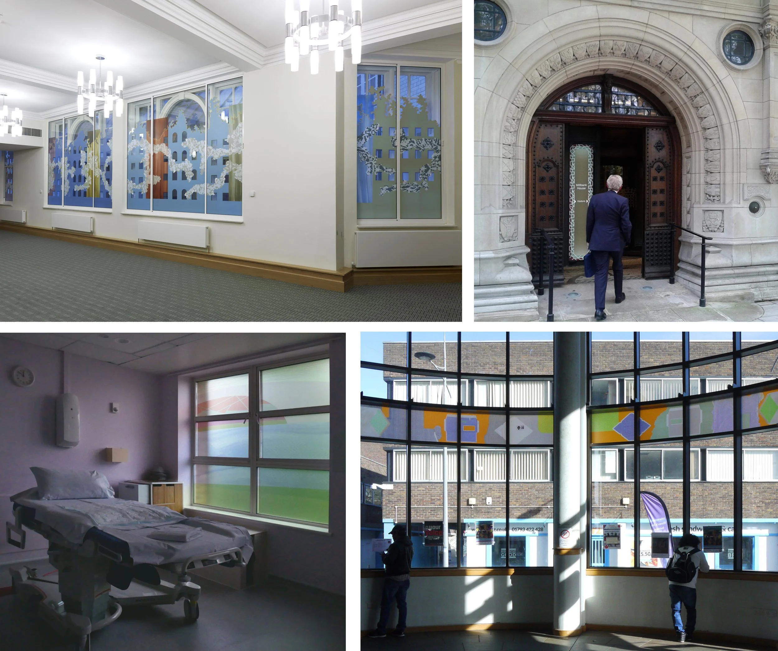
Origins of the vinyl leftovers - temporary commissions for The House of Lords Library at Millbank House (2011), The entrance to Millbank House (2012), Dorchester Hospital Maternity Suite (2019) and Swindon Library (2017).

New Front Door Window by Sasha Ward

I’ve just installed a design for an actual window, the first in quite a while. It felt good to be working out a design for the constraints of a shape, long and thin, and the clients’ preferences, simple, blue and with a touch of the organic. Once I got back into the stride of architectural glass design as opposed to making exhibition pieces, all went well. You can see the final design as it progressed in the drawings on my studio wall below.

Full size designs, 1320 x 150 mm, drawn in this order (from left to right) 5, 4, 1, 2, 3

Samples, enamel and sandblasting on glass.

The glass samples (above) I made at the end of this stage show the basic idea, a pattern of triangles with two stems of plants growing in the gaps between them. The detail comes from the intersection of the stems and the triangle points, you get thin lines of clear glass in the outlines of the leaves while the white triangles are sandblasted and therefore opaque.

The window is in a front door and is double glazed. We realised that you could get a more interesting effect by using both panes of glass with parts of the design on each pane, something I’ve done before, so that the two layers shift against each other as you move around, as in the two layered samples I made next (below).

Samples on two layers of glass.

Front door with design in vinyl - left: first layer inside, centre: second layer outside, right: both layers from the inside.

However, our plans had to change with the news that we couldn’t change the double glazed unit in the front door without getting a whole new front door (because of warranty not technical issues). We decided it was fine to go with the design printed on vinyl, that is adhesive window film, instead. As you can see above, the new window looks completely different from the outside and the inside, with a different part of the design printed on the interior and the exterior film. Although the colour printed on the vinyl is not as transparent as the blue and green enamels would have been the window does the job of providing privacy in the hallway while letting you know who is at the front door.

Details of completed window, 2 layers of vinyl.

In the Window by Sasha Ward

Left, roadside front window before. Right, kitchen window.

Left, roadside front window before. Right, kitchen window.

As you can see in the two pictures above, the windows in my friend’s new house have restricted views. At the back, the kitchen looks on to a concrete wall with tiles and objects positioned wherever they fit. At the front, there is a busy stretch of main road and a pavement close up to the low window. Although she has made it look great with her objects and stick on patterns, she wanted some pieces of my glass in front of the window to block the traffic in a more colourful way.

This was after seeing the rows of random samples I always have in my studio window, slotted into wooden grooves fitted across the window frames. At the moment (below right) I have my most recent samples, some colour test strips and a few samples that stay every time I have a reshuffle so I suppose they must be my favourites. I’ve used grooved wood for shelves in the window since I was a student at the Royal College of Art (years ago, picture below left), with a great view of the Albert Hall and a changing display of the pieces I was painting on top of a backlit piece of glass.

Left, my window at The Royal College of Art in 1985. Right, my studio window this week (2019).

Left, my window at The Royal College of Art in 1985. Right, my studio window this week (2019).

Left, roadside window after. Right, colours through the glass.

Left, roadside window after. Right, colours through the glass.

Choosing glass offcuts or old samples, cutting them up and arranging them in a row is like making a fragment-style stained glass window. That is, anything looks OK but there is an art to the ordering and cropping. These pieces are big at 400 mm tall, and from many different periods so I did a bit of work to unite them with two rows of circles sandblasted out and filled with green enamel. It means that you can still play around with the order and orientation of the pieces. The best part, as always, was seeing the colours projected through the glass on to the carpet in the afternoon sun (above right).

Detail of three panels, originally samples for The Centre Livingston, private house & Manchester Children’s Hospital.

Detail of three panels, originally samples for The Centre Livingston, private house & Manchester Children’s Hospital.

Colour sequence by Sasha Ward

This is part of a project I have been doing in the paediatric mortuary at Manchester Childrens’ Hospital. Over the past two years I have designed artworks for a suite of five rooms following extensive consultation with bereaved parents and hospital staff and negotiated with manufacturers and the hospital estates department to get the works, made of vinyl and glass, installed.

Vinyl detail:  Double doors leading to the mortuary:  Locked doors in the corridor

Vinyl detail: Double doors leading to the mortuary: Locked doors in the corridor

The overall scheme is now starting to come together with new colours on the walls and coloured vinyl on the door vision panels. These make an impact that is much larger than their size and help you find your way through the maze of windowless rooms that make up this backwater of the hospital building. The design on the vinyl is simple, the complicated part is the layered printing so that one half of each panel is translucent and the other is opaque i.e. a colour printed over a white layer. In the detail shown above left the blue is opaque and the yellow is translucent therefore it glows as you approach the double doors to the (badly sign posted) mortuary. In the next part of the corridor there is a pair of locked doors so the vinyl on these has a different design that is totally opaque - attractive but hopefully uninviting (above right).

Entrance door:  Babies’ room door: Children’s room door with room light on and off

Entrance door: Babies’ room door: Children’s room door with room light on and off

The main pattern is ordered, simple and gentle rather than geometric and rigid. The entrance door to the waiting area is green/blue, this leads to the babies’ room (blue/yellow) and the children’s room (yellow/green)- all shown above. The back door of the babies’ room is also blue/yellow but with the translucent and opaque sides reversed, while the back of the children’s room is blue/pink - all shown below. When the light behind the door is off you can see the colour on the opaque part of the design, while the translucent part appears very dark. This is a technique I have borrowed from my glass designs where I use textured opaque areas so that some colour is visible in a variety of light conditions. So far I’m happy with the installation which is still in progress - the colours are spot on.

Door at back of babies’ room with lights on and off: Back of children’s room

Door at back of babies’ room with lights on and off: Back of children’s room