A record I got for Christmas almost fifty years ago. The whole window in St Mary's Church, Selborne, Hampshire. Designed by A Gascoygne, made by Horace T Hinks, 1920.
There is a unique bird window in St Mary’s Church, Selborne, the Hampshire village where the eigtheenth century naturalist Gilbert White lived for most of his life (above right). It shows St Francis preaching to the birds and depicts every bird, I counted 67 different species, mentioned in White’s Natural History of Selborne. Painted in accurate detail, I know these birds well from the cover of a record I’ve had since I was a teenager. Because the record cover designer has cunningly omitted the uninspiring figure of St Francis in the middle of the window and the standard canopies and predella panels surrounding the scene, it was a surprise to see that the actual window is only remarkable if you look closely - how apt for a window about bird watching.
The other unique bird window that I’d wanted to see for a while is the only known work in stained glass by the artist William Nicholson (below left). This window, in the Somerset village of Mells, is also dedicated to St Francis, and is a memorial to John Francis Fortescue Horner of Mells Manor, commissioned by his widow Frances who knew Nicholson as well as many other leading artists of the time. It’s a window with a dynamic composition, where circles radiate from Mary’s halo and fish become birds as they rise to the top of the tracery. The window was painted by Nicholson assisted by Barbara Batt (or the other way round?) a 21 year old student from the Central School of Art who clearly knew what she was doing in terms of glass painting.

St Francis window in St Andrew's Church, Mells, Somerset, and detail of Mary with baby Jesus. Designed by William Nicholson, painted by Nicholson and Barbara Batt at The Glass House in London, 1930.
St Francis from The Selborne window, St Francis from the Mells window.
It is interesting to compare aspects of these two windows, like the figure of St Francis with the same hairstyle and hand position, but painted so differently (above). The treatment of the lettering particularly shows these differences of style. The paintwork in the 1920 Selborne window is so neat that it looks stencilled, while the writing on red glass, so unusual in its placement at the bottom left corner of the 1930 Mells window, is confidently hand written, scratched through two layers of iron oxide paint (below).

Birds and lettering at St Francis' feet, Selborne. Dedication panel from the Mells window.
The birds themselves are the stars of both windows. In a section (below left) of the Selborne window you have three overlapping blackbirds surrounded by, clockwise from centre left, song thrush, yellowhammer, cuckoo, blue tit, house sparrows, nuthatch, wallcreeper, woodcock and kingfishers on a lush green background painted in the same detailed style. Whereas the birds in the Mells window are not identifiable. A section (below right) from the centre of the window shows a variety of bird shape and detail in the most subtle colour scheme with bands of light in the background that are spokes of the radiating circles that hold the design together.

Blackbirds from the Selborne window. Unidentified birds in the middle of the Mells window.

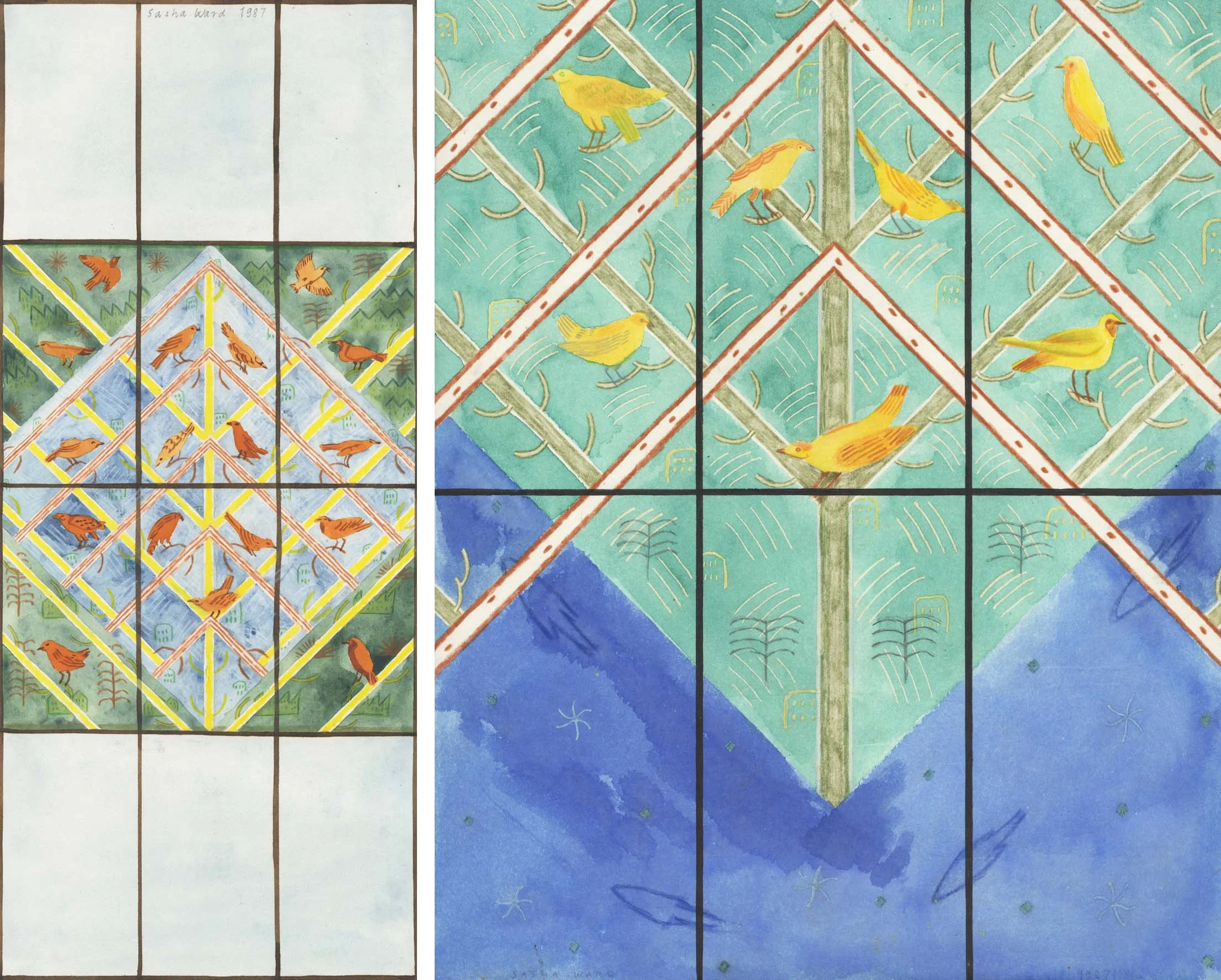
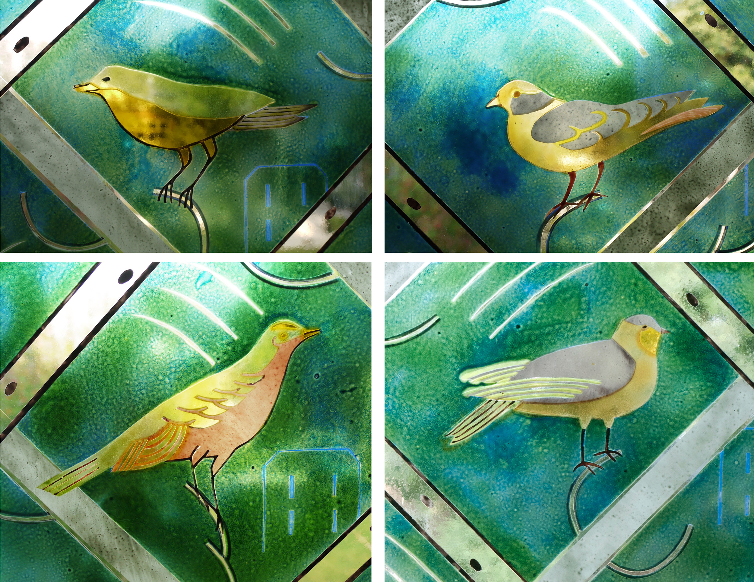
My first public commission on the cover of AN 1987. Full size drawing of one of the painted birds in the design.
When I saw a call out to make a bird window for Lansdowne Hospital in Cardiff soon after I graduated from the Royal College of Art in 1986 I had no doubt that the commission had my name written on it (above). I hadn’t come across many other contemporary stained glass artists who were comfortable drawing birds. More bird windows followed, including one for my old school (below) - the size of the glass pieces I painted the birds on increased with the size of my new kiln. Bird windows were so popular that I had to include birds in designs where I would have preferred not to, until I stopped doing them altogether. In addition to the aforementioned record cover, my way of depicting birds was influenced by the collection I had of birds on postage stamps and from drawing stuffed, not moving ones. My clients are still asking for bird windows and I think I’m ready to have another go, this time taking with me some influences from Nicholson, whose birds don’t perch but move and fly.

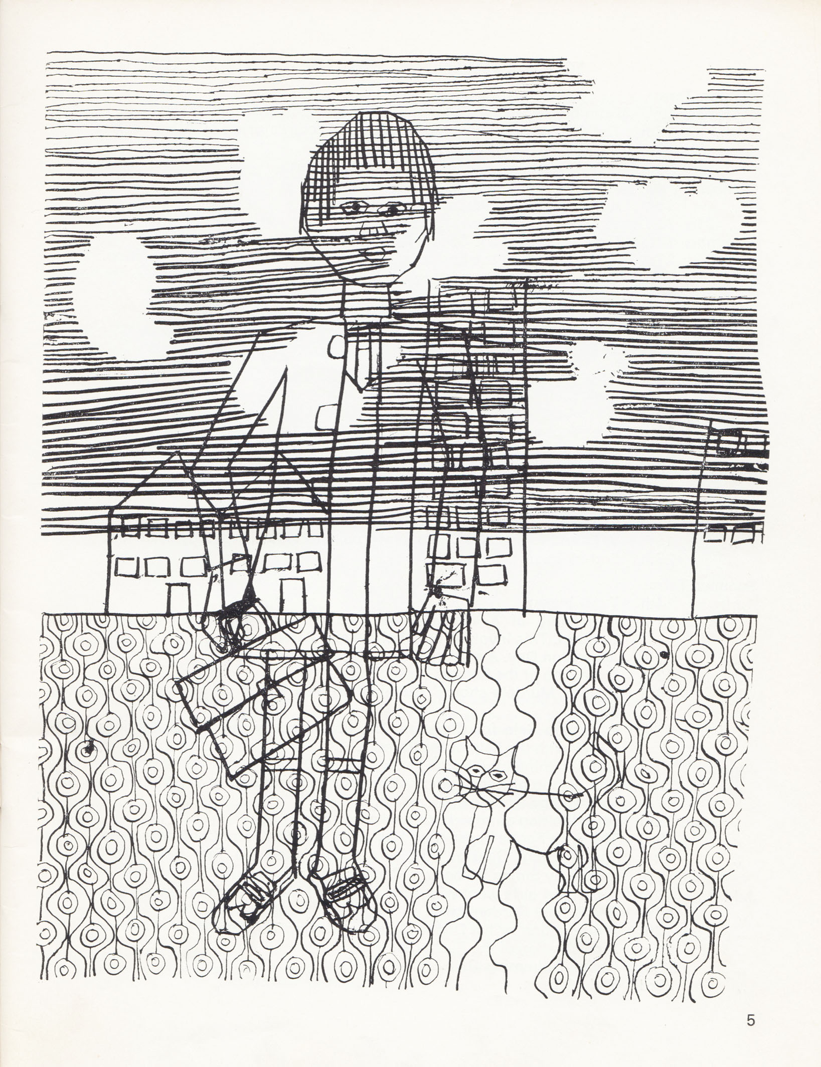
My second public commission (1988) in the chapel at Lady Margaret School, London S.W.6. and bird detail from it.