silver stain

Silver stain by Sasha Ward

Silver stain is a paint made from silver nitrate that turns some glass yellow when fired. It has been used for glass painting since the fourteenth century and it gave stained glass its name. I’ve written about my love of silver stained windows previously on my blog here. In my own work I usually use enamel when I want a transparent yellow, but below are two examples which show the great advantage of silver stain which is that you can put it on the back of the glass (you can’t do this with enamel as it sticks to whatever you lay the glass on in the kiln) and get a layered look.

Hillside from 1983 and Kelmscott Manor from 2014.

I haven’t bought any silver stain for years, but I have eight pots of it - all differently labelled - that I have acquired from various places over the years. I made a small panel out of my colour samples (below left) which included a strip of silverstain painted on the back and front of the glass - see how the metallic elements on the tin side of float glass change the pale yellow to amber. I also made some larger sheets to cut up (below right), failing to match the colours and textures that I achieved in the first piece I painted which is the tallest one on the left of the photo.

Leaded panel using colour samples with silver stain across the middle and sheets of silver stain in the window.

So I thought it was about time to test and label my eight silver stains. The variations in colour are shown below where I have put all the pieces together on the lightbox. I’ve used 6mm and 2mm float glass, testing how each stain changed on a sandblasted surface, on the tin side, when the painted surface is put up or down in the kiln, and whether the colour is better when fired at a lower temperature. As shown below, I can get pretty much any shade of yellow, ochre and brown that I want, and in combination with enamels on the other side of the glass I will be able to make any colours in the red, orange and green ranges too.

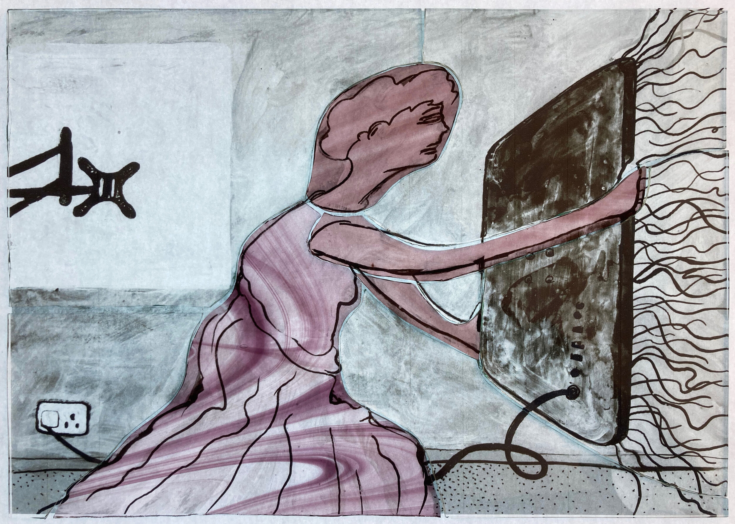
TV angel by Sasha Ward

Let The Light In. Painting in egg tempera on gesso by Ray Ward 435 x 300 mm.

Let The Light In. Painting in egg tempera on gesso by Ray Ward 435 x 300 mm.

This recent painting of Ray’s (above) intrigued me, I couldn’t quite work out what the woman shielding herself behind the TV was up to. It is based on a black and white drawing, as they often are, which I thought made the situation clearer. In that version (below) the discarded wall bracket is more obvious and the composition more open, she is offering up the TV with her arms outstretched. This drawing, in its turn, was based on an annunciation angel in a carved relief that Ray photographed in St Martin of Tours Church, Chelsfield (bottom).

You Light Up My life. Drawing in indian ink and white acrylic on black card by Ray Ward

You Light Up My life. Drawing in indian ink and white acrylic on black card by Ray Ward

IMG_2537.jpg

The interesting history of Ray’s painting made me want to add to the chain by making a stained glass version. I based this on the black and white drawing, only changing it by using a pink and yellow colour combination which is a classic in stained glass angelology. The glass pieces (below) show that the only pieces of coloured glass I used were two types of streaky pink on the angel, the yellow being a thin wash of silver stain fired on the back of the glass. As in all the panels I’ve made in this series most of the details are done with sandblasting and/or painting with black, brown and grey iron oxides.

Glass pieces cut and laid over an enlarged photocopy of Ray’s drawing

Glass pieces cut and laid over an enlarged photocopy of Ray’s drawing

Finished panel on the lightbox, 250 x 360mm.

Finished panel on the lightbox, 250 x 360mm.

The finished panel is shown above on the lightbox and below on my windowsill in the sunshine. Its title also has a history - Ray had called his painting ‘The Teacher, Look in Here and All Will be Revealed’ but then forgotten that fact. When I asked him for one he came up with two song titles, ‘You Light Up My Life’ which I used for the stained glass panel and alternatively ‘Let The Light In’ which he used as the new name for the painting. By then I’d been calling it TV Angel, so this little image actually has four names.

Finished panel in the sunshine

Finished panel in the sunshine

With Added Plants by Sasha Ward

This has been the first winter that I've let the plants into my studio. I thought they would get in the way and I could just carry on making them up if I wanted a plant in a design. However it has been great watching the daily changes and working out how to keep them happy. I've even bought a new one whose flowers match my current window display - a yellow and maroon auricula.

The purple plant climbing up the window has flowered in a way that frames the star on one of my grey glass samples. I thought I'd add the plant to another of the grey samples, really enjoying using two of the best glass colours, yellow and pink and the red that results where they overlap, after a long period figuring out how to work in neutral tones.

Plants doing their thing                                            Painted plant on grey glass sample

Plants doing their thing                                            Painted plant on grey glass sample

Meanwhile, I came across a lovely neutral plant form window in a local church, St. Mary's in Great Shefford, Berkshire. It shows a stencilled vine on an opaque but very pale background, with scratches (looks like cleaning damage) that only add to the peaceful, textured atmosphere. These type of windows often have yellow silverstain details - you can imagine the dots being coloured in for example. This one looks great in its simplicity. 

Vine window and detail - St. Mary's, Great Shefford