St Thomas the Martyr Church, Winchelsea, East Sussex. Left: west elevation. Right: east elevation.
The restored Thomas the Martyr church sits in its own ruins in the middle of Winchelsea, high up inland after the original Winchelsea was flooded in the thirteenth century. Almost every window in the church was designed by Douglas Strachan between 1929 and 1933 and it’s remarkable to see the effect that they have on its interior. Simon Jenkins isn’t so keen: “They wholly dominate the church, which means that if one dislikes them they spoil it. The work is dramatic and perhaps a future generation will show more enthusiasm for it than I can muster”. In his ‘England’s Thousand Best Churches’, he does give the church 3 stars on account of the medieval tombs that line the walls of both aisles. These are good, but I hardly had time to look at them as I was so enraptured by the amazing stained glass - the rare sight in an english church of twentieth century windows that were actually designed to go together.

Left: windows in south east corner. Right: (right hand) east window on the theme of death and resurrection..
On my visit, the sun was blazing through the six windows on the south and east walls and the colours in this set appeared quite pale. They make up the original 1929 commission from Robert Younger, Lord Blanesburgh in memory of his brothers and nephews. The first one to be completed, central on the south wall, commemorates the 1928 Mary Stanford lifeboat disaster.
The subjects of the three windows on the east wall are birth, praise (below) and death (above). These are all remarkable for their intense colour, not dimmed by the skilled glass painting. The praise window is entirely luminous, the colour combinations are riotous, but altogether the huge window gives a delicate, pastel glow. From the outside, the intricate web of expressive lead lines is so distinctive and so admirably rooted in its own period.

East window and details from the bottom of the window.
The third set of windows on the north wall (below) are, quite obviously, on the theme of earth, air and water in the context of a war memorial to the men whose operations were carried out on the land, sea and in the air. These last two and the birth window in the corner are the brightest blue, they drew me to that side of the church and complemented the beautiful tombs below.

Windows in the north east corner of the church.
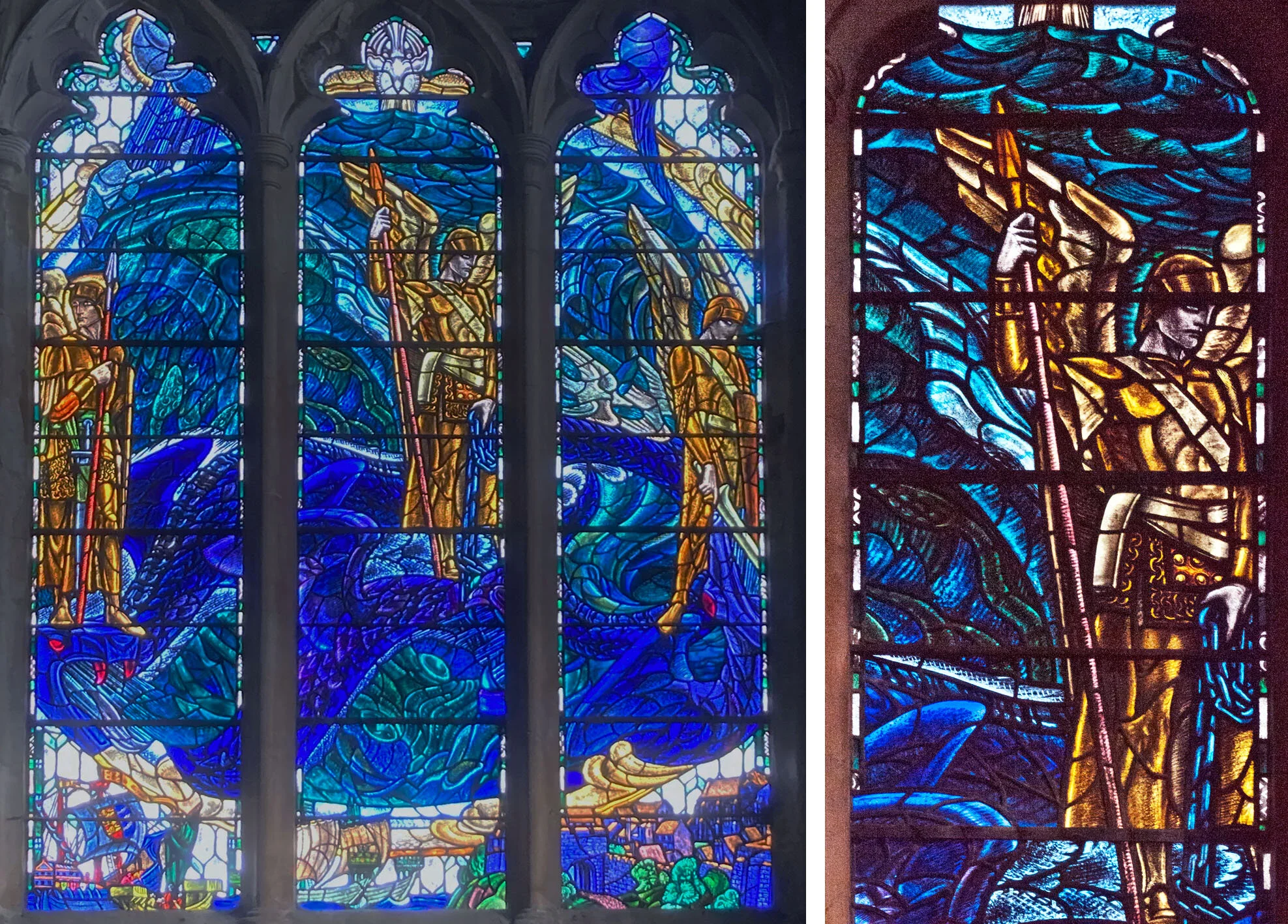
Lower section (& detail) of the left hand north window, on the them of the sea.
The one I really admire is the very 1930s sea window, with helmeted angels and sea monster. I particularly love the way that the little scenes in this series, here showing ships in Winchelsea harbour, are integrated into the picture, rather than placed in the usual boxy predella panels. Simon Jenkins’ future generations are finding this one totally to their taste.

The monster at the bottom of the sea window.