Windows made from scrap pieces of glass are a stained glass staple. In churches old pieces are leaded together in a different formation to make new windows, and in my own work I have always used offcuts, samples and broken pieces to make patterned windows, patchwork style. However, most of the samples I make for larger commissions are on thicker glass with large scale designs, not great for chopping up but ideal as the first layer in a new piece of work.

Experiment 1 with drawing and collage on top, 500 x 260 mm
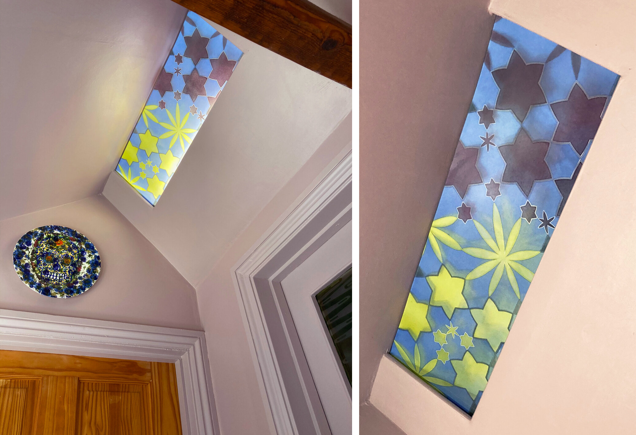
Experiment 1 (above and below) started with a leftover computer cut stencil from a large scale project which I stuck on an old piece of float glass to try out a coarse sandblasting grit. The first bit of enamelling, the red and purple on the left, was another leftover, this time from a bit of very runny spray painting. After firing the effect was so nice that I added another layer, or maybe two, of hand painted enamel enjoying the way that the grainy texture on the glass affected the colours. I spent a long time after these unphotographed stages drawing, collaging and photoshopping to find shapes that would add to the composition, hiding the muddled sections, keeping the best parts and not ruining what I already had.
I like the finished piece so much that it’s still in my studio window months later. The four narrow windows that I added to the design were sandblasted out, then each filled with a different enamel colour with a lot of flux in the mix to make them very pale. What was underneath slightly comes through and the new enamel colours perfectly compliment the ones that were already there.

Experiment 1 completed and detail.
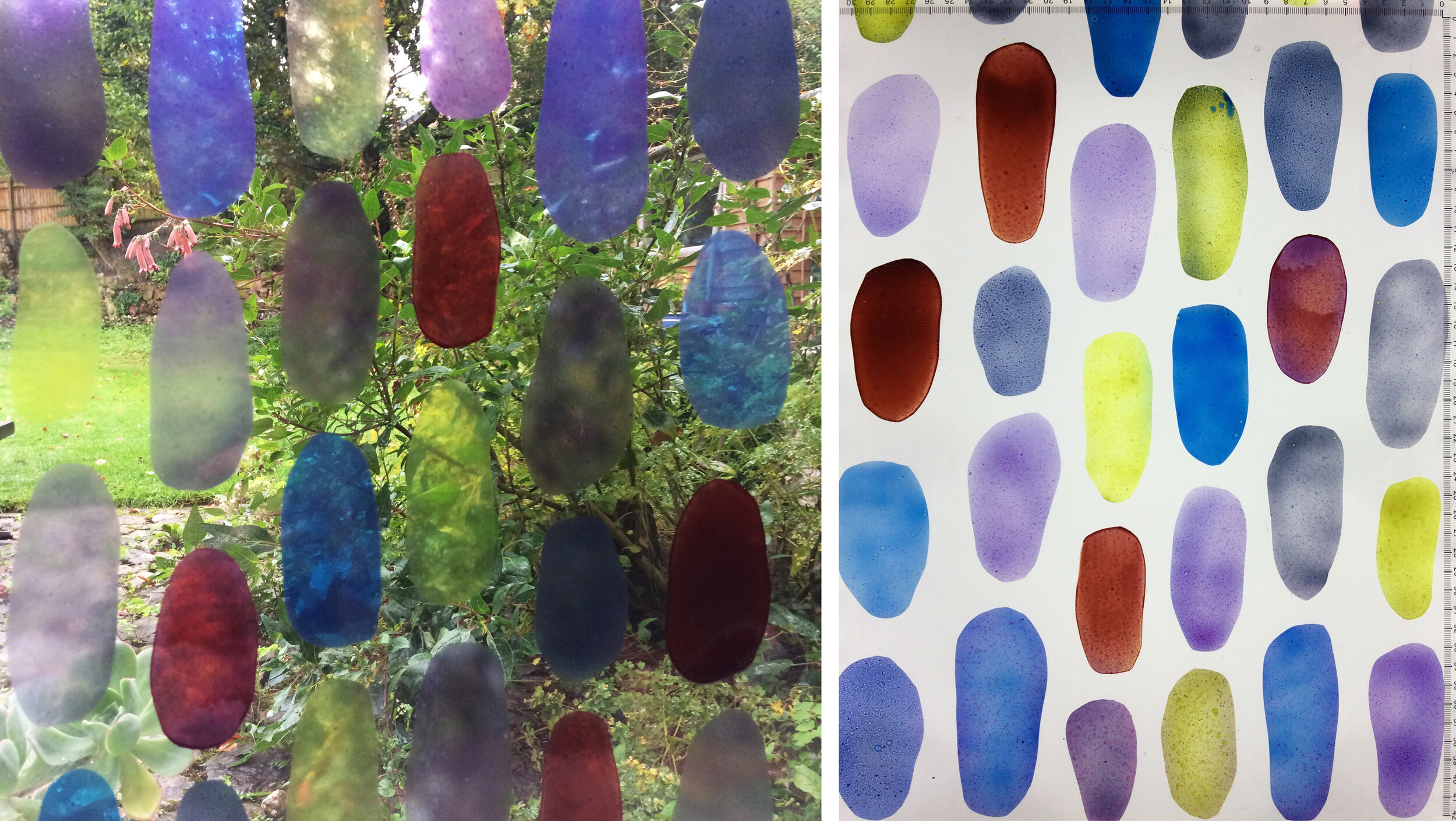
Experiment 2 in the window and on the light box, 470 x 450 mm
Experiment 2 (above and below) presented a different set of challenges. I had a large piece of glass where I’d tried out old glass enamels in rough ovals, there were some lovely qualities in the different enamel mixes but no overall shape to the composition. I decided to use it as the first layer of a new piece, 300 mm square, for the online exhibition of work by members (I’m a new one) of the British Society of Master Glass Painters as these marks and colours seemed to celebrate the joy of glass painting. I spent an even longer time on the next stage of this one, planning patterns around the shapes and additions to them inspired by the effect of the overlapping offcuts in my window (below left).
I know by now not to rush into things, I was very conscious that I mustn’t ruin the piece by interrupting the stillness at its centre. Instead I thought about the concept of tessellation and added more ovals where they were needed to make the tile roughly tessellate while creating just a few areas of overlapping colour. It looks much better on its own than when I did tesselate it as you can see below.
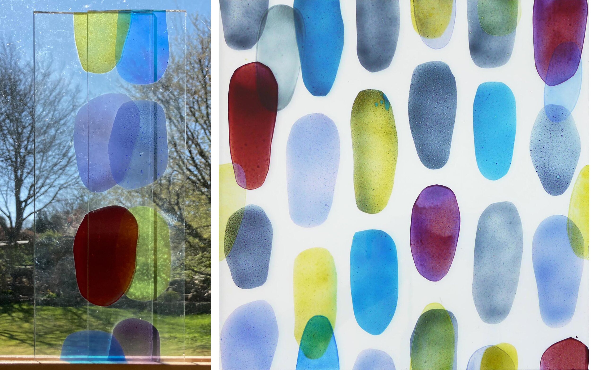
Experiment 2: Left, overlapping pieces. Right and below, turned into a tessellating tile.

Here is a link to lots of great contemporary stained glass squares in the exhibition on the BSMGP website.