I said tell me the truth and I got a lie, ink drawing by Ray Ward, and my interpretation in stained glass.
For my second attempt at interpreting one of Ray’s drawings in stained glass (above) I stuck to the original drawing much more closely. For the figure and the trees I painted with the glass pieces on top of a photocopy of the drawing, disguising the lead lines in the web of branches that pretty much follow his brush strokes. I had intended to stick to the original tones too, but when I swapped the dark green foreground I cut first to the piece of old pressed patterned white glass, it looked so much better.
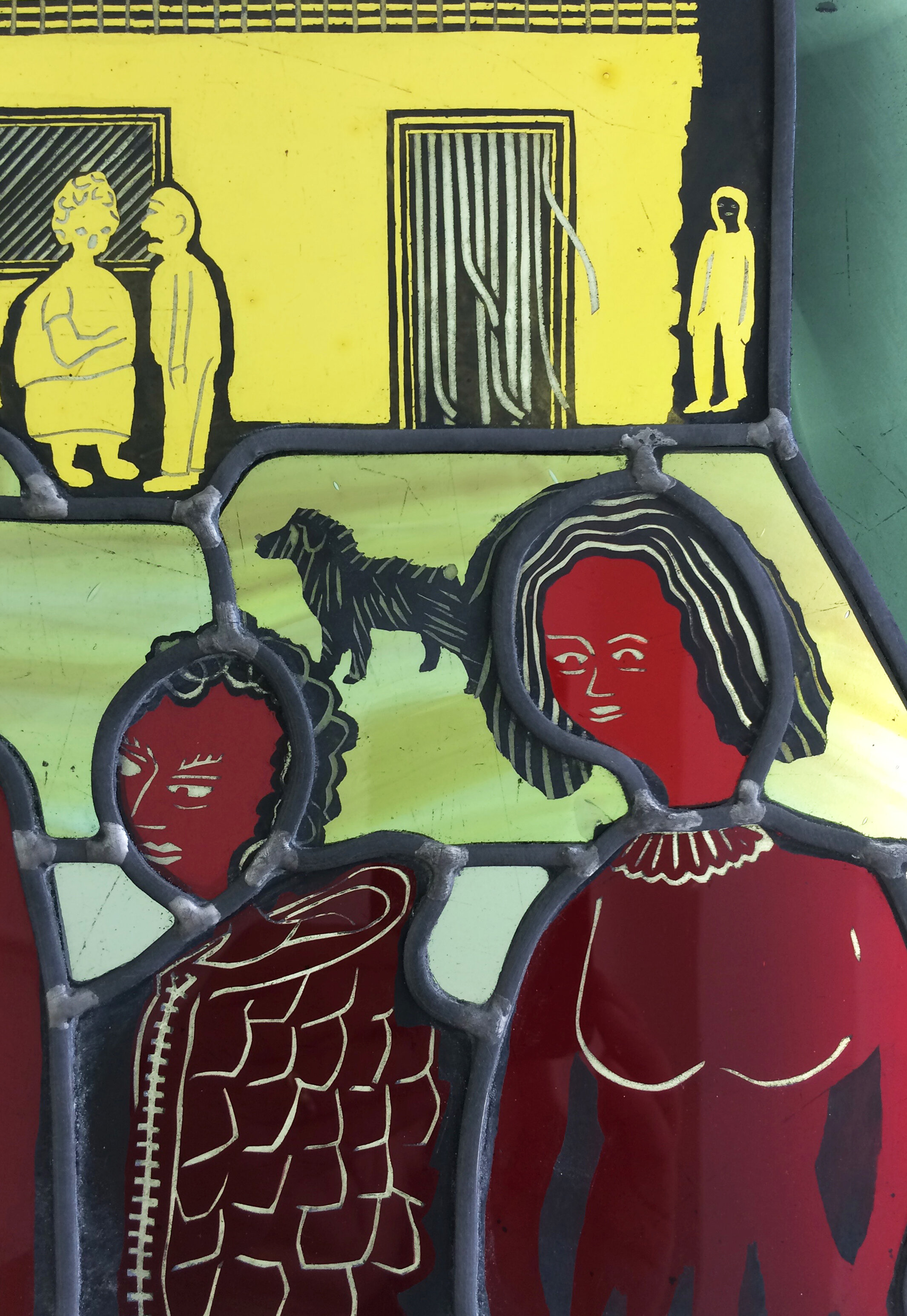
The third piece (below) was from a smaller drawing of a figure surrounded by details that I thought would be interesting to copy. Again I put the cut glass pieces directly on top of the drawing for painting and again I was going to stick to the tones of the original. Then I found a piece of perfect table coloured flashed glass which contrasted well with all the blues. It’s the same piece I used for the sea (above) and the dressing gown (below), but look how different it appears against the other colours.

The Summons, ink drawing by Ray Ward and my interpretation in stained glass.

Details from the two panels.
The powdery blue dressing gown drew my attention to the fact that what really worked was the clothes. This is also true of the first piece I made (see previous post) when what I was intending to concentrate on was figures in a setting. The details in Ray’s clothing reminded me of aspects of clothes in stained glass - specifically the weird neck coverings on Harry Clarke’s figures, the 1950s style skirts and jumpers in William Dowling work for Harry Clarke studios, and an even more fabulous dressing gown in Douglas Strachan’s 1944 Womanhood Window.
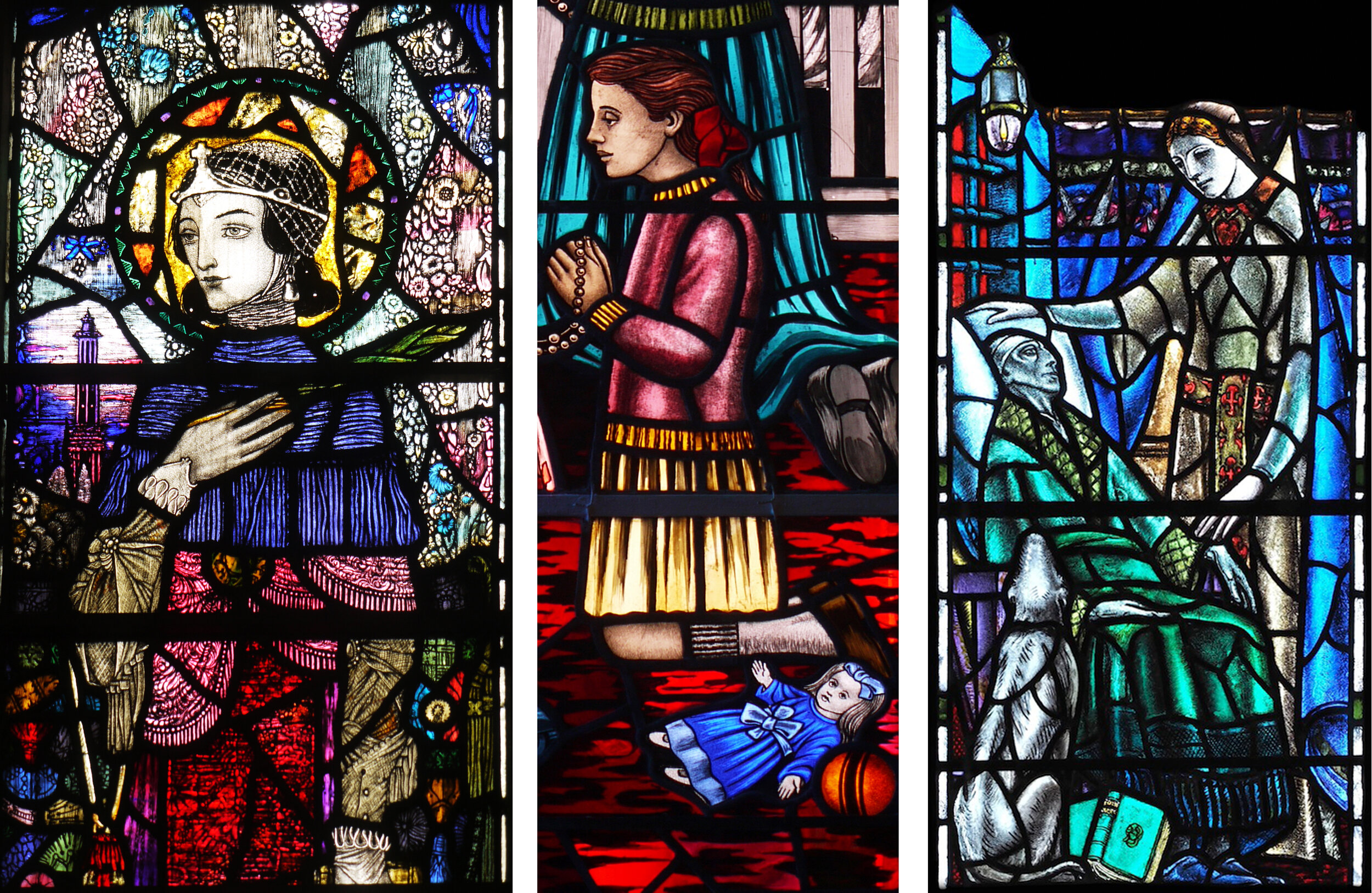
Harry Clarke at Sturminster Newton, William Dowling at Drimoleague, Douglas Strachan at All Saints, Cambridge