Drawing branches by Sasha Ward

Design for back door window panels, 3 versions, 2022.

The design for my latest commission, glass panels in a back door, was going well but there were large spaces in the middle of it that needed filling. In the end, I went with a motif I use a lot and that is based on tree branches (above). These days I don’t feel the need to go to the forest and draw the shape of the branches, instead I make them go in whatever direction is best for the design.

Illustrations by Jan Pienkowski for The Kingdom Under The Sea by Joan Aitken, 1971

Ray reminded me that we have been having the same discussion about how best to draw branches since we were students in the early 1980s. It’s one thing to go out drawing in the summer when leaves add more detail while also simplifying the shape of the whole tree, but quite another thing in winter when the shape of the branches are defined against the sky or the landscape. We came to the conclusion then that the Jan Pienkowski route, where branches are silhouettes, was a good way to go. These illustrations (some examples above) were favourites from our childhoods, and looking at them now I consider him to be an artistic influence.

I said Tell me the Truth, drawing by Ray Ward (left) stained glass by me (right) 2020.

Take this Ray Ward drawing (above) where the trees were from a memory of a scene in Cornwall. When I came to do the stained glass version I didn’t want to change a twig, so I painted the branches on a piece of purple streaky glass placed on top of a photocopy of the original drawing.

The Prophecy of Anguish, painting by Ray Ward, 2021.

Ray’s black and white egg tempera painting on gesso (above) has a design for bare branches that I find even more impressive. The curviness of the ancient tree with its feeble looking branches is offset by a web of sharp twig lines behind and a pattern of vertical lines over the trunk in the foreground.

The State Hospital, Carstairs, detail of glass screen and design, 2011.

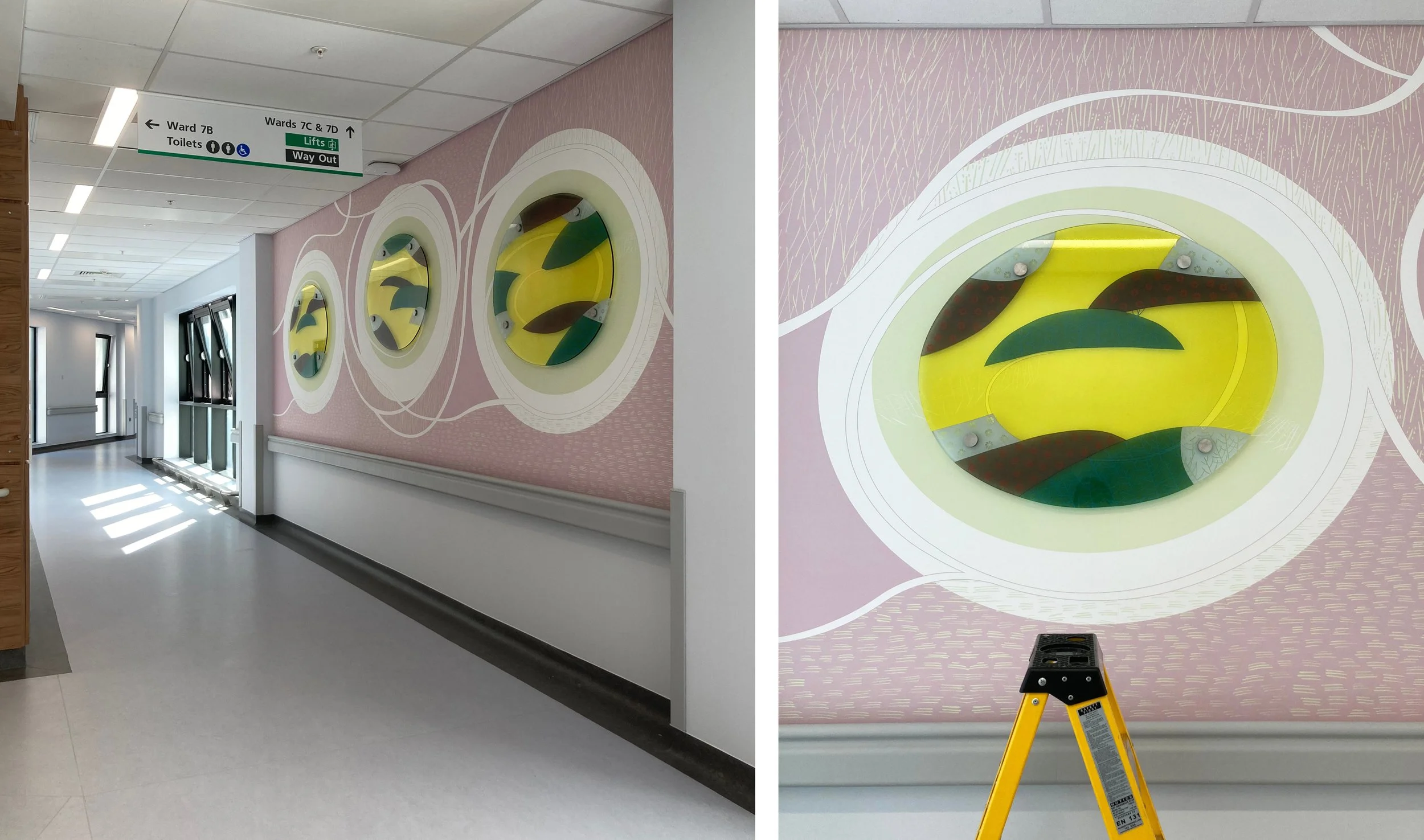
Looking for examples of branch techniques in my own work led me to a screen I made for the top security State Hospital in Carstairs, Scotland (above). In this design the pine branches cross bands of vertical lines that descend at a 90° angle from the pitch of the roof as if they are part of a woven cloth, where small twigs alternate with patterns of squares in the white cloudy sections.

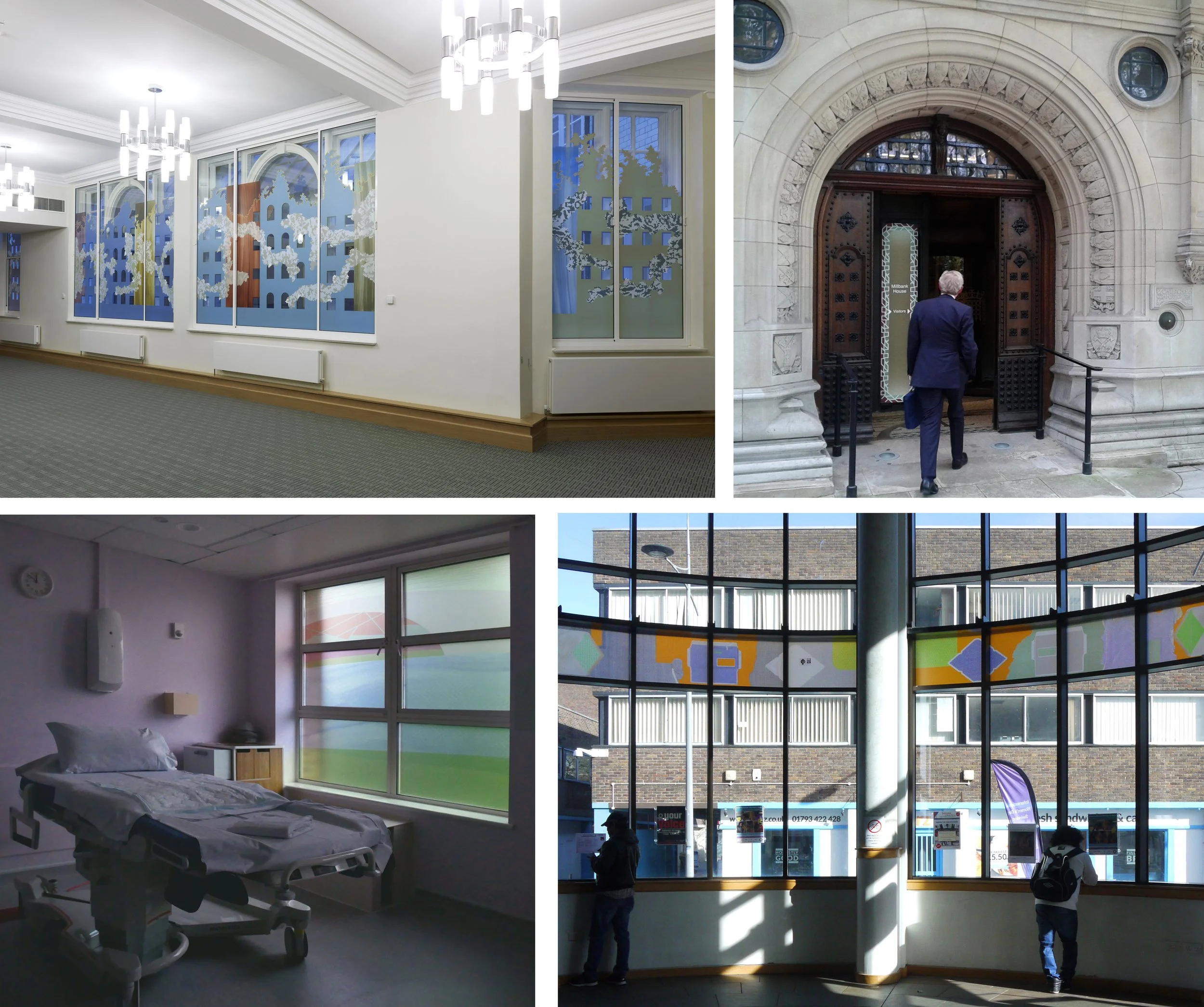
Premier Inn, Liverpool, detail of corner window and design, 2012.

Sometimes when the work is for a public commission, the subject matter needs to be optimistic and a few leaves are required to indicate that spring is on its way. Leaves don’t suit my style as much as branches do, but I found an example of cherry tree branches from a large corner window I designed for the Premier Inn on Hanover Street, Liverpool - an area once full of market gardens and ornamental trees but now much in need of any type of greenery.

Bathroom Doors by Sasha Ward

Colour samples, screen printed and hand painted enamels.

When I meet a new client, I usually have the three glass samples shown above in my bag. I have made hundreds of these over the years as I experiment with the colour and texture of overlapping stripes of vitreous enamel and iron oxide on clear glass, but these three are somehow the best and most admired. On the latest occasion my client liked the samples so much that she wanted a design for the glass panels in two bathroom doors based on the idea of the colour sample.

Colour samples in my studio windows.

Once I’d worked out the best proportions for the horizontal and vertical bands on the tall thin door panels, I set to work on new sets of colour samples using an etched, therefore transluscent rather than transparent, glass. One set was based on a golden colour range, the other set needed to coordinate with the bathroom’s terracotta tiled walls and floor. It’s hard mixing transparent glass enamels to match a colour, particularly in the warm orange range where things easily go towards brown - as you can see in the nine samples for this project in my studio window (above right). As much as the amounts of each powdered enamel you put in the mix, the result is affected by how you apply the enamel, in this case I hand painted (as opposed to printing or spraying) to achieve the textures in the original favourite samples.

On the table (below left) you can see the glass on my lightbox with the vertical stripes fired on and the samples I’m trying to match above them. The finished panels (below right) show the second layer of horizontal bands in a contrasting but paler colour range of greys, greens and some blue.

Left, half done panels on the table. Right, two finished panels in the studio.

First floor bathroom door installed.

The panels are finished and installed before the rest of the rooms are ready - so fingers crossed for their safety while work goes on around them. Both sets of colours are good, not exactly the same as the samples of course, with some unexpected mixes and welcome blemishes. The best aspect of the painting is that I have kept the layers light and thin which is a good glass painting tip - it’s easier to add than to remove.

Second floor bathroom door installed.

Royal Liverpool University Hospital by Sasha Ward

This was a commission that I thought would never get finished. A new Liverpool Hospital has been built next to the old one which is due for demolition. During the course of its construction, the main building contractor, Carillion, went bust, faults were discovered in the building and with the cladding that had been used causing further costs and delays which were added to by the pandemic. The selected artists, who had been contracted to Carillion, stored their work and waited to see what would happen next. Understandably, my enthusiasm for the project started draining away as the seven oval glass panels I had made were stored behind my kiln for five years.

Drawing for glass and wall design at Ward 7A, 2015.

The selected artists had each been asked to design work for walls next to the four ward entrances on their allocated level, mine was the seventh with bright green accents. Hospitals often ask for artwork that is organic and curvy, definitely not geometric, a look that I have struggled with over the years of doing commissions for health care settings. On this occasion I decided to go for no straight lines or interlocking patterns, taking inspiration from the natural world rather than the urban environment. For each location I designed a swirly drawing that would be printed on vinyl wallpaper with shaped pieces of glass mounted on top of a pool of pale colour.

The wall next to Ward 7A (above and below) changed shape and colour during the course of the years, with a piece of glass that is the biggest and I think the best. It was hard to photograph on installation day with reflections from a screen opposite and equipment stored up against it (below).

Ward 7A during installation, left wallpaper, right with glass on top.

Ward 7D, from drawing to glass, 2015 & 2022.

Ward 7D is similar, and for this one my first drawing (above left) shows the initial concept where lines and circles spiral into the pool of overlapping colours. However, the blank wall had been too much for someone to resist, and when I visited just before installation I saw that a square access hatch had been cut into it so I moved the glass up and some white lines around on the design. This wall is opposite a window which provides some great reflections of the the new building (below right) which is white and grey and spiky in design.

Details of wall and glass at Ward 7D.

Drawing for Ward 7C, 2016.

The wall leading up to Ward 7C had room for two glass panels above the crash rail. My watercolour drawing for this one (above) is closest in feel and colour to the work installed. The changes I made to the shape of the lines and the positioning of the panels happened because of a fire alarm that I had to keep well away from. The detail (lower right) shows how the ceiling lights are effective in picking up the lines sandblasted on the edge of the glass and mixing them with fine white lines printed onto the background vinyl.

Entrance to Ward 7C

Details of the glass at Ward 7C

Drawing for Ward 7B

The wall leading up to Ward 7B, six metres long, is the one that didn’t change so neither did the lines on my watercolour drawing (above). It’s a piece of wall between bays of windows - wouldn’t it be lovely and simple to be able to go back to doing windows again! This series of three looks the simplest and cleanest with an unfortunate resemblance to a row of washing machines.

Wallpaper and glass for Ward 7C

Corridor at Ward 7C and detail of glass panel during installation.

Overall, I am delighted with my last hospital commission. The no straight lines design looks effortless and was very easy to alter over the years and to install. Above all the colours look great, the transparent enamels on the glass are strong against the pastel coloured wallpaper and complement the tricky green on level 7. It’s hard to find your way around this building, hopefully this commission will help you remember the way and give you a boost of energy as you watch the patterns swirling around.

vinyl patchwork by Sasha Ward

Scraps of sample adhesive vinyl.

The long term plan for blocking the view through the bay window and into the sitting room (below) is to make a stained glass window. The short term plan was to use scraps of printed adhesive vinyl, otherwise know as window film, to make a patchwork in the window so we could get rid of the hated lace curtain. The before and after photos show the transformation of the room (mostly by painting it) and the surprising way that the coloured vinyl works. It blocks the view more but lets light through, with none of the droopiness you got from the lace curtain.

Levenshulme window - before and after.

Levenshulme window - inside and outside.

The easy part was the design, kept simple with repeated, accurately cut shapes that could be moved around later. The hard part was the installation, some of the vinyl was too old or bent to stick properly and some of it looked too pale against the opaque colours (which have a white backing that you can see on the photo of the window from the outside) and had to be discarded.

Hexagons are always good, they make the design feel open and slightly curvy, but the three ‘flowers’ we planned, each with a red centre, don’t stand out because of the different properties of the different types of vinyl - it’s like mixing cotton and silk and thinking you wouldn’t notice. This vinyl project is a useful step towards designing the future stained glass window which will be a collaborative effort (this is my daughter’s house). I’ll be advocating that some red stays in.

The red vinyl stands out because it’s the only sample that I didn’t design. The other pieces we used are samples from four projects shown below. One at Millbank House where the aim was to block a building right outside the windows with peepholes remaining, two at the entrance to the same building to cover an over bright lightbox, three next to a maternity bed at Dorchester Hospital where privacy was vital, and four from was a design I always really liked installed as part of an exhibition about public art at Swindon library.

Origins of the vinyl leftovers - temporary commissions for The House of Lords Library at Millbank House (2011), The entrance to Millbank House (2012), Dorchester Hospital Maternity Suite (2019) and Swindon Library (2017).

Even northern french light by Sasha Ward

Above and below: Church of St Martin, Romilly-sur-Seine. Windows by Joël Mône.

For our last day of stained glass sight seeing in France we chose, from another excellent tourist leaflet complete with map, two churches with windows made in the twenty first century. The large church of St. Martin in Romilly-sur-Seine has a series of windows by Joël Mône above what looks like a huge layer of bird netting. There is a very effective white, textured one above the west door, and a spectrum of coloured windows from yellow to red (in the south transept) through pink and purple to blue (in the north transept) and finally to turquoise and green. The colour sequence is interrupted by nineteenth century stained glass windows around the apse and, as you can see in the photos where similar glass can be seen in the lower windows of the church, the new windows sit well with the old ones by not imitating them in any way.

St. Martin, Romilly-sur-Seine, with blue window representing the baptism of Christ in the centre.

Initially I found the new windows, installed in 2013, uninteresting and the concept of the rainbow colours clichéd. In the church was a diagram that explained the sequence in terms of water and light at the green and yellow ends (cliché upon cliché) with each window linked to a bible story in the traditional way, starting with the old testament at the west and ending with the new testament either side of the altar. Now that I look at the window designs in more detail next to the verses that inspired them, I am more appreciative of the scheme and the attempt to interpret the words of the bible in an abstract manner.

Church of St Peter and St Paul, Villenauxe-la-Grande. Windows on the south side by David Tremlett.

Our last stop was Villenauxe-la-Grande, and a scheme of windows - all the glazing in the church of St Peter and St Paul - by the British artist David Tremlett that I’ve wanted to see since I read an article about them in 2005 when they were installed. 200 square metres of glass over 25 windows makes this the most significant church commission in France for twenty years, according to the leaflet. David Tremlett had not designed much for stained glass before he won this commission which was executed by the studio of Simon Marq in Reims, but this typically French stained glass system, where an artist is paired with a master stained glass maker, works perfectly here, as indeed it does in many of the churches we’ve visited on this trip.

Villenauxe-la-Grande. Windows on the north side by David Tremlett.

I think of these windows as giant watercolours, they are opalescent rather than transparent, with white lines bordering colours that remind you of the edge of a piece of paper. There is a bewildering variety of design but a consistency of scale and technique, Tremlett says that he wants each window to relate to the next one, but also to stand on its own. I imagine how satisfied the artist would have felt on seeing the commission completed - daring, original and seeming to add light to the interior with a wonderful range of light, bright colours.

Villenauxe-la-Grande. Left: Window 2 (Christ). Right: Windows 4 (Christ), windows 6 & 8 (the vine).

I chose as my favourite window no 2 in the scheme (above left), which with its pair, represents Christ. I had to keep blocking the next two windows out of my vision (above right) their spottiness represents to me the worst aspects of decorativeness - what was he thinking of? The diagram of the windows, spookily similar to the one in the church at Romilly-sur-Seine, says they represent the vine. The subject matter for the other windows goes from earth, through fire, ceramic (for the benefactor of the windows) to the virgin Mary, the paschal mystery, Christ, air and water.

Villenauxe-la-Grande. Left: Window 9 (fire), windows 7 & 5 (ceramic). Right: Windows 3 & 1 (The Virgin Mary).

Villenauxe-la-Grande. Left: Window 12 (air), windows 14 & 16 (water). Right: Windows 20 & 22 at the south west corner.

This was my favourite stained glass interior of all the ones we visited on this trip - see my last four blog posts for comparisons. I knew I would like the designs and the differences between the windows, but the success of stained glass windows, their luminosity, colour and detail, depend on their manufacture and in this case they were made by the best there is. I thought a view of the outside of the windows would give a clue as to how they’re made (below), it’s also interesting to see the wire mesh over them all that is hardly visible from the inside and to see the colour of the sky - the even northern french light that is perfect for the viewing of stained glass.

Villenauxe-la-Grande, windows 7 and 3 from the outside.