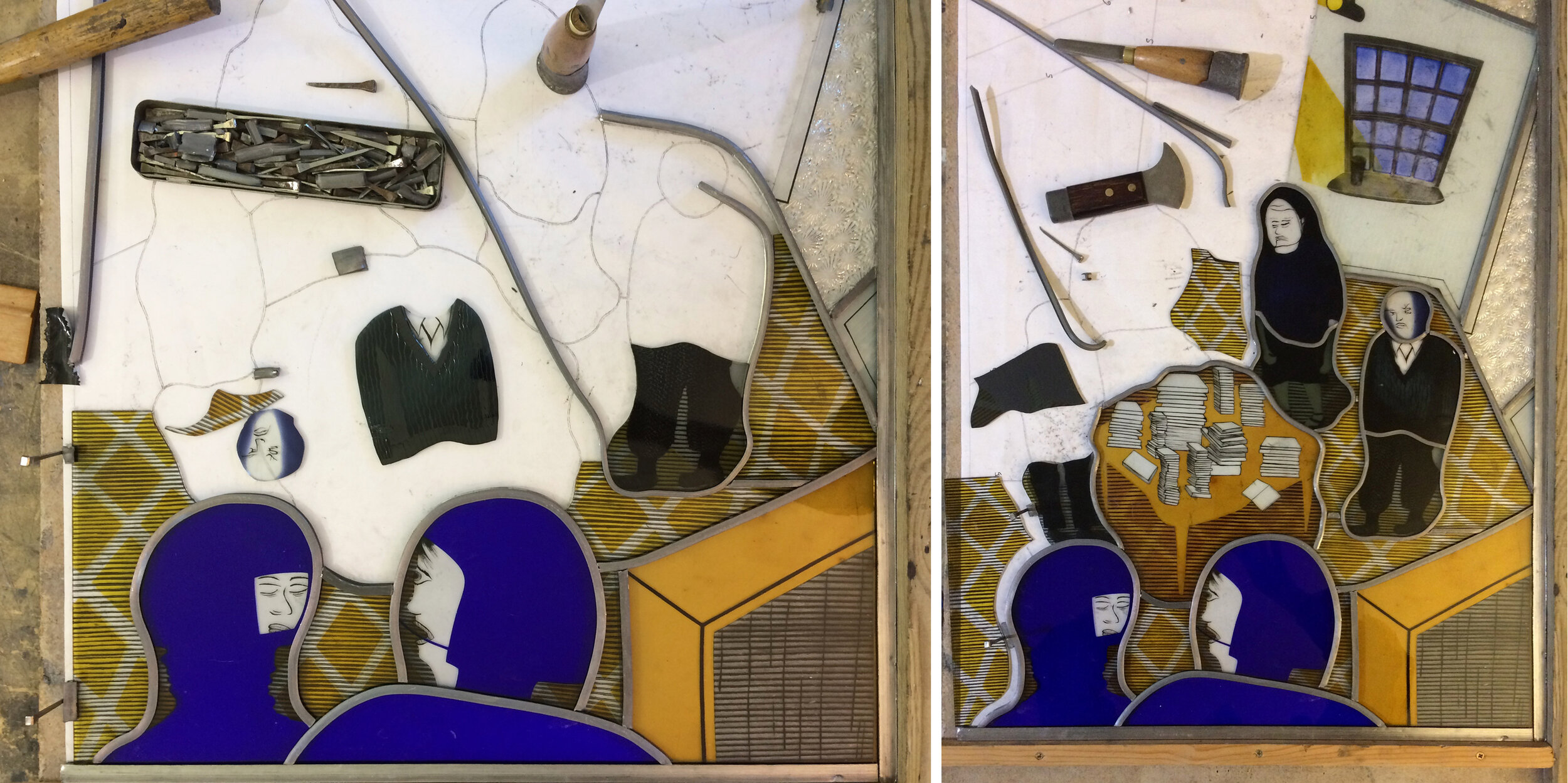
Purple man from ‘These People Are Intellectuals…’ Left, in progress. Right, in the exhibition at Norwich Cathedral
Purple man’s disembodied head was an unplanned addition to our exhibition at The Hostry, Norwich Cathedral. When making the stained glass panel ‘These People are Intellectuals, They Live in Houses Full of Books and Have Nothing Worth Stealing’ (described in a previous blog post) purple man ended up with two alternative heads. I did a second one (on the left in the photos above) out of the same piece of flashed streaky purple glass because I thought I’d sandblasted too much of the purple layer off on the first head. However head number one turned out to be the best one, so head number two ended up on its own stand in the display case alongside an explanation of how the window was made.
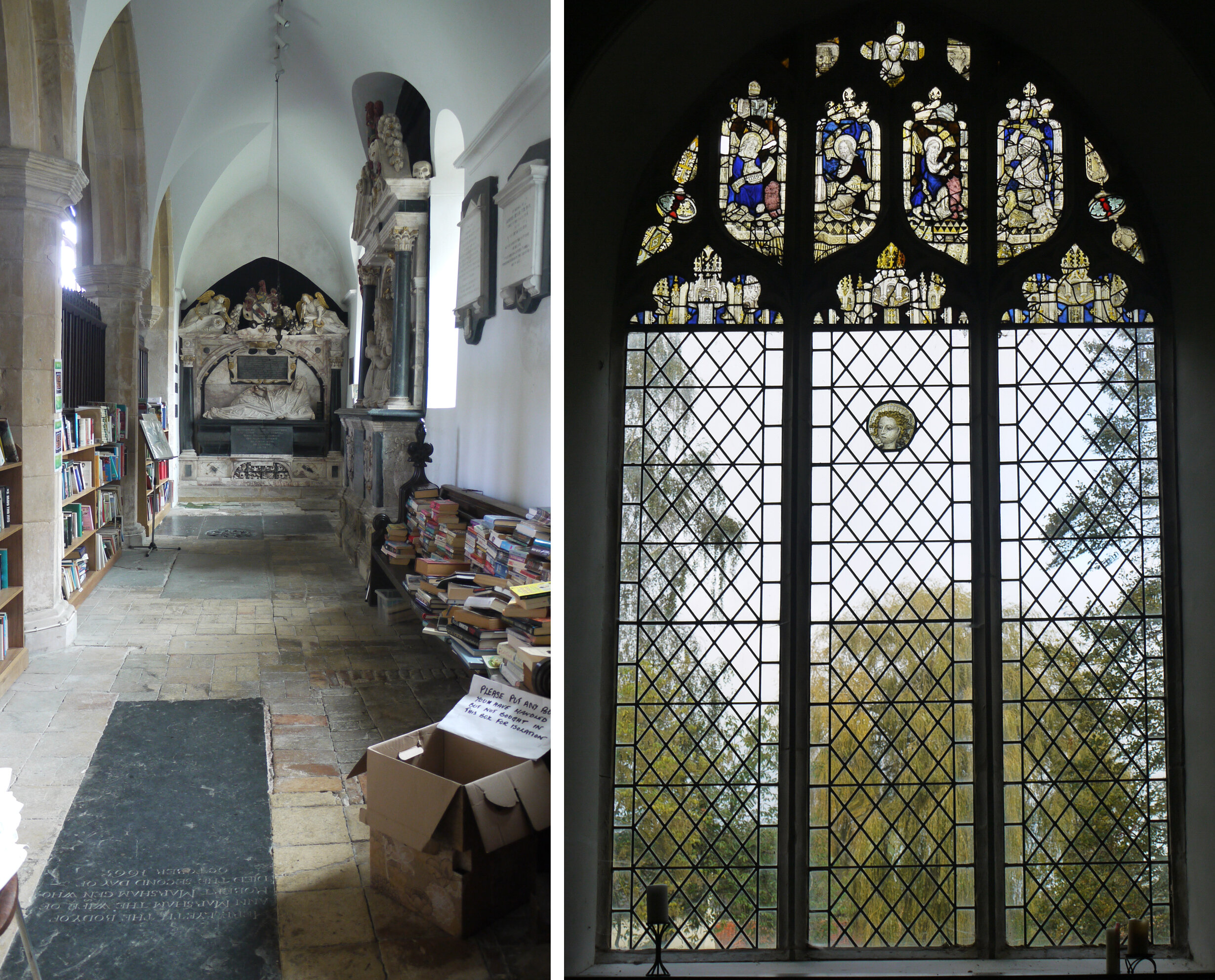
St Margaret, Stratton Strawless Left, the south aisle. Right, north window containing medieval glass.
When you start looking at old stained glass in churches you get used to seeing disembodied heads. These are pieces of medieval stained glass that have survived breakages or the releading of windows and find themselves either part of another picture or out on their own. We made a trip to the village of Stratton Strawless, just north of Norwich, to see a perfect example of fifteenth century Norwich glass painting in the angel head which has been set into a clear glass window (above and below). Miraculously the church was not locked and it is full of stupendous monuments and second hand books as well as the angel head which seems so beautifully done now that I’ve started painting heads myself.
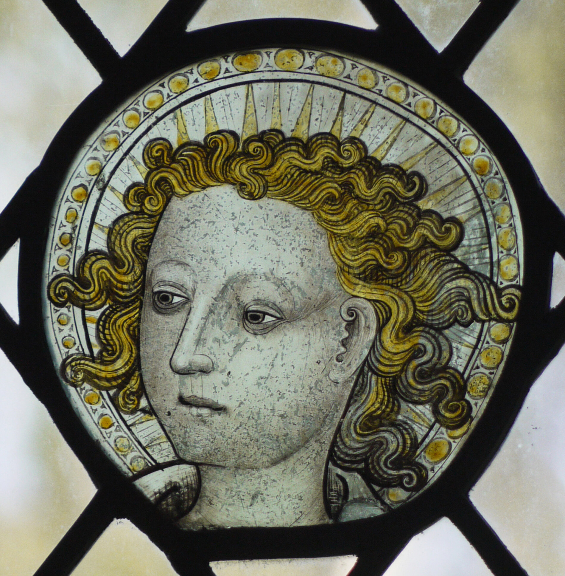
Stratton Strawless, the C15th angel head.

Stratton Strawless, glass in the windows of the south aisle.
Set into the windows of the south aisle are a collection of other glass fragments, including the heads of a bishop, a king with a fascinating web of lead lines where he has broken and a strange head which is all beard and no hair (above right). All of the other churches we drove to were locked, so thank goodness for a visit to Castle Acre Priory. Here were windows and arches, carved patterns and lines and among them just a few carved heads (below).

Stone heads from Castle Acre Priory.