North wall of St Peter Everleigh. Built in 1813 in the Gothic style and on an iron frame, with monument to Francis Dugdale Astley Esq. founder and donor of this church.
My trips to churches in the past few years have been generally unplanned, I stop if I pass one that looks as if it may be open and has an easy place to park outside. I had noticed that some of the loveliest, most uncluttered ones I visited were in the care of The Churches Conservation Trust whose website is up to date with current visitor opening times - no need to book!! - so we set off to see a couple of CCT churches near us in Wiltshire.

St Peter Everleigh. Left: East window, Right: South wall of the nave.
The interior of Everleigh church contains nothing ugly apart from those unevenly spaced wall lights on the north wall (top photo). There are wall monuments from the previous church in the village between tall windows with orange borders and a greenish glow from the trees pressing against them outside.
The glass in the east window by W.T. Cleobury is full of beautifully painted detail. I particularly like the mother and child panel (below left), the gaze and the hands of the shepherds point at them from one side and the three kings from the other. The best hand painting I have noticed from a stained glass firm I had never heard of, which is a perfect example of the surprises you get when you use your eyes rather than a guide book.

Everleigh, details of the east window by W.T. Cleobury 1873.
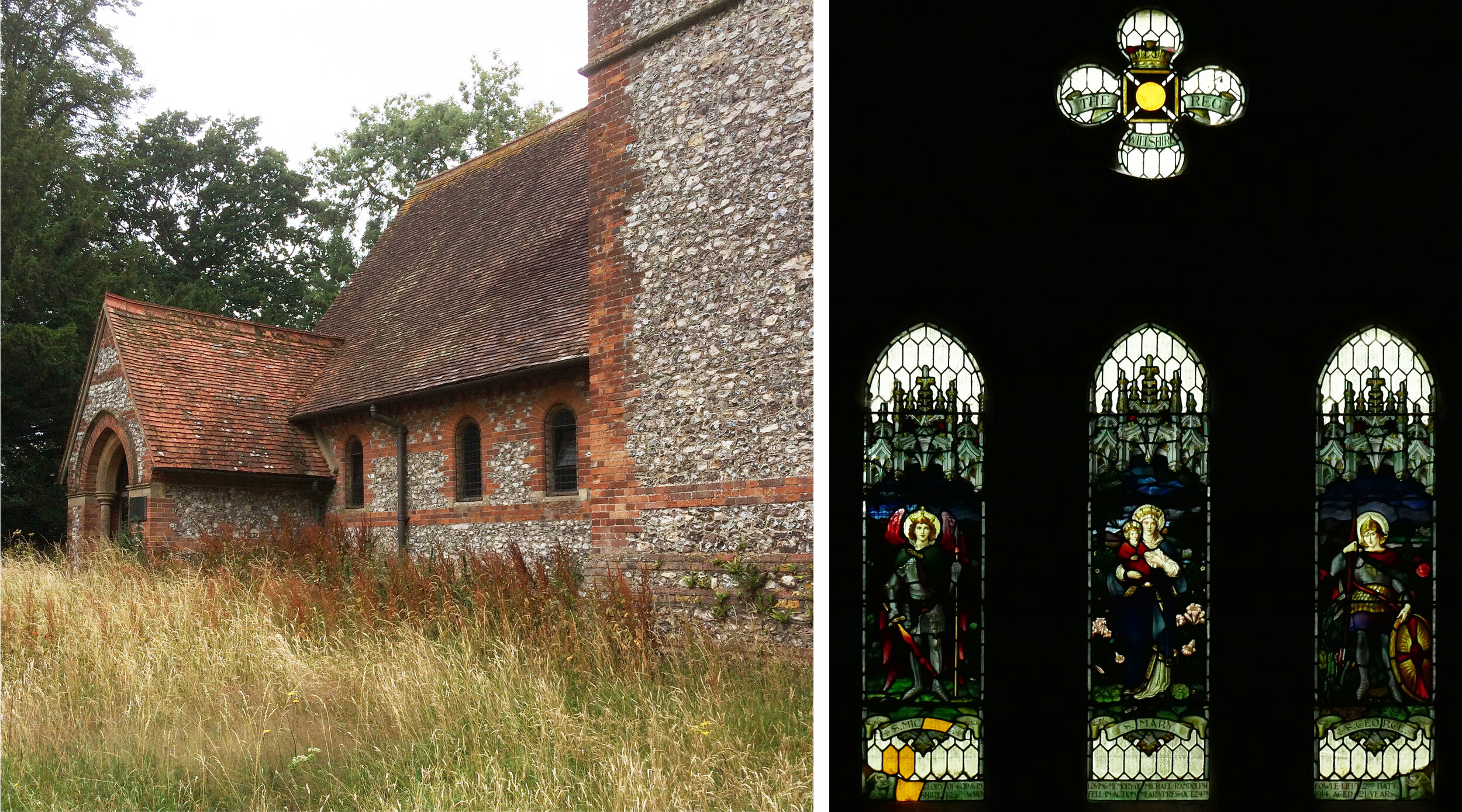
St Mary, Chute Forest. Left: entrance porch, Right: west window by Jones and Willis 1921.
St Mary, Chute Forest, is tucked away in an overgrown churchyard, again with nothing ugly inside or out. It was designed by J.L. Pearson and built in 1875 of brick and flint. The interior, with no electric lighting that we could find, had a perfectly Victorian atmosphere and perfect conditions for stained glass viewing on a drizzly day. The WWI memorial west window is moody, nicely painted and eccentrically repaired at bottom left with gold coloured glass (above right).
Chute Forest, Left: carved reredos in front of east window by Clayton and Bell, Right: window detail.
The east window is a lovely one, made by Clayton and Bell in 1875. The background to all the little scenes showing the life of Christ is covered in a web of sgraffito flowers which looks great against the familiar patterns of brick, tile and architectural ornament. You can find the same patterns and shapes in the church itself - the example below shows a lantern in the top of the left hand window and, in front of one of the deep window recesses, a lantern that reflects the colours of the stained glass.

Chite Forest, Left: top of the left hand window, Right: lantern with stained glass reflection.