Maternity Dorchester by Sasha Ward

MAT WINDOWSm.jpg

I’ve just installed printed translucent vinyl on 16 windows - that’s 98 panes - in the delivery rooms of the Maternity Unit at Dorchester Hospital. It was difficult to design (I started this project almost a year ago) and even more difficult to photograph the results. The designs are laid out in a block above, they are on a landscape theme with curved lines cutting across the unattractive window frames. The details within these curved shapes are mostly borrowed from things I’ve done recently and liked, but translated into a colour pallet that works with the pinks, purples and pale blues on the walls of the rooms.

Room 31 - before and during installation

Room 31 - before and during installation

You may wonder why you need to block a lovely view (above right), but where there is a view there is also a balcony covered in debris and privacy is what a woman who is giving birth wants. Some of the windows (below right) are overlooked by windows across the courtyard, so in both of these situations even the tops of the windows need to block the view while letting the light in and sending the curtains packing.

Room 12 - before and after, showing both windows against a pink wall.

Room 12 - before and after, showing both windows against a pink wall.

Room 1 - the curtains are going.

Room 1 - the curtains are going.

Room 27 - bed very close to the window, glow of light through the pale colours.

Room 27 - bed very close to the window, glow of light through the pale colours.

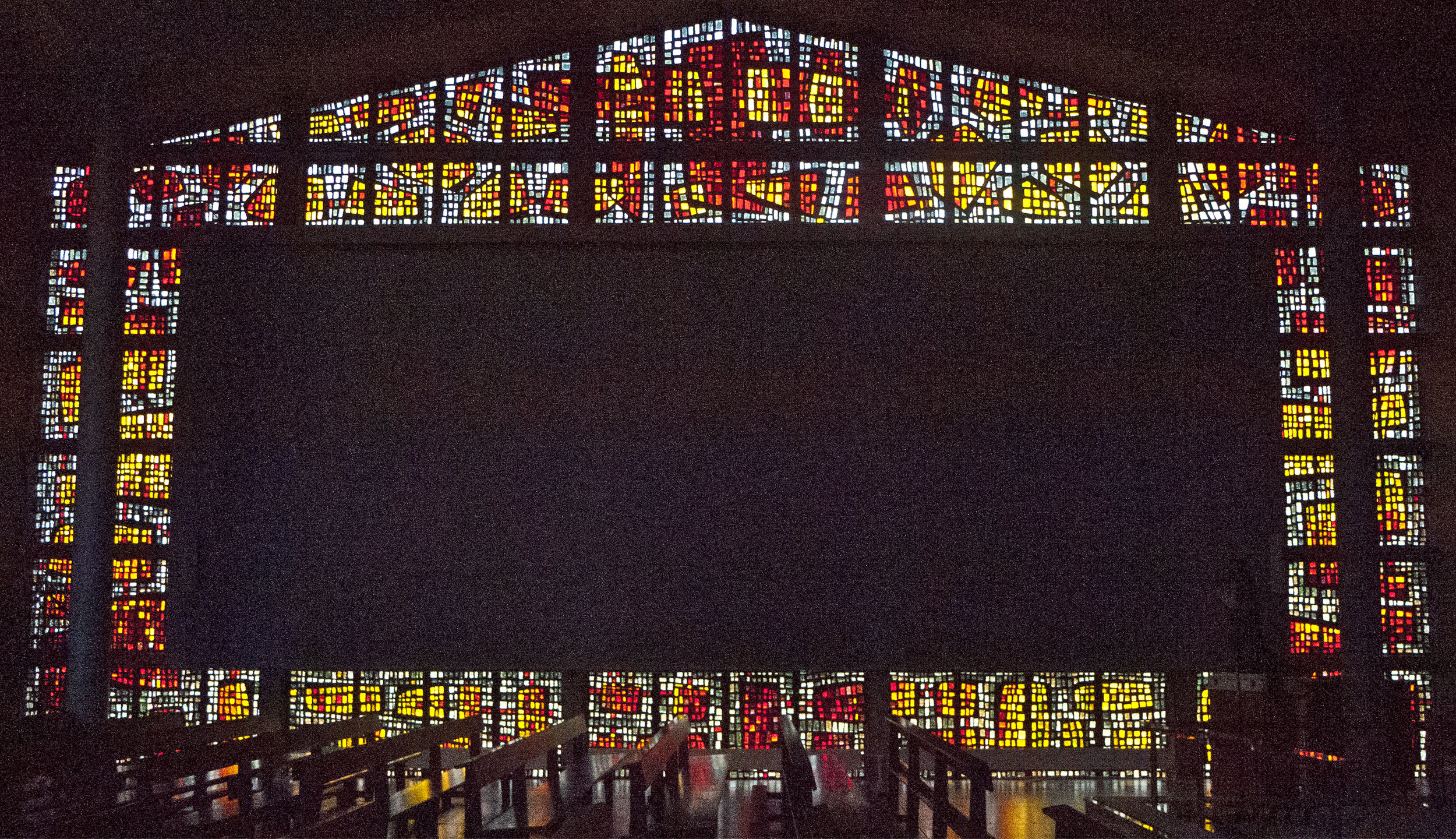
Working with digitally printed vinyl throws up its own surprises, obviously different from glass painting but with lots of qualities that translate across the two media. Room 25 gave me a shock similar to the one I get on opening the kiln and seeing that a coloured enamel has done its own thing, different from the sample. Often this oddity makes the work more interesting. So Room 25 with its block of luminous pink ended up being my favourite - the success of works like these is dependent on the colour combinations and I think that I’ve got that part right here.

Room 25

Room 25

Dalle de Verre Head by Sasha Ward

From the north wall of dalle de verre at Buckfast Abbey

From the north wall of dalle de verre at Buckfast Abbey

I’ve seen a lot of dalle de verre recently - that’s the french name, also used in english, for the slabs of coloured glass that are made into windows when they are set in concrete or resin panels. The quality of the glass, with characteristic shelling where the glass has been broken into smaller blocks, is amazing. The look you get when you design for the medium goes well with chunky style buildings, both old and new. The 1965 modernist Chapel of the Blessed Sacrament tacked on to the back of Buckfast Abbey contains one of the most well known examples in England. All of its windows were made in the 1960s by Dom Charles Norris, monk and graduate of the Royal College of Art, who went on to make dalle de verre windows for many other Catholic churches throughout the UK.

The outside of the Blessed Sacrament Chapel (Paul Pearn 1965) and Buckfast Abbey, Devon, rebuilt from 1903 - 38.

The outside of the Blessed Sacrament Chapel (Paul Pearn 1965) and Buckfast Abbey, Devon, rebuilt from 1903 - 38.

The famous window that I knew from a postcard I was sent in the 1970s is the truly horrible east window, shown below. It’s eight metres across, that makes Christ’s head more than one metre wide, and it’s not a pretty sight. I have seen massive stained glass figures before (e.g. Wispianski in Krakow) and I’ve also seen wonderful dalle de verre figurative windows (e.g. Gabriel loire in Chichester), so it is possible - just so much harder to do than an arrangement of luscious colours in attractive patterns.

8 metres wide - the east window in The Chapel of the Blessed Sacrament.

8 metres wide - the east window in The Chapel of the Blessed Sacrament.

South window, luscious colours in attractive patterns.

South window, luscious colours in attractive patterns.

Details from the south wall of the vestibule and the south wall of the chapel.

Details from the south wall of the vestibule and the south wall of the chapel.

North wall

North wall

The glass in the north wall particularly appeals to me and it demonstrates another stained glass truism - that coloured glass looks better without direct sunlight coming through it, the beautiful yellow with grey combination glows on its own. I also like the mysterious empty rectangle encircled by the glass. You can see the arrangement of shapes flowing across the solid blocks in the detail below which shows the same section from inside and out.

North wall inside and outside.

North wall inside and outside.

From Glass to Needlework by Sasha Ward

Window of the risen Christ and detail showing the little gold head, John Hayward, 1968.

Window of the risen Christ and detail showing the little gold head, John Hayward, 1968.

There’s lots of good twentieth century stained glass in the Church of St Mary and St Bartholomew, Hampton in Arden in the West Midlands. The window shown here is by John Hayward - with the unmistakable figures in profile, some hidden in backgrounds made of crisscross lines on blocks of colour. As usual, I prefer the details and the minor characters, for example the little gold head under Christ’s arm, to the overall composition. But the window looks great in its setting (below) with a wonderful bit of coordinated interior decor (how un church like!) in the embroidered cushions on the long bench leading up to the window.

View of the church interior, looking east from the entrance door, showing long bench on the south wall.

View of the church interior, looking east from the entrance door, showing long bench on the south wall.

There is an impressive information booklet that goes with the needlework, such as you never get for a stained glass window. Not only subject matter - “it depicts the risen Christ, holding aloft the flag, with his angels going out to bring the light of the resurrection to the souls of the departed” - but also details on the design and manufacture, with acknowledgements not only to the donors but also to the frame maker, design tracer, upholsterer and suppliers of the materials (John Cordwell, Robin Watkin, Parkes of Earlsdon and stitches of Solihull). The village needlewomen tell us they made a panel each and the project lasted from 2002-5 (!!!). They write “We were once again privileged to have the inspiration of the Reverend John de Wit, our priest in charge 1994 - 2004, for the design. It was decided that this should link with the window and thus bring the while concept into the body of the church….. One of the challenges has been to maintain the continuity of the designs because they flow from one panel to another and this had to be so exact for the joining of the sections” The concept and the linear version of the design works really well, although inevitably the bench was covered with leaflets and boxes when I was there.

Glass angel by John Hayward, needlepoint angel by Janet Hardcastle

Glass angel by John Hayward, needlepoint angel by Janet Hardcastle

It is interesting to compare the stained glass angels to the needlepoint ones, the hand positions show you which is which. More from the booklet “The canvas on which we worked uses ten stitches to the inch, which made the depiction of the details very taxing. For instance, one stitch in the face of an angel can make a huge difference to the expression!”

Needlepoint angels by Marjorie Iles and Janet Griffiths

Needlepoint angels by Marjorie Iles and Janet Griffiths

Christ Church, Southgate N.14 by Sasha Ward

North Aisle, left to right: Liberalitas & Humanitas (1899), Prudentia & Justitia (1885), Temperentia & Caritas (1876), Spes & Fides (1876)

North Aisle, left to right: Liberalitas & Humanitas (1899), Prudentia & Justitia (1885), Temperentia & Caritas (1876), Spes & Fides (1876)

I’ve rediscovered my enthusiasm for the stained glass of Morris & Company after visiting Christ Church in Southgate, North London. The windows in this church cover every period of the firm’s production from 1861 until the twentieth century, with designs by William Morris, Dante Gabriel Rosetti, Ford Madox Brown, Philip Webb and Edward Burne-Jones. The photos I’d seen were mainly those rare early windows designed, made and painted by the partners in the original firm, in the Victorian Medieval style i.e small figures engulfed by patterned borders and backgrounds. But the ones I really liked are shown in the photo below. There are pairs of figures in all the windows of the north and south aisle, they look great from a distance because of this consistency of design and are full of amazing detail and colour. Burne-Jones designed all except the figure of St. Francis which is the latest and is by Henry Dearle (1911).

Left: Detail from Liberalitas. Right: The figure of Justitia

Left: Detail from Liberalitas. Right: The figure of Justitia

The eight figures in the north aisle are all fantastic examples of the firm’s stained glass style as it developed, with gorgeous patterned backgrounds and drapery in Liberalitas and Humilitas (above left) and the use of amazing coloured glass, particularly in Justitia (above right.)

The next two pairs of windows were made earlier, the figures of Temperentia and Caritas are flowing and curvy, with a pair of astonishing babies, shown below left. The earliest two, Spes and Fides are plainer, calmer and they let in a lot more light.

Left: Babies at the feet of Caritas. Right: The figure of Fides

Left: Babies at the feet of Caritas. Right: The figure of Fides

South Aisle, left to right: Patientia & Pax (1909), Martha & Phebe (1903), King David & St Francis (1911), St Peter & St Paul (1865).

The figures on the south side are all much darker, particularly the matching backgrounds. Below are details of two of the figures, with beautifully painted faces, hands and clothes. In the set of windows in this church the faces are all different and quite mesmerising. At the end of the row (above right) are earlier windows of Saints Peter and Paul with wildly patterned surrounds, they are figures familiar to me from other Morris & Co windows.

Left: The figure of Patientia. Right: The figure of Martha.

Left: The figure of Patientia. Right: The figure of Martha.

The other pair of windows that show the designs of EBJ at his flowing best are high up on the north wall of the chancel, apparently the first ones where he used photographic enlargement of drawings to prepare the stained glass cartoons. All in lovely light colours and with a great detail of a rip over the knee of the ragged girl (below right) visible even from a distance.

North chancel: Left, Dorcas. Right, The Good Samaritan (1876).

North chancel: Left, Dorcas. Right, The Good Samaritan (1876).

Approach corridor by Sasha Ward

Vinyl/glass/vinyl window at Manchester Children’s Hospital: 1800 mm square.

Vinyl/glass/vinyl window at Manchester Children’s Hospital: 1800 mm square.

Sunburst was not the title intended for the piece I have just installed in a white corridor leading to the paediatric mortuary at Manchester Children’s Hospital. However in the record breaking February sunshine this week and framed by the corrugated sides of the hospital building outside, it glows like a gentle star. As you can see in the photo below left, dramatic shadows and colours are cast on to the floor - surely the best thing about stained glass. Evidently I hadn’t dared imagine the effect would be so good as the collage of my design on to the photo of the space shows (below right).

Left: Feature window at the entrance to the paediatric mortuary. Right: Photomontage of the same space.

Left: Feature window at the entrance to the paediatric mortuary. Right: Photomontage of the same space.

This feature window is part of a commission for artworks in the series of rooms that make up the mortuary. It was almost two years ago when I designed the work following consultation with staff and bereaved families and to a brief that asked for the artwork to be abstract, with no representational imagery and using gentle colours and shapes. Last month I wrote about the colour scheme and the door vision panels; there will be more on the wall designs (digitally printed wallpaper), wall panels and viewing windows when the new furniture arrives to complete the rooms later on.

Below is a page of sketches showing the development of the design for the feature window. I was concerned about working with - rather than fighting against - the horizontal bars and not blocking the wonderful view.

12 sketches showing development of the design

12 sketches showing development of the design

Window detail: vinyl on the left in this picture.

Window detail: vinyl on the left in this picture.

The feature window is made up of a hefty piece of laminated and toughened printed glass (2500 x 780 x 17mm) flanked by two pieces of printed transparent vinyl applied to the surface of the existing window. I hadn’t tried this combination up against each other before, and was apprehensive that the colours on the vinyl would look weak against the sparkling enamels on the glass. But they compliment each other well, the white/shadows are just as strong, and the pattern cast on the floor is colourful but subtle.

floorsm.jpg