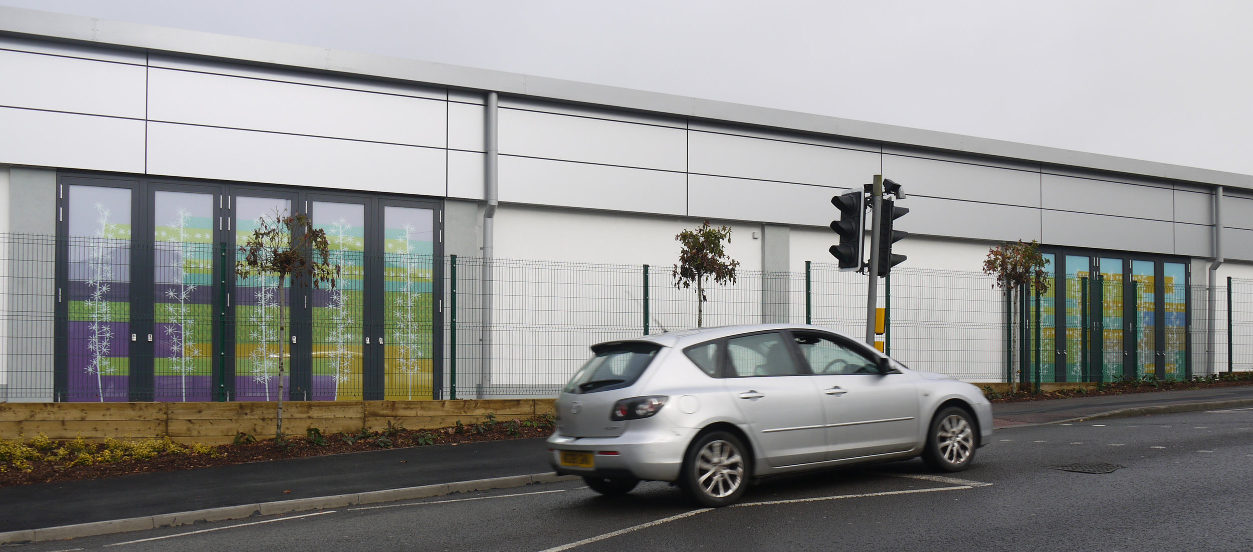
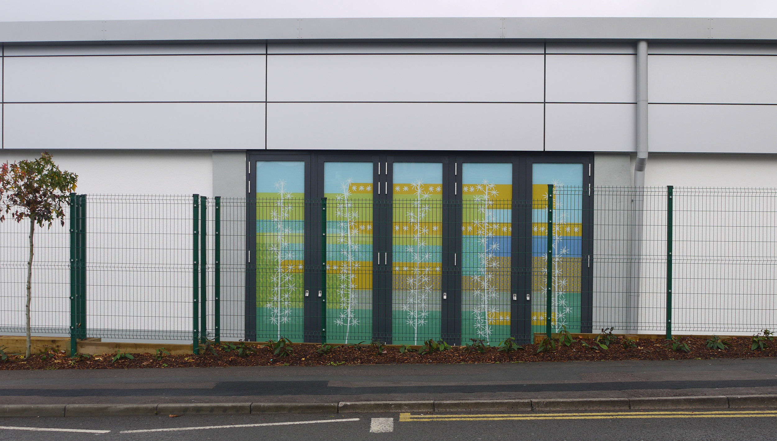
Lidl facade (are supermarkets the new cathedrals?)
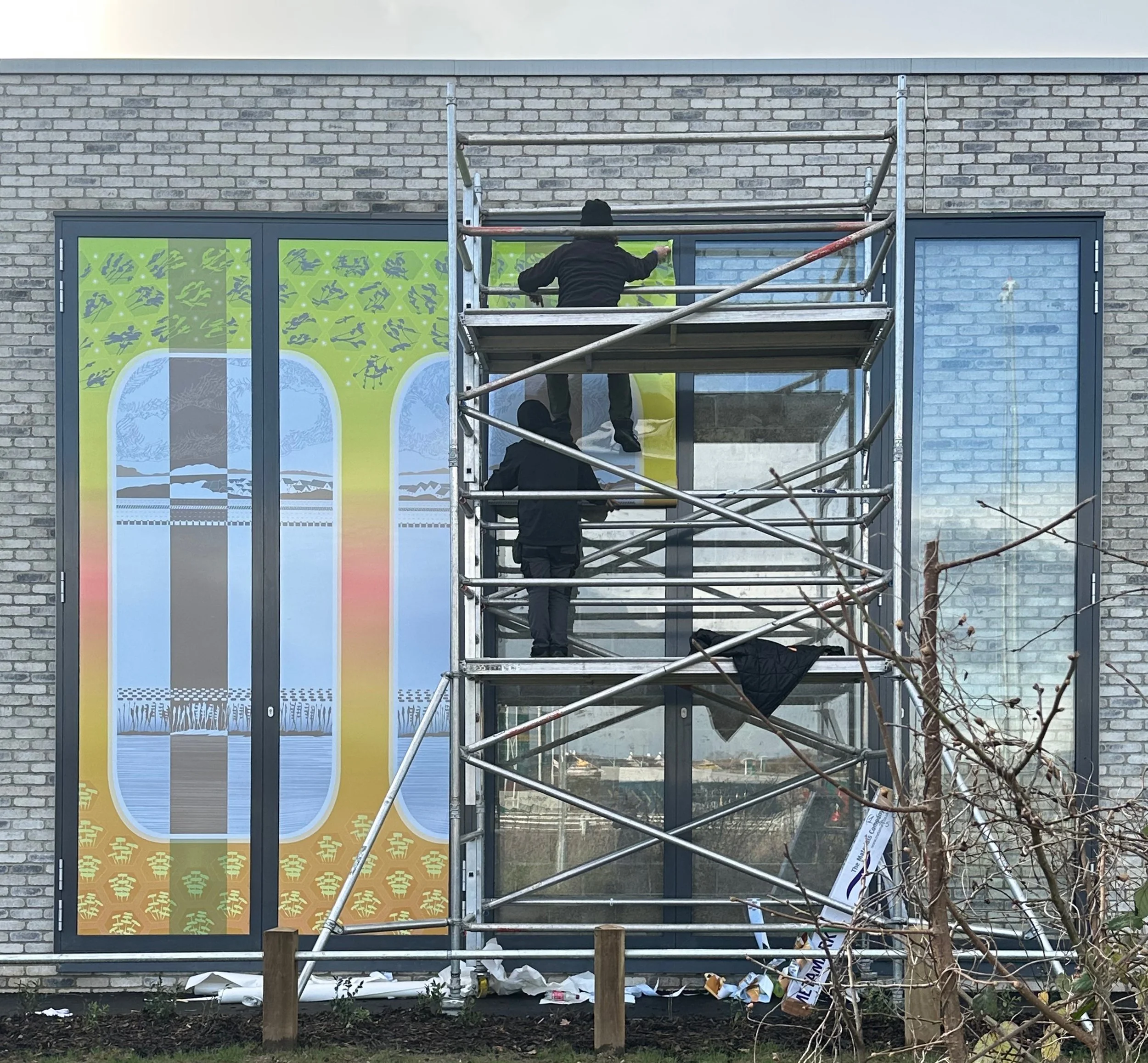
Installation day at Lidl, Berwick Green, South Gloucestershire.
I did a series of opaque window vinyls for a Lidl store in South Gloucestershire, where an art commission is a planning permission requirement, in 2017 (see link here) and again this year. In both cases these are not really windows, which I found depressing until a comment from an ultra positive friend who pronounced these architectural features to be “a lovely idea”. I certainly don’t often get the chance to work on such an exhilaratingly large scale.

Both windows installed. Each panel measures 4.62 × 1.14 metres.
My design presents a series of windows, slightly changing in colour, with views of a waterside path and a road bordered by local views under a cloudy sky. The sequence is broken up by the actual window frames and, as a counterpoint, by columns of trees where the colour scheme is reversed. The details are taken from my drawings of the area which is on the north west edge of Bristol and contains a network of routes, both visible and historical. Not only roads and motorways, but also a rail network, an airfield and a stream that I followed down to the River Avon.

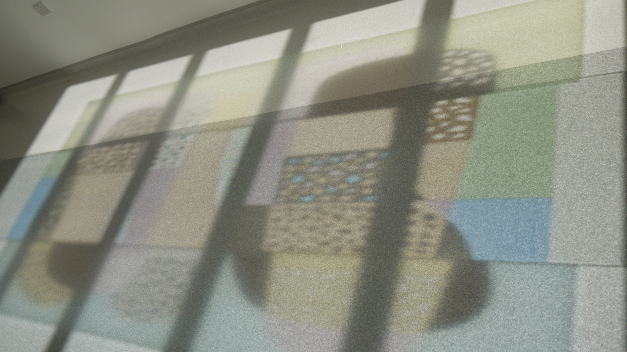
View from across the A4018

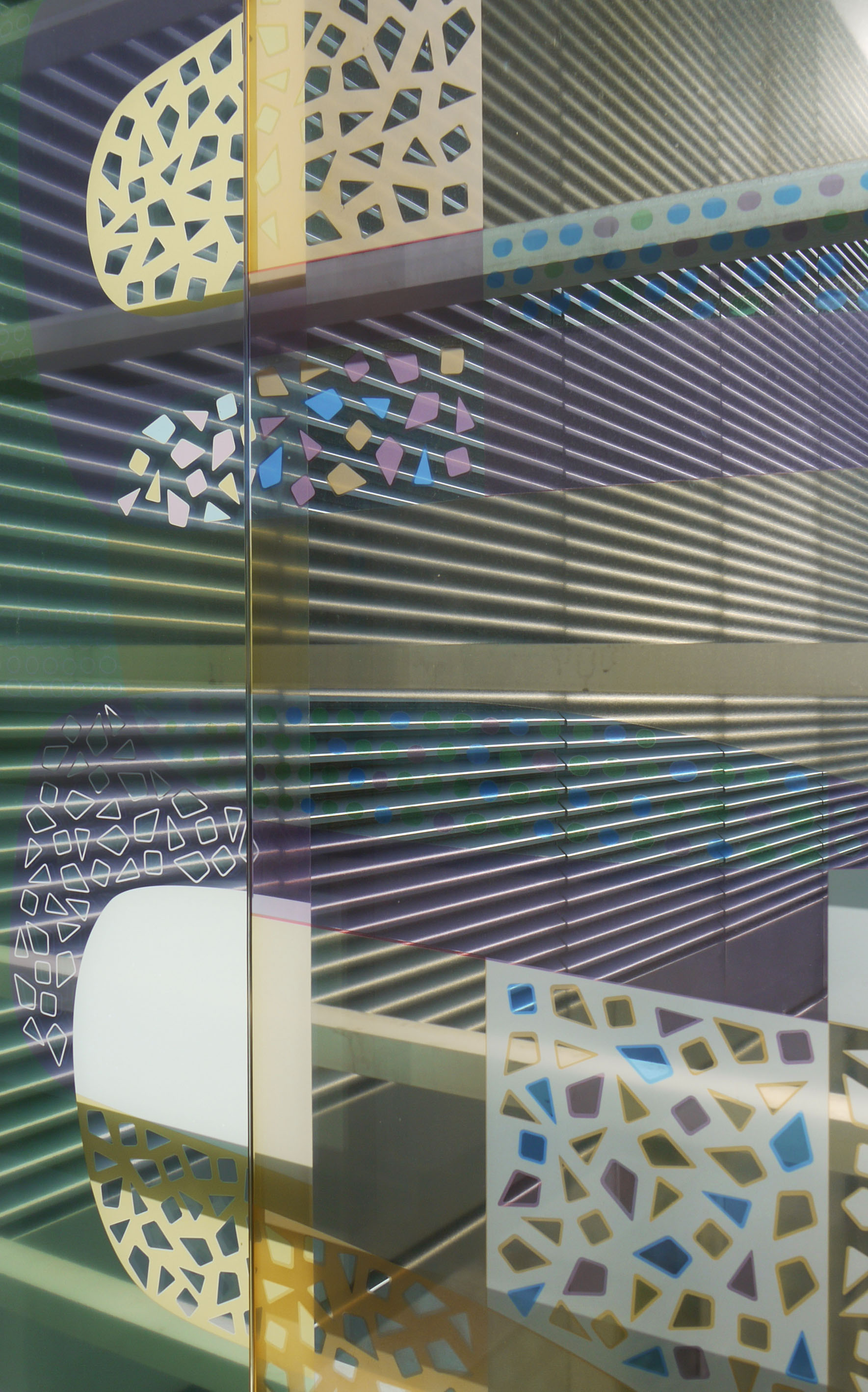
Computer screen shot of the design
Because the windows will mostly be viewed by car passengers rather than pedestrians, it is the overall design and the colour scheme that is the most crucial. The colours on my illuminated screen (above) are never exactly the same as the printed version which exists in the real world with changing light conditions and the occasional reflection, apart from that there is no difference between the design and the vinyl artwork. I’m happiest with the top section where you can see - although you’ll need binoculars or a zoom lens - a row of buildings wedged between cloudy vegetation and a six lane highway.

Detail, on the screen and on the window.