Along the River Windrush by Sasha Ward

St Nicholas, Asthall. Tomb of Lady Joan Cornwall with medieval glass above, window in the painted chancel.

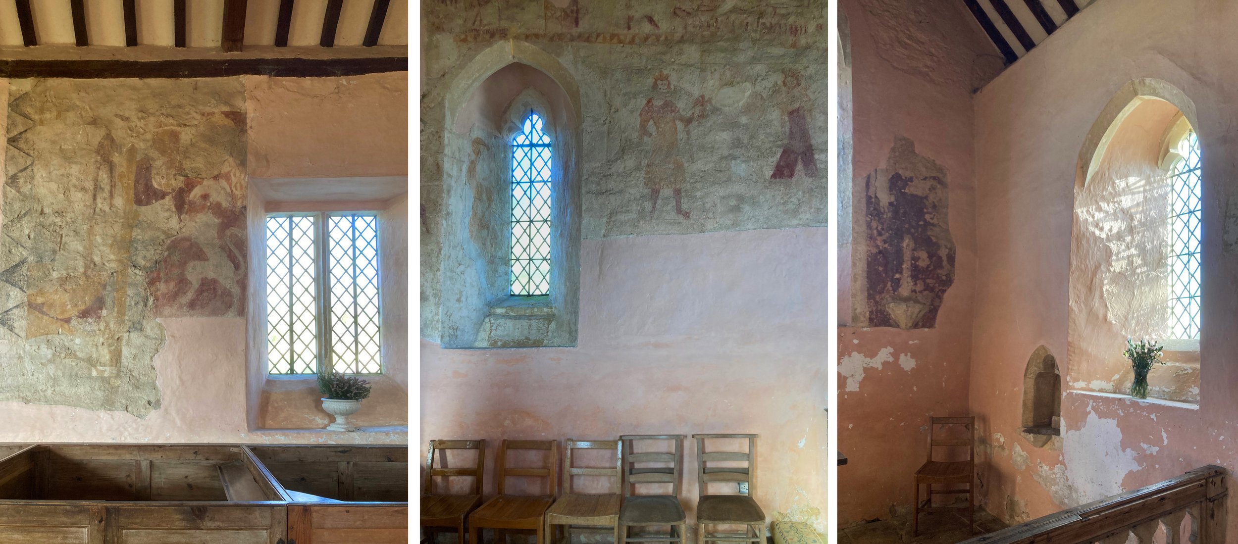
We took a route along the river Windrush in Oxfordshire starting at the village of Asthall, then to Swinbrook, past the deserted medieval village of Widford into Burford and back. There are four superb churches within these three miles. St Nicholas, Asthall (above and below) was unexpectedly spectacular, with painted walls, a huge tomb and some subtle stained glass windows that compliment the interior where nothing is out of place.

St Nicholas, Asthall. Chancel and detail of the east window.

We were really here because Asthall Manor was the favourite childhood home of the Mitfords and most of them are buried at the next church along the river, St Mary, Swinbrook. In her letters Jessica writes about walking across the fields to Burford to try and get the school there to take her on, so I knew it couldn’t be far. Nancy and Jessica were the only ones of the six sisters to complain about their lack of schooling, unfortunately we were not able to pay our respects to Jessica as she chose to be scattered at sea but Nancy is here along with Pamela, Unity, Diana and other Mosleys (below left).

Left: Mitford graves at St Mary, Swinbrook. Right: Frozen flooded fields beside the river Windrush.

St Mary, Swinbrook. The Fettiplace monuments in the chancel.

Inside the church are two sets of monuments (above) which put those poor little gravestones in the shade. The first set was ordered by Sir Edmund Fettiplace who died in 1613 for himself, his father and his grandfather: Sir Edmund Fettiplace II (who died in 1680) ordered the second set for himself, his uncle and his father. Again there is nothing ugly or unconsidered in this church, even the bibles are stylishly arranged on the chairs (below left). Next to them is a window made from fragments of ‘old glass’ that tell an interesting story - not least of the vicar who inexpertly arranged this glass with the text split by the stone mullion making it hard to follow.

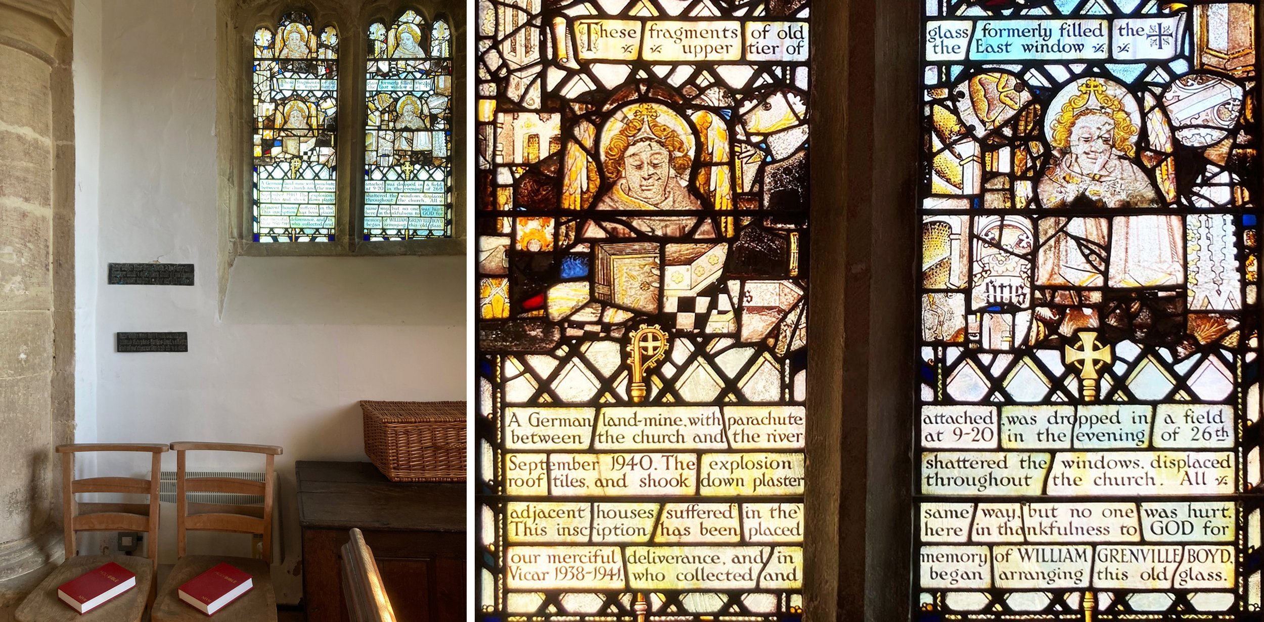
St Mary, Swinbrook: window with an interesting story.

Interior details from St Oswald, Widford.

Next to St Oswald, a tiny church in the fields a bit further along the river that was built on the base of a Roman house or temple. Here there are plain windows, more of those simple chairs, pink plastered walls and the remnants of fourteenth century wall paintings, including a St Christopher opposite the south entrance door (above left).

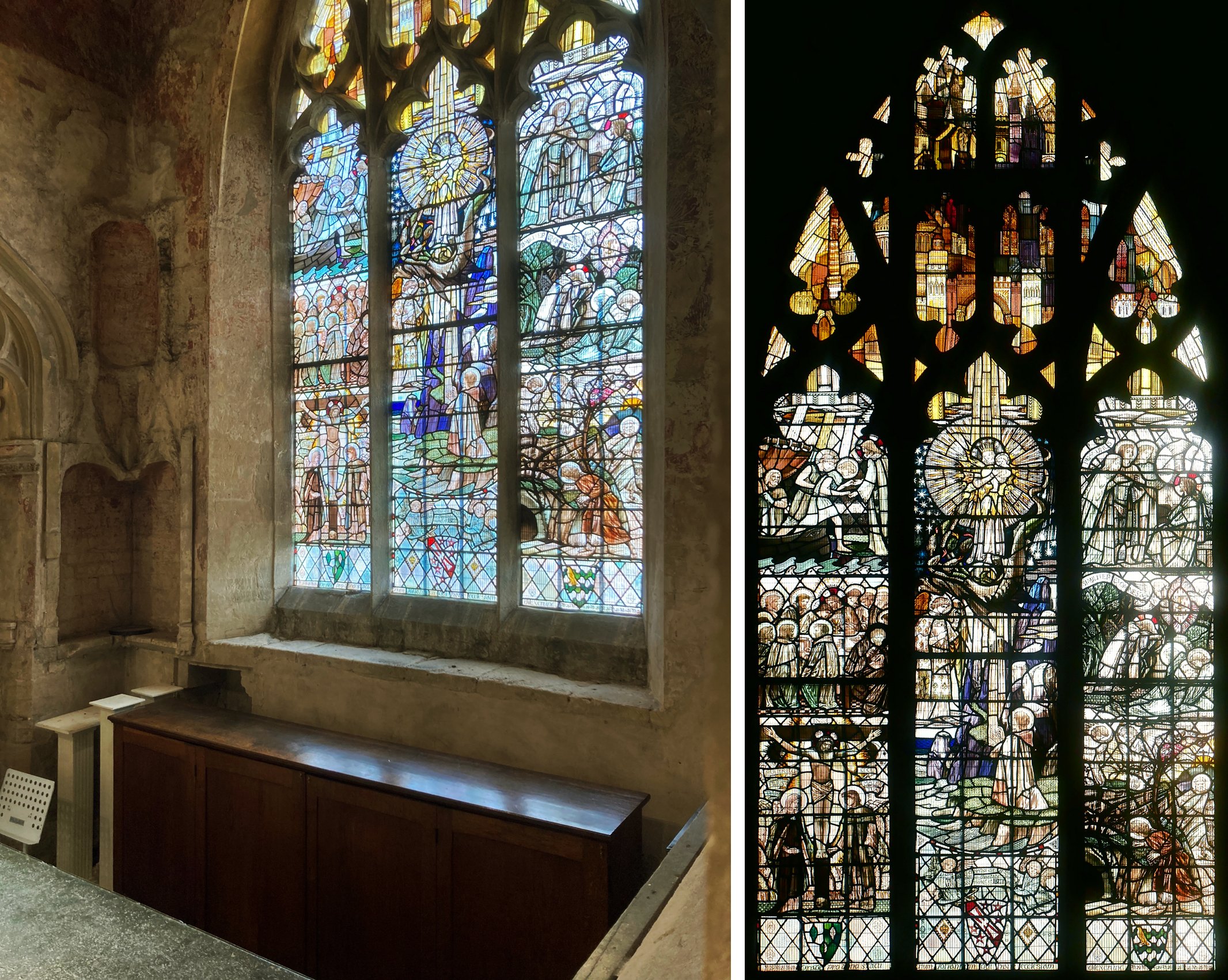
St John the Baptist, Burford, south window of south transept by Christopher Whall, 1907.

After these three beautiful interiors, entering the much larger church in Burford with its inevitable clutter of merchandise, furniture and audio visual equipment is a bit of a shock. However the Christopher Whall window in the south transept is one of his masterpieces, I kept going back for another look as I caught glimpses of it from different angles that showed how subtle both the colours of the glass and the arrangement of the design are, even with a bright winter sun shining through. I am always keen on paintings of the heavenly city, shown in the top section here and providing an interesting comparison to the city depicted in the earlier east window at Asthall. The bits of restrained patterning that link the top and bottom sections of the window are particularly satisfying (below left), as is the pair of little quatrefoil windows that just contain non symmetrical arrangements of beams of light behind the buildings which Whall drew from places he knew and loved.

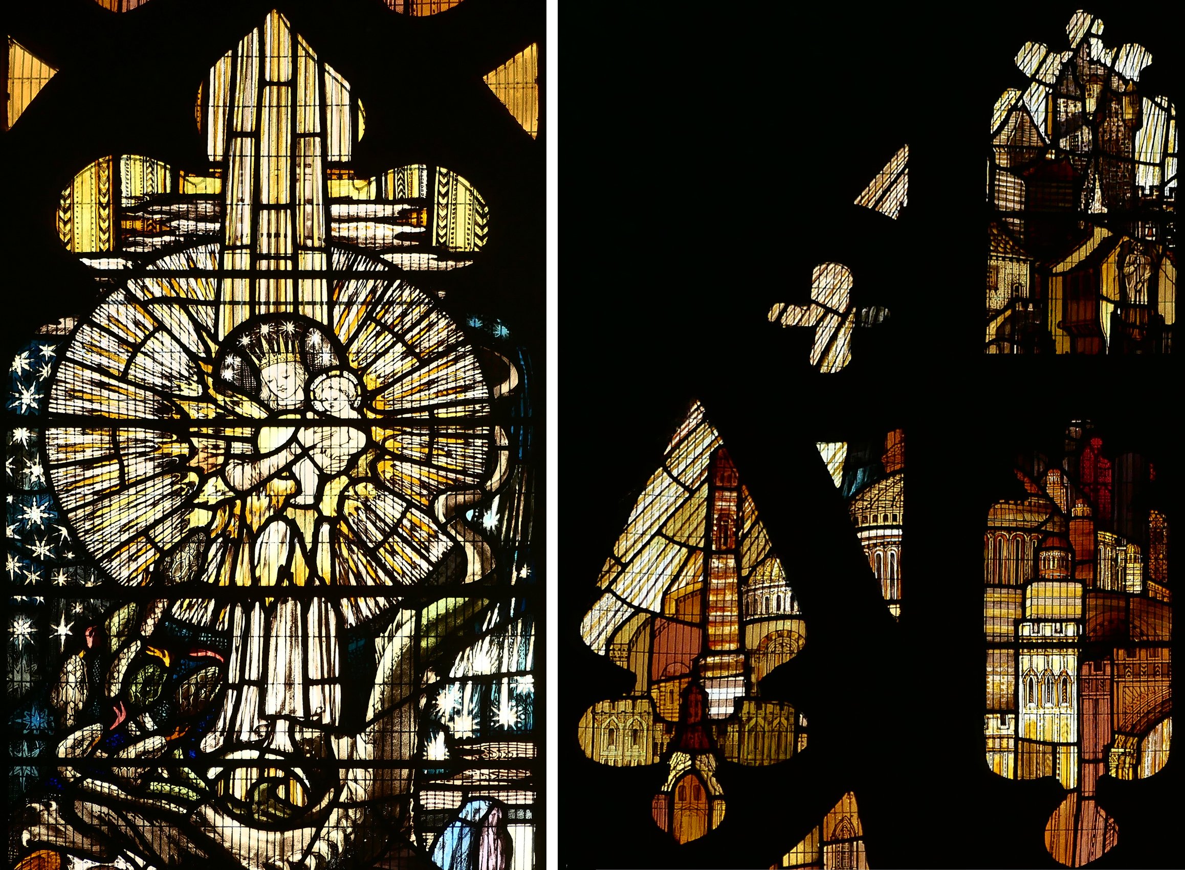
Details from the Chrustopher Whall window in Burford.

Christmas Cards - Year 8 by Sasha Ward

Our cards - above 2022 & 2021. Below 2020, 2015 and 2018.

As we got fewer cards than usual this year and also because I have become rather critical of the ones we do get, I thought it was about time to add the ones that we send out to my annual Christmas card survey. These five are the ones I could find copies of, as you can see we are trying to do something about the scarcity of stained glass and nativity scenes that I’ve noticed over the years.

You may also notice than none of them is square. Like last year, over 50% of the cards we got were square while only 15% were landscape format. 46% had an animal or bird as part of the imagery, 10% had a religious scene and 10% had presents or Father Christmas. 37% were homemade (or designed by the person who sent it) which is a pretty steady statistic. The unwelcome trend that I noticed last year, i.e. writing on the front of the card, is the same as last year at 30%.

Here are four of the best from this year. Above left, the best shop bought one (from the V&A) and above right, the best photograph. Below are my two personal favourites mainly because they are both really well made which is hard to keep up when you’re making lots of cards. Most of the ones in the homemade category are, like ours, printed on a home printer.

Finally, a special mention for the Chrismas hares!

Drawing branches by Sasha Ward

Design for back door window panels, 3 versions, 2022.

The design for my latest commission, glass panels in a back door, was going well but there were large spaces in the middle of it that needed filling. In the end, I went with a motif I use a lot and that is based on tree branches (above). These days I don’t feel the need to go to the forest and draw the shape of the branches, instead I make them go in whatever direction is best for the design.

Illustrations by Jan Pienkowski for The Kingdom Under The Sea by Joan Aitken, 1971

Ray reminded me that we have been having the same discussion about how best to draw branches since we were students in the early 1980s. It’s one thing to go out drawing in the summer when leaves add more detail while also simplifying the shape of the whole tree, but quite another thing in winter when the shape of the branches are defined against the sky or the landscape. We came to the conclusion then that the Jan Pienkowski route, where branches are silhouettes, was a good way to go. These illustrations (some examples above) were favourites from our childhoods, and looking at them now I consider him to be an artistic influence.

I said Tell me the Truth, drawing by Ray Ward (left) stained glass by me (right) 2020.

Take this Ray Ward drawing (above) where the trees were from a memory of a scene in Cornwall. When I came to do the stained glass version I didn’t want to change a twig, so I painted the branches on a piece of purple streaky glass placed on top of a photocopy of the original drawing.

The Prophecy of Anguish, painting by Ray Ward, 2021.

Ray’s black and white egg tempera painting on gesso (above) has a design for bare branches that I find even more impressive. The curviness of the ancient tree with its feeble looking branches is offset by a web of sharp twig lines behind and a pattern of vertical lines over the trunk in the foreground.

The State Hospital, Carstairs, detail of glass screen and design, 2011.

Looking for examples of branch techniques in my own work led me to a screen I made for the top security State Hospital in Carstairs, Scotland (above). In this design the pine branches cross bands of vertical lines that descend at a 90° angle from the pitch of the roof as if they are part of a woven cloth, where small twigs alternate with patterns of squares in the white cloudy sections.

Premier Inn, Liverpool, detail of corner window and design, 2012.

Sometimes when the work is for a public commission, the subject matter needs to be optimistic and a few leaves are required to indicate that spring is on its way. Leaves don’t suit my style as much as branches do, but I found an example of cherry tree branches from a large corner window I designed for the Premier Inn on Hanover Street, Liverpool - an area once full of market gardens and ornamental trees but now much in need of any type of greenery.

Bathroom Doors by Sasha Ward

Colour samples, screen printed and hand painted enamels.

When I meet a new client, I usually have the three glass samples shown above in my bag. I have made hundreds of these over the years as I experiment with the colour and texture of overlapping stripes of vitreous enamel and iron oxide on clear glass, but these three are somehow the best and most admired. On the latest occasion my client liked the samples so much that she wanted a design for the glass panels in two bathroom doors based on the idea of the colour sample.

Colour samples in my studio windows.

Once I’d worked out the best proportions for the horizontal and vertical bands on the tall thin door panels, I set to work on new sets of colour samples using an etched, therefore transluscent rather than transparent, glass. One set was based on a golden colour range, the other set needed to coordinate with the bathroom’s terracotta tiled walls and floor. It’s hard mixing transparent glass enamels to match a colour, particularly in the warm orange range where things easily go towards brown - as you can see in the nine samples for this project in my studio window (above right). As much as the amounts of each powdered enamel you put in the mix, the result is affected by how you apply the enamel, in this case I hand painted (as opposed to printing or spraying) to achieve the textures in the original favourite samples.

On the table (below left) you can see the glass on my lightbox with the vertical stripes fired on and the samples I’m trying to match above them. The finished panels (below right) show the second layer of horizontal bands in a contrasting but paler colour range of greys, greens and some blue.

Left, half done panels on the table. Right, two finished panels in the studio.

First floor bathroom door installed.

The panels are finished and installed before the rest of the rooms are ready - so fingers crossed for their safety while work goes on around them. Both sets of colours are good, not exactly the same as the samples of course, with some unexpected mixes and welcome blemishes. The best aspect of the painting is that I have kept the layers light and thin which is a good glass painting tip - it’s easier to add than to remove.

Second floor bathroom door installed.

Royal Liverpool University Hospital by Sasha Ward

This was a commission that I thought would never get finished. A new Liverpool Hospital has been built next to the old one which is due for demolition. During the course of its construction, the main building contractor, Carillion, went bust, faults were discovered in the building and with the cladding that had been used causing further costs and delays which were added to by the pandemic. The selected artists, who had been contracted to Carillion, stored their work and waited to see what would happen next. Understandably, my enthusiasm for the project started draining away as the seven oval glass panels I had made were stored behind my kiln for five years.

Drawing for glass and wall design at Ward 7A, 2015.

The selected artists had each been asked to design work for walls next to the four ward entrances on their allocated level, mine was the seventh with bright green accents. Hospitals often ask for artwork that is organic and curvy, definitely not geometric, a look that I have struggled with over the years of doing commissions for health care settings. On this occasion I decided to go for no straight lines or interlocking patterns, taking inspiration from the natural world rather than the urban environment. For each location I designed a swirly drawing that would be printed on vinyl wallpaper with shaped pieces of glass mounted on top of a pool of pale colour.

The wall next to Ward 7A (above and below) changed shape and colour during the course of the years, with a piece of glass that is the biggest and I think the best. It was hard to photograph on installation day with reflections from a screen opposite and equipment stored up against it (below).

Ward 7A during installation, left wallpaper, right with glass on top.

Ward 7D, from drawing to glass, 2015 & 2022.

Ward 7D is similar, and for this one my first drawing (above left) shows the initial concept where lines and circles spiral into the pool of overlapping colours. However, the blank wall had been too much for someone to resist, and when I visited just before installation I saw that a square access hatch had been cut into it so I moved the glass up and some white lines around on the design. This wall is opposite a window which provides some great reflections of the the new building (below right) which is white and grey and spiky in design.

Details of wall and glass at Ward 7D.

Drawing for Ward 7C, 2016.

The wall leading up to Ward 7C had room for two glass panels above the crash rail. My watercolour drawing for this one (above) is closest in feel and colour to the work installed. The changes I made to the shape of the lines and the positioning of the panels happened because of a fire alarm that I had to keep well away from. The detail (lower right) shows how the ceiling lights are effective in picking up the lines sandblasted on the edge of the glass and mixing them with fine white lines printed onto the background vinyl.

Entrance to Ward 7C

Details of the glass at Ward 7C

Drawing for Ward 7B

The wall leading up to Ward 7B, six metres long, is the one that didn’t change so neither did the lines on my watercolour drawing (above). It’s a piece of wall between bays of windows - wouldn’t it be lovely and simple to be able to go back to doing windows again! This series of three looks the simplest and cleanest with an unfortunate resemblance to a row of washing machines.

Wallpaper and glass for Ward 7C

Corridor at Ward 7C and detail of glass panel during installation.

Overall, I am delighted with my last hospital commission. The no straight lines design looks effortless and was very easy to alter over the years and to install. Above all the colours look great, the transparent enamels on the glass are strong against the pastel coloured wallpaper and complement the tricky green on level 7. It’s hard to find your way around this building, hopefully this commission will help you remember the way and give you a boost of energy as you watch the patterns swirling around.