Whenever I see beautiful lettering decorating the walls of a church I think what a good idea it is to use meaningful texts to embellish a church interior. The inscriptions on stained glass windows however, are rarely as interesting to me, usually being an account of who commissioned the window and when they died placed in a predella type panel at the bottom.
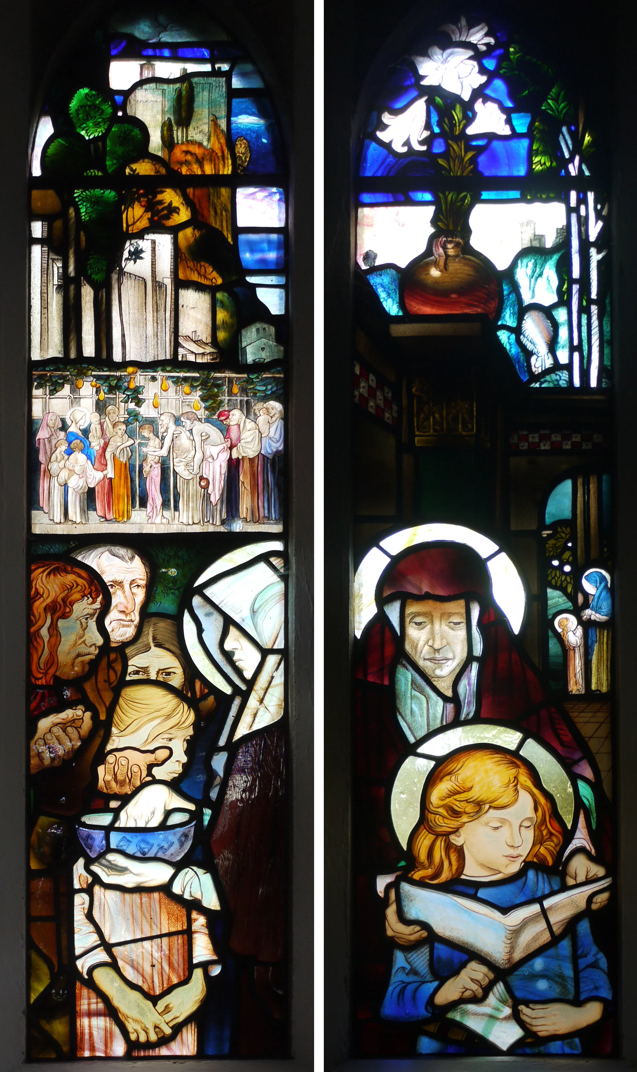
Left: St Winifred’s Church, Manaton, Devon. Detail of window by Frank Brangwyn 1927 Right: St Andrew’s Church, Cullompton, Devon. Detail of window by GER Smith c 1950
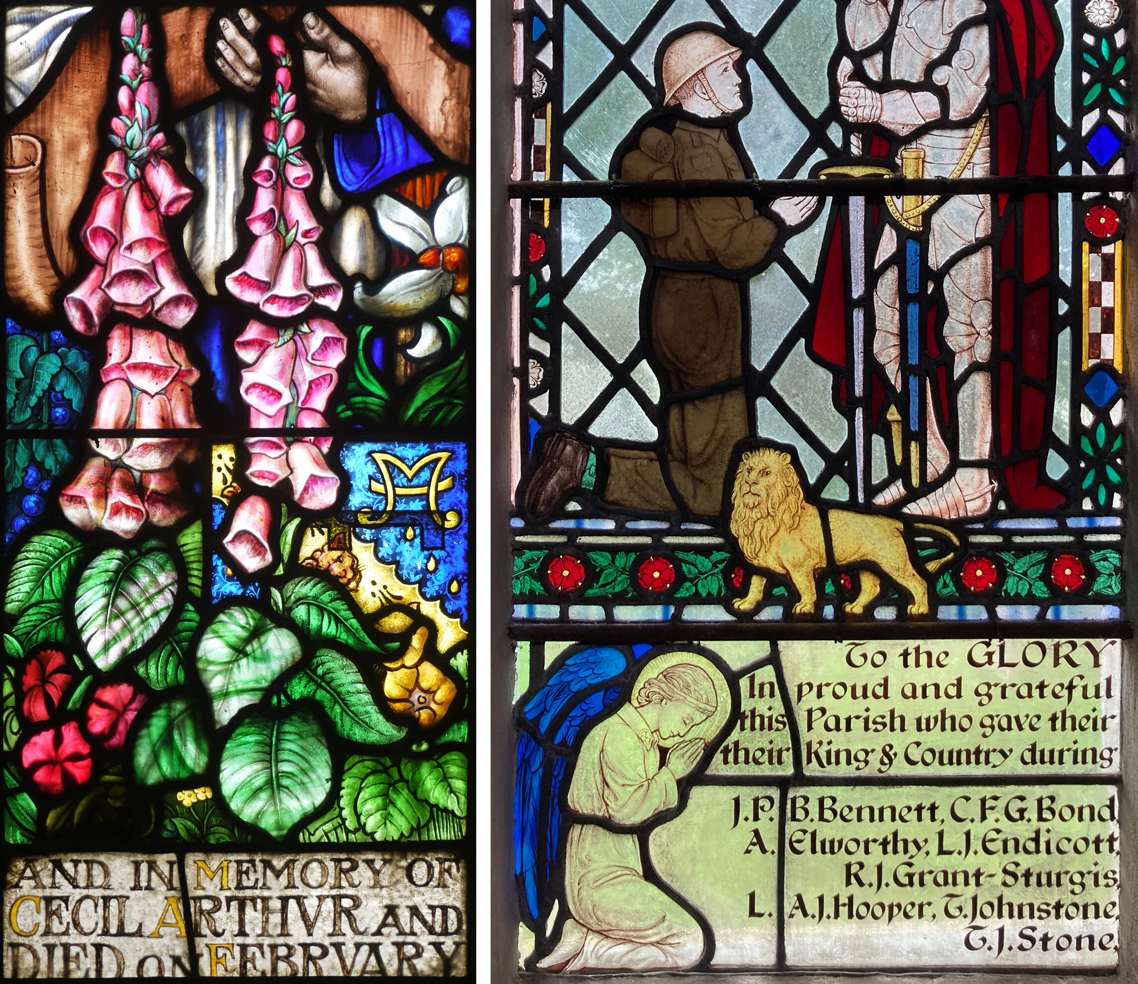
Some examples from twentieth century windows seen on recent church visits (above and below) show a variety of lettering style with borders and backgrounds, and a tendency to run the sentences across the two or three lights in each window so it is hard to make sense of the narrative. I prefer the inscription, light on a dark ground, by Robert Anning Bell (below left) where you read a complete sentence in one pane and find out when the person commemorated was born.

Left: St Paul de Leon Church, Paul, Cornwall. Detail of window by Robert Anning Bell 1917 Right: St.Matthew’s Church, Midgham, Berkshire. Detail of window by Francis Skeat 1955
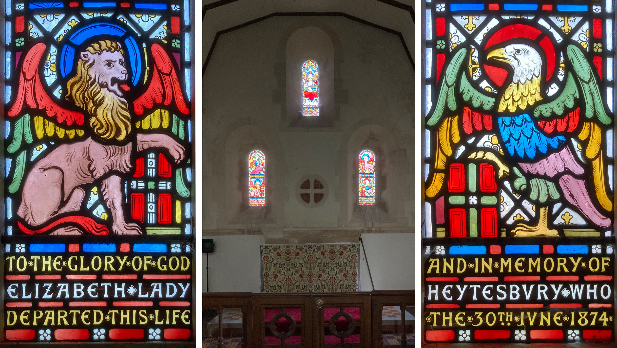
St Margaret’s Church, Knook, Wiltshire. East windows by Alexander Gibbs 1874.
This wall of windows (above) in a tiny church restored by William Butterfield in 1874 with windows made by Alexander Gibbs, shows how far apart the parts of the sentence can be, with Lady Heytesbury’s name split either side of the altar. The lettering, in rows separated by bars of red glass, is truly a part of the design, colourful and legible from a distance.
At Heytesbury in the same parish is the large church of St Peter and St Paul, also restored by William Butterfield with windows made to his designs by Gibbs. Here, the panel of text is truly spectacular (below) in departure board style, with triple rows of coloured glass between the lines of white and yellow writing.

St Peter and Paul Church, Heytesbury, Wiltshire. Detail of north window by Alexander Gibbs, 1867
The arrangement of these stripes of writing, taking up vertical space in one narrow window light, reminded me of the one in St Nicholas, East Grafton (below). Here there are coloured bands at the bottom of the panel and patterns at the top, the script is surprisingly easy to read and the message is meaningful as well as decorative.

St Nicholas Church, East Grafton, Wiltshire. Detail of East window by Heaton, Butler and Baine 1888.