Neutral Tones by Sasha Ward

Samples of glass fired with transparent enamels and oxides in layers.

I wonder if there is such a thing as transparent grey. The question has come up while designing a window which the client would like in neutral tones, like my inky black and white drawings. All the samples I have made so far have too much colour in them, this comes from the metallic elements these powdered enamels are made of. So I thought of watering down an opaque black with a transparent flux, which was the point at which I realised there is no such thing as transparent black, nor therefore transparent grey. All the areas that look grey aren't very transparent, they're full of small black bits suspended in a clear medium. And there is no such thing as transparent white either, which could be why we stained glass people call clear antique glass "white".

Leaded panel using a piece of every different colour in my studio and scraps of neutral.

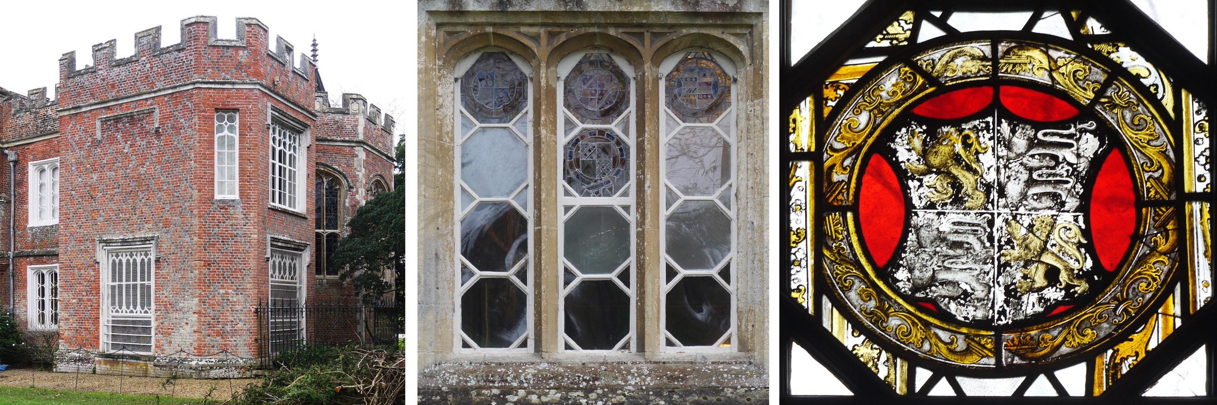
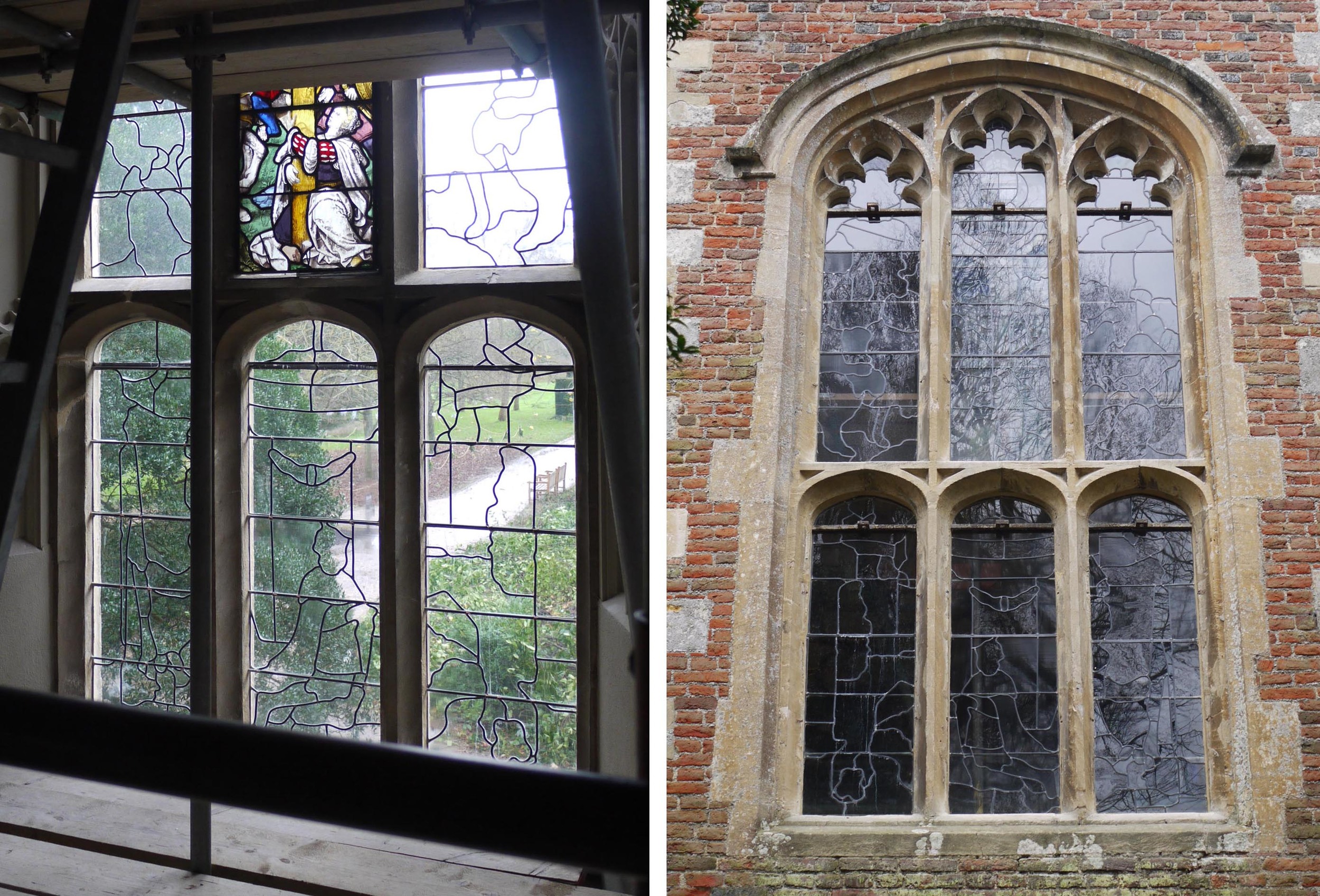
Colour compositions in stained glass using pieces of transparent coloured glass, like the one above (made by my daughter/work experience student), benefit from a lot of neutrals amongst the bright colours. Sorting through my scrap box I found a selection of neutrals and some opaque black and white - that's as close as it gets to grey. The pieces I was looking at on my lightbox (above right) led me to the words of my favourite Thomas Hardy poem, I can even see the pond and the winter leaves in the glass. It's like that outdoors today.

neutral tones-1.jpg

Rotating Repeats by Sasha Ward

Patterns with curling lines pointing inwards                                                 "Norfolk" plate

Inspired by looking at dishes, and thinking of painting some myself, I have been drawing patterns that repeat as they rotate. The curling lines I drew started growing into trees. They point towards the middle of the circle as I would draw them if designing a roof light or domed ceiling. However, when I wanted to add a landscape element to the design (as I often do) and looked at the decoration around the edge of the "Norfolk" plate I bought this week, I saw that the right way for the landscape to point around a plate is outwards. (I'm not mad on the flat vignette in the centre).

I've made a number of circular overhead & underfoot commissions. The one I have been reminded of while rotating the repeats this week is from 1997 for Leeds General Infirmary. The abstracted landscape, or cityscape, points inwards on the glass ceiling light and outwards on the lino floor design beneath. The intention was to make the viewer feel as if they were in the centre of things, with the patterns spreading out into space.

Lift lobby, Leeds General Infirmary & preliminary sketches for the glass ceiling light and cut lino floor design, 1997.

The left hand dish sketch below adds a contrasting landscape to my original curling trees. It was then that I realised I needed to turn them around to point outwards resulting in dish sketch number two.   

Dish sketches number one and two, 2016.  Click on images to enlarge.

Analysis of the Christmas Cards by Sasha Ward

Three of the best

Three of the best

The cards are my favourite of the Christmas rituals: making them, then actually getting some post for a change, displaying them and, best of all, analysing the Christmas card collection. This year there has been no clear winner in the best card category and - in a shocking development - no stained glass cards.

The statistics are as follows : 17.5% home made, 17.5% home printed, 65% bought.  Format: 38.5% square, 37% portrait, 14% landscape, 6% postcard.

Some cards from the most popular subject categories are shown here. We had 11 cards with reproductions of well known artworks (2 examples at the top): 7 of a single tree (the best ones above): 5 of birds (the best ones below).

As a series, I particularly like the street scene category shown below. Perhaps the card at bottom left is the real winner as it straddles the well known artwork (Ravilious), tree and street scene categories.

ST Mary's Church, Cheltenham by Sasha Ward

I've learnt not to ask about the stained glass when visiting churches as the information I want (who made it? when?) is rarely there. I am usually told that it's only Victorian and then given stories about the iconography. However in the oldest building in Cheltenham, St Mary's Church, there are two guide books which in combination tell you almost everything you need to know. One takes you around the church with pictures, plans and bible references, while the other (not to be taken away) gives you historical information.

The Rose Window, William Wailes glass 1879         Detail from the Central West Window, Heaton, Butler & Bayne 1885

The Rose Window, William Wailes glass 1879         Detail from the Central West Window, Heaton, Butler & Bayne 1885

The beauty of The Rose Window (above left) is in the fourteenth century tracery, slightly angled and very low in the wall  - east facing in the north transept. All of the windows on this level are filled with stained glass from the late nineteenth century.  Here are photographs of some of my favourite details: the H,B&B radiating star (above right), The Parable of the Talents (below left), foliage done in a completely different way by Clayton & Bell in the window of St. Peter (below right) where I also love the painted ship and the pale landscape colours.

South Aisle, Bell & Son 1877                                                      The Chancel, Clayton & B…

South Aisle, Bell & Son 1877                                                      The Chancel, Clayton & Bell 1879

I'm not able to guess which firm made the North Transept window (information missing from the book) whose apostles showed up well in the afternoon sunlight (below). The L,B&W Last Supper Window also looks particularly good in the fine ancient tracery and is full of the sort of details that people love to point out. This from the guide book: 'Can you see the disciple with the brown halo in the far right panel? This is probably Judas Iscariot..." 

Top : Matthew, Mark, Luke & John from The North Transept Window.  Below : The Last Supper Window, Lavers, Barraud & Westlake 1880 

Top : Matthew, Mark, Luke & John from The North Transept Window.  Below : The Last Supper Window, Lavers, Barraud & Westlake 1880


The Outside of Stained Glass by Sasha Ward

The Vyne (NT, near Basingstoke) and some of its heraldic glass

The Vyne (NT, near Basingstoke) and some of its heraldic glass

Fantastic fenestration at The Vyne, those glazing bars that form octagons, triangles, lozenges and diamonds also contain some great heraldic glass. You can tell how good it is - and well restored - from the outside (above).  My favourite panel on the right, the arms of Henry VIII, has lions painted and scratched back in such a way that it is easy to imagine the painter's hand at work. 

C16th glass : the base of the Crucifix and Henry VIII panel

C16th glass : the base of the Crucifix and Henry VIII panel

Inside the chapel there is a rare opportunity to get close to the exceptional 16th century glass by climbing the scaffolding that is there while the glass panels are conserved. The crucifix panel (above left) is already in place and the one featuring Henry VIII is on display on a light box in the house, also great for a close up view. Adjacent panels feature Queen Margaret of Scotland (his sister) and Catherine of Aragon.

panel 2.jpg

It easy to see where these three figures, together with gorgeous canopies and name Saints, will go by looking at the leading pattern in the clear glazing installed in the chapel windows before the coloured ones arrive back. Curious idea, but It looks good from the outside (above right) while protecting the precious glass inside. 

How good to get so close up to Henry VIII, portrait at about 30 years old. Glass possibly by Flemish glaziers, commissioned by Lord Sandys of The Vyne in the 1520s.

How good to get so close up to Henry VIII, portrait at about 30 years old. Glass possibly by Flemish glaziers, commissioned by Lord Sandys of The Vyne in the 1520s.