Styles in glass painting and lettering by Sasha Ward

Left: West window by A.J. Davies at St Mary Magdalene Church, Crowmarsh Gifford. Right: Interior of St Lawrence, Warborough, Oxfordshire.

Since seeing his little east window at St Margaret’s in Herefordshire (described on my blog here) I’m getting more interested in the work of A.J. Davies of the Bromsgrove Guild. The first window I saw on this Oxfordshire trip was in the church at Crowmarsh Gifford (above left) high up above the west entrance door and slightly lost in its surroundings (my zoomless camera couldn’t capture the details). However St. Lawrence church at Warborough, only four miles away, has three A.J. Davies windows from different periods, therefore interesting to compare them with each other and to see their quiet impact on the whole church (above right).

Warborough: East window by A.J. Davies (1919) and details from the bottom lights.

The east window is dedicated to those who died in the First World War with large and small figures, badges and scenes united by patterned borders and quarries. The scenes at the bottom show how these quarries, covered in unconnected painted ornamentation, break out into different shapes with strong lettering incorporated into the design and his signature so usefully placed at bottom right.

Warborough: North nave window by A.J. Davies & detail (1924).

At the north east corner of the church is this slightly later work (above) of an organ playing monk next to St Hilary. In the background are the same sort of symbolic details that I’d admired in his St. Margaret window, angels and radiating light as well as a flock of cute bluebirds. The snakes and slipper detail below shows the technique of covering all the pieces of glass with paint, then removing it with textured strokes, scraping and stippling to let the light come through in a subtle way.

A.J. Davies made the third window (below), also visible in the photo of the church interior, twenty two years later towards the end of his life. Gone are the interestingly shaped background pieces, the patterns and the branches for borders. Instead we have a stippled background, realistic looking flowers instead of floral ornamentation and some cute children, all of which record changing fashions in the making or commissioning of stained glass.

Warborough: North nave window by A.J. Davies & detail (1946).

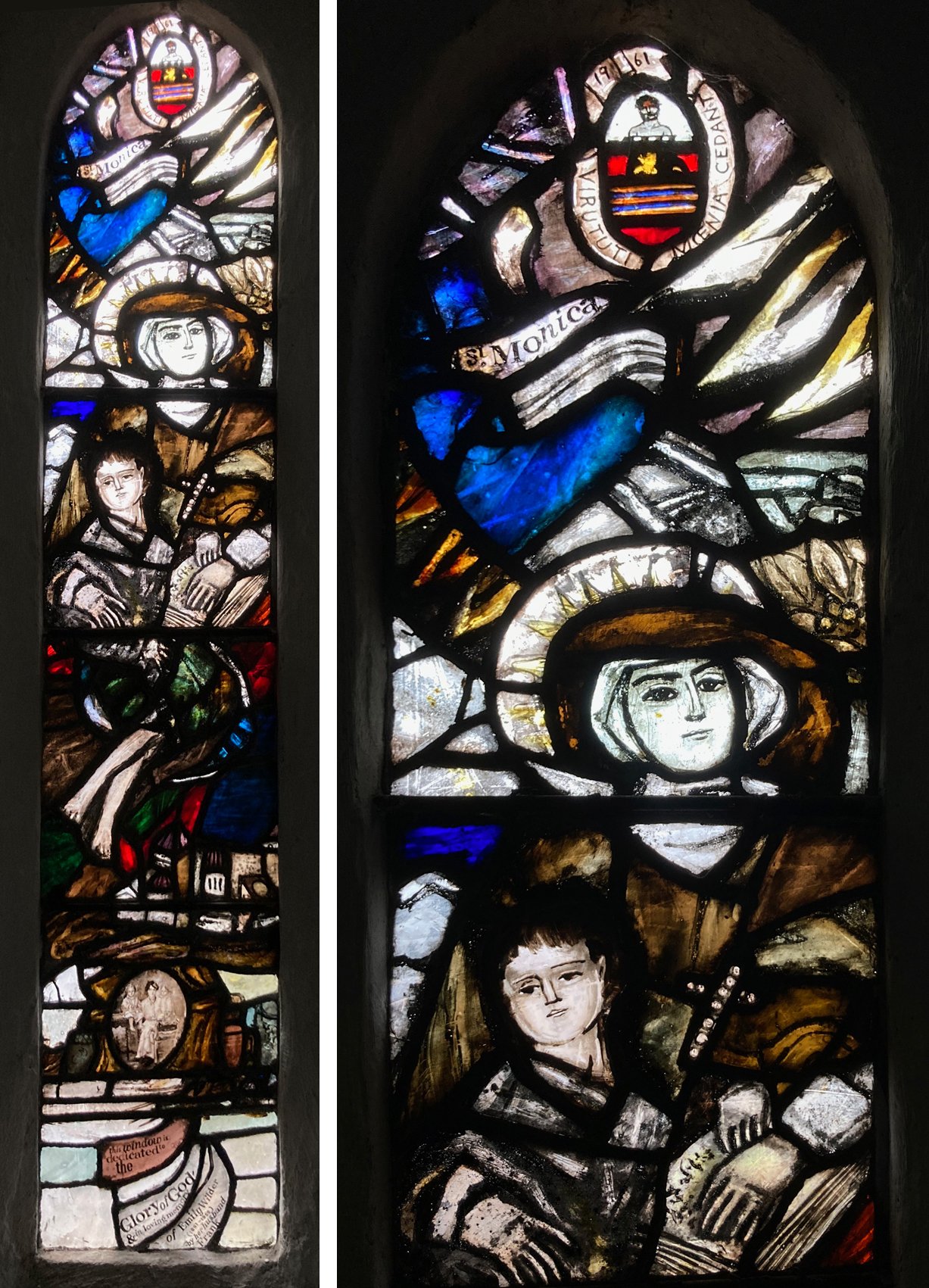
St Mary Magdalene Church, Crowmarsh Gifford, Oxfordshire. North chancel window by Charles de Vic Carey, 1961.

On the same trip I was thrilled by a small lancet window in the church at Crowmarsh Gifford, the only one I have ever seen by Charles de Vic Carey, the teacher at Wimbledon Art School of Pauline Boty and my first stained glass teacher, Tony Attenborough. In it, I recognised the way I was encouraged to paint, with visible brush strokes (so good to see some actual painting rather than the endless quest to find different ways of applying the paint) going across lead lines and uniting the pieces of glass to make a composition, as a painter would. At the bottom is a little, loosely painted portrait of Emily Wilder and children above the fabulous lettering that is collage like and totally of its time.

Details from the bottom half of the Charles de Vic Carey window.

Inspired by the Hudson River School by Sasha Ward

View across the Hudson from Blithewood, Bard College, Annondale-on-Hudson, 2023 and 2000.

Staying with my brother on a recent holiday in New York State I spent a lovely morning drawing the view across the river from the lawns of Bard College (above left). We had visited the house of the father of the Hudson River School, Thomas Cole, and I was using the style I’d picked up from looking at his paintings, with paintbrush blobs for distant trees and picturesque details in the foreground. When I got home I looked through sketchbooks from previous visits (shown below) and was astonished to find a drawing I did 23 years ago from pretty much the same spot (above right).

My USA sketchbooks, clockwise from top right: 1996, 2000, 2012, 2023.

Looking through the sketchbook from my first visit there in 1996 I found more versions of the view, usually framed by the summer houses of historic houses that line the riverbank but behind the railway that seems to run through the water. The old drawings practically line up with the new (below left) as if my hand remembers the drawings I always do when I’m there.

Left: More views across the river, 1996 and 2023. Right: House in Annandale-on-Hudson 2000.

Left: Thomas Cole, River in the Catskills, 1843. Right: Frederick Church, Catskill Mountains from the Home of the Artist, 1871.

In 1996 we had visited Olana, the house of Thomas Cole’s pupil, Frederick Church, that he had built in a spot with fantastic views. Some of my work from the following years was consciously influenced by Church’s use of landscape motifs - mountains, waterfalls, sunsets - and the solitary foreground tree that cuts across the horizontal layers of the landscape as shown in my sketchbooks below.

View across the River Hudson to the Catskills, 1996 & 2000.

If I’m not drawing the river, or the view across the street from the porch, I draw the view through the window, recording the different houses we have stayed in on each visit. Again I was surprised by the repetition in what I’ve chosen to draw, with pine trees making another, looser grid right up against the windows of each house.

Windows, Rhinebeck 1996, Haggerty Hill Road 2012 & Bard College 2023.

Behind the Scenes by Sasha Ward

Left, East Hagbourne, Oxfordshire. Right, Urchfont, Wiltshire.

To see the medieval glass patchworked into a window at St Andrew’s Church, East Hagbourne (above left) I had to poke my head through a screen of heavy curtains that hide the vicar’s desk. To get up close to Rosalind Grimshaw’s window in Urchfont church I had to move piles of chairs and toys (above right). I’ve now started looking out for the children’s corners which, like kitchens in churches, give an indication of how the church is being used.

Left, inviting at North Moreton, Oxfordshire. Right, austere at Potterne, Wiltshire.

Steeple Ashton, Wiltshire.

In the huge church of St Peter and St Paul, Steeple Ashton, everything is clean and neat with fragments of medieval glass in almost all of the windows. The door to the vestry, not a separate room but just a space sectioned off, was open and everything inside was in order (above left). The children’s corner (above right) looked like you might want to spend time there, it seemed to have been arranged by someone who actually cares what the place looks like.

My best behind the scenes photo, above left, is from the corner of another huge church, this one at Madley in Herefordshire. The scene is simply furnished, the atmosphere is timeless. In the east window of the church is a wealth of medieval stained glass (below), but even more unusually there are twenty first century paintings by Edward Kelly installed in the nave and the crypt (above right). The triptych in the crypt is a particularly wonderful sight because paintings, particularly modern ones, are rarely found in English churches.

This from The Rev Simon Lockett, who I like to imagine sitting on that pink cushion. ‘It is a great joy to have the triptych “The Lillies of the Field” here in Madley Crypt. I have lived with these paintings for a long time now and they have helped to bring this beautiful space alive giving the crypt depth as well as a flourish of colour and bold form. They have helped with a contemplative practice as well as a daily reminder not only of the beauty of creation but of the natural cycle of abundance, death and new life’.

Medieval glass in the east window of The Church of the Nativity of the Blessed Virgin Mary, Madley.

Squares by Sasha Ward

Left: from my 1996 sketchbook, drawing before making the kitchen window. Right: photo of window 500mm square.

I made a window for the kitchen door in our old house which I sold to a friend who was visiting. It was a simple thing, an arrangement of squares of glass scraps, mostly enamelled, and mostly featuring the stripes I use for my samples. This window was much better than the snap I have of it (above right), but luckily I also have my sketchbooks from a time when I drew everything, before I made it (above left) and even after I made it (below). The before drawing in coloured pencil shows that I changed about five pieces before leading it up, with the thinnest possible lead used for the verticals. The arrangement spiralled around the central circle on a square of orange flashed glass (that I remember breaking when I was sandblasting off the thick orange layer) becoming paler towards the edges of the window.

Pencil drawing (not rubbing) of the window.

Left: glass squares on the lightbox. Right: centre of the new panel.

I’ve never found a pattern for putting sample pieces together that I like as much as that simple mosaic of squares, and as I had a lot of small ones (40mm sq.) in my sample box I thought I’d make a new panel in the same spirit. In 1996 I was led by the central orange square but this time, 27 years later, I had lots of green pieces that suggested a landscape format, and lots of diagonal stripes that I was careful to arrange in an imaginary oval that pulls the composition together. I found a piece with a building painted on it and then one with a belisha beacon, these added interest to the panel so I dared to add a cow in the middle. These pieces all contain the right subject matter for a local landscape and show me a way of using small scale imagery that mixes well with my habitual pattern making.

Comparing my old work and approach with my new one, I know that I used to put more concentrated effort into drawing and that the glass I made was quite scrappy and loose. Now my drawing is rough and untidy, while I put a lot more detail and care into the glass painting.

Woman in an Opera Dress at a Prison Camp by Sasha Ward

Left, Ray Ward’s painting, egg tempera and indian ink on gesso. Right, my stained glass interpretation of Woman in an Opera Dress at a Prison Camp, 420 x 360 mm.

This is the latest in my series of so called collaborations with Ray, made as a request by one of his collectors who missed out on buying the original black and white painting (above left). Sometimes Ray’s characters are adapted from visual sources, like a snapshot, but this one comes from a story told in her memoirs by Evgenia Ginzburg who served an 18 year sentence in labour camps at the eastern edge of the Soviet Union. Here she met women who arrived at the camp in their tattered finery because they had been arrested while at the opera. This was a great choice of painting to interpret as it is covered in lines and textures, with the dress and her flesh that is visible through it seemingly the focus of the piece.

Although I trace directly from a photocopy of Ray’s work, I have to do the lines in a completely different way - too many black lines on coloured glass would look like a load of dirty scribbles. Instead for the dress I chose two shades of streaky pink flashed glass and sandblasted the colour off to make fine white lines. You can see in the photo of the dress detail above how deep I had to go to get to the white, creating a texture that looks pleated and scruffy, as I imagine the original dress was. I covered the background in fine sandblasted lines and smoky paintwork too, with the only bit of sgraffito scribble on the ground behind the figure. All this talk of detail makes me think I should concentrate less on the technique and more on the subject matter.

Choosing the glass, painted pieces on the lightbox.

Evgenia Ginzburg survived her ordeal in the gulag, as did my mother’s cousins. She met them for the first time when we went to visit the family in Gus-Khrulstany in the year 2000, a photograph (below) marks the happy occasion The two cousins are in the back row in the centre of the photo, I can see that I could have used either of their faces for the portrait of the woman. Next to them sits my mother Elizabeth (wearing glasses) with me in the right foreground.

In the 1990s Anastasia, the granddaughter of my mother’s cousin Natasha and therefore my second cousin once removed, brought the branch of the family that had stayed in Russia into contact with the branch of the family that had gone to England at the Revolution. She is in the centre of the photo above and on the left below with her parents and grandmother Natasha. We have a wealth of family stories, diaries and photographs from the pre revolutionary period, then a big gap except for one story from the late 1920s or 30s. My great aunt Lena travelled to Gus in an attempt to bring little orphaned Natasha back to England with her, but the grandfather wouldn’t let her go. As Natasha recounted the familiar story to us she said, ‘think how different my life would have been then.’