August 2016
It’s hard to believe that the end of our garden looked like this so recently, a straggly bank up to a sloping fence that new neighbours had just put up. Since then, and especially during lockdown, we’ve spent a huge amount of time gardening. Transforming the bank and unearthing the rubbish buried underneath was at one time Ray’s major project. He made paths, steps, benches, an unexplained grotto and planted mostly ferns.

August 2016

July 2017
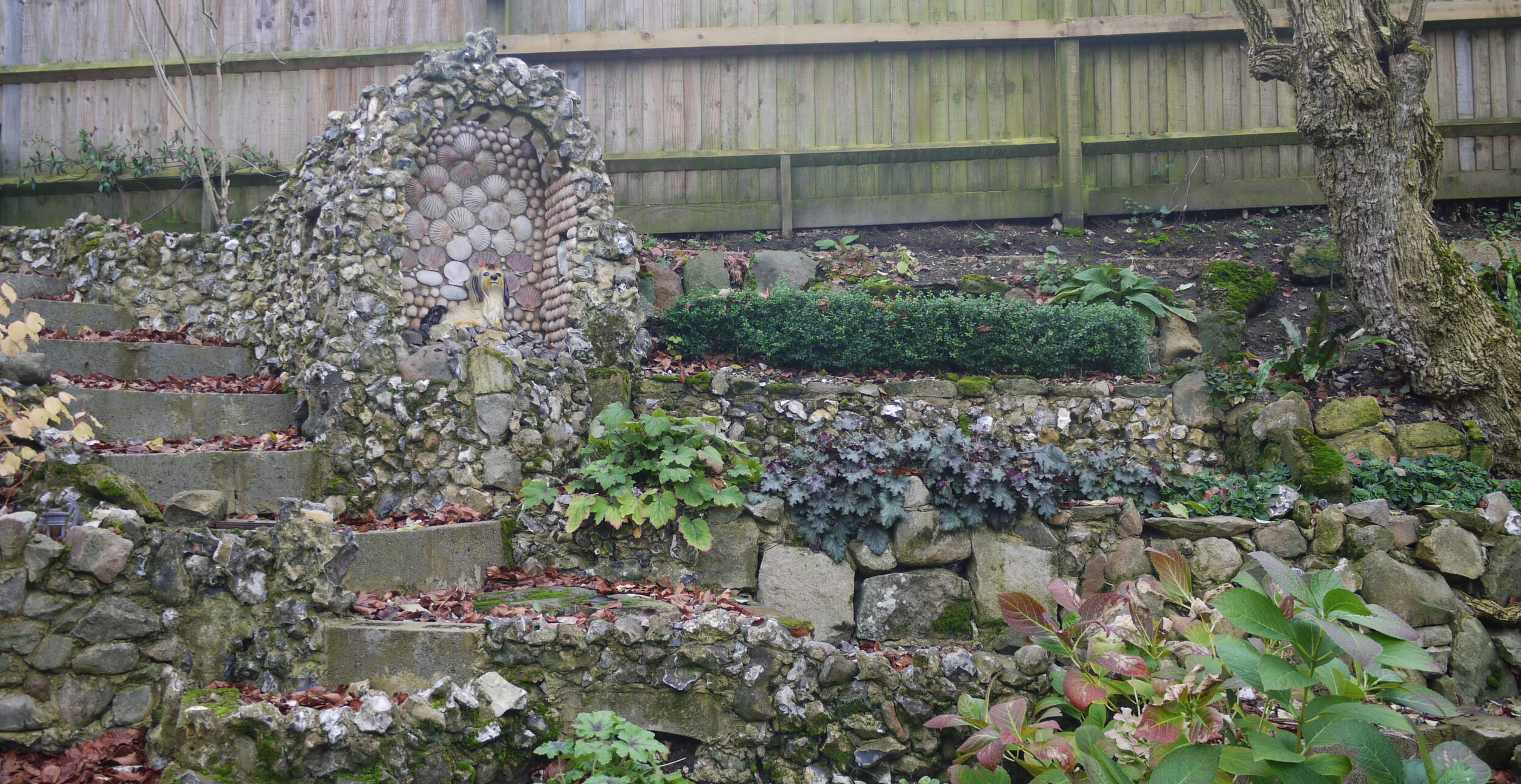
The photos I found show the bank during the two summers it was constructed. There is a high up bench (above) where you can sit and watch traffic on the A346, and a low down shady bench (below) for morning coffee break. The grotto, seen side on in the centre of the photo above and to the left in the photo below, was made of concrete and covered, like most of the walls, with the flints which are so abundant in our soil. Ray made a window in each side and a corrugated plastic section of roof to let the light in to whatever he was going to put inside it.

July 2017
The whole construction looks particularly fine in the snow (below) with all the sloping lines and steps visible. The existing trees were what had determined the contours of the walls and flower beds. One peculiarity of the grotto was the way it was hidden by a stray conifer in the flower bed in front of it, it took another year for us to realise that it had to go.
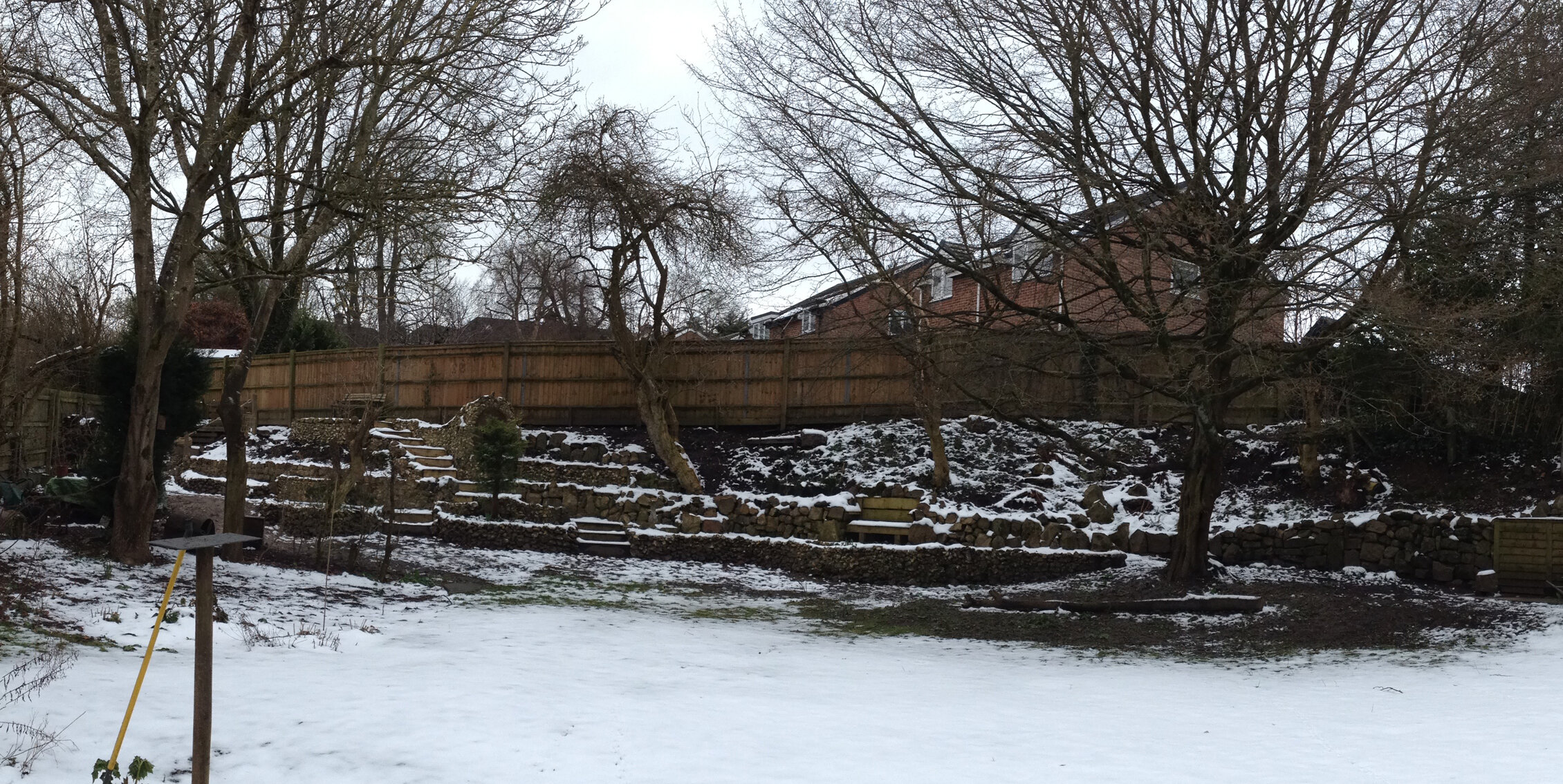
February 2018 - view from the studio
November 2020
My part of the grotto was lining the inside with shells. The fact that nothing is straight or symmetrical was a challenge to my sense of order, but the shells we collected over a couple of summers dictated the ‘design’. The scallop and oyster shells came from Kent, while the cockles came from Curracloe Beach in County Wexford where we collected over 500 in one evening’s walk. We found the current keeper of the grotto on a recent trip to King’s Lyn, where everything except the shops was shut. So it’s become a seaside souvenir grotto for times like these when we’re spending so much time at home.

Top: The current keeper of the grotto. Bottom: Curracloe Beach and girls eating ice creams.