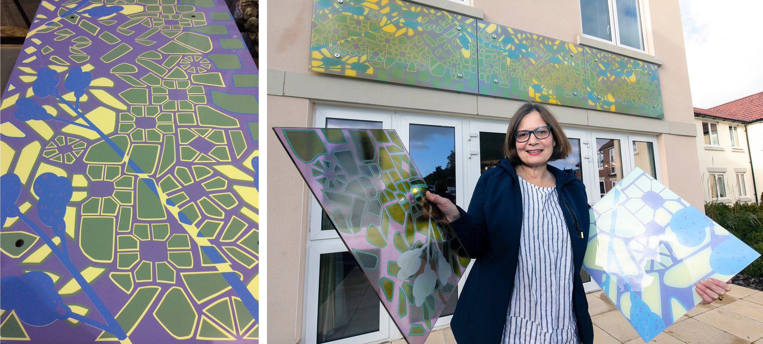
Left, glass panel in the factory before lamination. Right, glass samples in hands, installed glass behind me.
I get large or external commissions screenprinted by protoglassstudios.com . Although they have been making my work since 1992 and have always done a good job, there are so many things to worry about when you hand over the manufacture to somebody else. For this one, commissioned for Alexandra Lodge which is a new development by Churchill Retirement Living in Thornbury, South Gloucestershire, it was the colours. I had the design worked out (described in my blog “Cobbles” in July) and a combination of four opaque colours agreed - you can see the factory sample showing the glass version of these colours in my left hand (above right). In my other hand is a painted sample with an earlier colour palette which ended up being rather similar to the final version.
The colours I use are usually paler, and I would say subtler, than the average. In this case, I was persuaded that the design wouldn’t show up outside and from a distance unless we boosted the colours. Imagine my surprise on visiting the factory after printing but before lamination, to see how dark the colours looked (this stage shown above left) - I was convinced I hadn’t chosen that blue but it was too late to do anything about it other than start again with all three panels. But the same finished panels, as you can see installed on the face of the building below, are somewhere in the middle in terms of the colour range and look just right with the building and the planting scheme.
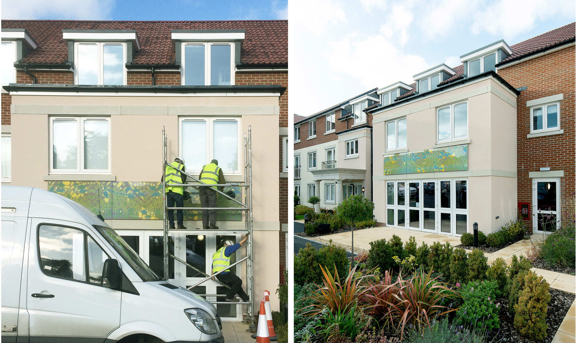
Left, installation of glass at Alexandra Lodge, Thornbury. Right, official photo showing glass above lounge doors.
I visited the glass factory on one day during manufacture to photograph the process as far as I could. An all out yellow layer had been printed first, this background brightened the whole piece and gave the exposed laminated edges a lovely yellow and purple two tone appearance. On the day, the green cobbles had already been printed and they were doing the blues which went around the edges of some cobbles and cut across the design in flowering branches. The purple layer would be the last to be printed, you can see this stencil on the screen below right and also as the black on the films that we laid on top of the other printed colours in the bottom picture.

Left, panel 2 in front of screen for blue. Right, screen for panel 3 purple.

Left, preparing to print blue on panel 3. Right, panel 3 going through the dryer.

Left, films for screens in the factory. Right, panel 1 with film for purple overlaid.