Familiar Figures by Sasha Ward

West window, St. Helen's Church, Welton with Melton, Yorkshire. EBJ                   Malmesbury Abbey, 1901          Click to enlarge

Visiting churches with windows made by the firm of Morris, Marshall, Faulkner & Company, and after 1874 by Morris & Company, throws up familiar figures. In St Helen's Church, Welton (about ten miles west of Hull) there are five Morris & Co. windows with figures mostly designed by Edward Burne-Jones who had a local family connection. The large west window has beautiful roundels above and King Ethelbert on the right who I immediately recognised from a recent trip to Malmesbury Abbey , initially by his magnificent leggings.

The St. Nicholas at Welton (below centre) was familiar to me from his facial features: when you look at the earlier window at Beaudesert you see a different portrait of the same figure. I find the background details particularly interesting - ways of depicting underfoot plants, borders and backgrounds. I love the illusionistic dark blue curtains on poles behind the Welton figures - this photo of Mary comes with a real decaying tassel and cobweb in front of the window. 

The Virgin Mary and St. Nicholas from Welton Church, EBJ  : An earlier version of St. Nicholas from Beaudesert

Saints Ursula & Catherine from Welton Church, EBJ & WM                                                    …

Saints Ursula & Catherine from Welton Church, EBJ & WM                                                       The St. Catherine at Kelmscott Manor

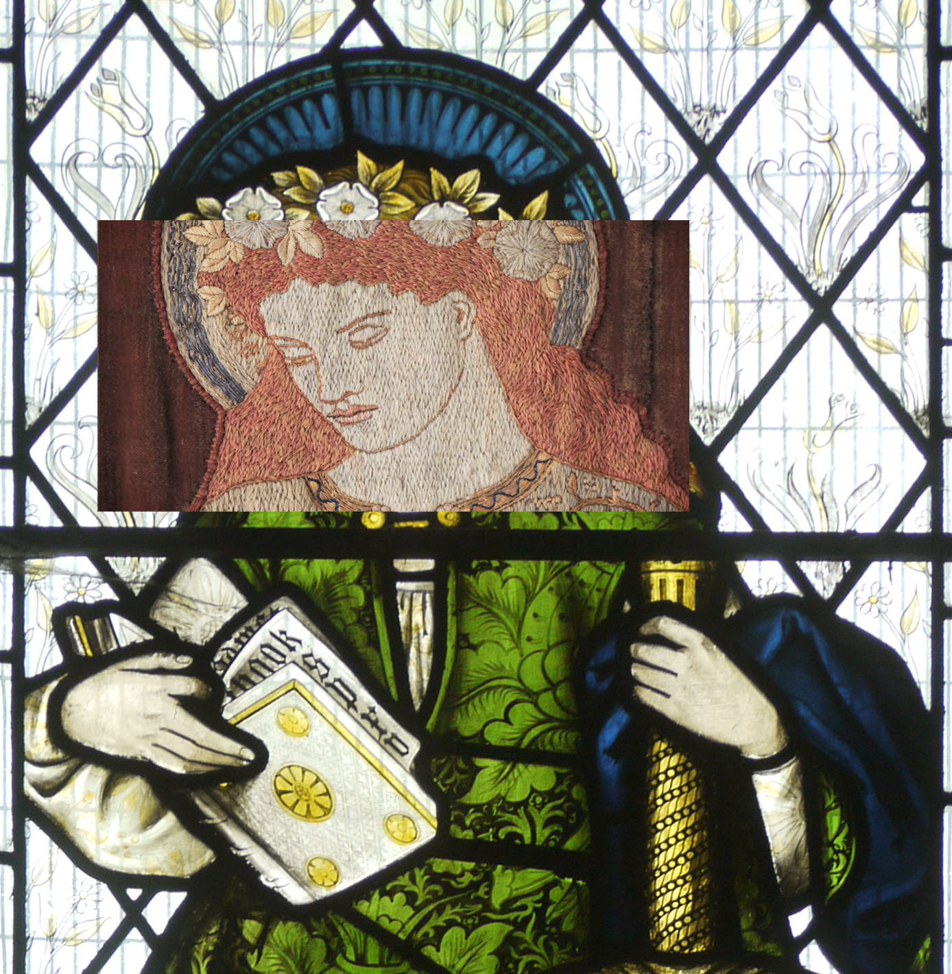
In the same church I stood enthralled in front of St. Catherine, thinking how great the combination of book, sword and beautiful green dress was. Nothing interesting in the background to distract you here. The fun part of window spotting is remembering where you've seen someone before, and this St. Catherine is also on an embroidered brown velvet curtain at Kelmscott Manor, it is one of my favourite items there. I checked by putting the embroidered face on top of the stained glass one that the details are no different, only the size and the colour. Although I am reluctant to believe the guides, all the ones I have consulted attribute this figure to William Morris who supposedly couldn't do people.

Why Do Anything New? by Sasha Ward

1970

1970

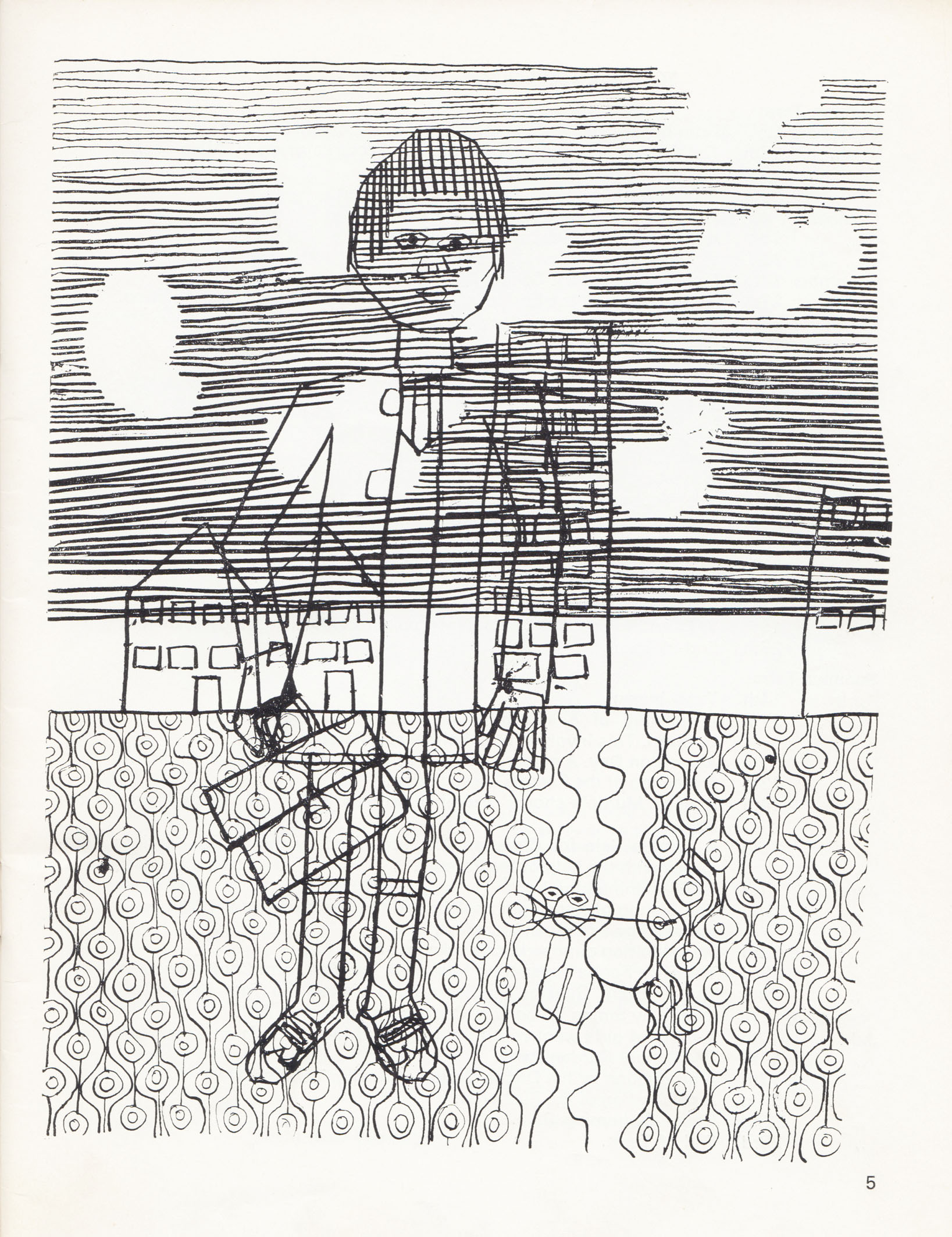
This drawing is called "Myself Going to School on the First Morning" and it had a whole page in the school magazine that year. Looking at my old drawing, I find myself transported to the moment I was doing it - I remember the scratchy dip pen, the decision not to finish off the paving pattern and the dots that I used to plan the shapes of the clouds that were supposed to be hidden by the stripy sky. The most authentic details are my lovely new shoes, briefcase and donkey jacket and the most amazing thing is how all the elements that make my artwork particular to me are present in this example. 

The cover of the magazine in that year of my first morning brings back more wallpaper memories. B.H.O. (english teacher) wrote in his editorial; "The School has been redecorated, and we can now well imagine the former elegance of the eighteenth century houses that constitute the School. To commemorate this event, our cover this year is an adaptation of a piece of wallpaper from the entrance hall". This wallpaper is listed as Sanderson's "Rivoli" in the index. The overblown floral shapes on top of irregular stripes are just like something I am designing at the moment.

1974

1974

This drawing, printed on the sort of brown paper I like to use now, has a whole page in the 1974-5 magazine. I  think it's based on observation, in fact I'm pretty sure it's of Caroline Fitt, but I think of this as another self portrait. The detail that amazed me when I saw it again was the horizontal dot pattern. I've tried to limit my use of this as a filler pattern, thinking that I'd picked it up at a later date from looking at Paul Klee. I admire the time it must have taken me to keep the dots varied in shape but not scale, perfect for that scratchy pen. So, why do anything new ? I don't think I could improve on these self portraits now.  

More recent examples of the patterns I used in those early drawings: Left to right: The vertical waves at Langley Green Hospital 2008: The stripy sky at The State Hospital 2009: The dot pattern at Longparish School 2005. Click on photos to enlarge.

Transformation by Sasha Ward

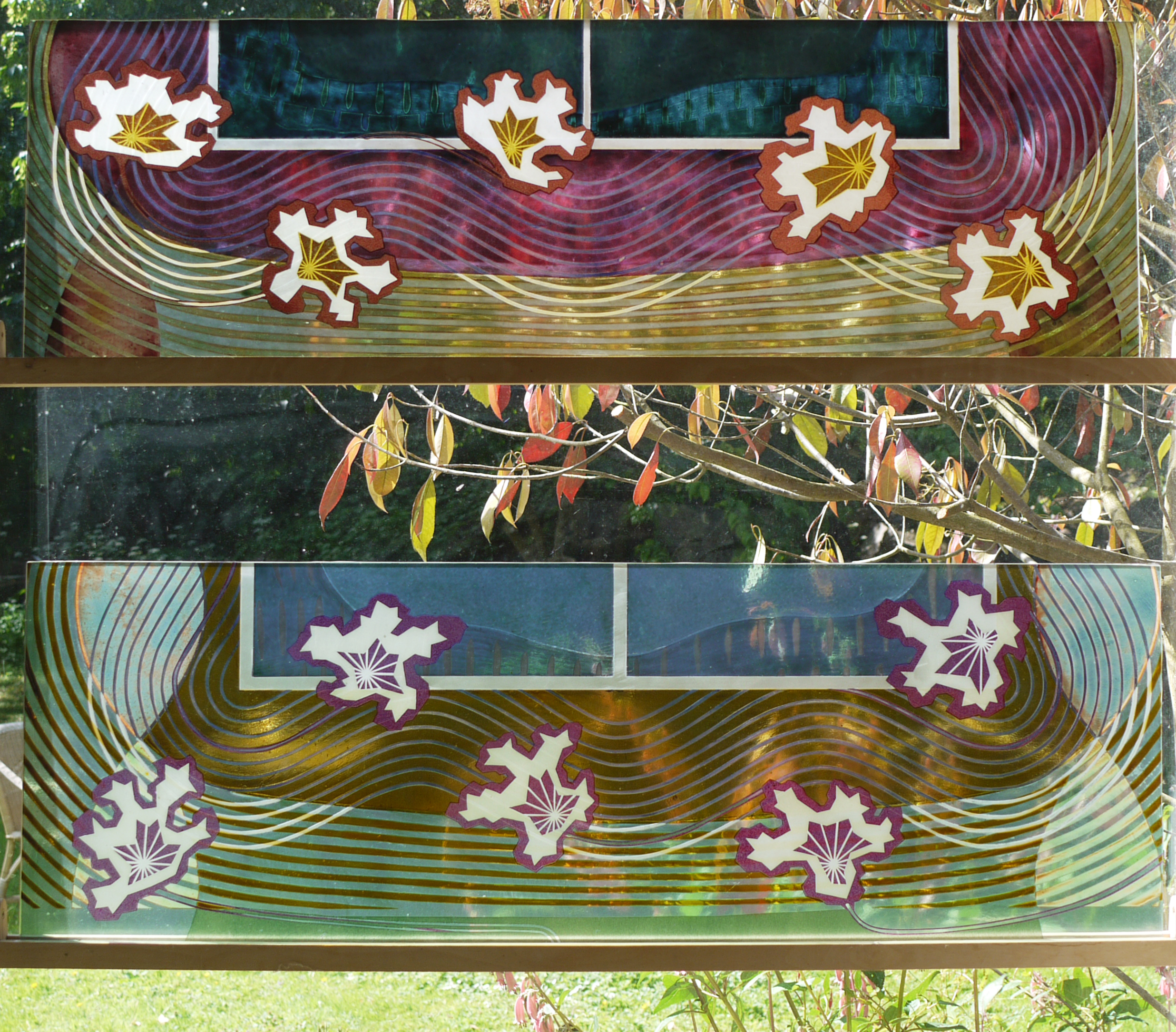
Offcuts standing sideways in my studio window, each 1 metre tall

Offcuts standing sideways in my studio window, each 1 metre tall

I had a commission to make two fanlight windows for a friend's house in Poland. She said offcuts would do, so I put two leftovers sideways in my studio window and waited for inspiration. I had made the glass in 2000 for an exhibition, the pink one broke and I remade it in yellow but was never satisfied with the results. You can see in the pages below from my 2000 sketchbooks that there was a lot going on here - how could I add something while also making sense of a poor composition ?

Meanwhile another friend, the artist Wendy Smith who I met when we were students together, came to stay. She had a lot to say about the process of transformation, you can read about it on her blog. Her ideas spoke to me about the danger of overworking versus making a fresh start. I have often tried to make new pieces on top of old samples and all I got was a struggle made visible.

The new panels in my studio, finished last week.

The new panels in my studio, finished last week.

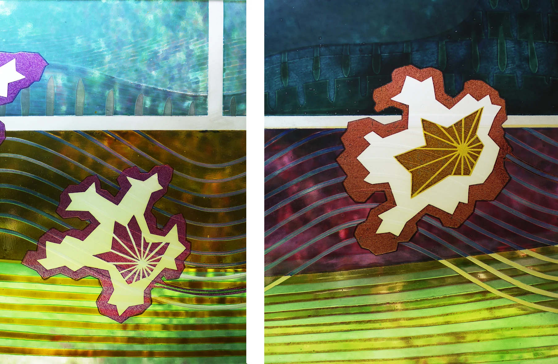
This time, I sandblasted across the glass backgrounds with star/flower shapes, as if embroidering figures across a patterned and pleated fabric ground. The yellow ground got pink details, the pink ground got yellow and a fantastic rich amber made from a mix of enamels. You can see the depth of the old lines under the surface of the glass in the details below. 

Beaudesert by Sasha Ward

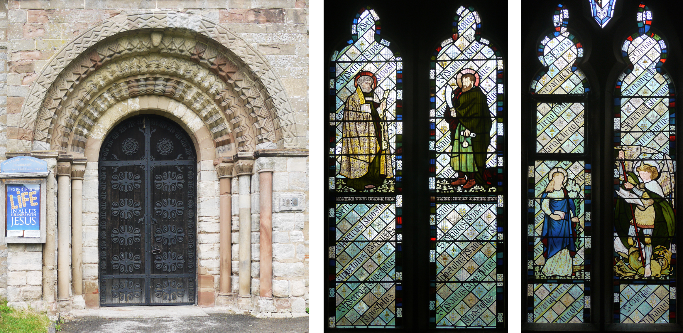
St Nicholas Beaudesert, Henley-in-Arden, the church in a place with a beautiful name and a hideous sign almost wrecking the Twelfth Century entrance. Inside I found other themes that appear every time I go to a church with windows designed by William Morris and his partners. For instance, is the curly haired, bearded St. Peter (below left) one of those figures that is based on a portrait of WM?

Entrance to St. Nicholas, Beaudesert                                            2 of a set of 5 windows by Morris, Marshall, Faulkner &…

Entrance to St. Nicholas, Beaudesert                  2 of a set of 5 windows by Morris, Marshall, Faulkner & Co. 1865

1865 Beaudesert Virgin Mary                                                               &nbs…

1865 Beaudesert Virgin Mary                                                                            1873 Sopworth Virgin Mary

I'd seen Burne Jones' figure of the Virgin Mary in the north west window at Beaudesert before; she is in the window of the three Marys at St. Mary's Sopworth, and there is an earlier version of the same figure in Bradford Cathedral. It's not my photography, some of the paint has gone (borax problem) from the Beaudesert glass and because it is about half the size of the Sopworth Mary the details look less fine when comparing the images at the same size. 

Then there are some more fine shoes for the stained glass shoes collection,  these are on Saints Paul and George. A graphic version of what I call "the clump" makes a lovely repeat ground for all these figures to stand on. And there are angels wearing feathers and standing on wheels, which I have learnt puts them in the third ranking order of angels.

Two of five Morris, Marshall, Faulkner & co. angels

Two of five Morris, Marshall, Faulkner & co. angels

First steps towards alphabet by Sasha Ward

My alphabet is an ongoing project. The idea is to make a font from my hand writing to use for inscriptions on windows or for lettering and signage in decorative interior schemes. My current scheme is for Ron Jones House, Stokes Croft, Bristol, where words will run around the top of one of the communal rooms.

top : Ron Jones font trial on my studio wall                   bottom : two types of lettering in Exeter Cathedral

top : Ron Jones font trial on my studio wall                   bottom : two types of lettering in Exeter Cathedral

Lettering from All Saints, Selsley, Gloucestershire, the first ecclesiastical commission undertaken by Morris, Marshall and Faulkner & Co. 

Lettering from All Saints, Selsley, Gloucestershire, the first ecclesiastical commission undertaken by Morris, Marshall and Faulkner & Co. 

Looking at lettering in this type of context of course leads me in to churches again, but because I mostly make work for secular public buildings I need to remove any ecclesiastical looking influences I may pick up here. The words on the early Morris windows at Selsley are encouragingly rough and lively in contrast to the 3-dimensional lettering on the wall of the same church (both shown above).  I've put off this alphabet project previously because I knew it would take me a long time, I haven't even started on the capitals and punctuation marks yet.

Just to see what my alphabet looks like as a font - not there yet.

Just to see what my alphabet looks like as a font - not there yet.