Church Of St Alban, Westbury Park, Bristol by Sasha Ward

Outer door, Inner door and inside the Church of St Alban, Westbury Park.

This is a church built beside an older one (still standing) that the congregation in the Bristol suburb of Westbury Park, had outgrown. The architect was CFW Denning, it was completed in 1915 with furnishings and stained glass in every window added over the following two decades. As a result the interior is cohesive and true to the arts and crafts ideals, with modest entrance doors, stone walls and wooden chairs amid the evidence of regular use by local groups. The designer of most of the wonderful stained glass in the church was Arnold Robinson, a pupil of Christopher Whall, who worked with and then bought the stained glass firm Joseph Bell & Son of Bristol. The east window (below and above right)) glitters with complementary purples, greens and browns and is crammed with detail - from rainbows and cherubs at the top to realistic figures of contemporary servicemen, with nurses, at the bottom.

The east window and detail , designed by Arnold Robinson, 1920.

Three windows in the north wall, two by Arnold Robinson, the third by Florence Camm.

Six of the nave windows are also by Robinson, on the north wall there is one by Florence Camm (1929) that fits in well with the general style although it’s very different in its decorative detailing. The details in Robinson’s windows show an interesting mix of pastel coloured streaky glass in chunky borders and characters in the nativity window that are taken from sources as diverse as Raphael’s Madonna della Seggiola (below left) and a toddler straight out of a 1920s popular illustration (below right).

Details from the nativity window (in the centre of the photo of the north wall).

South transept window by Margaret Chilton, 1915, and detail.

The window that is contemporary with the building of St Alban’s is a tall lofty one in the south transept by Margaret Chilton. It depicts classically dressed craftsmen working on the building, one holding up a model of it. The lower sections with eccentric leading, little squares of colour and finely drawn wild flowers has got a very Charles Rennie Mackintosh look about it, this window dates to three years before Chilton’s move to Glasgow.

Window 1 on the south wall and detail.

Continuing from that window along the south side of the nave are four more Robinson windows, all set in deep craggy recesses with sills covered in plastic sheets for groups of white candles. There are wonderful things to be found in all of these - in the first window there are little people processing towards the open door (above centre) and the handpainted note in memory of a local 2nd lieutenant (above right), a reminder of the boom in stained glass memorial windows caused by World War 1.

Window 2 on the south wall and detail.

The second window again has finely drawn flowers in the border, and clustered around the missionary Ruth Salisbury are a group of realistic, attentive children (above). The third window is in memory of a couple who were benefactors of St Alban’s, the details I picked out in this one are another group of little people including two sweet babies, and a walled town in the background (below).

Window 3 on the south wall and detail.

Window four (below) is a scene of the Revelation, with a wonderful sea shore, an angel with a visionary globe, a harp, a sword and a dedication to another young local 2nd lieutenant killed in the war.

Window 4 on the south wall and detail.

Looking west, windows by Arnold Robinson.

Coming to the west end of the church (above) are a pair of windows by Robinson from 1925, where pastel coloured angels soar above a nativity scene and an ascending figure of Christ. The ordered composition, pale backgrounds and geometric rays of light are in great contrast to the colourful riot of the Te Deum east window. Finally, in the baptistry and now cut off by a glass partition, are two smaller pairs of windows of small people, or cherub children with realistic heads (below). They are the work of Margaret Chilton, given by members of the Mothers’ Union in 1915. The font has been moved out of this space which is now a play area. I wonder if this was because the images of the cherub children were considered disturbing, or even confusing because of the popular belief that the dead turn into angels, whereas in Christian doctrine they are two different things. It’s hard to imagine this sort of imagery, thought provoking and poignant in a time of war, being allowed anywhere near a baptistry these days.

Two pairs of windows inside the baptistry by Margaret Chilton 1915.

Christmas Cards Year 10 by Sasha Ward

Our mantlepiece with the favourite cards on display.

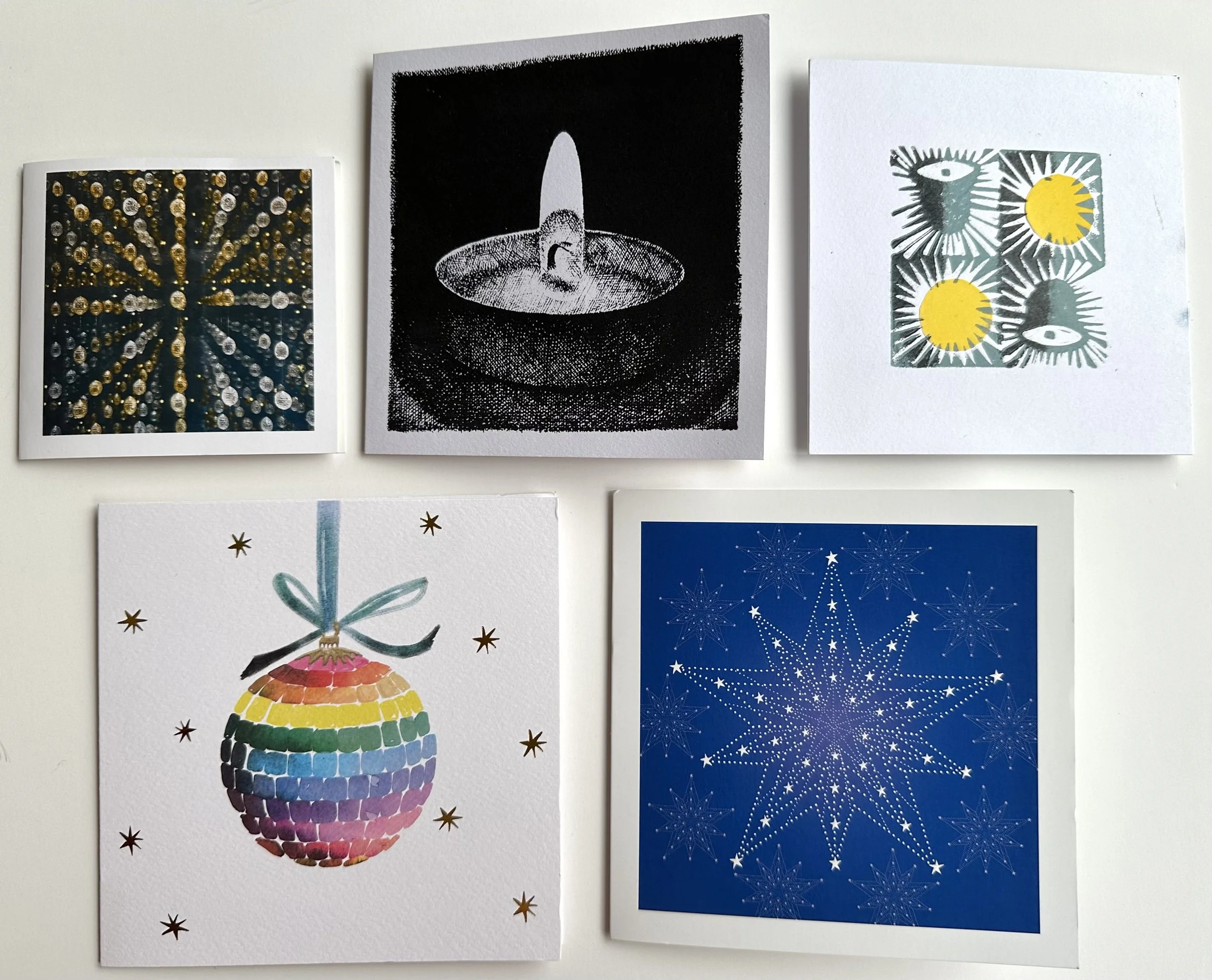
This is the 10th year of my Christmas card statistics where I sort them into categories that have remained pretty consistent over the years. For example more than half of the cards we received were square, just over a third were handmade and the most popular subject matter was a snow scene. A category that caught my eye this year was the white border, common to forty percent of our cards. On the mantelpiece (above) are a selection of the best, on the right is one I particularly enjoyed - a cottage to make up with a paper tree attached, it’s one of three cards in the ‘shaped’ category.

Classic Christmas Tree category.

In terms of subject categories, we had 24% that were mostly tree, examples are shown above including the lovely red square one on the right. Another classic category is the star or candle (10%) , with examples that are mostly homemade, shown below.

Classic Shining Light category.

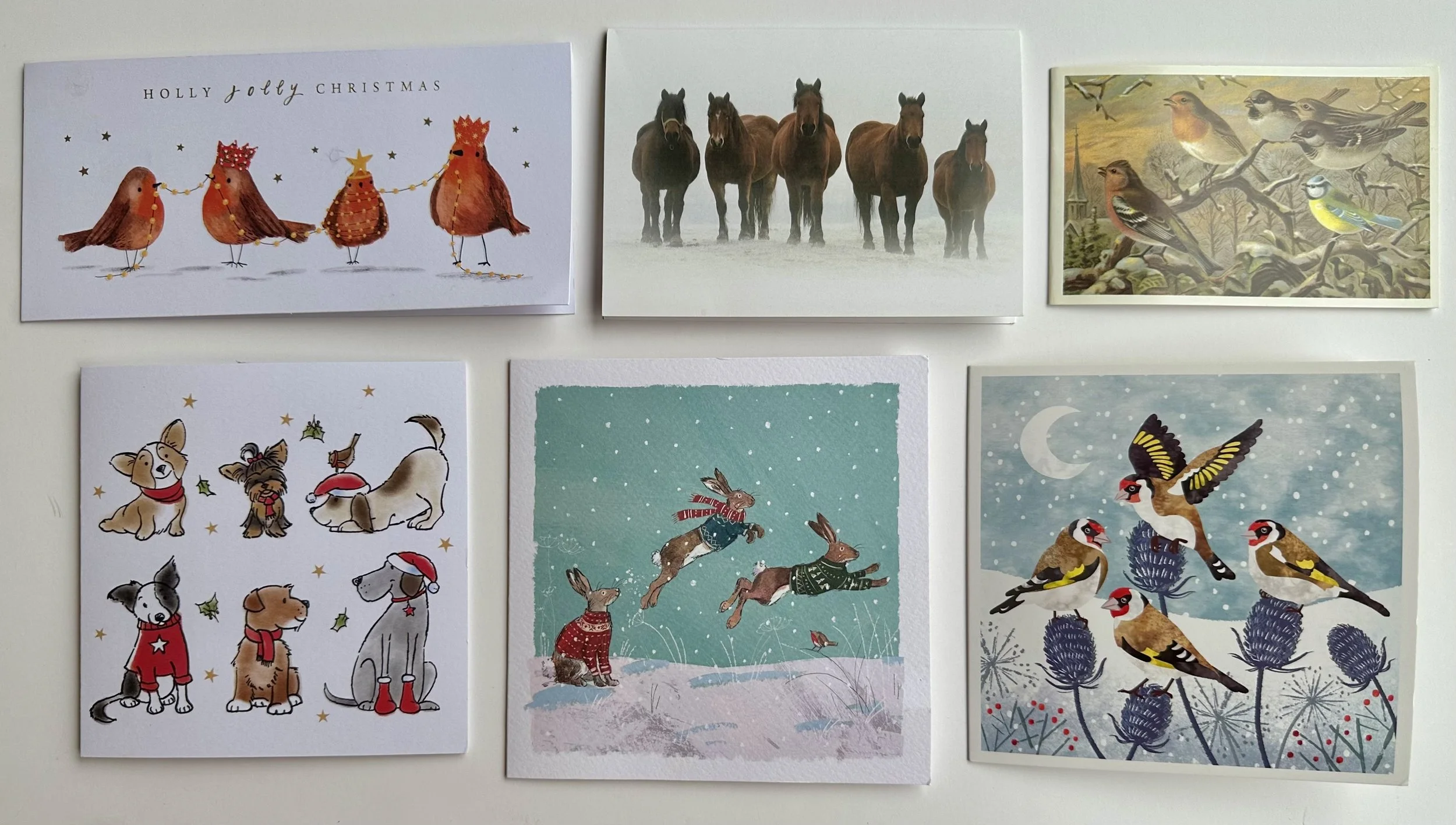
I’m still surprised by the decline of cards with nativity scenes (down to 8%) or reproductions of well known art works, I would say there were none of those this year. Instead we got rows or groups of animals (below) - jolly robins, spooky horses and hares in wooly jumpers.

Groups of animals - some in wooly jumpers.

Number 110 by Sasha Ward

A row of windows - view from the outside at night.

Last Monday we delivered, installed and unveiled a row of windows that Rob and Lorna Ryan had commissioned for the front of their workshop in Bethnal Green, London E2. I’ve written about making them in a previous blog post here, all without showing how the design joined up, flying from one end of the sequence to the other where you find the number 110.

Window 1 on the workbench : In my studio window : Windows 1 & 2 installed.

Window 1 (above) is designed around a floating oval which was the last piece of glass I cut. I agonised over which of the streaky colour combinations to use, in the end going for the most vibrant glass I had, golden yellow with green to tie in with the pale green that runs through the design. The painting stage took a long time as I worked out the best way of tying the shapes together with black and grey oxide and enamel painted across the lead lines - you can see this in a ring around the number 110 below and the same pieces of glass on the lightbox before painting and sand blasting. When we installed the last two windows the sun came out casting a shadow of the number on the wall and a flash of the bright pink glass above it.

Window 4, working out the painting : Detail of the number in my studio window : Windows 3 & 4 installed.

A row of windows - view from the inside in the daytime.

Approximately one third of the glass in the row of windows is clear, this maintains their connection to the large windows below them and also to the world beyond the windows with its blocks of flats, tree tops and big patches of sky. Previously the glass in the windows was opaque so now we are letting more of the outside in.

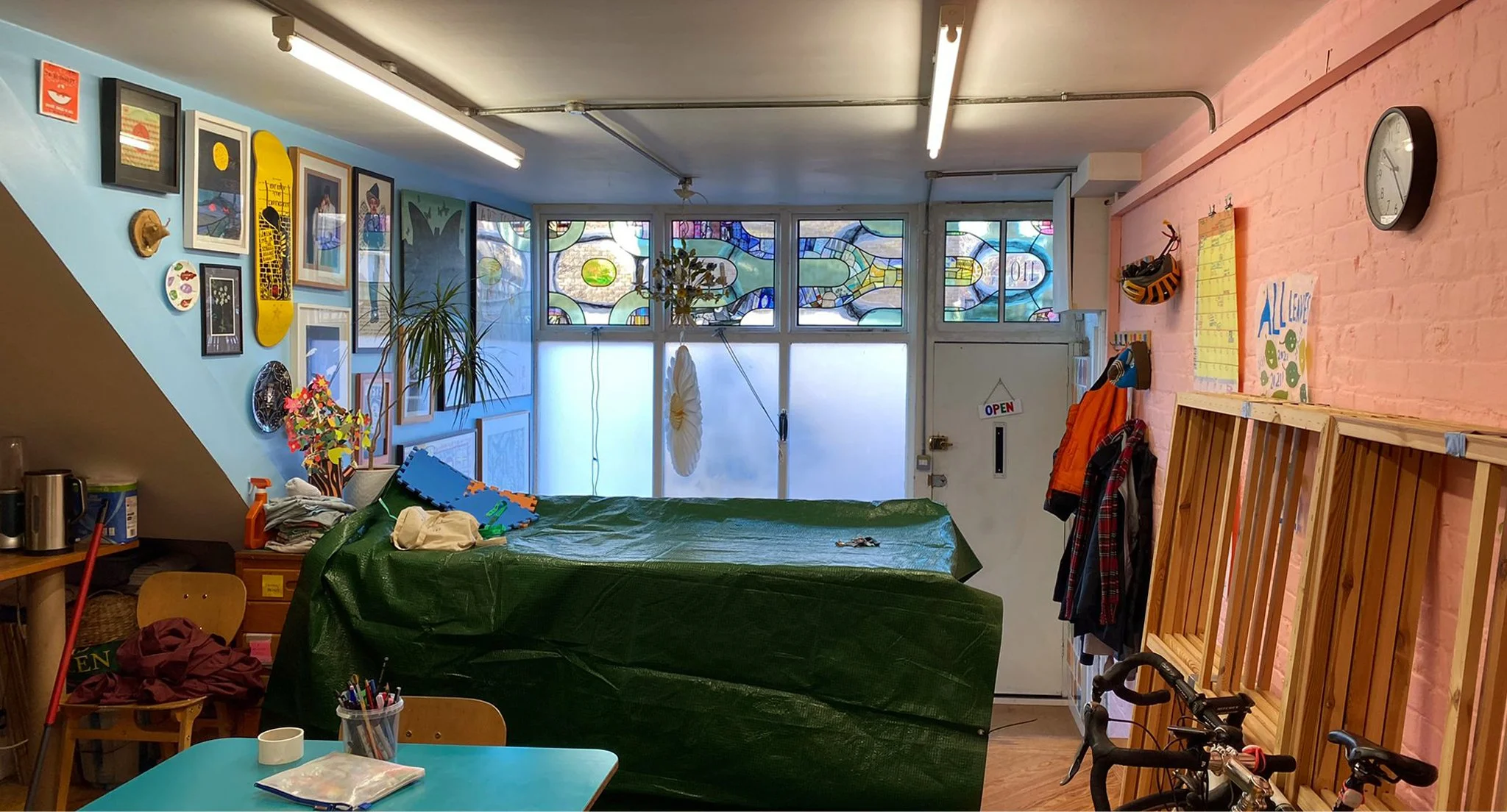
These photos (above and below) show the row of windows in the context of the workshop. It wasn’t too hard to fit in with their aesthetic as I’ve known Rob and Lorna for more than forty years since we were at art college together. If you’re not familiar with Rob Ryan’s work you can find it on this website and there are examples of his drawings and Lorna’s paintings on the green wall in the sitting room (below). Next to the green wall is the curtain made of a patchwork of silk scarves, a wonderful thing that inspired the spirit of my glass design. The blue wall (above) is equally crammed with art - I’m very happy to have my work added to this generous collection of drawings, paintings and photographs by friends and fellow artists.

The sitting room part of the workshop : wall of pictures and window with Rob’s vinyl design and silk scarf curtain.

The unveiling ceremony.

The friends and fellow artists turned up that evening for a proper unveiling ceremony where the wrapping came away without a hitch. The bright lights of the workshop spread a perfectly even light with the bonus of a reflection or two in a big black car bonnet.

Reflections in a car bonnet and invitation card by Rob.

Harry Stammers in Wiltshire by Sasha Ward

St Mary’s Church, Whaddon, Witshire. Left: Entrance porch. Right: Inside, facing east.

Here we are in Whaddon Church on a stormy day beside the River Avon in Wiltshire (above). The church is down a windy dead end road - I’d seen the Harry Stammers window there only from the outside because it was, as churches so frequently are, locked. This time, I made an appointment and took along some friends to chat with the key holder and take photos of me taking photos of the window that we all admired so much (below).

Whaddon: Window by Harry Stammers 1950.

The subject matter is from Matthew chapter 13 verses 24 & 25: ‘The kingdom of heaven is like a man who sowed good seed in his field. But while everyone was sleeping, his enemy came & sowed weeds among the wheat, and went away’. In the window the good sower and his enemy have the same posture and are placed on similar backgrounds but with dramatically different colour combinations that emphasise the contrast of day and night, light and dark. There are areas of loose brushwork that contrast with sharply painted plants and the familiar Stammers style cartouches for the lettering (below). The window is dedicated to the memory of George Merrett a local lay preacher who walked across the fields every Sunday, on the day we were there the fields were flooded and the windy road almost impassable.

Detail of the Whaddon window with Harry Stammer’s mark.

In Holt, only a mile across the river but quite a long way round by road, is another Harry Stammers window. Again I’d made an appointment and again the key holder was surprised that we were more interested in the Stammers window than the other ones - in both churches they are by Horwood from about 1880. This is an early Stammers work, with the figures and cartouches suspended on a standard background of white glass quarries and no maker’s mark to be seen. There are few indications here of how his later style would develop, and had already started developing by the time he was commissioned to make the Whaddon window four years later.

United Reformed Church, Holt, Wiltshire. Window by Harry Stammers in the south aisle 1946.

The Holt window is dedicated to St Cecilia, and in memory of another much loved local character, Daisy M. Tucker, who was choirmistress and also organiser of the local sewing bee - hence the bees (below left) or so the much repeated story goes.

Details from the Holt window.

St Mary, Wilton, Wiltshire. Harry Stammers window 1952 and detail with his mark.

The other Stammers window I know of in Wiltshire is in St Mary’s Church in Wilton (near Salisbury) and now in the care of The Churches Conservation Trust. In this window, although St Edith and St Monica are also floating on those clear background quarries, the composition fills more of the space and the style of the figures, particularly in the sections below them, is veering away from the naturalistic. Here is the same contrast between light and dark and the monochrome figures that you find in the Whaddon window and that he used so much in his later work.

Wilton. Left: St Monica. Right: scene below with monochrome figures.

St Peter’s Church, Over Wallop, Hampshire. Left: Detail of St Michael in left hand panel. Right: Window by Harry Stammers 1956, on the wall is the flag of The Glider Pilot Regiment.

Four years later Stammers made a window for St Peter’s Church in Over Wallop, just over the Wiltshire border into Hampshire. It tells the sad story of three members of the same family, Joan Mary Grece, Group Captain C.M.M. Grece and her uncle H.D. Harman who were killed in a flying accident in 1954. The picture of the plane (below) gives this window a 1950s ‘Festival of Britain’ feel, and like much of his work from this period the window design is crisp and graphic.

I’ve always wondered if the practice of using white glass backgrounds that was so common in this period of stained glass and that lets in too much light was done for cost cutting reasons. I say this because that was why I started using so much clear glass myself, especially when I was a student. The Whaddon window, so small and so satisfying in its all over composition, rather reinforces my suspicions.

Detail of the Over Wallop window.

Vertical Landscapes by Sasha Ward

The rug page in my June 1983 sketchbook, and the centre of the rug itself.

The threadbare rug in my studio is an inherited one and has fascinated me for years, as documented by a drawing of it in my 1983 sketchbook (above). I loved the way that the landscape had been turned into a vertical pattern of loosely drawn scales, one of which is a lake rather than a mountain. I’ve been thinking about vertical landscapes recently because I’m designing a set of vinyls for very tall windows, 4.6 metres high. Although I could ignore the divisions between the windows and float the design across the window frames, I’m more inclined to emphasise the vertical and treat each as a separate window.

Left: Installing the fake windows in the new Lidl. Right: The drive-by commission I did for Lidl in 2017.

Left: St John Hospital Chapel, Lichfield 1984. Right: All Saints, Farnborough. Memorial window for John Betjeman 1986.

These two approaches are evident in rows of windows from many different periods of stained glass design. The first pair that I thought of are by John Piper (above). On the left hand window the shapes in the design link up, with the mullions cutting through the figures, whereas the window on the right consists of a separate picture in each opening, with the result that the fish confined to the right hand window seem to float up into the air.

The second set of examples (below) are windows in Wiltshire from the nineteenth century. In the crucifixion scene on the left, it’s not the figures that cross over the mullions but the landscape and sky behind them which become a row of coloured bands. The Warrington window on the right uses all sorts of decorative devices - borders, columns, canopies - to split up the shapes while still keeping enough room in the middle for some spectacular rocks, clouds and trees.

Left: St Mary, Nettleton, Wiltshire, Crucifixion window by E.R. Suffling 1892. Right: Christ Church, Bradford on Avon, window by William Warrington 1857.

Easy to keep photos vertical with the camera phone.

The subject matter for this commission is based on the local South Gloucestershire landscape. On my walks and drawing trips around the area I’ve been looking for features that split up the landscape, obviously trees which are also useful as borders, but also fences, buildings and paths. I’m aiming to make a composition that is richer than a stripy landscape and is something that you can’t mistake for an advertising banner.

Not to so easy to keep my drawings of hillsides, parks and paths vertical.