architectural glass

New Front Door Window by Sasha Ward

I’ve just installed a design for an actual window, the first in quite a while. It felt good to be working out a design for the constraints of a shape, long and thin, and the clients’ preferences, simple, blue and with a touch of the organic. Once I got back into the stride of architectural glass design as opposed to making exhibition pieces, all went well. You can see the final design as it progressed in the drawings on my studio wall below.

Full size designs, 1320 x 150 mm, drawn in this order (from left to right) 5, 4, 1, 2, 3

Samples, enamel and sandblasting on glass.

The glass samples (above) I made at the end of this stage show the basic idea, a pattern of triangles with two stems of plants growing in the gaps between them. The detail comes from the intersection of the stems and the triangle points, you get thin lines of clear glass in the outlines of the leaves while the white triangles are sandblasted and therefore opaque.

The window is in a front door and is double glazed. We realised that you could get a more interesting effect by using both panes of glass with parts of the design on each pane, something I’ve done before, so that the two layers shift against each other as you move around, as in the two layered samples I made next (below).

Samples on two layers of glass.

Front door with design in vinyl - left: first layer inside, centre: second layer outside, right: both layers from the inside.

However, our plans had to change with the news that we couldn’t change the double glazed unit in the front door without getting a whole new front door (because of warranty not technical issues). We decided it was fine to go with the design printed on vinyl, that is adhesive window film, instead. As you can see above, the new window looks completely different from the outside and the inside, with a different part of the design printed on the interior and the exterior film. Although the colour printed on the vinyl is not as transparent as the blue and green enamels would have been the window does the job of providing privacy in the hallway while letting you know who is at the front door.

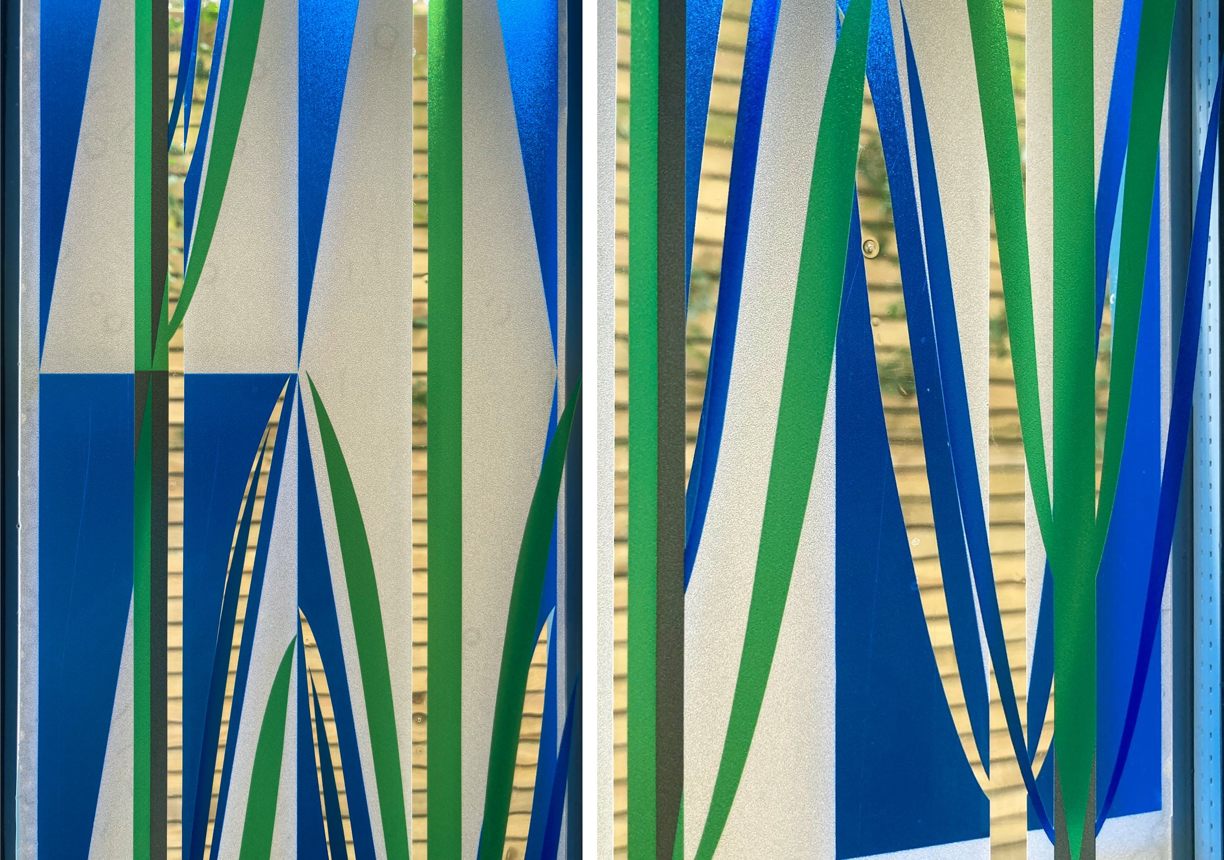
Details of completed window, 2 layers of vinyl.

Two Layers by Sasha Ward

Two layers installed, from the front, 960 x 790 mm.

Two layers installed, from the front, 960 x 790 mm.

This is a new commission for a house in London. The glass panel is in a place where there used to be a fishtank (with different dimensions); the client asked for geometry, textured colour, transparency and no flowers. I suggested two layers of glass to get interesting overlaps and a sense of movement and the project manager suggested edge lighting - we are are all pleased with the result which you can see in the photos above taken on installation day. The following pictures document the commission in progress, from first designs to final firing in my studio kiln.

Left: Original model made of acrylic. Centre: Half size watercolour design. Right: Sample on 2 sheets of glass

Left: Original model made of acrylic. Centre: Half size watercolour design. Right: Sample on 2 sheets of glass

First layer of enamel on the lightbox (left) and after firing in the kiln (right).

First layer of enamel on the lightbox (left) and after firing in the kiln (right).

Some handpainting on the second layer, trying (never succeeding) to match to the colour samples.

Some handpainting on the second layer, trying (never succeeding) to match to the colour samples.

The two panels in the kiln before their final firing.

The two panels in the kiln before their final firing.

Above: studio shot showing panels on lightbox Below: finished panels with tracing paper backing in the window

Above: studio shot showing panels on lightbox Below: finished panels with tracing paper backing in the window

panel 7.jpg

Painting enamel on the two layers of glass (shown separately above) and overlapping them in the window frame (below left) means the colours keep their own hue. Transparent glass enamels are very unpredictable when mixed and layering them often results in a lot of brown. The colours we ended up with are brighter than I had originally planned and they look absolutely great with the pinky decor and the concealed lighting which runs around the edges of both panels (below right).

Two layers installed, from the back with lights off (left) and on (right).

Two layers installed, from the back with lights off (left) and on (right).

The best details of the glass (below) are from the back, from the hallway behind the living room which is the darker side. As less light falls on this surface of the glass, the transparent colours are brought to life by the light through the living room window, even when the lights are off. The proportions of my design match those of the windows in the house, with a sandblasted off centre box where the two halves of the design come together and frame that window (below right).

Details of the glass from the back

Details of the glass from the back

Screen printing by Sasha Ward

Left, glass panel in the factory before lamination. Right, glass samples in hands, installed glass behind me.

Left, glass panel in the factory before lamination. Right, glass samples in hands, installed glass behind me.

I get large or external commissions screenprinted by protoglassstudios.com . Although they have been making my work since 1992 and have always done a good job, there are so many things to worry about when you hand over the manufacture to somebody else. For this one, commissioned for Alexandra Lodge which is a new development by Churchill Retirement Living in Thornbury, South Gloucestershire, it was the colours. I had the design worked out (described in my blog “Cobbles” in July) and a combination of four opaque colours agreed - you can see the factory sample showing the glass version of these colours in my left hand (above right). In my other hand is a painted sample with an earlier colour palette which ended up being rather similar to the final version.

The colours I use are usually paler, and I would say subtler, than the average. In this case, I was persuaded that the design wouldn’t show up outside and from a distance unless we boosted the colours. Imagine my surprise on visiting the factory after printing but before lamination, to see how dark the colours looked (this stage shown above left) - I was convinced I hadn’t chosen that blue but it was too late to do anything about it other than start again with all three panels. But the same finished panels, as you can see installed on the face of the building below, are somewhere in the middle in terms of the colour range and look just right with the building and the planting scheme.

Left, installation of glass at Alexandra Lodge, Thornbury. Right, official photo showing glass above lounge doors.

Left, installation of glass at Alexandra Lodge, Thornbury. Right, official photo showing glass above lounge doors.

I visited the glass factory on one day during manufacture to photograph the process as far as I could. An all out yellow layer had been printed first, this background brightened the whole piece and gave the exposed laminated edges a lovely yellow and purple two tone appearance. On the day, the green cobbles had already been printed and they were doing the blues which went around the edges of some cobbles and cut across the design in flowering branches. The purple layer would be the last to be printed, you can see this stencil on the screen below right and also as the black on the films that we laid on top of the other printed colours in the bottom picture.

Left, panel 2 in front of screen for blue. Right, screen for panel 3 purple.

Left, panel 2 in front of screen for blue. Right, screen for panel 3 purple.

Left, preparing to print blue on panel 3. Right, panel 3 going through the dryer.

Left, preparing to print blue on panel 3. Right, panel 3 going through the dryer.

Left, films for screens in the factory. Right, panel 1 with film for purple overlaid.

Left, films for screens in the factory. Right, panel 1 with film for purple overlaid.

Approach corridor by Sasha Ward

Vinyl/glass/vinyl window at Manchester Children’s Hospital: 1800 mm square.

Vinyl/glass/vinyl window at Manchester Children’s Hospital: 1800 mm square.

Sunburst was not the title intended for the piece I have just installed in a white corridor leading to the paediatric mortuary at Manchester Children’s Hospital. However in the record breaking February sunshine this week and framed by the corrugated sides of the hospital building outside, it glows like a gentle star. As you can see in the photo below left, dramatic shadows and colours are cast on to the floor - surely the best thing about stained glass. Evidently I hadn’t dared imagine the effect would be so good as the collage of my design on to the photo of the space shows (below right).

Left: Feature window at the entrance to the paediatric mortuary. Right: Photomontage of the same space.

Left: Feature window at the entrance to the paediatric mortuary. Right: Photomontage of the same space.

This feature window is part of a commission for artworks in the series of rooms that make up the mortuary. It was almost two years ago when I designed the work following consultation with staff and bereaved families and to a brief that asked for the artwork to be abstract, with no representational imagery and using gentle colours and shapes. Last month I wrote about the colour scheme and the door vision panels; there will be more on the wall designs (digitally printed wallpaper), wall panels and viewing windows when the new furniture arrives to complete the rooms later on.

Below is a page of sketches showing the development of the design for the feature window. I was concerned about working with - rather than fighting against - the horizontal bars and not blocking the wonderful view.

12 sketches showing development of the design

12 sketches showing development of the design

Window detail: vinyl on the left in this picture.

Window detail: vinyl on the left in this picture.

The feature window is made up of a hefty piece of laminated and toughened printed glass (2500 x 780 x 17mm) flanked by two pieces of printed transparent vinyl applied to the surface of the existing window. I hadn’t tried this combination up against each other before, and was apprehensive that the colours on the vinyl would look weak against the sparkling enamels on the glass. But they compliment each other well, the white/shadows are just as strong, and the pattern cast on the floor is colourful but subtle.

floorsm.jpg

Glass Network Questions by Sasha Ward

Today "Glass Network", the quarterly magazine of The Contemporary Glass Society arrived - here is my page. The questions I wrote about in this piece may be familiar to people who work to commission, or to those who have read my posts from Kelmscott Manor when the questions most frequently asked by visitors were spinning in my head.