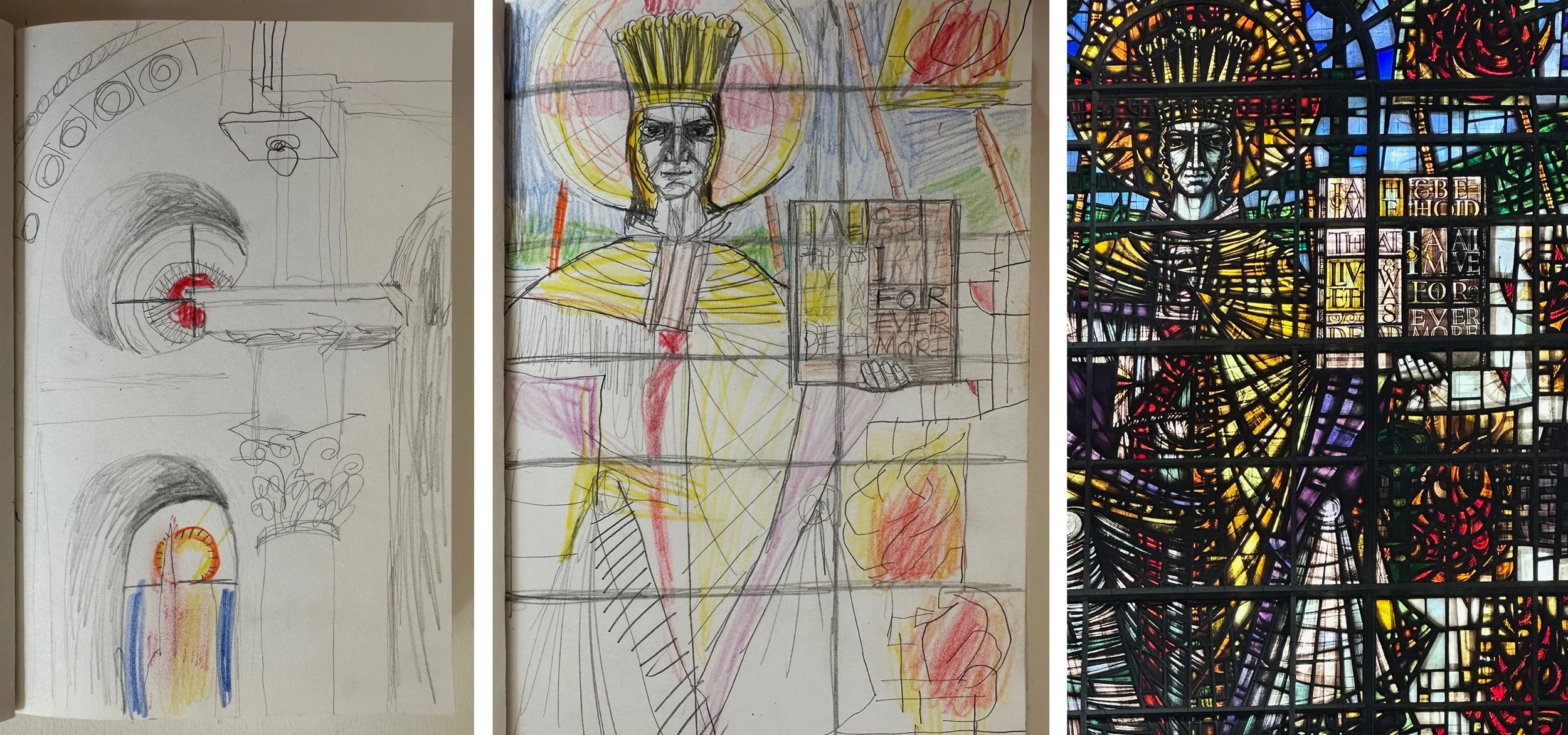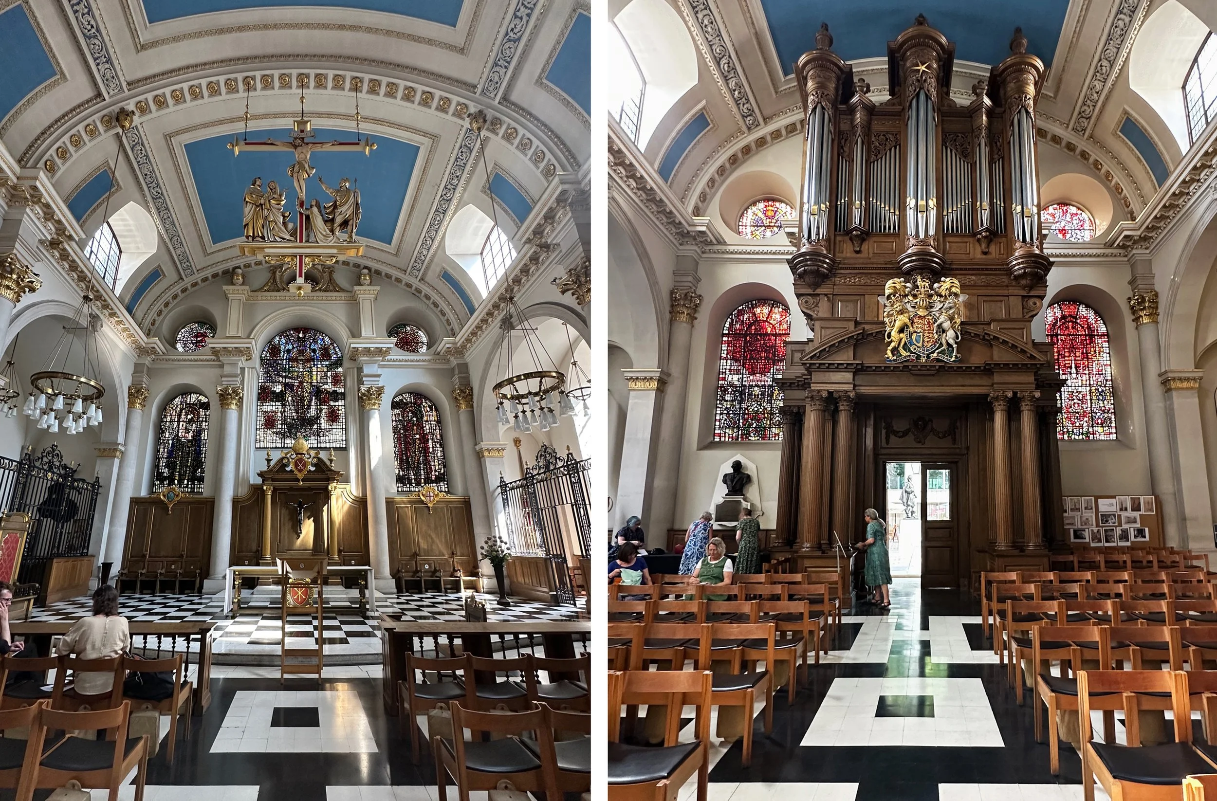
In Manchester Cathedral by Sasha Ward

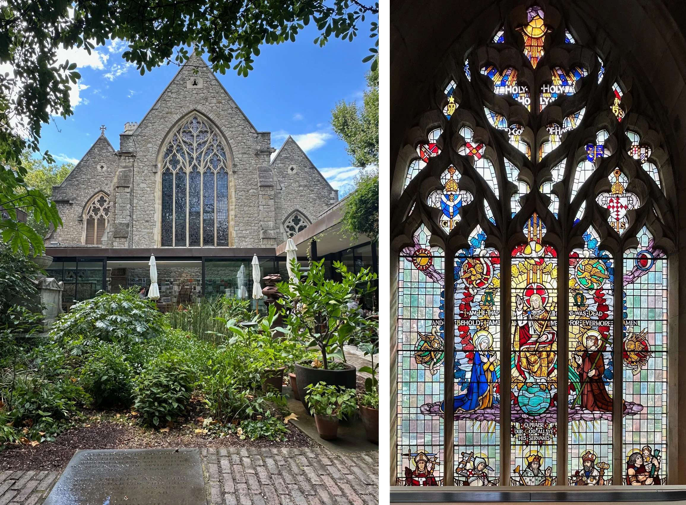
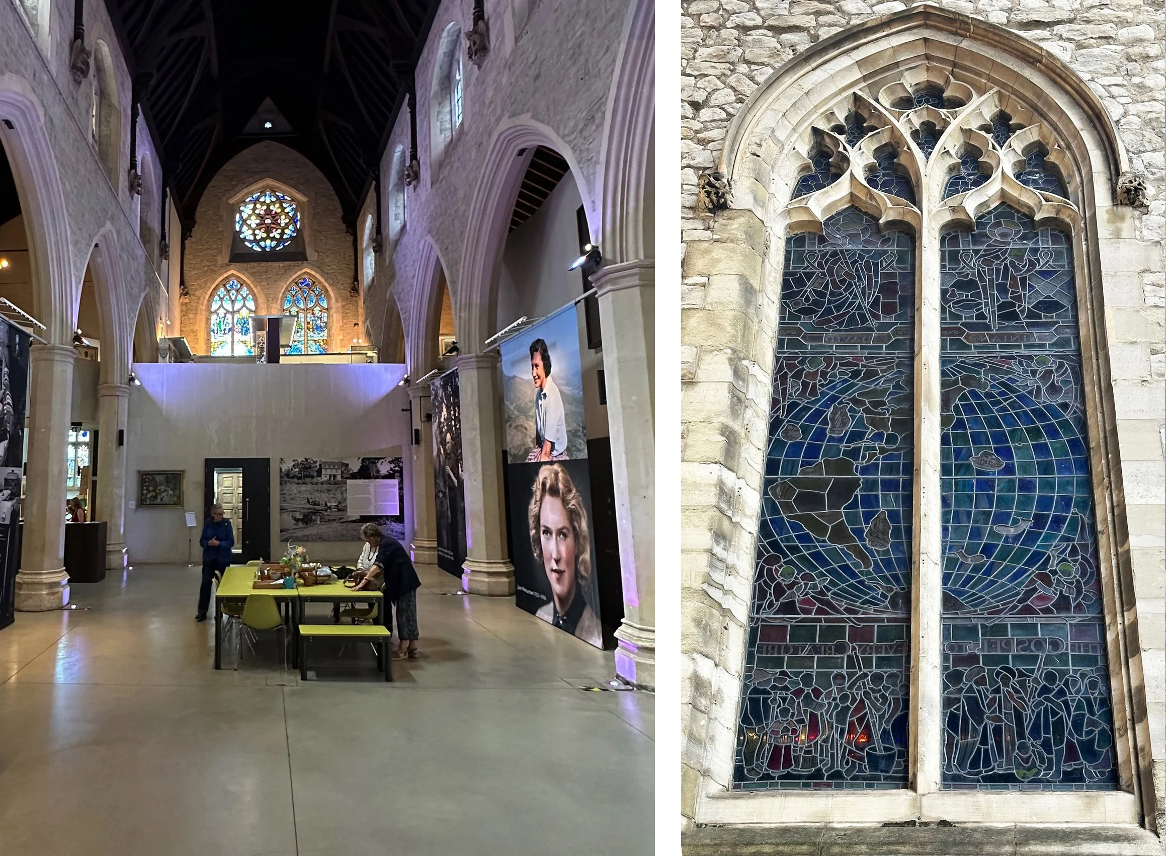
Left: View of Manchester Cathedral from the west. Right: Interior with windows by Antony Hollaway - Creation 1991 and St George 1973.

In the late medieval period Manchester Cathedral was a collegiate church dedicated to Saints Mary, George and Denys. The rebuilding of the tall west tower and the addition of chapels, galleries and a large annexe happened mostly after the building was given Cathedral status in 1847, then more changes came with destruction caused by the second world war and by the IRA bomb in 1996, so it is hard to identify anything from the medieval period. However all of the windows along the exceptionally wide east and west fronts were made between 1966 - 2016, chief among these being the five west windows designed and made by Antony Hollaway. I am writing ‘made’ with confidence as Tony Hollaway was head of three-dimensional design when I was a fine art student at Trent Polytechnic, and I went to his studio to see one of the windows being made on his workbench. So on my recent visit to Manchester I thought I would take another look, and make an assessment of these, his most celebrated works.

From left to right they are Creation 1991, St George 1973, St Mary 1980, St Denys 1976 and Revelation 1995. As you would expect from a series that spans 22 years, the styles are quite different with nothing obvious that links them all together other than the vision of one artist and his patron, the cathedral architect Harry M. Fairhurst.

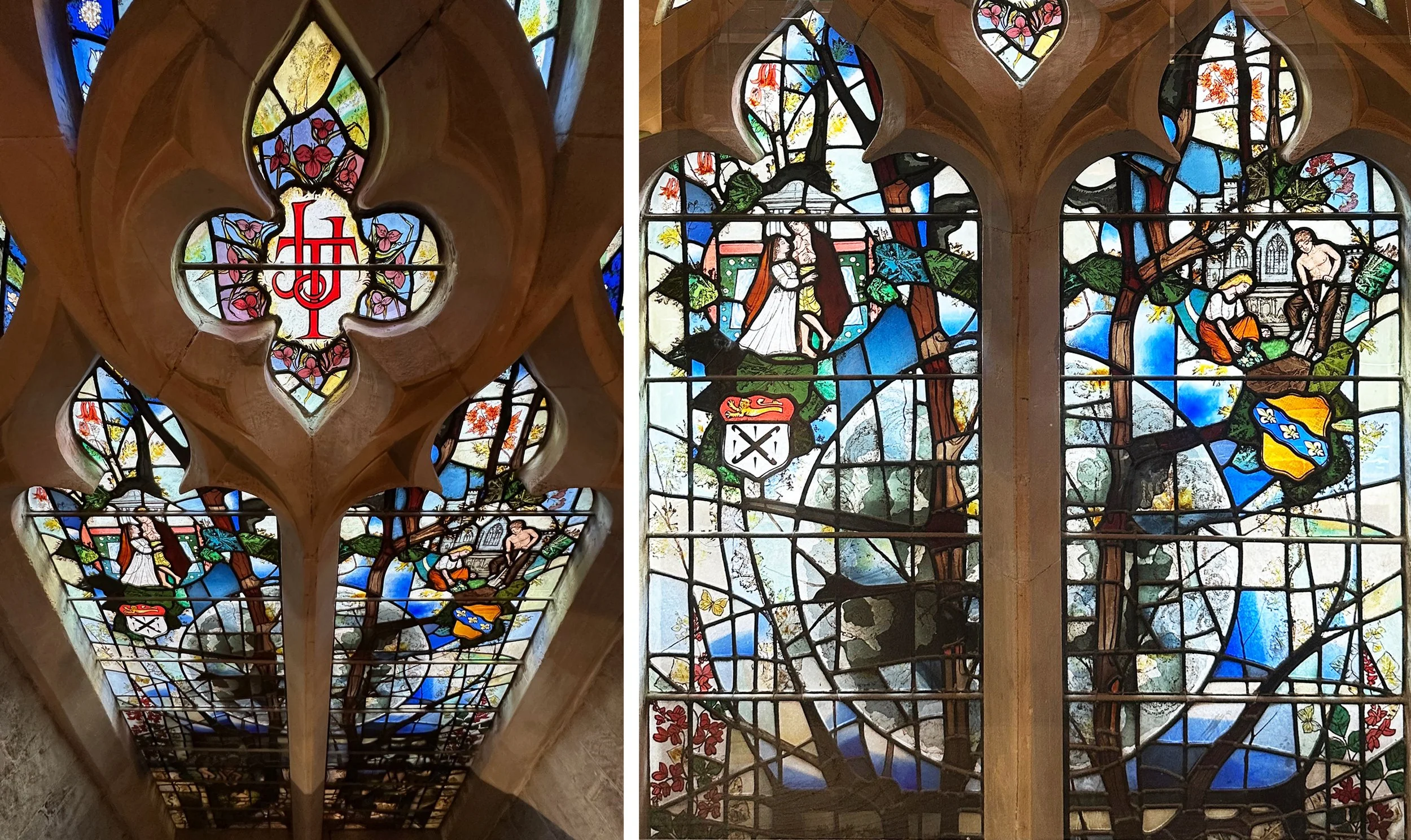
Left : detail from bottom left of Creation window 1991. Right : detail from bottom right of St George window 1973.

The Creation window which fittingly starts the sequence has an angular, complicated composition evoking landscape and skyscape, with versions of circular gender symbols at the bottom (above left). The next in line is the earliest window and is dedicated to St George, there is a deconstructed red cross that spans most of the window and lurking behind is a dragon, whose abstracted body appears in green on the right hand side (above right). While the Creation window is smothered in the sort of messy paintwork that I never liked, the details in St George are more curvy, with period looking scaley patterns in the rich colours that are often used for stained glass dragons.

St Mary window 1980 and detail from bottom left.

The St Mary window is next and higher up as it’s in the tower. This is the one that you see on all the publicity for the cathedral, and it’s the one that I saw being made in 1979. I really remember the evening studio visit where I was allowed to join a group of not particularly interested 3D design students, glass wasn’t a material in favour at the college then. I remember the jumbled lettering - words from the Magnificat - letters being used for their look rather than their meaning as it seemed to me at the time, so another work with echoes from the past and a period of stained glass design that i was trying to get away from. I was never taught by Hollaway, but he was very rude about the work I was doing in the manner of a typical 1970s art school tutor.

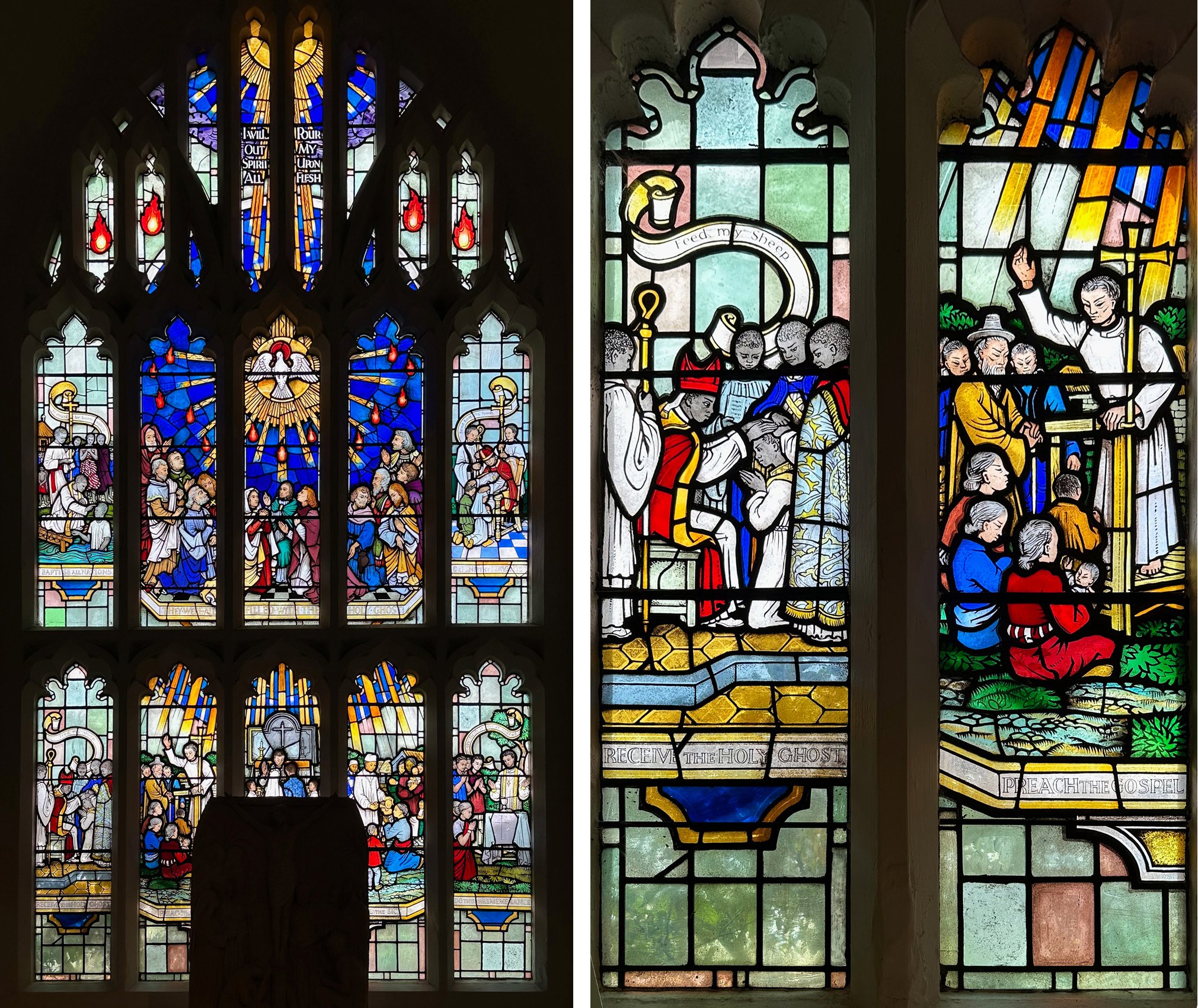
Left : Interior with windows by Antony Hollaway - St Denys 1976 and Revelation 1995. Right : St Denys window.

The glass in the St Denys window returns to the predominantly red palette of the St George window, and like the Mary window, uses a large off centre circle to symbolise the saint. In addition to the crosses there are elements of buildings and foliage (below left) with painting and colour drifting in bands across the 15th century tracery.

Left : detail from bottom right of St Denys window. Right : detail from bottom right of Revelation window.

Finally the latest window and for me, easily the best. No jarring red circles, just stones to symbolise the heavenly city in a divine range of colours and although the close up (above right) shows you that every piece is indeed painted, the black/grey pigment doesn’t dominate. This work reminds me of the windows of Brigitte Simon in Tournus Abbey, France, where her aim was to '‘extend the impression of the stones’ in an ancient building.

Revelation window 1995.

Opposite Revelation, across the length of the cathedral, is Margaret Traherne’s Fire window from 1966 (below). This also looks fantastic in the space, the regimental chapel, and is the most simple, literal interpretation of the theme that was originally commissioned to commemorate the rebuilding of the cathedral by the architect Hubert Worthington after the 1940 Manchester blitz. When the window was damaged by the 1996 Manchester bomb, Traherne supervised its restoration using superb streaky glass and an eccentric leading panel that closely matches the original - I checked on the pre 1996 postcard I have of the work.

Regimental chapel at the north east end of the church with Fire window by Margaret Traherne 1966, remade in 1996.

And a quick mention for the paintings of Carel Weight in the recesses of the stonework above the entrance doors to the Chapter House. In the lower panels separate small paintings with titles of seven of the beatitudes (or blessings from Christ’s sermon on the mount), above them a painting that spreads across the compartments and shows Christ with the people in a rural, local setting. All are wonderful - it’s a pleasure to see the work of these distinguished twentieth century artists in such a magnificent setting.

Entrance to The Chapter House, with paintings of The Beatitudes by Carel Weight 1963.

Design Process by Sasha Ward

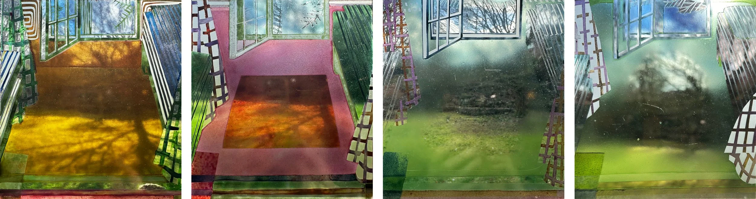
These squares show a small part of a large work that I have designed to cover an 18 metre long hospital corridor, from floor to ceiling on both sides. The squares illustrate the design process in 15 stages - a process that is interesting to me because of the way it shows the design developing, and that is unlike a traditional work in progress piece that illustrates the stages of making.

15 stages in the design of one square, from floor to ceiling, taken from the centre of the design. The solid band 2/3rds down represents the crash rail.

This is a commission for a public place with many interested parties involved in the discussion about the artwork. So not all the decisions to alter or add things are mine - which is as it should be. Colours were changed completely, geometry was reduced to a minimum, detail and texture were introduced, and the interpretation of the given theme, which was ‘nature’, ended up more pastoral than patterned. There are lots of things - and echoes of things - that have to be avoided when you’re making work for a space as sensitive as the approach to a mortuary.

15 stages in the design of another square, from floor to ceiling, taken from the end of the design.

However there are discarded aspects of the design that I miss - the sharp straight lines to contrast with the ovals that went after square 4: the empty spaces in square 5: the simple patterns in square 6. I made paper models of some of the stages to help us look at the design - below are the versions that include squares 4 and 15. The design will be printed on to PVC panels and installed in the corridor soon. Fingers crossed.

Two months of churches by Sasha Ward

On my days out I visit any church I pass whose door is open. I’ve not come across anything spectacular recently, so here are small scale highlights from the past two months that include some obvious links - blue glass, boats and rivers.

St Thomas Church, Lymington. Left: George Cooper-Abbs 1946. Right: Tracey Sheppard 2024.

In Lymington, beside the sea, I liked the fish at the bottom of a Cooper-Abbs window where you can also see a clear example of his name and maker’s mark (above left). In the same church, the new inner doors etched and engraved by Tracey Sheppard have a full size sparrow and goldfinch on the tree branches that are astonishingly life like, full of textures and shades of white (above right). On the lower part of the doors (not shown) salt laden waves lap at the roots of the tree.

In St Saviour’s Pimlico there was a subtle window, predominantly pale blue, made up of separate scenes including a landscape with sheep and wolf in the bottom corner (below).

St Saviour Church, Pimlico. Baptistry window c. 1922.

In one of my local churches, Alton Barnes in Wiltshire, a south facing window has a number of memorial diamond panes designed and engraved by Laurence Whistler and his son Simon Whistler, with the later ones (from 2004) engraved by Frank Grenier. Here you can again find some sheep, also a paper boat that Laurence Whistler designed for his own memorial, being blown around by life (below right).

St Mary Church, Alton Barnes. Window with diamond panes by Laurence Whistler and Simon Whistler 1979 - 2001.

All Saints Church, Hove. Narthex windows by Martin Travers, 1932.

In All Saints Hove, I was delighted to find a series of small windows by Martin Travers in the Narthex, so outside the main body of this huge church. You are able to get close up to see the finely painted details in the figures that fill each of the window openings, with simple plain borders and this text below; Remember O Lord the souls of Thy servants Thomas Peacey priest Vicar of Hove 1879-1909 and Prebendary of Chichester Cathedral, born 16.IX.1846 died I.IV.1909 and Ellen Maria Conolly his wife, born 10.III.1854 died 22.X.1899. These windows were given in their memory by their loving and grateful children.

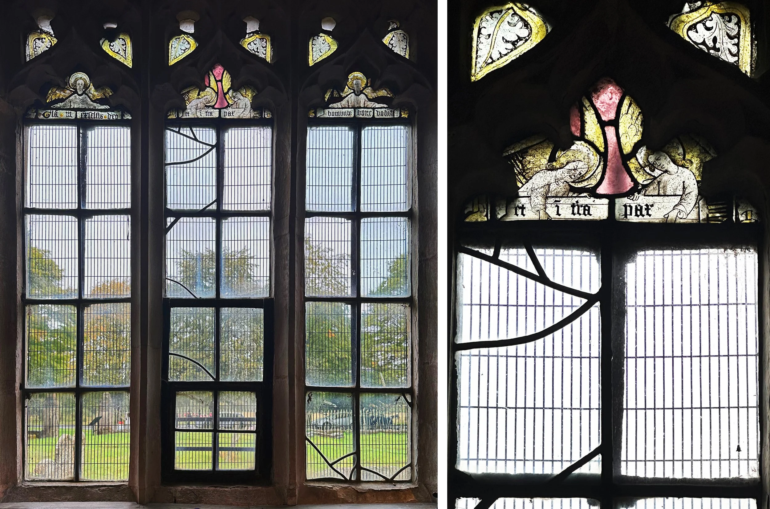
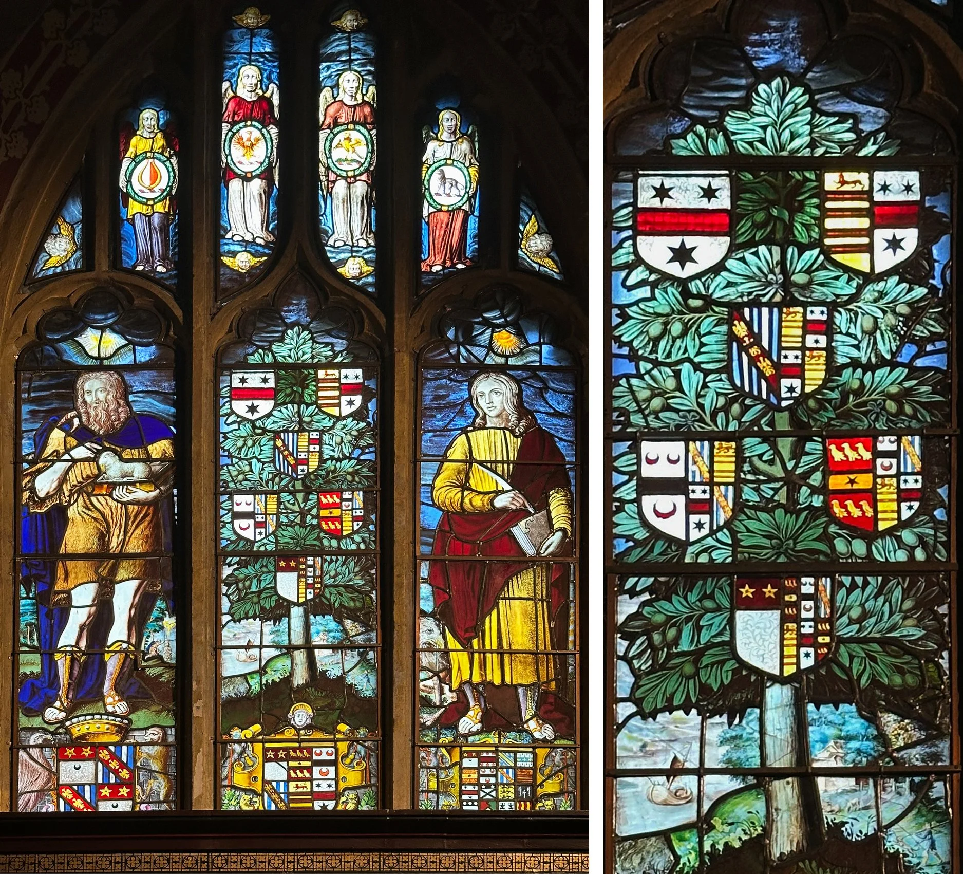
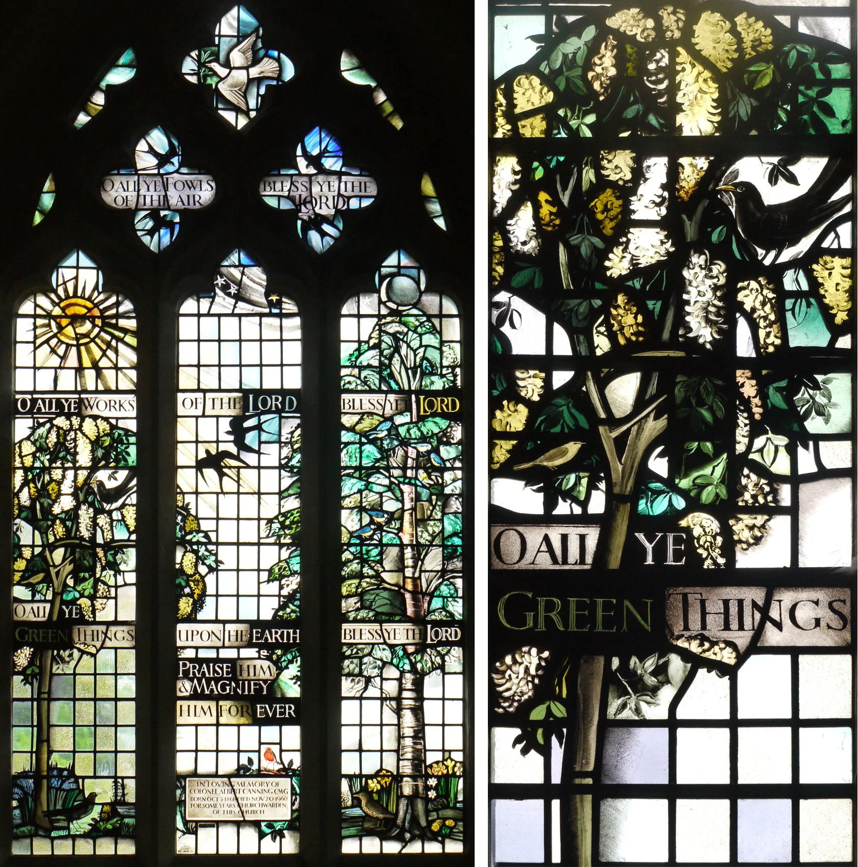
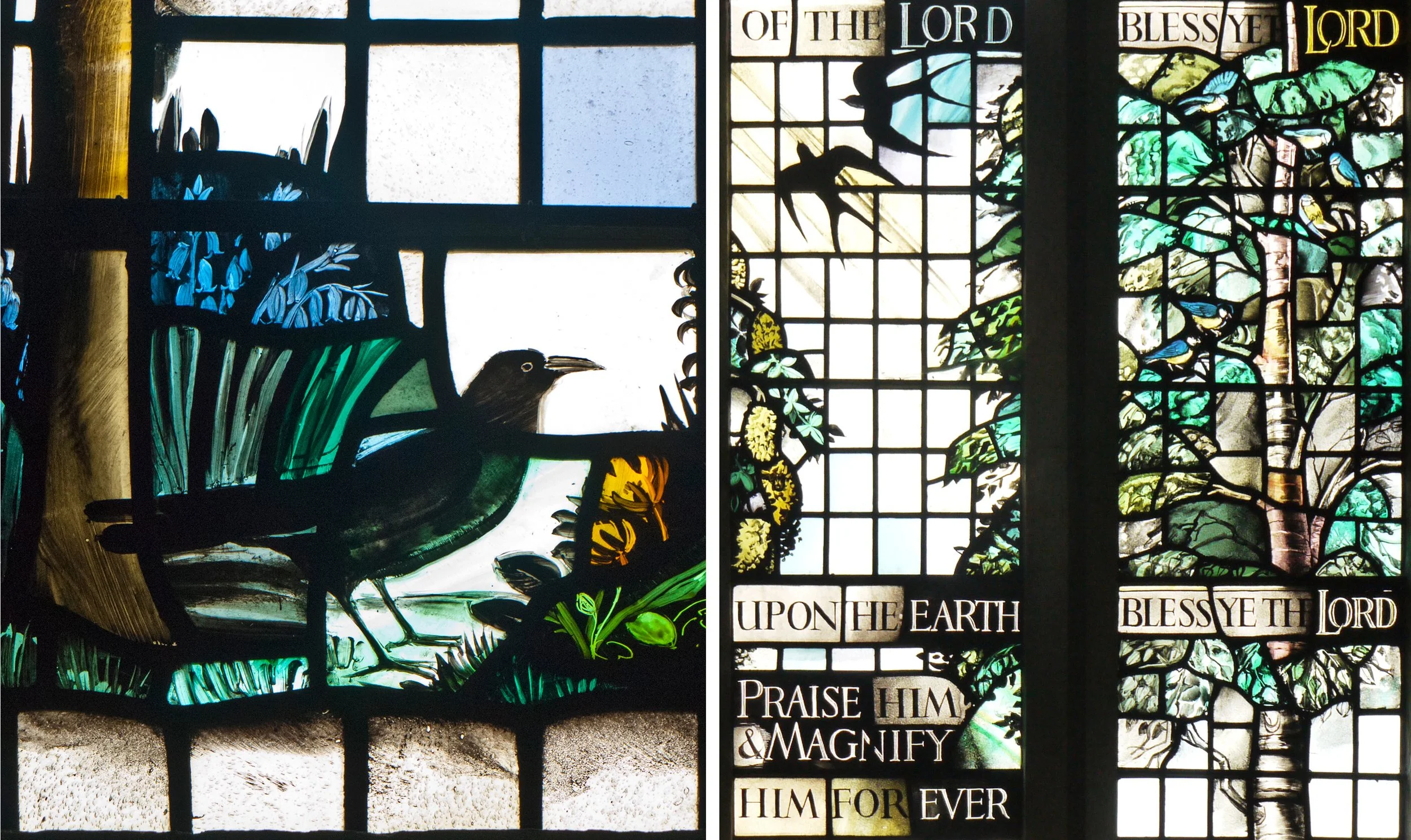
A window from 2023 installed in one of the windows in the Abbey Church, Beaulieu is dedicated to Edward John Barrington Douglas Scott Montagu (all one person) 1926-2015, founder of the National Motor Museum in the grounds of his stately home, Beaulieu Palace House. This window shows the Beaulieu river from the Abbey down to the sea, there are symbols of different aspects of the Christian faith included in the design but like so much new church glass the emphasis is on the natural world.

Abbey Church, Beaulieu. Nicholas Bechgaard, made by Salisbury Cathedral stained glass 2023.

I went to see a new set of windows that were installed at the bottom of the very tall north transept window in St Mary Redcliffe in 2023 to replace panels commemorating the Bristol slave trader Edward Colston. On the theme And who is thy neighbour? the artist chosen for the commission, Ealish Swift, has drawn scenes linked by water and showing Jesus as multiple ethnicities. These scenes include the Bristol Bus Boycott, which paved the way for the Race Relations Act of 1965, with Jesus as a fellow protester and radical and in the third panel (below right) a depiction of Jesus as a child refugee fleeing to Egypt. It is good to see meaningful events celebrated in stained glass, and also good to see new work that fits in with the old in terms of scale of figures, decorative borders and text, but that is so obviously of its own time.

St Mary Church, Redcliffe Bristol. Lower panels by Ealish Swift made by Holy Well glass 2023.

Nature Inspired Wallpaper by Sasha Ward

Above: 4 stages of my design for UCHL. Below: latest version with both sides of the corridor design.

So far this year I have been fully occupied with the design of a wallcovering for both sides of an 18 metre long corridor leading to the mortuary in University College Hospital, London. There are many things to consider when doing a commission like this. I’m now at the stage where I’ve responded to the brief (nature inspired but with lots of caveats), to the feedback on my design ideas from the working group and then to the different opinions on the latest version of my design (above). I was in need of inspiration to fortify myself for the next stage of the process, and happened to be in Brighton so I paid a visit to The Royal Pavilion.

Aquatint of The Long Gallery, Brighton Royal Pavilion published in 1826

Here, nature inspired wallpapers are everywhere, enlivened by geometric patterns on borders, carpets and ceilings. The blue and pink paper that covers the walls of the Long Gallery and the staircases at either end is a hand painted copy of the original, which was probably hand-painted in distemper by Frederick Crace around 1815, so produced in Britain but strongly influenced by work exported from China and seen elsewhere in the pavilion.

In 1823 local historian Richard Sickelmore described the Long Gallery as “one of the most superb apartments that art and fancy can produce and which, for richness in effect, and dazzling brilliance of decoration and design, is not to be equalled, perhaps, in Europe, if [not] the world”.

Brighton Royal Pavilion, details from the Long Gallery wallpaper (above) and from the staircase (below). Just shades of greyish blue on a pink background that glows and changes with the light conditions.

Brighton Royal Pavilion, The King’s apartments and detail of wallpaper

The other wallpapers that I like are in the bedrooms. White on green in King George IV’s apartments (above) and yellow on gold in his brothers’ bedrooms (below). These are also copies, but of designs from a slightly later date when the King was moved to the ground floor during John Nash’s transformation of the pavilion. The paper is a hand-painted copy of decorator Robert Jones’ original printed wallpaper from the 1820s - you can see brush marks in the white paint. This design features dragons and birds as well as flowers and a wonderful stripy scroll along the bottom.

Elements of the design are repeated in the version in the upstairs bedrooms that uses the chrome yellow that was a new and popular colour of the period - the colour of joy and madness that I often have to avoid (or sneak in small amounts of) in my designs for hospitals. Here bamboo is used as an edging, there is a trompe l’oeuil pattern at the bottom and, best of all, there are actual Chinese paintings on the yellow walls that are a series illustrating the production of cotton and tea.

Upstairs in Brighton Royal Pavilion, The Yellow Bow Rooms and detail of wallpaper.

So the next steps for me - try a version with dark foliage and then one with white. Like the plants in these papers, mine are not intended to be realistic but to break up the expanses of wall in a way that combines geometry with nature - nature being the source of so much pattern-making.

Tadley Pool by Sasha Ward

Tadley Health and Fitmess Centre, Hampshire: Pool windows from the outside and the inside.

I returned to Tadley Pool for the first time in 28 years to see if the windows I’d made were still there - the answer was yes and they were looking absolutely great. We were invited in to take photos before the inflatable fun session started (above right) and I thought, as I had at the time, what an odd place it was to have stained glass windows. Because of that and the fact that I’d never had any good photos of them, I’d had a bad opinion of these windows and was now taken aback by how much I liked the design and the colours. The late 1990s was a time when local authorities commissioned art for new public buildings, and it was evidently a good period for my work.

Two windows at Tadley pool 1998. Each 2.6 × 2.9 metres.

The windows were screen printed at Proto Studios which was located in Greenwich at the time, using old fashioned technology. I drew out the designs in black ink, these were photographed and made into screens resulting in a finish where I can recognise my own hand drawn lines. Each window has a different combination of a blue and a yellow with a third colour on the overlaps and a clear white line rather than a sandblasted white one. The screens for the edge panels were flipped for the panel opposite, making this commission one with a very effective use of a smallish budget.

Details of the centre panels

Sunshine through the corners, the clear lines stand out in the transmitted coloured light.

Small watercolour design for the windows.

Back in the studio I found the watercolour designs, tiny but close in feel to the final product. I’m now thinking of how much I can learn from looking back at the way I used to do things before computer technology intervened in the drawing up process and everyone’s work started looking slightly similar.

I also remembered the window I made as part of the same public art project in the nearest infants’ school, Bishopswood. The school colour was red and the theme was trees, as it was for the pool windows. The design was directly from eleven of the children’s drawings and I leaded the window up in the school so that the pupils could see how it was made, and handle (health and safety was also great in those days!) the glass pieces. This was a window that I always really liked, hopefully it’s still there too.

Bishopswood Infants School, Tadley. Window above the entrance doors.