Sea, Stone and Glass by Sasha Ward

Detail of 1919 window designed by Edward Prynne, made by J.Jennings.

Usually, you can find a great bit of detail in any old stained glass window. I saw this wonderful cupid at the bottom of one of a series of six in St Thomas a Becket, Pagham, West Sussex, helpfully signed with the inscription of the designer and the maker, "Edwd. A.F.Prynne, J. Jennings, AD 1919". The backgrounds to the figures are smothered with clumps of plants between streams of water on pieces of glass whose shape reminded me of the flints that some buildings in this area are made of.

Wall of St Thomas a Becket, Pagham.          Background detail from one of the six Edward Prynne windows

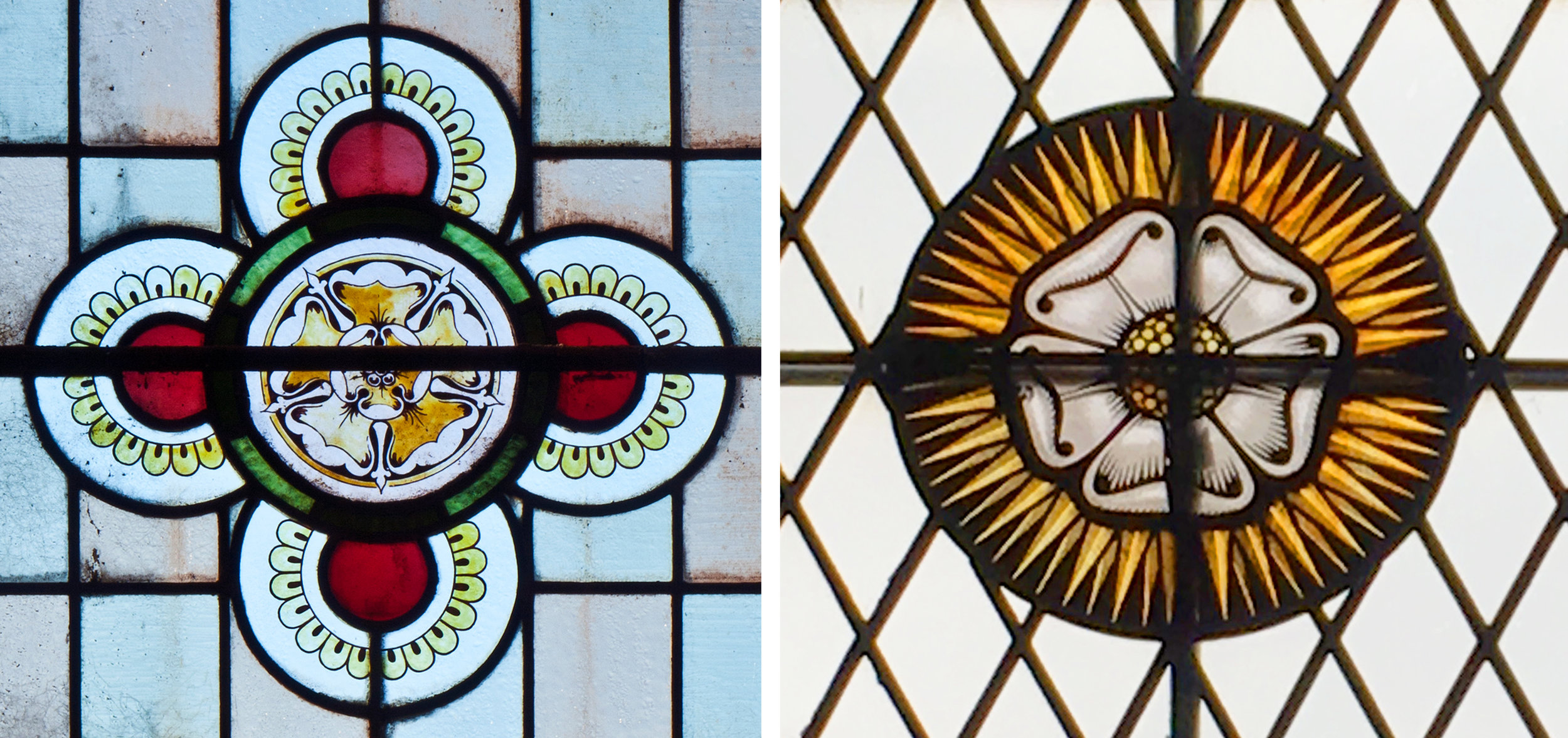
Details from the east window, with signatures at bottom right.

The whole of the east window is a lovely composition of old glass. The details I have picked out include figures in bright coloured glass with rich silverstain. In the bottom right of each photo is another useful inscription - on the left "Re-glazed & re-arranged 1939 HMOT" (Howard Martin Otto Travers), on the right "RE-LEADED AD 1919 J.Jennings". 

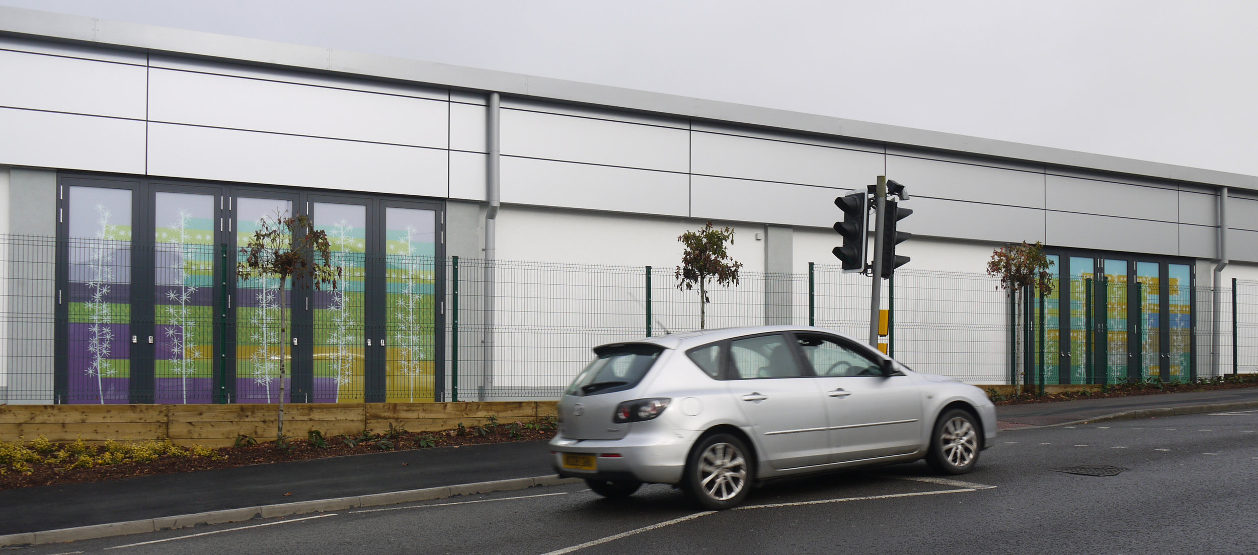
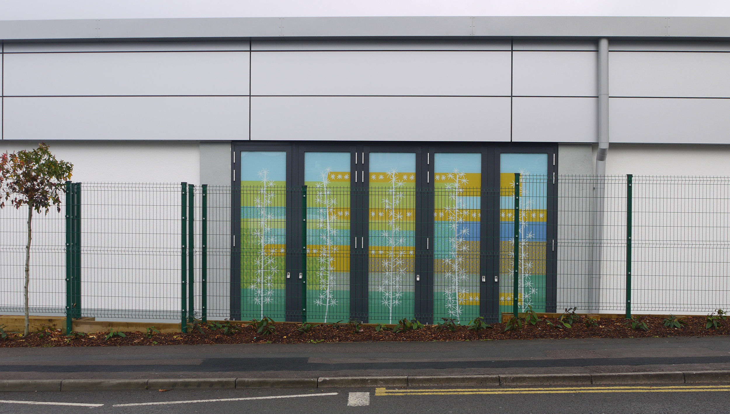
It was good to have this reminder of the process as I was on my way to teach a stained glass course at West Dean College. At the end of the week I could see lots of links between the windows in Pagham Church and the students' panels, see below. These include representations of the sea in cut shapes and glass paint, clump shaped pieces of glass with landscape painting, and the inspiring backdrop of a wall in the world's largest flint building (according to one of my students, an ex- architect).

Student windows from West Dean College: sea, rainy landscape, composition in front of flint wall at West Dean.

Pagham: seaside coffee break, seaside architecture, seaside window.

Click images to enlarge

Rose Windows by Sasha Ward

All Saints, Shrewsbury                                                                 Ho…

All Saints, Shrewsbury                                                                 Holy Cross, Ramsbury, Wiltshire

On the last four trips to look at stained glass windows, I've found myself looking at the same shaped rose in the centre of a design. These all have at leat one ring of five petals with a symmetrically folded edge and a spotty centre. They range from the most realistic at All Saints Shrewsbury (above left) to the most modern and heraldic one from the 1950s at Eltham Palace (below right).  The effect of three of them is rather ruined by one or two bars running right through the centre, but I like the combination of this basic 3D modelling surrounded by geometric patterns - as ever I'm focusing on the look of the design rather than its meaning. 

Moravian Church, Malmesbury                                            Great Hall, Eltham Palace

Moravian Church, Malmesbury                                            Great Hall, Eltham Palace

The Vyne, Hampshire                             St. Mary, South Hayling             St. Mary, Cheltenham

The Vyne, Hampshire                             St. Mary, South Hayling             St. Mary, Cheltenham

Unsurprisingly, I found more examples of the same in my files of recent stained glass photographs including the two above - the most lovely red on blue rose in a tudor window at The Vyne (NT, near Basingstoke) and one at the bottom of a Kempe window on Hayling Island. As this slightly blurry image shows, I wasn't concentrating on the bottom, or predella, of a window at this point even though this is where you can get an excellent close up shot. 

It's great to see more realistic roses too, like the ones in the triangular tracery from St. Mary, Cheltenham (above right). My all time favourites are in St. Johannes, also known as The Church of the Roses, built in Malmo in 1906. The rose is everywhere inside and is the subject matter of most of the windows, including a number of rose "rose" windows. Since my first visit to this church in 2012 I have been very influenced by its colour scheme in my work for interiors. The combination of every hue but in a pastel tone gives you a really peaceful, happy feeling.

panel rose 5.jpg
St. Johannes, Malmo

St. Johannes, Malmo

Slightly Anonymous by Sasha Ward

Glass in the light well, Shrewsbury Cathedral toilets.

Luckily there were some fascinating glass blocks in the toilets at Shrewsbury Cathedral, as that (and the cafe) was the only part of the building open to visitors last Sunday lunchtime. I took photographs of these (above) instead of the famous Margaret Rope windows I wanted to see. Then I thought about the windows I had seen recently and sorted out the ones that photographed well to make this review of my stained glass year. Comments below say what I like about each group of windows. Together, they are a celebration of the anonymous makers and designers - except for a few bits of Victoriana. 

King's College Chapel, Cambridge. Chavenage House, Gloucestershire. St. Mary, Bruton, Somerset.

Fantastic glass painting of faces and figures - C15th deceased man standing in his tomb; medieval fragments; coloured background of the promised land by The Royal Stained Glass Works.

Peterborough, shop door. St. Thomas a Becket, Romney Marsh. Sts. Peter & Paul, Wisbech.

Crosses - stained glass crochet style; cross that emphasises the qualities of the materials; crucifixion using Victorian (William Wailes?) and medieval fragments.

The Grand, Folkestone. Holy Cross, Ramsbury, Wiltshire. Kingsdown Crematorium, Wiltshire.

Shadows and the introduction of colour - holiday breakfast; wonky geometry; new laminated coloured glass panels.

All Saints, Cambridge. All Saints, Leicester. Peterborough Cathedral.

From rectangles to diamonds - ancient angels below & William Morris angels above; with both shapes & more wonky geometry; keys of St. Peter in light and dark colours above the huge diamond panels.

Click on pictures to enlarge, follow me on twitter (link at top of page) and instagram (sashawardglass) to see more.

Analysis of The Xmas Cards Part 3 by Sasha Ward

This is the third consecutive year of my Christmas card analysis, see the previous results here and here. Thinking about it, I've realised that some of my categories are a bit arbitrary - the only certainty is the shape of the card itself. This year the square ones have leapt up to 49% as shown in the chart below. 

graph.jpeg

Portrait shaped cards look the best on the mantlepiece, but they were in the minority this year.

Some good ones on the mantlepiece, in case you're in doubt - square, portrait, other, sq., sq., sq., portrait, sq., sq.

Some good ones on the mantlepiece, in case you're in doubt - square, portrait, other, sq., sq., sq., portrait, sq., sq.

Cards go sideways on the walls.

Cards go sideways on the walls.

Last year, I was sad about the dropping off of home made cards, as opposed to home (digitally) printed cards. This year I've stopped being so picky and the category title is "a card made by the person who sent it" (31%), not must change over the survey period for this homemade category.

Twin robin cards and some pigeons

Twin robin cards and some pigeons

In terms of subject categories, there were more birds than ever (11 including 4 robins) and 6 cards that included pictures of deer. Only 1 with angels, 2 of the virgin & child and 2 nativity scenes - one of them in stained glass - hurray! But, as I said, my categories are getting confused. In the past I've had "reproductions of well known artworks" and "snow scenes". There are some obvious category-straddlers here, with the robin in the snow (above) & the Edward Bawden deer (below). 

I hate to choose an overall winner, although I don't think there is a big overlap between people who send me cards and those who read this blog. Four favourites below are Robert Rauschenberg's Gold Painting, Janina Konarska's Skiers, Edward Bawden's Deer and Trees, and a mistletoe print - there is such a lovely texture on this genuine handmade item.

x1.jpeg

Drive By Design by Sasha Ward

Driving along Cecil Road

Driving along Cecil Road

This is the first part of my commission for a new Lidl store in Kingswood, South Gloucestershire. The side of the building is on a residential street, so the standard elevation has been enlivened with a series of "windows" and a design printed on opaque vinyl that links the three sets of panels with ribbons of colour and pattern.  

panel 3.jpg

As you can see from the two sets of designs above, things change during the building process. Where there were four windows per set, there are eventually five. Where the landscape design took account of these windows, in the end it didn't and there was a fence with a banner on it partly obscuring the end windows that announced the opening of the shop in November (below).

panel 4.jpg
panel 2s.jpg

However, I am happy with my design. The geometry goes well with the grids of the building and the fence, the stars in various forms link with the lines of trees and upright posts and the colour scheme looks just right under the grey or the blue sky. In the details taken from the partially obscured windows (who knows, the banner may have been removed by now) you can see different types of stars and details from local buildings both printed and reflected in the vinyl.

panel 1.jpg