Nevers and Rodez Cathedrals by Sasha Ward

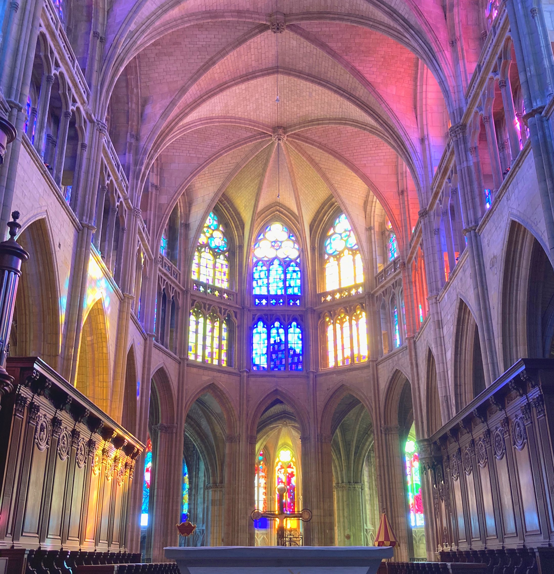
Morning sun in Nevers Cathedral

The Cathedral of Saint Cyr and Saint Juliette of Nevers, in the middle of France on the river Loire, is an essential stop on a stained glass road trip as its windows are filled with modern stained glass - that is 1052 square metres in 130 windows designed by five different artists. The gothic east end was blazing with colour on the morning of our visit, projecting right up to the opposite end of the cathedral (below left) where there are four subtle, rhythmic windows by Raoul Ubac. These were the first to be commissioned for this ambitious stained glass project initiated almost forty years after the building was bombed by the Royal Air Force.

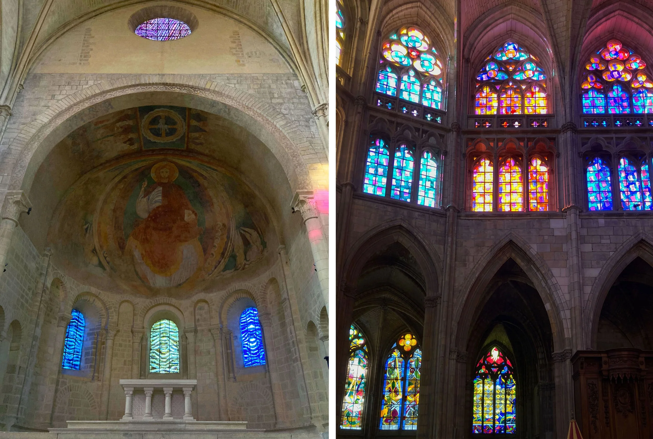
Nevers: Left, four windows in the romanesque west end by Raoul Ubac, 1983. Right, upper choir windows by Claude Viallat, 1992.

It is the upper windows in the choir that project most of the colour, this set by Claude Viallat contains a repeated motif (which we called the floating toast) in a gorgeous bright and light colour palette. They act as a bridge between the set of geometric designs by Gottfried Honegger in the windows of the upper nave, and the many windows by Jean-Michel Albérola in the chapels around the apse which you can see in bursts through the cathedral’s interior arches as soon as you enter (above right and top).

There are several useful information boards about the windows in the cathedral, the one below particularly so as it gives the names of the glass studios that worked with each artist and a detail from each set of windows - something I can’t do as I forgot to take my good camera on this trip. The commentary, as always, is keen to interpret the designs in terms of subject matter, whereas in fact the only artist who used figurative imagery is Jean Michel Albérola.

Useful information board in Nevers Cathedral

Nevers: Left, Chapel of the Joyful Mysteries. Right, Blessed Sacrament Chapel, Jean-Michel Albérola, 1993-4.

The figurative path is, I think, the hardest one to choose and to admire. Look at the gorgeous saturated green, orange and pink projected on the floor of the radiant gothic Blessed Sacrament Chapel, and then look again and realise that the white shape is a giant hand silhouette, one of the hands of God. Albérola’s imagery is saturated with motifs from the whole history of European painting, as well as borrowing from traditional stained glass design as you can see in the floral ornamentation, crosshatching and cartoonish figures and hands in the example below.

I took pieces of images either figurative or decorative which I mixed together, as I usually do… From the beginning, I started with the idea of quotation, without inventing anything”. Albérola quoted in a comrehensive article about these windows in The Spirit of the Eye.

Nevers: Left, two windows by Albérola in the apse. Right, two windows by Gottfried Honegger in the crypt, 2001.

Gottfried Honegger’s windows seem to be exercises in elegant shape and colour, even the information board resists the urge to interpret the simple shapes in his windows for the nave and the crypt (above right). But are they enough? My favourite set, the windows in the side chapels of the nave by François Rouan, hover between the worlds of imagery and abstraction. They play sensitively with the complicated patterns in the tracery using restrained colour combinations and have a huge impact when you stand in front of them (below).

Nevers: Windows by François Rouan in the side chapels of the nave, 1991-6.

Our next stop, 250 miles south, was Rodez and the Cathedral of Notre Dame. Here one artist, Stéphane Belzère, was chosen in a competition launched in 2002 to design seven tall gothic windows in the side chapels around the choir. A condition of the competition was that the windows should contain Christian iconography on set themes using figurative imagery appropriate to the twenty first century. Atelier Duchemin, who made Albérola’s Nevers windows, was chosen as the manufacturer and these windows are also beautifully made and slightly cartoonish with a digital, twenty first century feel.

Rodez: Windows by Stéphane Belzère in the chapels on the east side of the nave (windows completed 2006).

The first window interprets the theme The Blood of Christ (above left) with oversized hands (again) and blood cells. The second window, Resurrection, uses glass that goes from the deepest red to the palest yellow - extreme colour saturation to extreme light - with minimal leading and all details etched, painted and silverstained by the artist (above right).

Rodez: Windows by Belzère in the chapels on the west side representing Saints in Heaven (left) and Genesis (right).

The windows on the west side are taller still, and the top tracery of each is filled with wonderfully multicoloured glass, made with coloured frits. My favourite of them all is the one with the slightly terrifying red border (below centre and right). This one, The Dream of Boaz, contains a version of Jesse’s tree, you can make out figures and faces in the beautifully painted, etched and silverstained bubble. It’s interesting to see the collision of a twenty first century approach to picture making with the cathedral’s architecture and the declared intention of giving people images that interpret the bible in the traditional manner of stained glass windows, a view outlined in the comprehensive explanation panels on display. The whole effect is jumbled, patternless and full of religious content, a thing you rarely find in modern church or cathedral windows.

Rodez: Windows by Belzère in the chapels on the west side, representing Fire (left) and The Dream of Boaz (right).

Introduction to the French Road Trip by Sasha Ward

Rouen Cathedral with stained glass by Max Ingrand 1956 (below)

The first leg of our road trip consisted of a journey from the north - Calais - to the south - Mazamet - with stops along the way, some for stained glass and some for camping. Our first stop was Rouen and a quick evening visit to Notre Dame Cathedral, famous for its façade painted by Monet, drawn by Ruskin and admired by William Morris and Edward Burne-Jones on their sight seeing visit in 1855. On our trip the heat wave was on and the sun was blazing through tall thin windows filled with excellent examples of stained glass from the 13th to the 16th century. The 1950s windows, most notably by Max Ingrand, replaced the ones that were bombed during the Second World War. They are similar to the cathedral’s medieval and renaissance windows in terms of composition, with colours and imagery that fit in, in an unremarkable way. I loved the patterned windows (top right) in a design of squares and diamonds with painted details that makes the glass look padded, like a quilt.

Stained glass windows in the church of St Ouen, Léry.

Early the next morning we stopped outside a church 15 miles away, and found it open, the interior beautifully kept. It looked, sounded (taped organ music) and smelt in perfect order, with painted walls, tiled floors, wooden sculptures and a complete set of twentieth century windows. The ones in the lower windows (shown above) were all of a similar design in different colour combinations and they became more satisfying the longer we looked at them. Like the patterned windows in Rouen Cathedral, I couldn’t find a name or a date, and like those windows they were in harmony with the architecture. When I was an art student I used to call this sort of stained glass ‘subservient to the architecture’, now I tend to think that’s a positive quality for a stained glass window to have.

Chartres Cathedral: east window, west window and Notre Dame de la Belle Verrière. 12th and 13th century glass.

We spent a day in Chartres, where I hadn’t been since I was a school student. I knew the interior had been controversially cleaned, so the pools of coloured light projected through the glass don’t seem so intense now that the interior is mostly white, rather than mostly black. However the medieval stained glass in its entirety is the best there is; huge and intricate, overwhelming and predominantly cobalt blue. The windows above the west door are beautiful (above centre) and so is the window of Notre Dame de la Belle Verrière (above right) that was always one of my favourites in my stained glass picture books. That’s one of the points of the road trip - to stand in front of your favourite artworks, an experience that is completely different from looking at them in a book or on a screen.

Playmobil window by Sasha Ward

Stained glass playmobil style.

My ideal customer wrote to me with an idea for a commission, based on what he described as ‘plastic glass from a toy’. Imagine my delight when I looked at the photos attached (above) and realised that we were talking playmobil, and that these playmobil stained glass windows are better, in terms of simplicity, colour and design, than most of the ones that I see of a similar date commissioned for churches and other buildings.

Inspiration also came from a photo story about the commissioning of the playmobil stained glass (above). I particularly like pictures 1 and 2 showing two figures looking and listening for inspiration on site, followed by drawing up plans, ‘meeting the world renowned stained glass artist Philipp and his wife Amelie in their alpine home’ (picture 4) and then, rather less convincingly, Philipp looking at stones and gems for colour ideas. The windows arrive properly packed in time for installation at Christmas when Bishop Paul says mass at dawn (last picture).

My studio lightbox

Inspiration in the studio came from the suitcase of playmobil that my children and now my grandchildren play with and scraps of leftover glass laid out on the lightbox (above). The palette follows the predominantly primary colours of the plastic toys, especially the stained glass, and the idea that I went with for the design is based on a house with arched windows at the top, flower boxes at the bottom and figures, just bigger than life size (i.e. playmobil life size), standing inside and outside it.

Top left: Design work with glass scraps. Top right: Design, colour version 1. Bottom left: Design, colour version 2. Bottom right: Window in progress.

I worked out the details with scraps of glass over my cutline (above left), the subsequent changes mostly related to blocks of colour and light and dark. The pale orange streaky glass I had chosen for the lower wall of the house changed completely during the firing, becoming so dark that the two main figures, an old one with integral hands and a new one who features in the playmobil photo story, just looked like shadows. I recut and painted them on a pale mottled yellow instead.

Above, finished playmobil panel, 255 x 485 mm.

Detail showing the two main figures.

The originals on the orange streaky glass and the initial samples where I tried out figures on red flashed glass and on pale enamelled glass, left me with enough pieces to make a sample panel (below). A happy ending to pretty much my ideal small commission.

Ewelme and North Stoke, Oxfordshire by Sasha Ward

Between chancel and chapel, tomb of Alice de la Pole.

St Mary’s church, Ewelme, is full of many beautiful things including fifteenth century decorations spared from destruction during the civil war and the famous alabaster tomb of Alice de la Pole, Geoffrey Chaucer’s grand daughter and Duchess of Suffolk. The tomb (above) is spectacular, her full length figure is lying above her full length cadaver in a shroud and carved angels rise on columns above it.

The wall painting at the east end of the church is simple, decorative, meaningful but illegible and I’ve no idea how heavily it has been restored. My favourite corners are up above the Clayton and Bell east window (below) where exotic plant tendrils underline the writing on the wall making a gorgeous pattern from a distance.

St Mary Ewelme, chancel and detail of east window.

The chapel on the other side of Alice de la Pole’s tomb has a paler window containing fragments of medieval glass, mostly yellow (silverstain) that is well complimented by the rerodos and altar frontal by Ninian Comper. In these two wall and window combinations I love to see the contrast between different ages and styles, in both of them there is a good balance of light and colour so you feel as if you are surrounded by a world of rich, subtle detail.

St Mary Ewelme, chapel window and detail.

St Mary, North Stoke, looking east. Painting beside pulpit showing murder of Thomas a Becket.

On the same day I visited St Mary the Virgin, North Stoke, a church close to the river Thames where the ridgeway path runs through the churchyard. It has a lovely interior with a beamed barn like roof, and plenty of light inside through windows that are either plain glazing or figures on a plain background. The tiers of fourteenth century wall painting around the walls of the nave are elaborate with recognisable, though fragmented, scenes including the murder of Thomas a Becket (above) and Christ’s betrayal (below right). In trying to get a photo that showed the wall and window combination here, it was obvious that the windows were letting in too much light for this to work using the phone camera. But I like the way these windows, with their patches of primary colour on odd parts of the saints’ bodies, have a fragmentary appearance similar to the painted figures on the walls. They are understated and subtle in the manner of the patchwork of medieval fragments at Ewelme, and are a style of nineteenth and twentieth century church window that I have never really admired before.

Chelsea Flower Show by Sasha Ward

The pavilion of the SSAFA Sanctuary garden at Chelsea Flower Show 2022

It was exciting making a screen for a garden at The Chelsea Flower Show, a garden designed by Amanda Waring of Catfoot Garden Design, for the armed forces charity SSAFA and destined to move to a space in their rehabilitation facility at Norton House in Leicestershire. The excitement was put on hold for two years as 2000’s show was cancelled and 2001’s moved to the autumn, while the first 20 odd pages of my black and white design lay in a drawer, unresolved and uncertain of completion.

Design development, 2020 - 2022

Final design drawing

The screen consists of five acrylic panels around a corner of the pavilion, they are there to mask the view rather than to block it out. The design is sandblasted on both sides of the acrylic, in some lights the sandblasting looks white, in others it looks dark. It was always hard to imagine how the panels would look installed under the pavilion roof, so I concentrated on getting the right feel for the design - something cloudy and sparkly to compliment the planting rather than illustrate it. The drawing above is the first one I was happy with, then used as the basis for lots of sandblasted acrylic samples. The design is a repeat, rotated on panels 2 and 4, and with different cloud shaped sections marked out on the front of the acrylic, while the rest is sandblasted on the back, as shown in the strip below. You can see how the overlaps work in the photos (below) that show the work in progress and finally taken out into the light where the clear lines sparkle and show the colours of the garden behind.

Design drawing repeated, rotated and marked out.

Work in progress, cutting the template, sandblasting and detail of completed acrylic panel.

Close up of the panels installed in the pavilion.

The panels fitted in the pavilion and helped give the illusion of the floating triangular roof above, looking good with the planting and the outline of the Royal Hospital behind. I like the view behind the panels - as there is more light on their surface you can really see whether the cloudy shapes are on the back or the front (below). I was sent some photos of unexpected light effects, with shadows in the morning and a complimentary orange sky in the evening (bottom). When it rains the sandblasting disappears, but I get the feeling that a lot of people didn’t notice it at all anyway. That’s not a bad thing in the Chelsea context, where I found so many of the structures and ornamental details in the other gardens to be ugly and intrusive on the planting. This is a place where the essence of good design may well be that you don’t notice it.

Back of the panels in the pavilion.

Shadows through the acrylic, orange sky at sunset.