An Insertion by Sasha Ward

My 1978 diary records me learning how to cut a hole in a piece of glass - ‘an insertion’. Because I have a tendency to keep everything, I found the 1978 insertion in my glass racks (above) and was surprised to find how close to the edges of the background glass I got as I smashed and nibbled my way to the perimeter of the circle.

Large piece of glass showing the bashing and removal stages during the cutting of an irregular shaped hole in it.

These days, I use a drill or order a piece of glass already drilled with holes. I have been known to sandblast through the glass to start a hole off, but decided to return to the old school method to cut a big hole for a chunky glass insertion with an irregular shape. The method goes like this - first score and open up two circuits; then cover the centre with crisscrossed lines; then start bashing from underneath the glass; then start removing squares of glass with the notches of an old fashioned glass cutter; finally remove the edge pieces with glass pliers.

Left: hole in glass, Right: piece of glass to be inserted in it.

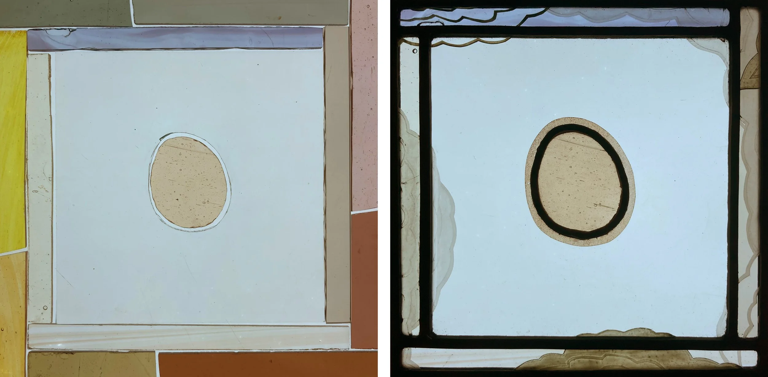
Handling glass and finding out how much it is willing to do for you is satisfying. It was actually harder cutting small holes in thin glass to make the central panels of glass sketches that explored some ideas. Should the colour of the glass extend beyond the circular lead line (above right) or be contained by a thick lead line (below right) ? Should I combine black painting with enamels on the coloured glass strips (below) or should I introduce sandblasting in lines that ignore the leading (above) ? It’s hard to decide these things on paper, but the little glass sketch often provides the answer.

Lead Lines by Sasha Ward

On the five day stained glass course at West Dean College students sometimes make panels which are particularly good because of the way that the painting and sandblasting combine with the leading. There is no set way of doing this as you can see from the variety of examples I have chosen below.

Panels by students at West Dean College. Top: Gillian, Helen’s workbench, Zahra. Bottom Karl, Sarah, Julie.

Top left (Gillian) used a silhouette of black paint around the edges of the pieces thus disguising the lead lines, which is good practice. Bottom left (Karl) used lines of black paint and sandblasted areas in the foreground to link the separate glass pieces, which is also good practice. Top left (Zahra) framed interesting pieces of chunky glass with off cuts, collage style. Bottom right (Julie) combined the collage style with lines and spatters of paint worked across the lead lines. The panel at bottom centre was a particular triumph in its use of a colour palette where nothing jumps out and where the lead lines describe the objects while also making a pattern. This student (Sarah) did all the painting on one evening when she was able to put the glass pieces next to each other on a light box, it’s really hard to do good glass painting when you haven’t got the space to do this.

West Dean House, window with portrait of Edward James by Patrick Reyntiens 1990s and foliage detail.

The Patrick Reyntiens window in the oak hall at West Dean House is useful for showing students some of these glass painting techniques. They are usually amazed to discover that you can’t really make out from a distance what is lead line and what is black paint. This is loosely applied, with scraffito details, on the green glass that makes up the tree trunks and the foliage (above right).

Panel by Susan, 2023, with inspiration from Louis David.

Sometimes a student’s panel references a particular window, like Susan’s version of a Louis David figure from a window in Colmonell, Ayrshire. In the photos above you can see the stages in between, with a fabulous drawing on black paper where details from the illustration of the window were moved around to make something new. On another of last year’s courses, Benedikt found a Harry Clarke illustration of the mealstrom and combined it (hooray for originality) with his version of the stick man from the album cover of Led Zeppelin IV (below right).

Panel by Benedikt, 2023, with inspiration from Led Zeppelin and Harry Clarke.

On this year’s course Helen finished her large (600 x 500 mm) door panel of Thunderbird 2 flying over the sea. Her originality was in the working process, with the overall design in her head rather than on paper. The separate elements - sea, sky and copper foiled Thunderbird came together over a few courses like magic, trailing lead lines through the broken pieces of sky.

Thunderbird 2, made by Helen completed in 2024.

Analysis of Someone Else's Christmas Cards by Sasha Ward

This should be year 9 of my Analysis of the Christmas Cards series where I think of as many different ways as I can to categorise the cards we receive then choose and photograph my favourite ones before chucking them all away and saying goodbye to Christmas before it rolls round again. But the number of cards we get is on the decline, and either I’m getting bored of them or the cards themselves are becoming more boring - less homemade, disfigured by ugly written slogans (for example season’s greetings) with even a couple of duplicates or repeats from previous years. I’d already decided I wasn’t going to bother with the analysis when I visited my Aunt Gillian’s house and saw a christmas card display that was better than any I’d seen for ages and therefore worth counting up then quickly sorting into some basic categories.

Around the sitting room, birds on the mantlepiece.

The cards, already sorted into loose categories, stand on every surface in the sitting room. There are so many, about 100, that they spill out into other rooms. I missed a whole group on the windowsill (the curtains were drawn) that excitingly included a triangular card, there is also an octagonal one in the religious corner (shown below left). These have been included in the final shape statistics which are as follows and roughly as usual: 55% square, 22% portrait, 22% landscape, 2% other.

The religious corner, small ones on the bookshelf.

Two more chests in the sitting room.

Into the hall and the kitchen where we find some of Gillian’s favourites (I think her number one is the hare staring at the moon).

I had to choose a favourite quickly, and went for the Selwyn Image mistletoe, oak and robin design displayed on the mantlepiece and shown below. Gillian said she liked all the bird cards, which make up 25% of the whole collection, with other favourites on the card display bar in the kitchen. These include two wonderful buildings shown below and the ever popular mysterious Christmas hare.

My favourites: two buildings and two robins by Selwyn Image and Gertrude Hermes (the last two are Ashmolean Museum cards).

Tree patterns by Sasha Ward

Combination Trees 350 x 350 mm.

As you can probably tell, I made the panel above by leading together glass pieces from two different styles of work, both based on trees. I happened to have the two painted pieces of glass shown below in a pile on my work bench and had a feeling they would go together well. The finished panel also uses other pieces of glass from the same two series as I fitted the two patterns together in the best and most treelike way.

Tree patterns, left from the Theme and Variations series 2020, right sample from front door window 2023.

The original background tree pattern, the tops of four windows for a private house, 2018.

The coloured tree pattern is one I invented to show a woodland scene (I don’t think I stole it from anywhere) for a commission that I never got a great photo of, the one above was taken in my studio window before installing it. I then made a series of panels that were deliberately a cross between a design and a colour sample (below). Three years later I made the black and white trees pieces as samples for a front door commission where I tried out different blacks and greys as well as different methods for making the foliage patterns.

Theme and variations 2020

Some of the samples for a black and white front door commission 2023.

With my leftover pieces I made a second and opposite combination panel (below) where the coloured pieces float across the black and white sample like patches of light in a woodland scene. I’m able to chop these pieces up into complex shapes and then lead them together because it is the right type of glass - i.e. 2 to 4 mm thick whereas most of my work from the past thirty or so years has been made of glass at least 6mm thick and often toughened or laminated, as are many of my samples. These are not commissioned pieces and it’s a wonderful novelty for me not to have to get a beautifully drawn design agreed by a client before starting the making stage. The downside of this spontaneous way of working is that I don’t see mistakes (in the design) until the glass is cut, leaded and soldered so I have to pull the panel apart and change things, aiming for the sort of perfection that happens very occasionally.

The Opposite Combination 375 x 360 mm.

Styles in glass painting and lettering by Sasha Ward

Left: West window by A.J. Davies at St Mary Magdalene Church, Crowmarsh Gifford. Right: Interior of St Lawrence, Warborough, Oxfordshire.

Since seeing his little east window at St Margaret’s in Herefordshire (described on my blog here) I’m getting more interested in the work of A.J. Davies of the Bromsgrove Guild. The first window I saw on this Oxfordshire trip was in the church at Crowmarsh Gifford (above left) high up above the west entrance door and slightly lost in its surroundings (my zoomless camera couldn’t capture the details). However St. Lawrence church at Warborough, only four miles away, has three A.J. Davies windows from different periods, therefore interesting to compare them with each other and to see their quiet impact on the whole church (above right).

Warborough: East window by A.J. Davies (1919) and details from the bottom lights.

The east window is dedicated to those who died in the First World War with large and small figures, badges and scenes united by patterned borders and quarries. The scenes at the bottom show how these quarries, covered in unconnected painted ornamentation, break out into different shapes with strong lettering incorporated into the design and his signature so usefully placed at bottom right.

Warborough: North nave window by A.J. Davies & detail (1924).

At the north east corner of the church is this slightly later work (above) of an organ playing monk next to St Hilary. In the background are the same sort of symbolic details that I’d admired in his St. Margaret window, angels and radiating light as well as a flock of cute bluebirds. The snakes and slipper detail below shows the technique of covering all the pieces of glass with paint, then removing it with textured strokes, scraping and stippling to let the light come through in a subtle way.

A.J. Davies made the third window (below), also visible in the photo of the church interior, twenty two years later towards the end of his life. Gone are the interestingly shaped background pieces, the patterns and the branches for borders. Instead we have a stippled background, realistic looking flowers instead of floral ornamentation and some cute children, all of which record changing fashions in the making or commissioning of stained glass.

Warborough: North nave window by A.J. Davies & detail (1946).

St Mary Magdalene Church, Crowmarsh Gifford, Oxfordshire. North chancel window by Charles de Vic Carey, 1961.

On the same trip I was thrilled by a small lancet window in the church at Crowmarsh Gifford, the only one I have ever seen by Charles de Vic Carey, the teacher at Wimbledon Art School of Pauline Boty and my first stained glass teacher, Tony Attenborough. In it, I recognised the way I was encouraged to paint, with visible brush strokes (so good to see some actual painting rather than the endless quest to find different ways of applying the paint) going across lead lines and uniting the pieces of glass to make a composition, as a painter would. At the bottom is a little, loosely painted portrait of Emily Wilder and children above the fabulous lettering that is collage like and totally of its time.

Details from the bottom half of the Charles de Vic Carey window.