Vinyl/glass/vinyl window at Manchester Children’s Hospital: 1800 mm square.
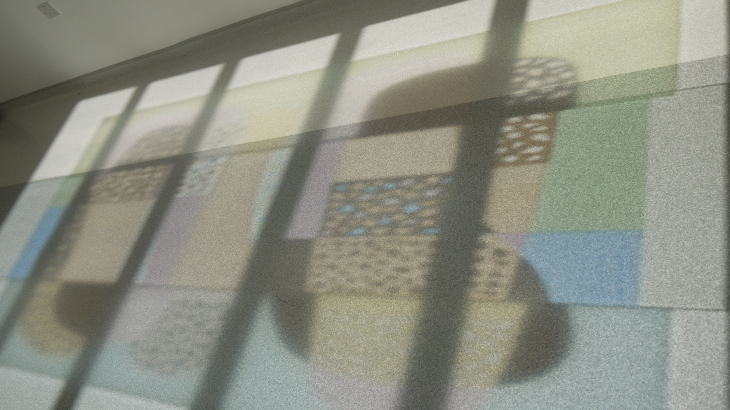
Sunburst was not the title intended for the piece I have just installed in a white corridor leading to the paediatric mortuary at Manchester Children’s Hospital. However in the record breaking February sunshine this week and framed by the corrugated sides of the hospital building outside, it glows like a gentle star. As you can see in the photo below left, dramatic shadows and colours are cast on to the floor - surely the best thing about stained glass. Evidently I hadn’t dared imagine the effect would be so good as the collage of my design on to the photo of the space shows (below right).

Left: Feature window at the entrance to the paediatric mortuary. Right: Photomontage of the same space.
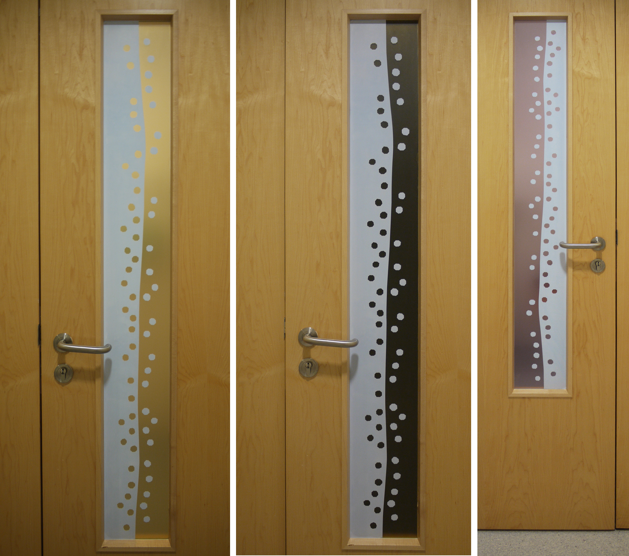
This feature window is part of a commission for artworks in the series of rooms that make up the mortuary. It was almost two years ago when I designed the work following consultation with staff and bereaved families and to a brief that asked for the artwork to be abstract, with no representational imagery and using gentle colours and shapes. Last month I wrote about the colour scheme and the door vision panels; there will be more on the wall designs (digitally printed wallpaper), wall panels and viewing windows when the new furniture arrives to complete the rooms later on.
Below is a page of sketches showing the development of the design for the feature window. I was concerned about working with - rather than fighting against - the horizontal bars and not blocking the wonderful view.

12 sketches showing development of the design
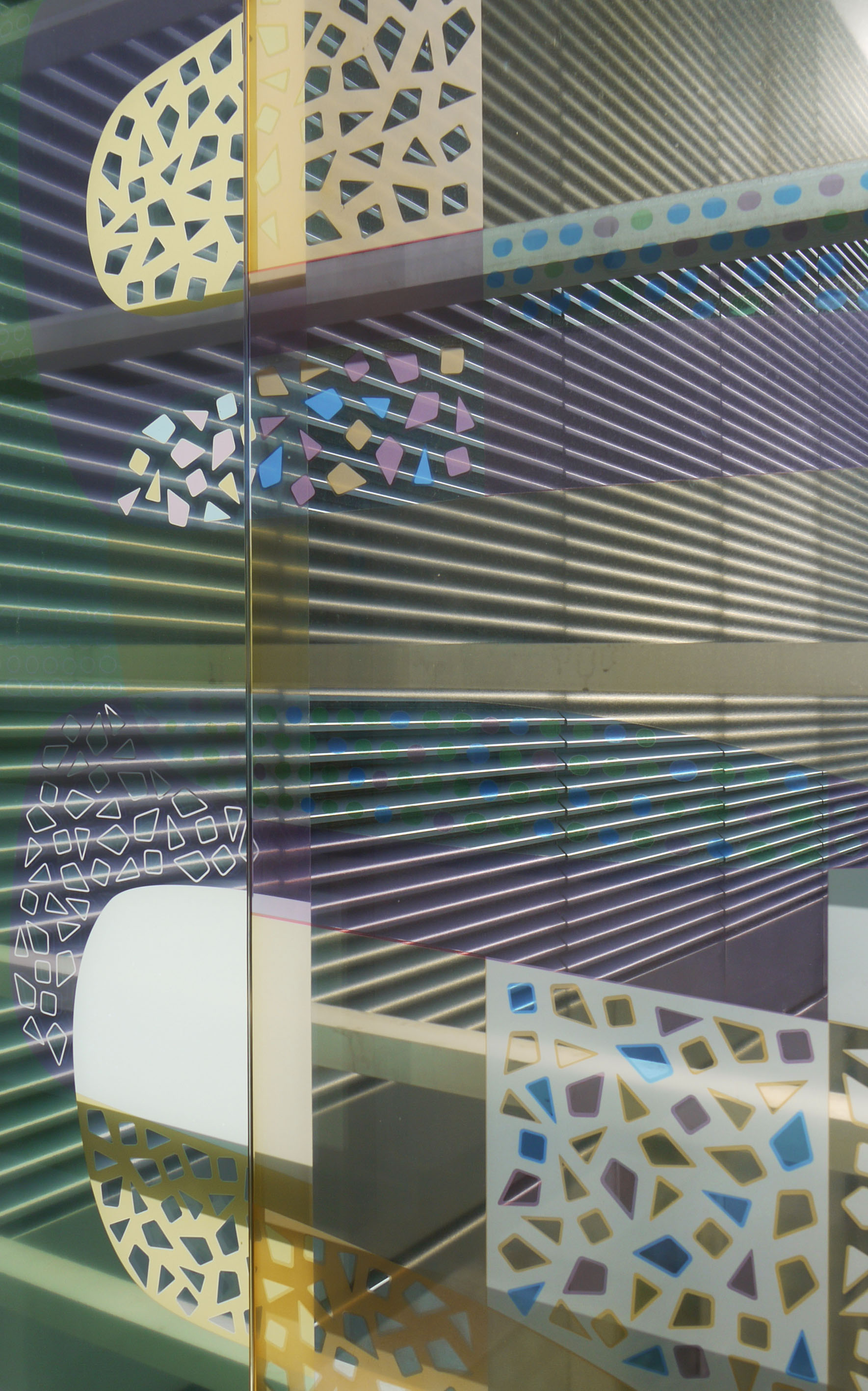
Window detail: vinyl on the left in this picture.
The feature window is made up of a hefty piece of laminated and toughened printed glass (2500 x 780 x 17mm) flanked by two pieces of printed transparent vinyl applied to the surface of the existing window. I hadn’t tried this combination up against each other before, and was apprehensive that the colours on the vinyl would look weak against the sparkling enamels on the glass. But they compliment each other well, the white/shadows are just as strong, and the pattern cast on the floor is colourful but subtle.