work in progress

Scrap Glass by Sasha Ward

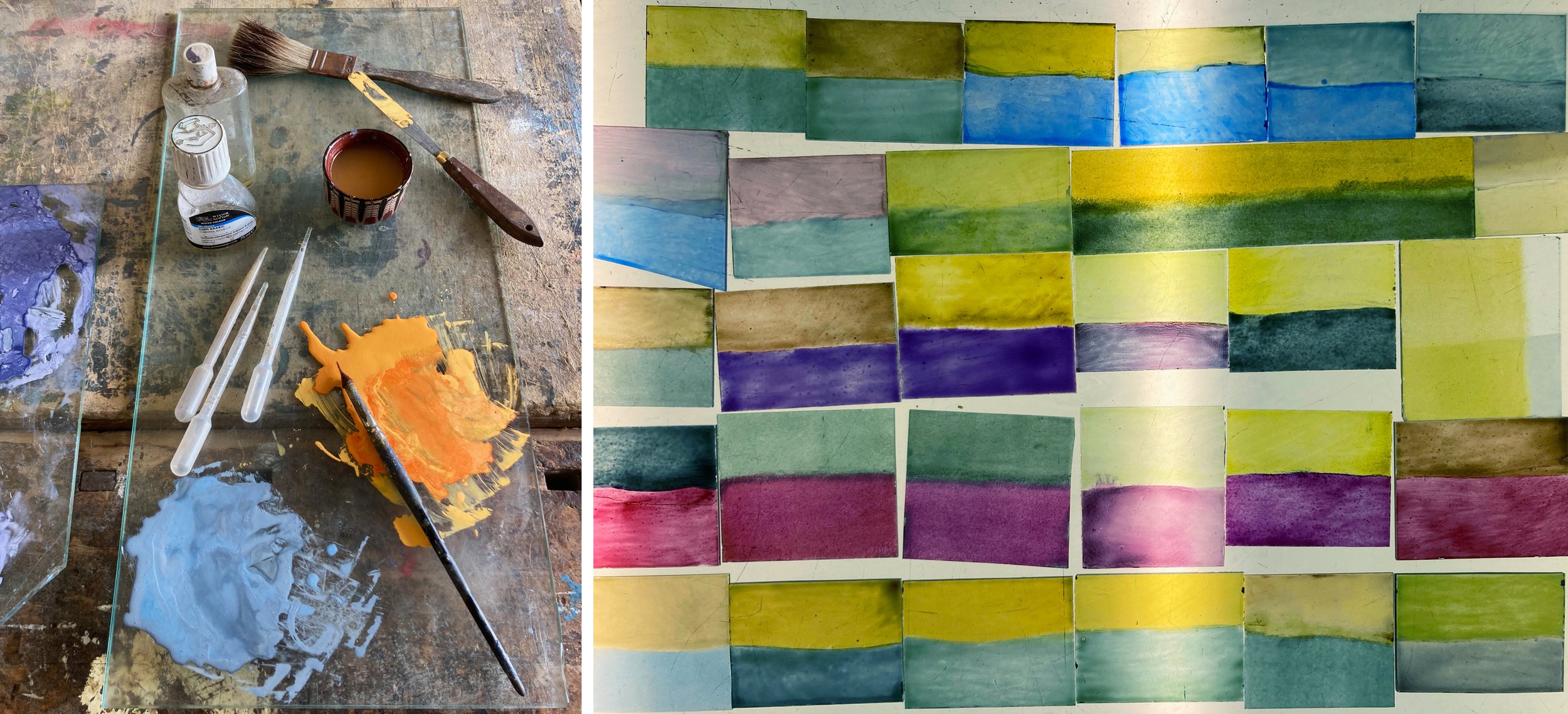
Left, palette with unfired enamel paint. Right, glass scraps painted with two enamel colours and fired.

For a recent commission I had to make a lot of colour samples using transparent glass enamel mixed with a drop of lavender oil and another of gum arabic in the traditional way. With the leftover paint I coated rectangles of glass with two colours against each other and once fired, saved them in a box. The next stage, cutting them up then leading them together to make something satisfactory, proved harder than I thought.

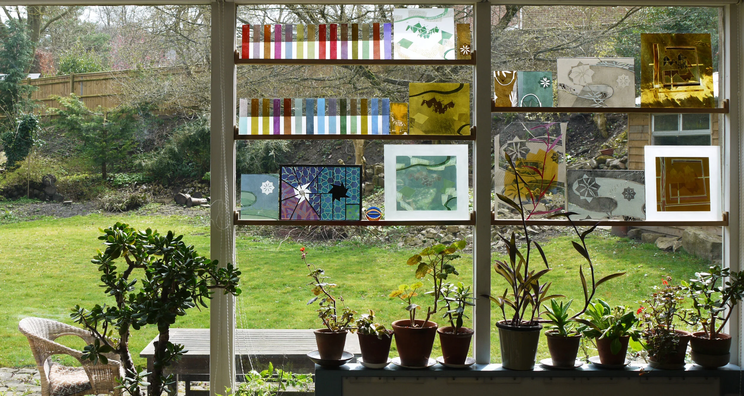
Scraps cut up and arranged to make scrap panels 1, 2 and 3.

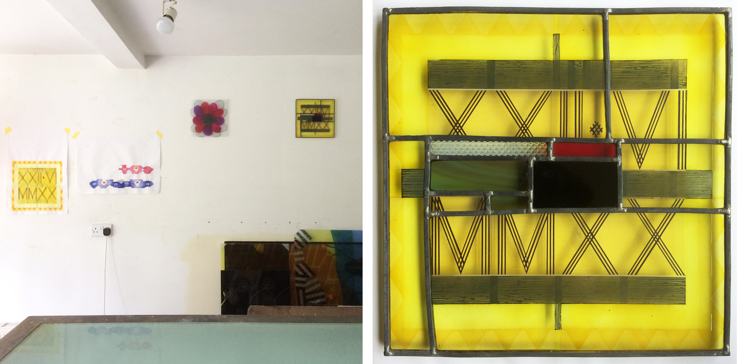
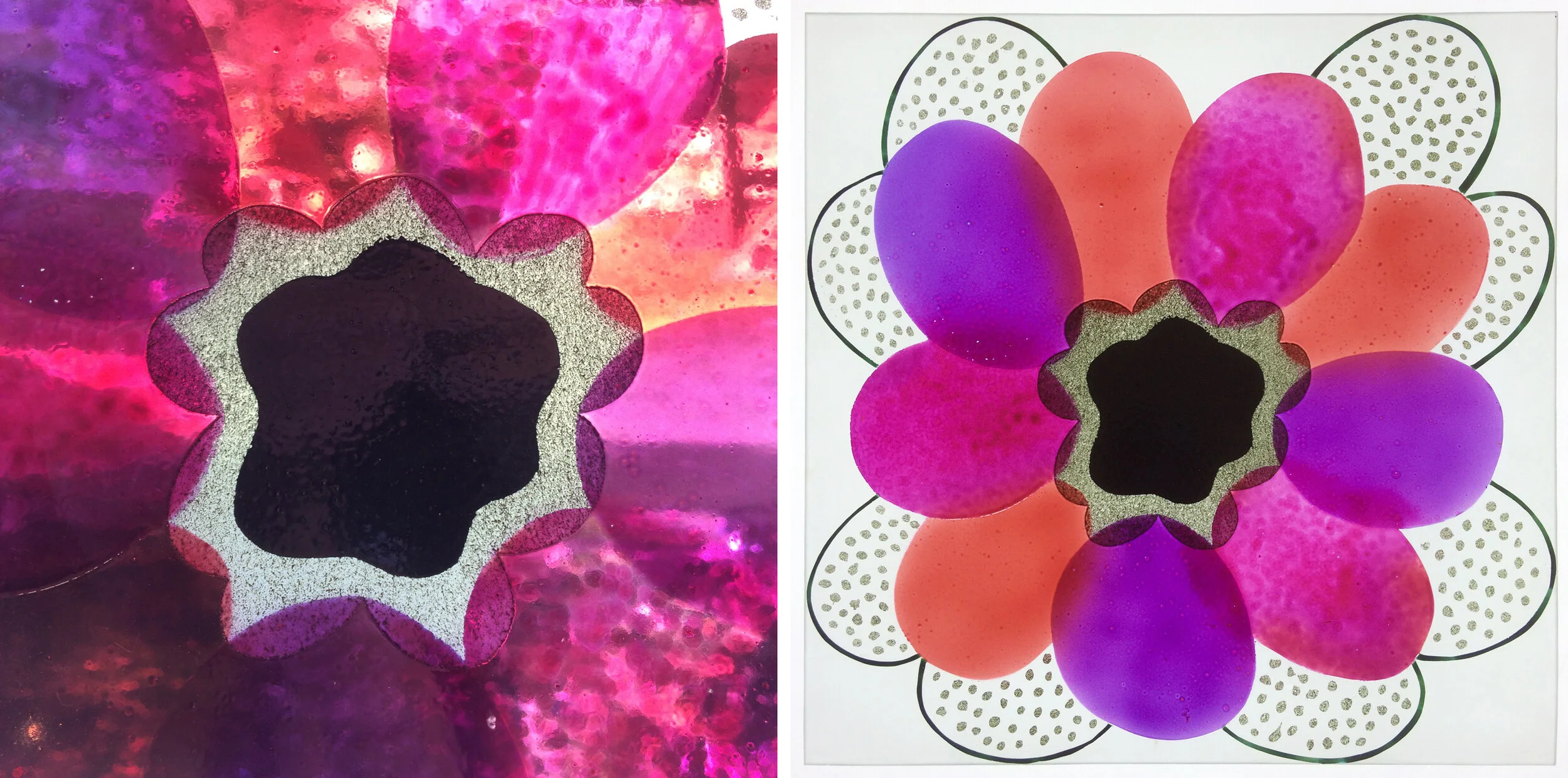
My first idea was to make exuberant curved shapes with background pieces cut on the slant (scrap panel 1 above and below). The offcuts from the slanted pieces made an effortless triangle panel (scrap panel 2 above & below). I shouldn’t have been surprised that panel no 2 was so much better than panel no 1, as I wasn’t trying too hard - always a recipe for disaster. There was too much yellow in no 1, so panel no 3 (above right) was an attempt to deal with the yellow by making it the spine of the piece and using the colours in a more ordered way.

Scrap panels completed, top panels 1 & 2. Bottom panels 3 & 4.

The original format of panel no 3 looked very clumsy, so I cut it down to make a smaller panel no 3 (above right). Finally, to emphasise the original idea of the two enamel colours coming together on one piece, like a simple flag or landscape design, I made panel panel no 4 (above left) where the bands of complimentary colours frame other painted and sandblasted scraps from one of my many boxes of broken glass and sample pieces.

Three Squares by Sasha Ward

The small square glass panels I’ve made over the past fortnight were designed as wall panels - you can see them hanging high up on my studio wall (below left). I wanted to try out an invisible fixing which is glued to the back centre of the panel, that part of the glass has to be opaque to hide it.

Left: studio wall with original date stamp design and two glass wall panels at the top. Right: Square One, 265mm sq.

Left: studio wall with original date stamp design and two glass wall panels at the top. Right: Square One, 265mm sq.

Square One (above right) is a leaded elaboration on the date stamp painted piece I made on XXII.VI.MMXX that looked a bit pointless as a stand alone piece of glass. I added patches of colour to compliment the yellow and remind me of midsummer in the local countryside, with an all important black piece in the middle and a scrap textured with triangles to match the XXs on the yellow ground.

Square Two (below) was designed as an opposite to that geometric piece with organic, slightly out of control shapes in lush sprayed enamel colours that I rarely use all together. I sandblasted the surround and the edges of the glass so they look as if they merge into the wall. The light, bright colours and the different textures achieved by applying the glass paints in a variety of ways show up really well against a white (rather than transparent) background in both of these pieces.

Square Two: detail and full piece on the wall, 260 mm sq.

Square Two: detail and full piece on the wall, 260 mm sq.

Left: ‘One Way Out’ ink drawing on plywood by Ray Ward. Right: ‘One Way Out’ glass enamels, 260 mm sq.

Left: ‘One Way Out’ ink drawing on plywood by Ray Ward. Right: ‘One Way Out’ glass enamels, 260 mm sq.

The third piece was a continuation of my project to turn Ray’s drawings into glass panels (see my previous posts for more examples). The drawings have been going so easily into stained glass versions, but I wanted to try one using my usual enamelling and sandblasting techniques. I intended to give the figure (above left) a solid centre to hide the fixing, but that was one of the things that didn’t really work out. I saw how unpredictable the enamel colours, used in layers, can be as my gold turned green and the hand painted streaks looked so watery that I resorted to sandblasting stripes across the whole background. The result - 6 firings later - is the panel (above right) displayed in the window not on the wall.

Left: panel before firing no. 5.  Right: reverse side of finished glass panel.

Left: panel before firing no. 5. Right: reverse side of finished glass panel.

Studio window by Sasha Ward

Winter 2020

Winter 2020

Do you ever get sick of the sight of your own work? In my case, samples and fragments of it are sitting on shelves in my window, blocking a view of our beautiful garden. The up side is that even in the gloom of a winter afternoon (above) there were interesting coloured reflections cast on the work I was doing on the lightbox. As this piece of work was a geometric composition, I ended up with a window full of striped colour samples and a more coordinated look in the studio (below). However, I was tired of that look and resolved, as we were going into lockdown, that I would end up with a completely different window at the end of it.

Winter 2020

Winter 2020

Autumn 2015

Autumn 2015

I found an autumnal photo with no coloured glass on the shelves from another year when I must have needed a change (above) and one from the following spring where I had painted the shape of one of the pink leafed plants on to a sample I was doing for a house in Italy (below).

Spring 2016

Spring 2016

Spring 2014

Spring 2014

Further back in time (above) I had the shelves in the same positions and a similar mix of geometric test strips and slightly organic patterns which were sample pieces for the commissions on the go. I recognise fragments from a wall panel for St James Hospital in Leeds, a plane propellor from Pegasus House in Bristol and colour variations for windows in Liverpool and Derbyshire. I only remember one occasion when I wanted to fill all four windows with samples (below). This was the last time we held an open studio event and the samples were labelled showing which commission they were made for. (Ten years ago I thought this was a terrible picture of me, now I can only see how much younger I look.)

Summer 2010

Summer 2010

Which brings me to the same window today and work that does look pretty different from anything I’ve put in front of it before (below). There are two main themes; self portraits which are on the bottom shelf and which I think I’ve done enough of for now, and stained glass panels from Ray Ward’s drawings which are on the top shelf and which I’ve described in previous blog posts. These have been a welcome return to making leaded panels and this is something I hope to continue doing both to commission and for exhibition.

Summer 2020

Summer 2020

Interpretation by Sasha Ward

Drawing on grey card by Ray Ward 2019, 840 x 590 mm

Drawing on grey card by Ray Ward 2019, 840 x 590 mm

With projects put off during lockdown, I’ve turned to something I’ve been wanting to do for ages - that is the interpretation of one of Ray’s black and white drawings in stained glass. People have often suggested this would work, and the narratives in his recent series of large drawings do remind me of some of the things I really like about medieval stained glass. Thinking of those panels that tell a story, I chose the drawing above, where there’s a lot going on, for my first try.

Bottom section of Ray’s drawing with blacks and whites reversed.

Bottom section of Ray’s drawing with blacks and whites reversed.

I decided to make the glass panel square and quite small - about half size. I knew I wanted to do the three foreground figures in dark red flashed glass with the lines sandblasted out and the other colours followed from there (below left). I was pretty pleased as the first few pieces came through the painting and sandblasting processes (below right), but then things started getting over complicated.

Left, coloured glass pieces cut: Right, some of the pieces after firing and sandblasting

Left, coloured glass pieces cut: Right, some of the pieces after firing and sandblasting

Left, all the pieces after firing and sandblasting. Right, version 1 finished

Left, all the pieces after firing and sandblasting. Right, version 1 finished

I finished the panel (above). I’d removed all the shadows from the original drawing as well as the figure squished in between the front three and had put the seated figure on a little bit of pink glass. I also thought the trees would make a good decorative border. I finished the panel and thought I’d sleep on it before chucking it in the bin. The next morning, Ray agreed “It wasn’t up to my usual high standards”, so I took off all the bits I couldn’t stand and replaced them with nice bits of dark grey streaky glass.

Version 2 finished, 280 x 260 mm, shown in the window in natural light.

Version 2 finished, 280 x 260 mm, shown in the window in natural light.

Conclusions:

  1. If in doubt use dark grey glass

  2. Simplify even more than you think you need to

  3. It’s easy to do a good bit of detail, but getting the composition right is hard.

Detail of version 2 shown on the lightbox (which is very scratched).

Detail of version 2 shown on the lightbox (which is very scratched).