Below is window panel three from a set of four with the watercolour design on the left and the completed glass on the right. I’ve put these images side by side because I feel as if I’ve made progress over the years in showing clients a design that gives a good indication of what the finished glass will look like. I’ve just completed the panels, but it will be a while before I get photographs of them installed so I thought I would look at the progress of ideas from paper to glass.

One of four panels for a private house, 1200 x 460 mm. Left watercolour, right glass.
A collage, partly shown below left, was one of my early designs and it turned out to be the key to sorting out this composition. The quality I copied from the paper to the glass was the contrast between a matt neutral ground and pools of pale, decorated, transparent colour. In glass terms, this became sandblasted dirty pink ground (a great new enamel colour mix) against a very transparent hand painted blue pool.
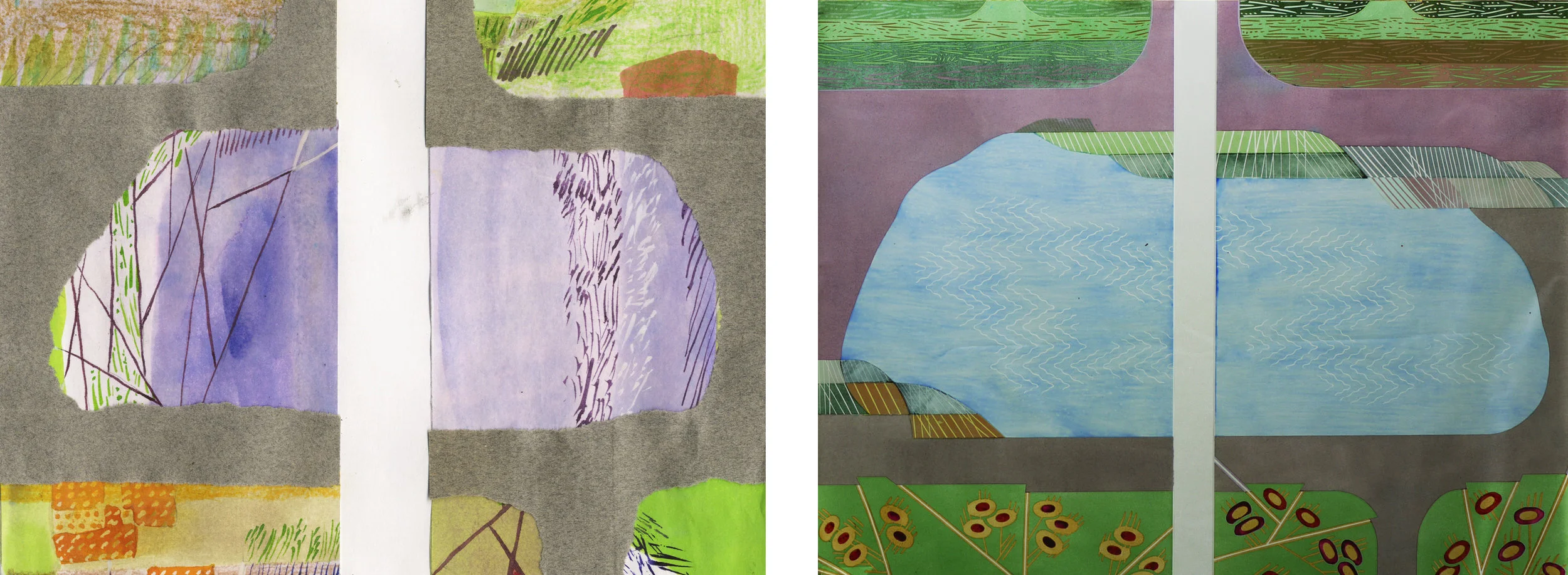
Central section of panels 3 & 4. Left collage, right glass.
In another watercolour/collage, below left, I worked out some details and found a new pattern to suggest a wooded background. I didn’t really like the overall look of this design, and was surprised when I put it against the glass in progress, below right, to see how much I had stuck to my original shapes. These two glass panels on the lighbox before their first firing show how much the colour of the enamel changes when fired.

Panels 1 & 2. Left watercolour/collage, right glass panels on the lightbox before firing.
When I look at a photo (below left) of the first, unfired layer of enamel I used to create the background, I can hardly remember how I did it. I can see the drawn lines are the same in the finished version (below right) and I have my notes, which tell me that the brown turned grey and the green went pink - as planned obviously!

Background detail. Left on the lightbox before firing, right same section completed.
A third comparison (after paper to glass and unfired to double fired) is from artificial to natural light. The panels will be installed in an existing four light window with a light box behind each one. The colours work much better in artificial light - as planned obviously! You can see this in the photos below. However, when the glass has daylight behind it my original concept, matt ground against pale pool, is really emphasised and gives me something I want to take into my next piece of work.

Top half of the glass completed. Left on the lightbox, right against the window.