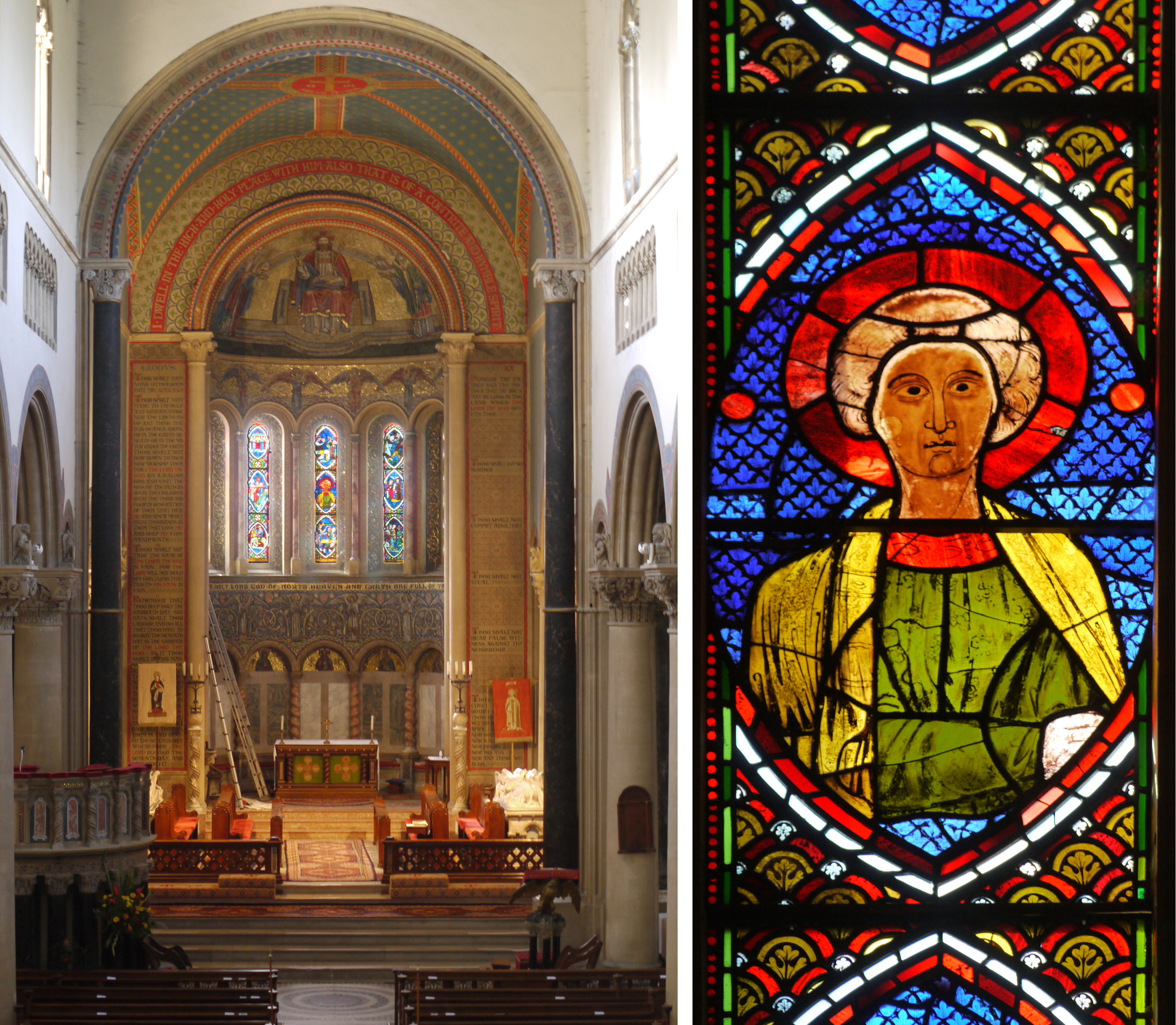
St Mary, Upavon, Wiltshire, above and below

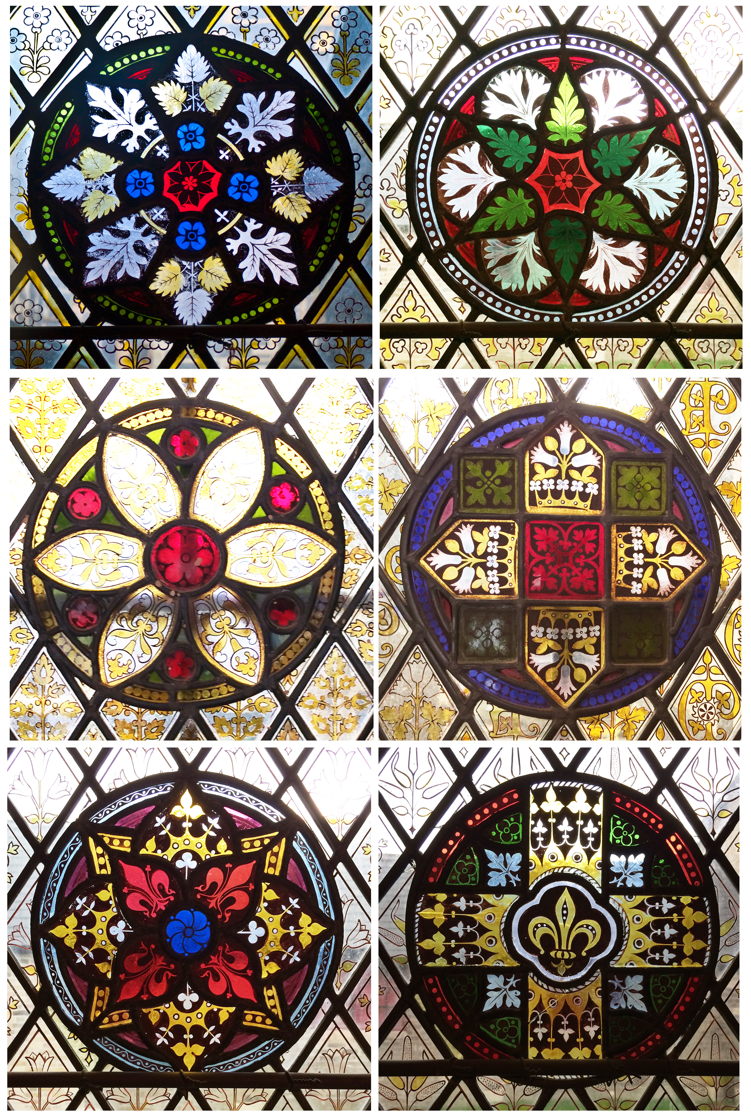
I gave a talk last week to a local group at www.pewsey-heritage-centre.org.uk and, needing to gather my thoughts and opinions, took a quick tour of some of the churches nearby. St. Mary, Upavon has a celebrated Nativity window (below) designed by Henry Holiday in the late pre-Raphaelite style. It also has a set of windows of plain pale coloured glass in simple patterns that give a lovely wash of colour to the whole interior of the church. In the corner (above right) I spotted a window that had a few bright red borders, as well as the addition of some painting consisting of traditional iron oxide patterns and some silverstain - the yellow stain made from silver nitrate that gave stained glass its confusing name.
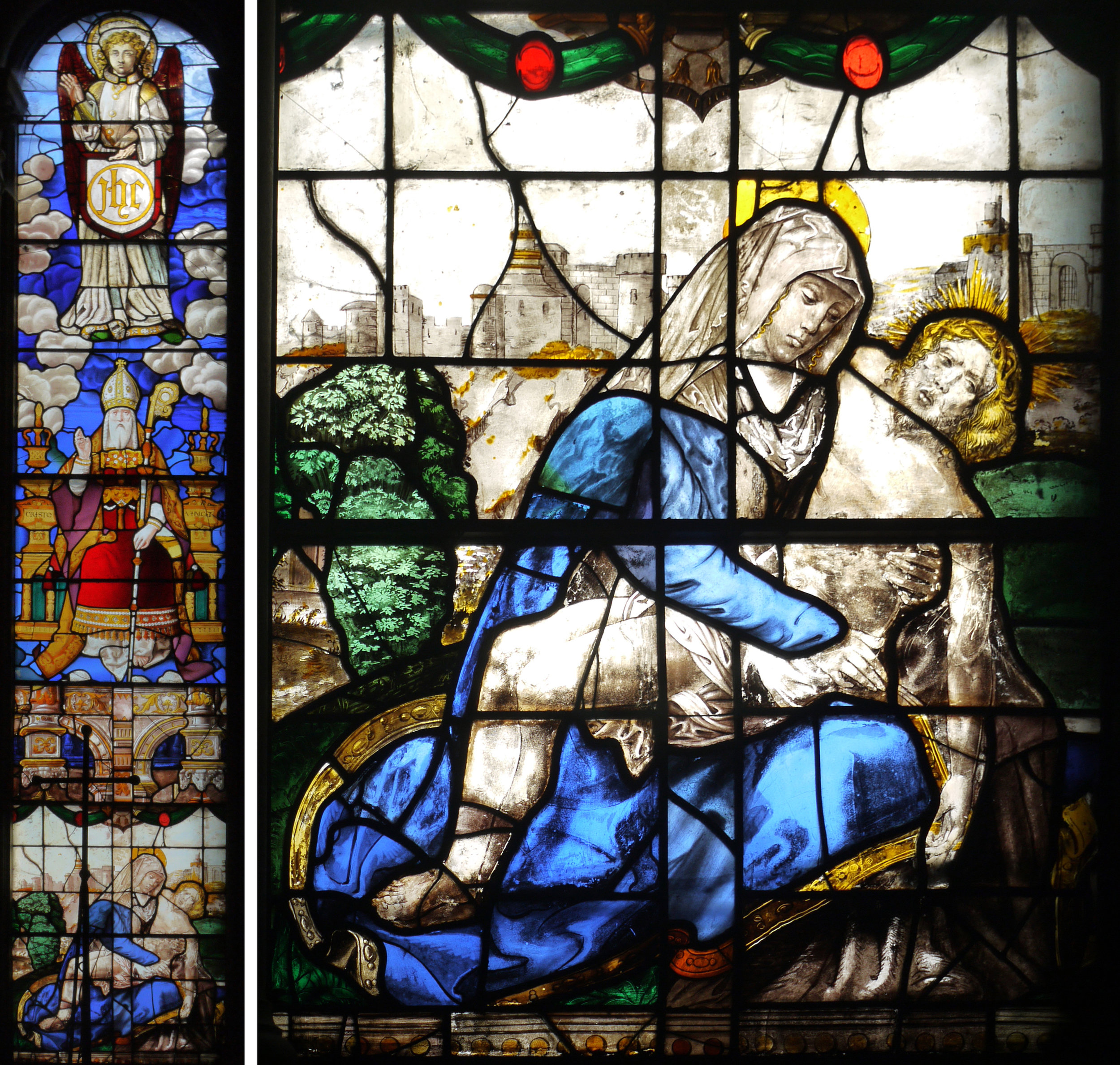
St Mary, Upavon. Nativity window by Henry Holiday 1917
These three examples were perfect for showing what a coloured window would look like without paint, whether the window is improved with a little bit of it, and how the painting and leading should work together to create what we call a "stained glass window". This is always one of the main topics when I talk to people who are not stained glass makers themselves. Is the unpainted window stained glass (it's a leaded light really!), is a window without lead but with silverstain (like the things I do) a stained glass window? You can find confusing explanations of how stained glass got its name everywhere, here's an inaccurate one I saw recently in the seat of learning that is Kings's College Cambridge.


All saints, Alton Priors, Wiltshire
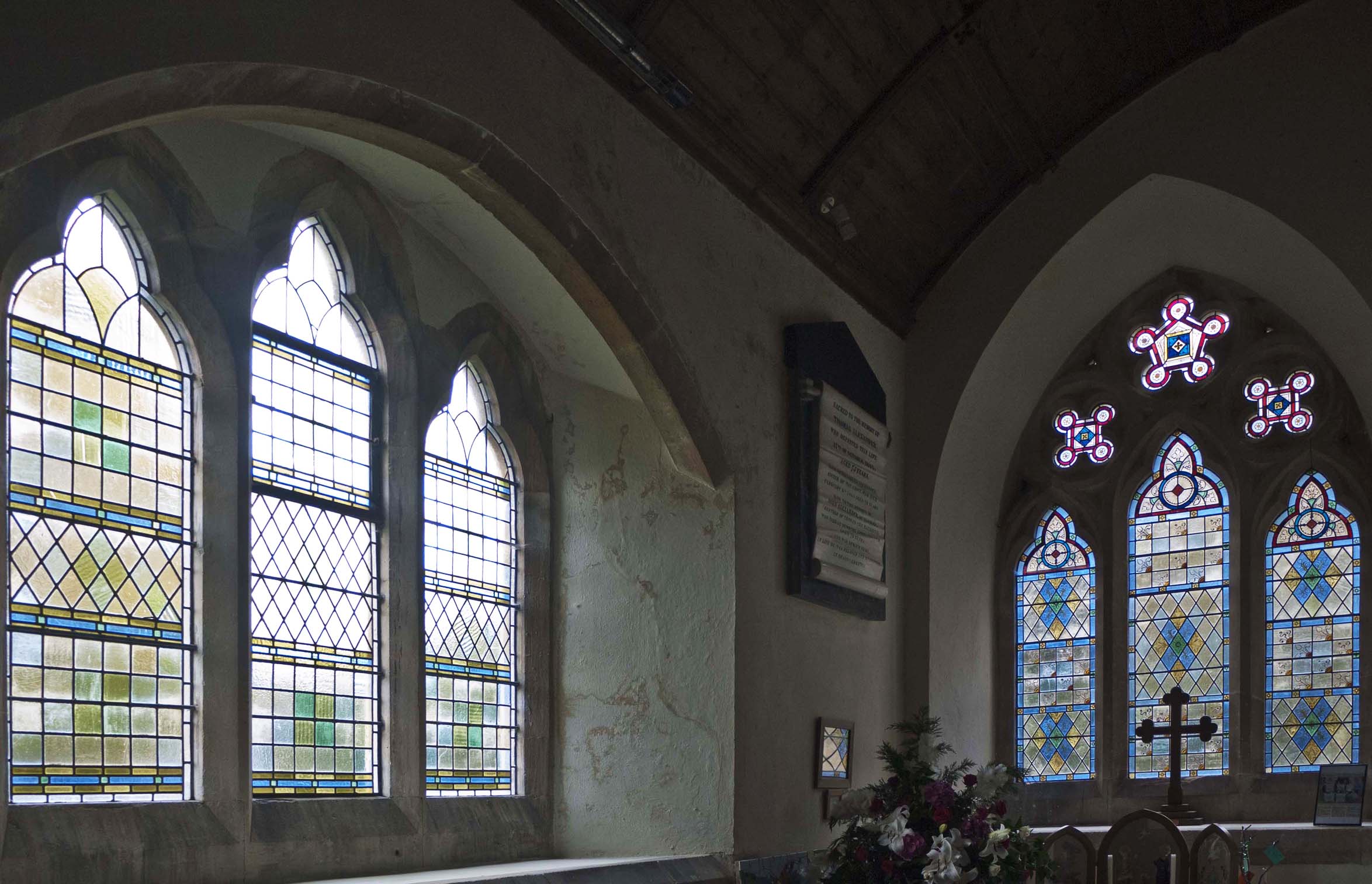
I found an example of a peaceful atmosphere in All Saints, Alton Priors. This ancient church is now in the care of The Churches Conservation Trust and has a stripped interior, simple furnishings and plain windows. The ones in the main body of this church have very attractive blue metal grills in the leaded framework and an accidental pattern in subtle colours made of shattered glass still in place. The conclusion I drew from these examples was that the stained glass has to be really good to beat a simple leaded window, especially when it includes a view of the beautiful trees and landscapes around this area.
A pair of windows in All Saints