Fanlights for two upstairs bathrooms
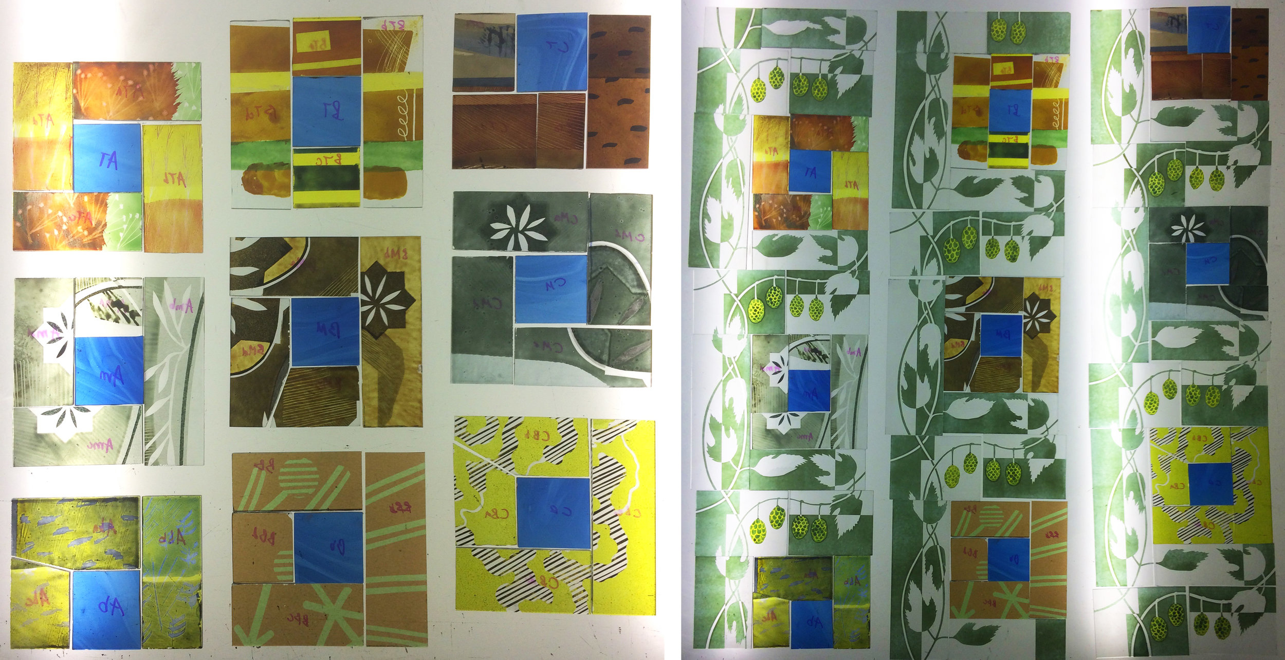
This set of windows are for bathroom fanlights for the same house (as my last post) in Oxfordshire. The shape of the windows, the function of the rooms and the local landscape all led me to return to the River Thames for my subject matter. Although I had walked, photographed and drawn along the path of the river a couple of years ago, I hadn't found a good enough way to show the reeds along the river banks and the general stripiness of the flat landscape before.

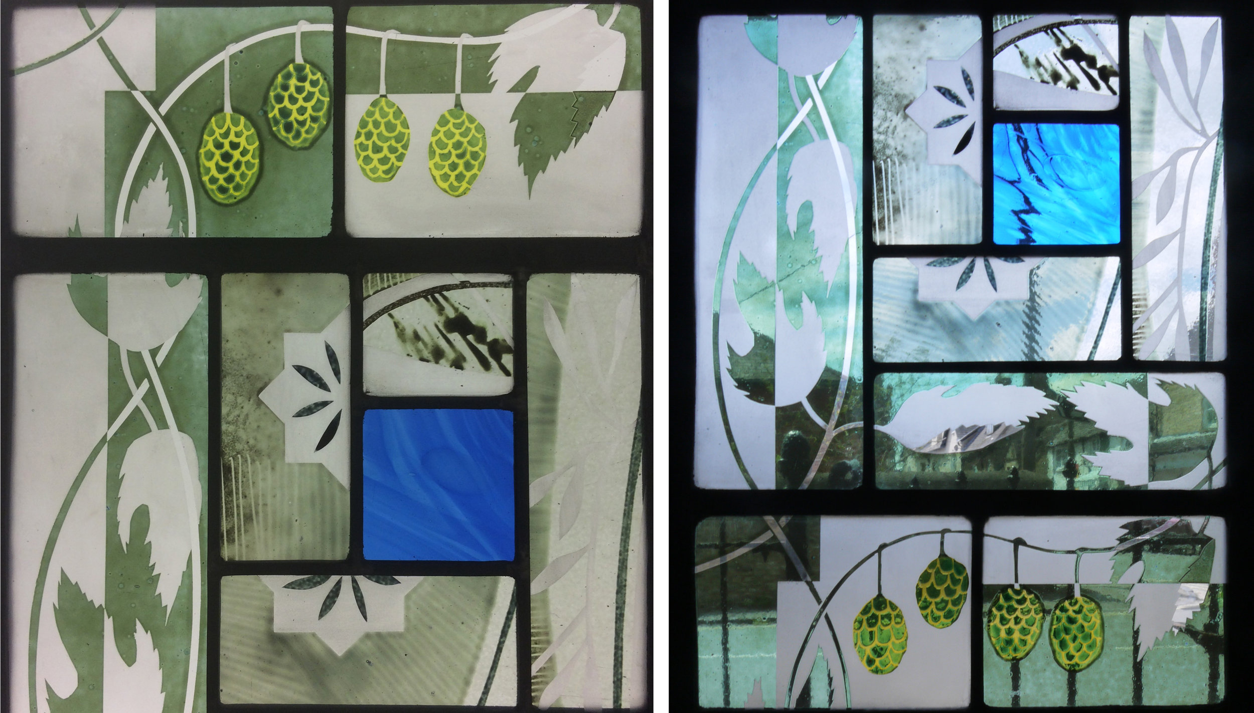
Fanlight one
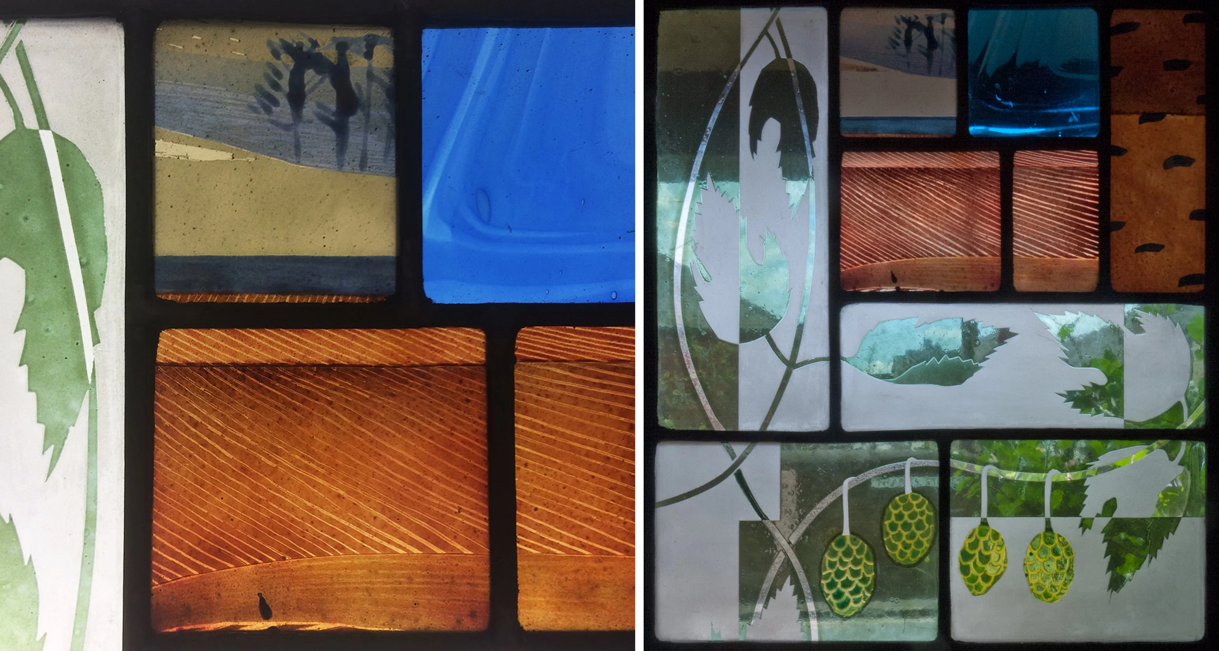
The photos of the windows installed, above and below, show the different colour of the light coming through windows and skylights in the bathrooms . The colours of the hand painted enamels are the same for each window, with the image of the blue river flowing to join the pictures together.

Fanlight two
I spent a long time on the design for these windows, struggling with my riverbank drawings. The designs look very similar to the finished windows, as is shown in the photo of glass on top of the drawing below. Back in my studio the drawings are still on the wall, giving me ideas for the next piece of work.
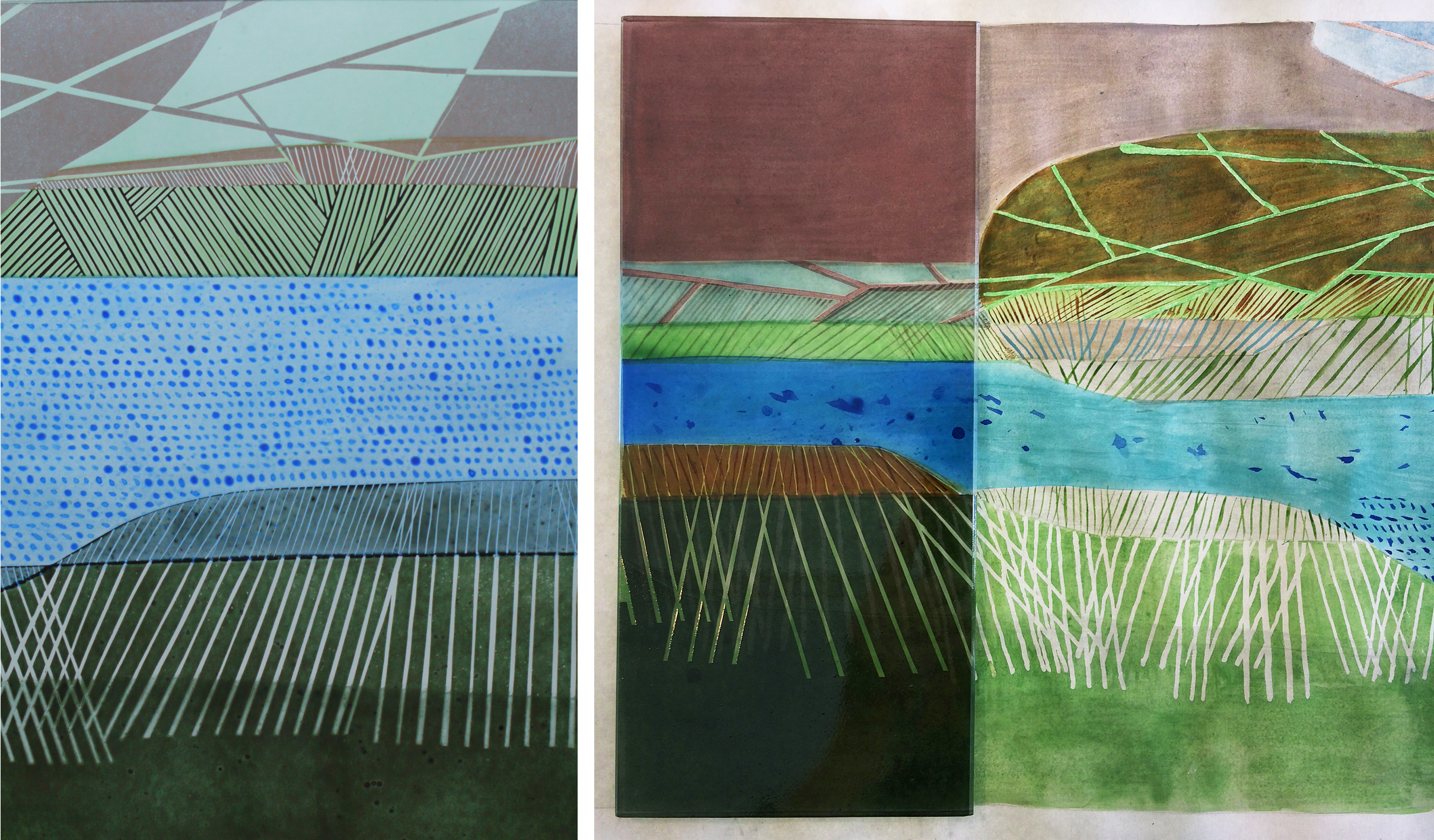
Detail from window two: sample for window one on top of the sketch design.