Guess which town is the subject of this post. There may be clues on the sign (above) which greets you as you descend from the Old Town to the spreading acres of the new. Confused? Maybe the graphics don't help, I think there are some arrows missing as there is an outer and an inner ring linking the five mini roundabouts that make up Swindon's Magic Roundabout.
In my depictions of places it is my long term practice to combine drawings and photos from viewpoints with maps and diagrams, it helps me find my "sense of place". Although I am often asked to research a particular place for a public commission, in this case I am investigating the magic roundabout, twelve miles from where I live, just for fun.

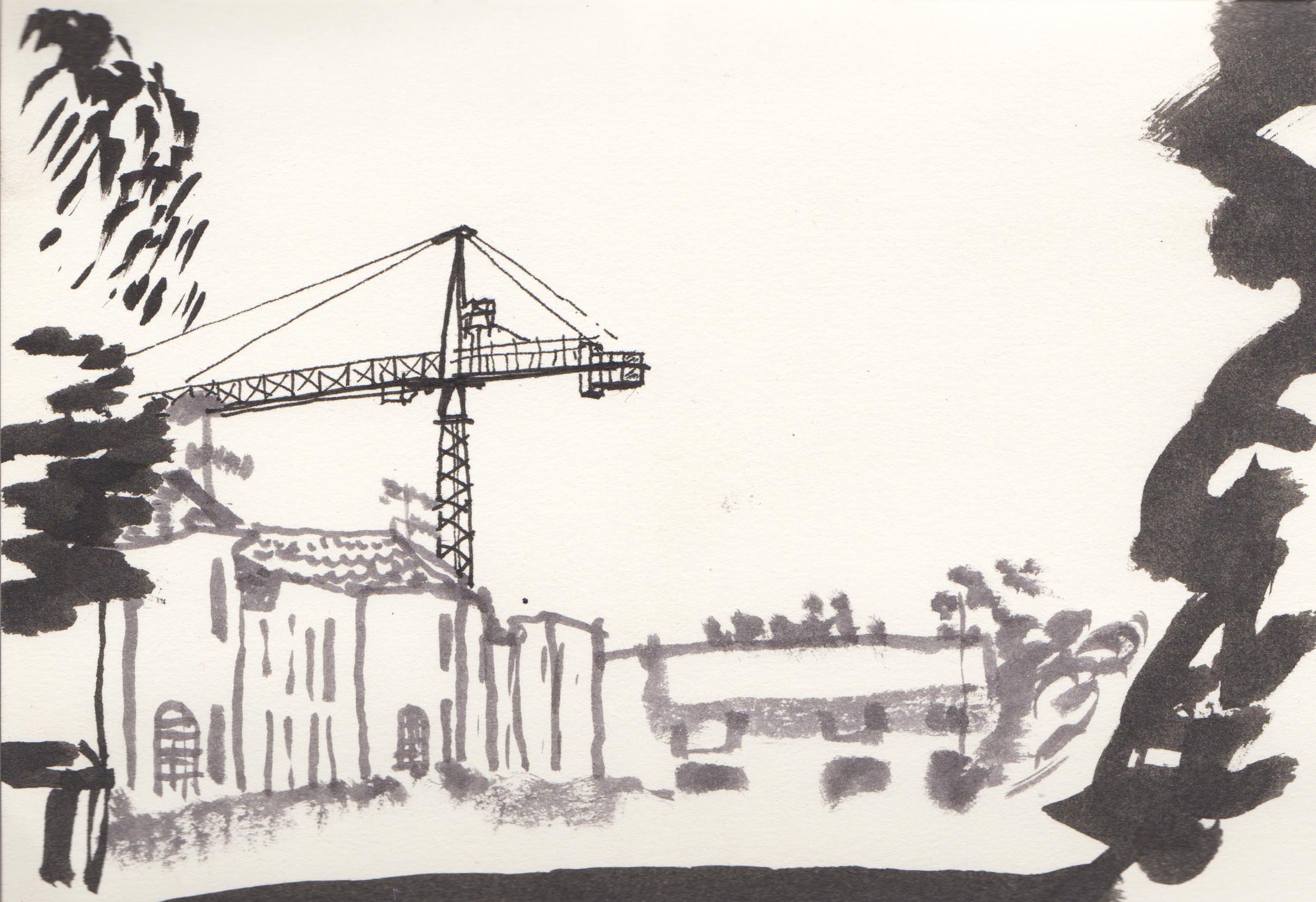
Nine drawings on thin paper (above) helped me work out what I needed to leave in and take out to make a satisfactory image that also explains the workings of a roundabout that is both logical and mysterious.
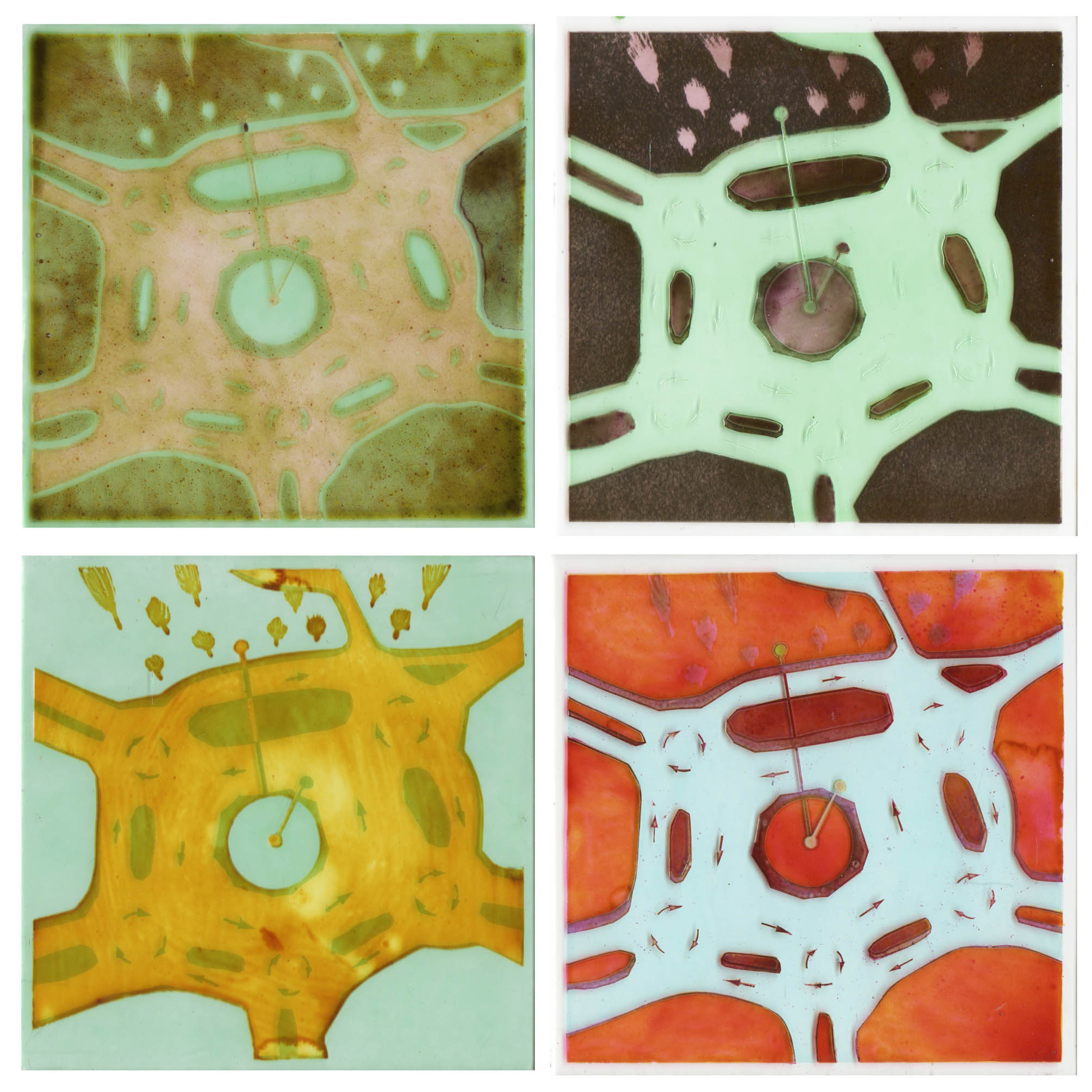
The first four glass roundabouts, sandblasting, enamels, oxides & silverstain on clear glass

Magic Roundabout number five, image size 100mm square.

Going smaller for Magic Roundabout number six, image size 75mm square.
P.S. I hope I haven't overthought this one - I've never worried about navigating it before, let's see what happens when we get there for an evening out in Swindon tonight.