Cobbles by Sasha Ward

a.jpg

The picture above shows the lawn outside my studio after an episode of sun burn. I’ve done it before when leaving mirrors outside to dry after cleaning them. This time it was a load of dalle de verre - slabs of thick glass that concentrated the sun’s midsummer rays on to the grass before I had time to pick them up and polish them. Lots of people think it’s an art form.

The pattern has been there for three weeks and I have been looking at it in combination with the crazy paving cobbles of the adjacent terrace, which I know well as I made a glass panel in 2007 that faithfully copied the contours of the stones. I loved making this, switching my brain off while I copied rather than invented a pattern, but as you may know I am always suspicious that the work won’t be any good if I’m enjoying myself too much.

b.jpg

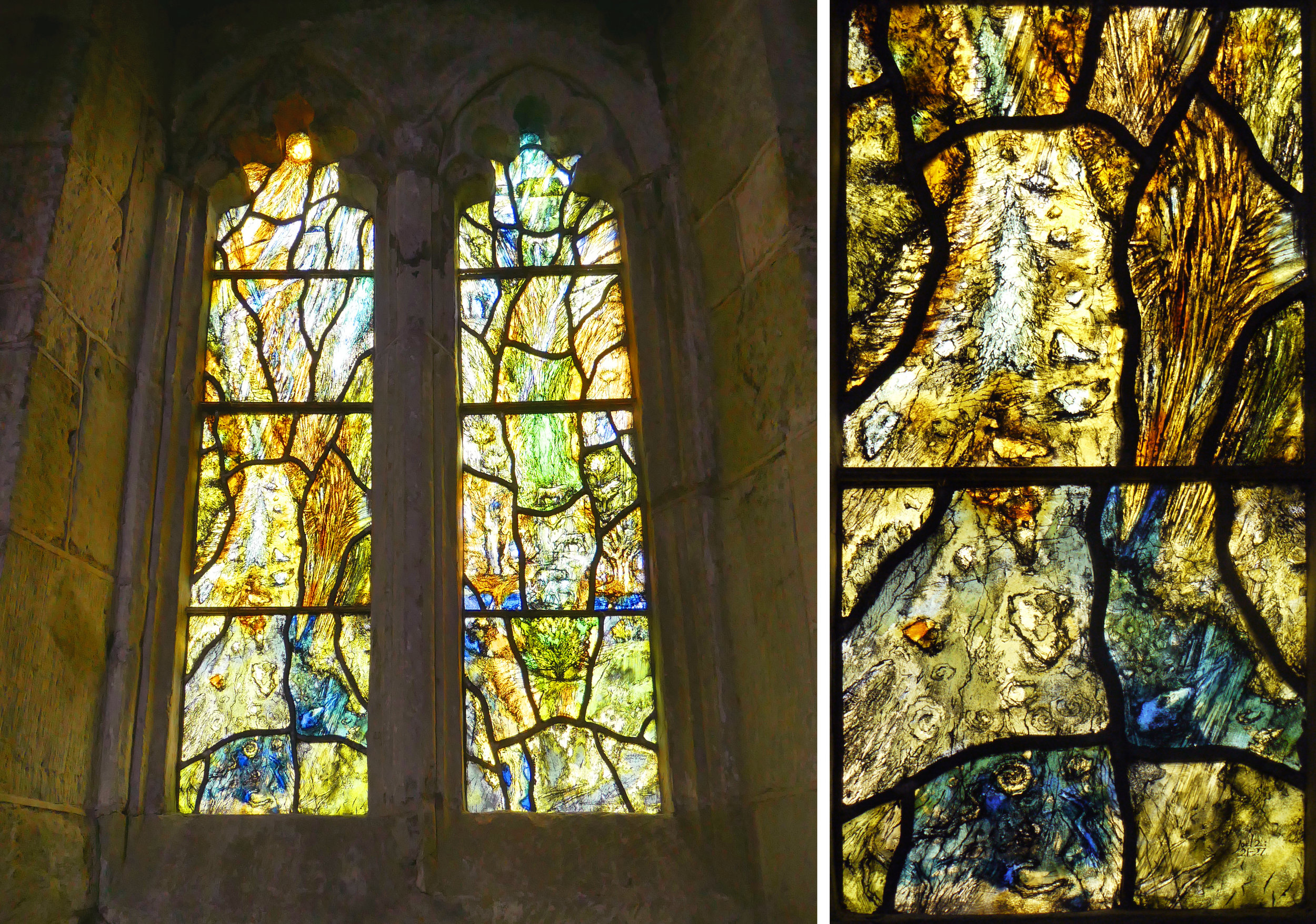
I was disappointed in the panel when I got it out to look at again, apart from the success of the colour combination which resulted in a thin yellow outline to each stone (see detail below - can’t remember how I did that!) and the delicate scalpel cutting in neat facets rather than curves.

h.jpg
Yate Library 2009: detail from glass panel and sample in my studio window.

Yate Library 2009: detail from glass panel and sample in my studio window.

I have continued with this garden/cobbled theme in lots of commissioned work ever since. Above is a detail and a sample of one of four panels for Yate Library that I made in 2009. Here the random shapes are derived from the stones on the wall of an ancient barn with an anemone cutting across the sandblasted lines.

Things got more complicated a couple of years later when I had a commission for a health facility in Dorchester (see details below). Here the plants are marigolds drawn in a schematic way under the cobbles and in a graphic style on top of them. The patterns in this design came from chicken wire (obviously) and a marbled endpaper for the green lines.

Maiden Castle Road, Dorchester: details from two glass panels.

Maiden Castle Road, Dorchester: details from two glass panels.

Although I really like both of those commissions, they weren’t in my head this month as I drew out a new commission for a building in Thornbury, South Gloucestershire (see design below). Here I disguised some flowers and leaves amongst the cobbles in the manner of an oriental carpet. I’ve concluded that a design of cobbles alone is just too boring. It doesn’t provide the links with nature that is a traditional part of ornamentation for architecture, so here branches cut across the cobbles with flower heads that are pale blue and shaped like clouds.

Design for glass panels for Alexandra Court, Thornbury July 2019.

Design for glass panels for Alexandra Court, Thornbury July 2019.

Blood and Tears by Sasha Ward

Inside Blessed Robert Griswold Church: 2 existing windows, artist unknown. Photomontage showing my design

Inside Blessed Robert Griswold Church: 2 existing windows, artist unknown. Photomontage showing my design

Blessed Robert Grissold Catholic Church is a brick and wood building in Balsall Common, built in 1994. The church has two painted glass windows already and are now commissioning me (fingers crossed) to make a third. Although you can’t see all three windows at the same time, I wanted to make a link to these two (above left) in my design which is on the theme of the eucharist and is in a straight forward sort of style. I sent off my initial sketch designs with the usual trepidation and received a great reply from the priest that included the sentences quoted below.

“Some of the abstract patterns reminded me of the decoration on the walls of the 17th century chapels at Baddesley Clinton and Harvington. Considering Blessed Roberts association with the recusants I wonder if Sasha could incorporate into her design a deliberate echo of this religious art”

I spend a lot of time looking at religious art (in churches) and a lot of effort trying to keep the influences out of my own work. This is particularly the case when I am working on a hospital commission as I have often been told that my work appealed to the commissioners because it isn’t traditional and therefore it doesn’t have associations with churches and by extension with death. So for a change, I was delighted to be able to pick up on some shapes, drops of blood and tears, and use them in a way that doesn’t disguise their meaning.

4 development sketches: Initial design with shapes: Final design with blood and tears following the feedback.

4 development sketches: Initial design with shapes: Final design with blood and tears following the feedback.

Inside the small chapel at Harvington Hall, Worcestershire

Inside the small chapel at Harvington Hall, Worcestershire

Drops of blood and tears of the passion painted on the walls of the small chapel in the sixteenth century.

Drops of blood and tears of the passion painted on the walls of the small chapel in the sixteenth century.

Both Baddesley Clinton and Harvington Hall are moated manor houses in the West Midlands with hidden priest holes and rooms formerly used as private chapels. The walls of Harvington Hall are covered with paintings from the 16th and 17th centuries preserved in good condition after being whitewashed for over a hundred years. The small chapel is covered in a schematic pattern of the shapes that were unknowingly in my first designs - some folds of cloth at the top, then alternating lines with drops of blood and tears of the passion. As my design is in a straight forward style, I copied them and kept them in colour lines which radiate out from a white circular host and chalice. In the glass, the white (sandblasted and clear) areas will really stand out against the colours of the fired enamel, seen in the samples I made below.

Full size glass samples showing part of the chalice and drops of blood and tears.

Full size glass samples showing part of the chalice and drops of blood and tears.

The Appreciation of Stained Glass by Sasha Ward

dorset.jpg

On a beautiful day in Dorset, here I am in front of a cricket pitch on my way into Milton Abbey to appreciate some stained glass. Once inside, the abbey opens into a magnificent tall transept. On the north side is a monument to the Damers underneath a heraldic window bordered by roses and on the south side a huge tree of Jesse window designed by AWN Pugin and made by Hardmans, in typically vivid colours.

Left, south transept window above monument to Joseph & Caroline Damer. Right, Tree of Jesse window by Pugin, 1847.

Left, south transept window above monument to Joseph & Caroline Damer. Right, Tree of Jesse window by Pugin, 1847.

However, I was not in Milton Abbas for the abbey but rather to see a Lawrence Lee window in St James Church in the famous landscaped village street. I’ve never knowingly seen a Lee window, but he wrote a book “The Appreciation of Stained Glass” which was one in the series on the appreciation of the arts published by the Oxford University Press. That was in 1977, the year that I went to the Central School of Art to do my Foundation Course and to learn how to make stained glass properly - in preparation I read Lee’s book thoroughly. Re reading it now I can see where I picked up many of my stained glass dos and don’ts based on the study of church windows - in particular lots of don’ts and harsh opinions on celebrated twentieth century windows.

Left, in front of the 1970 Lee window (I usually need a chair for taking photos). Right, the top of the window

Left, in front of the 1970 Lee window (I usually need a chair for taking photos). Right, the top of the window

I particularly like his chapter on (glass) painting which is one of the few to show an example of his own work, a distinctive head of St. Columba. Just from those few images I would have recognised these figures anywhere, and I’ve concluded that it’s his figures I particularly like, when usually it’s the figures in a window that I hate. These, St Catherine and the Virgin Mary shown below, remind me of inky black and white book illustration of the same period. Here is a passage from the painting chapter that is good to bear in mind when on these church visiting trips :

“The argument will always go on between those who make and those who talk about what is made - and it is very useful to both parties that it should be so. I believe, however, that in the context of this Appreciation of the Arts Series we ought to instruct ourselves to look, filtering out as far as possible any purely mental questions about dates, styles, authenticities and so on (all that is fun afterwards), so that appreciation becomes an impulsion of our physical self toward’s the artists work. We must literally pick up from the very point at which the glass painter’s brush left the glass, seeing what he saw as he laid it aside for firing.”

Lawrence Lee details - left, St Catherine and right, The Virgin and child.

Lawrence Lee details - left, St Catherine and right, The Virgin and child.

Tom Denny window, St Mary, Tarrant Hinton 2000

Tom Denny window, St Mary, Tarrant Hinton 2000

Our route home went through Tarrant Hinton, so we made a stop to see a Tom Denny window. I have seen so much of his work recently that it’s beginning to grow on me - the leading patterns so particular that you can spot one in a church even when driving past. The presence of this small window, on a Dorset landscape theme, is huge with an overall golden glow. Here are some wise words from Denny:

“Colour is the most immediate thing about glass; most of your problems are solved if the colour is right for the place. Although I don’t aim to make glass look as if it were made hundreds of years ago, a happy by-product of the way I work - etching, plating and staining - not only enriches the surface, but creates a visual fragility equivalent to old glass.” From an interview with Tom Denny in Contemporary Stained Glass Artists by Kate Baden Fuller, A & C Black 2006.

I forgot to take the outside of the Tarrant Hinton window, so I’ve shown one in Leicester (below) from inside and out. You can see the irregular look of the lead pattern, and also the way that he draws his figures (animals in the Dorset window) as if they are knitted in to the backgrounds. That part of his work hasn’t grown on me yet, perhaps it’s the hardest thing to do well.

One of two Tom Denny 2016 windows in Leicester Cathedral from the inside and the outside.

One of two Tom Denny 2016 windows in Leicester Cathedral from the inside and the outside.

Maternity Dorchester by Sasha Ward

MAT WINDOWSm.jpg

I’ve just installed printed translucent vinyl on 16 windows - that’s 98 panes - in the delivery rooms of the Maternity Unit at Dorchester Hospital. It was difficult to design (I started this project almost a year ago) and even more difficult to photograph the results. The designs are laid out in a block above, they are on a landscape theme with curved lines cutting across the unattractive window frames. The details within these curved shapes are mostly borrowed from things I’ve done recently and liked, but translated into a colour pallet that works with the pinks, purples and pale blues on the walls of the rooms.

Room 31 - before and during installation

Room 31 - before and during installation

You may wonder why you need to block a lovely view (above right), but where there is a view there is also a balcony covered in debris and privacy is what a woman who is giving birth wants. Some of the windows (below right) are overlooked by windows across the courtyard, so in both of these situations even the tops of the windows need to block the view while letting the light in and sending the curtains packing.

Room 12 - before and after, showing both windows against a pink wall.

Room 12 - before and after, showing both windows against a pink wall.

Room 1 - the curtains are going.

Room 1 - the curtains are going.

Room 27 - bed very close to the window, glow of light through the pale colours.

Room 27 - bed very close to the window, glow of light through the pale colours.

Working with digitally printed vinyl throws up its own surprises, obviously different from glass painting but with lots of qualities that translate across the two media. Room 25 gave me a shock similar to the one I get on opening the kiln and seeing that a coloured enamel has done its own thing, different from the sample. Often this oddity makes the work more interesting. So Room 25 with its block of luminous pink ended up being my favourite - the success of works like these is dependent on the colour combinations and I think that I’ve got that part right here.

Room 25

Room 25

Dalle de Verre Head by Sasha Ward

From the north wall of dalle de verre at Buckfast Abbey

From the north wall of dalle de verre at Buckfast Abbey

I’ve seen a lot of dalle de verre recently - that’s the french name, also used in english, for the slabs of coloured glass that are made into windows when they are set in concrete or resin panels. The quality of the glass, with characteristic shelling where the glass has been broken into smaller blocks, is amazing. The look you get when you design for the medium goes well with chunky style buildings, both old and new. The 1965 modernist Chapel of the Blessed Sacrament tacked on to the back of Buckfast Abbey contains one of the most well known examples in England. All of its windows were made in the 1960s by Dom Charles Norris, monk and graduate of the Royal College of Art, who went on to make dalle de verre windows for many other Catholic churches throughout the UK.

The outside of the Blessed Sacrament Chapel (Paul Pearn 1965) and Buckfast Abbey, Devon, rebuilt from 1903 - 38.

The outside of the Blessed Sacrament Chapel (Paul Pearn 1965) and Buckfast Abbey, Devon, rebuilt from 1903 - 38.

The famous window that I knew from a postcard I was sent in the 1970s is the truly horrible east window, shown below. It’s eight metres across, that makes Christ’s head more than one metre wide, and it’s not a pretty sight. I have seen massive stained glass figures before (e.g. Wispianski in Krakow) and I’ve also seen wonderful dalle de verre figurative windows (e.g. Gabriel loire in Chichester), so it is possible - just so much harder to do than an arrangement of luscious colours in attractive patterns.

8 metres wide - the east window in The Chapel of the Blessed Sacrament.

8 metres wide - the east window in The Chapel of the Blessed Sacrament.

South window, luscious colours in attractive patterns.

South window, luscious colours in attractive patterns.

Details from the south wall of the vestibule and the south wall of the chapel.

Details from the south wall of the vestibule and the south wall of the chapel.

North wall

North wall

The glass in the north wall particularly appeals to me and it demonstrates another stained glass truism - that coloured glass looks better without direct sunlight coming through it, the beautiful yellow with grey combination glows on its own. I also like the mysterious empty rectangle encircled by the glass. You can see the arrangement of shapes flowing across the solid blocks in the detail below which shows the same section from inside and out.

North wall inside and outside.

North wall inside and outside.