Almudena Cathedral, Madrid by Sasha Ward

almudena 9a.jpg

This is one of a series of ten windows designed by the Spanish artist Manuel Ortega (1921 - 2014) for Almudena Cathedral, Madrid in 1998. I love the design - in every one the ground is broken up with geometric lines into colour blocks, some of these contain figures with painted faces, hands and feet. Each window is in its own side chapel and is complimented by a painting or artefact below. They work brilliantly in the spaces, with subtle colours and spooky faces glowing in the gloom.

Three of the side chapels in the nave of the cathedral.

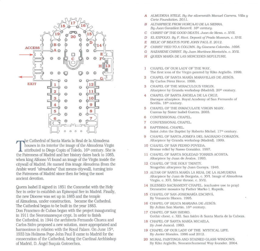
I haven’t found out any more about the windows, and the information panels in this recently decorated cathedral leave them out altogether. On the plan of the cathedral below they are in the chapels numbered 1 -5 and 8 -12, but agin no mention of the stained glass here!

Screen Shot 2019-02-04 at 21.27.09.png

I didn’t have my zoom lens with me for close ups, but photographed every window and, using the subject matter listed in the plan above, I think I’ve got my photos in the right order below. As you can see they all have a geometric dove in the top hexagonal light, and a pair of angels on either side below. There are lovely variations in the colouring in of the triangles around these flying figures, with no two quite the same.

The window in the chapel of the Miraculous Virgin is shown closer below. You can see the large areas of unpainted textured (bathroom style) glass with inserts of simple painting that give those blocks a 3-D quality. These are unorthodox techniques and I am reminded again that it’s the design that counts, and that here you are looking at the work of a significant artist.

Colour sequence by Sasha Ward

This is part of a project I have been doing in the paediatric mortuary at Manchester Childrens’ Hospital. Over the past two years I have designed artworks for a suite of five rooms following extensive consultation with bereaved parents and hospital staff and negotiated with manufacturers and the hospital estates department to get the works, made of vinyl and glass, installed.

Vinyl detail:  Double doors leading to the mortuary:  Locked doors in the corridor

Vinyl detail: Double doors leading to the mortuary: Locked doors in the corridor

The overall scheme is now starting to come together with new colours on the walls and coloured vinyl on the door vision panels. These make an impact that is much larger than their size and help you find your way through the maze of windowless rooms that make up this backwater of the hospital building. The design on the vinyl is simple, the complicated part is the layered printing so that one half of each panel is translucent and the other is opaque i.e. a colour printed over a white layer. In the detail shown above left the blue is opaque and the yellow is translucent therefore it glows as you approach the double doors to the (badly sign posted) mortuary. In the next part of the corridor there is a pair of locked doors so the vinyl on these has a different design that is totally opaque - attractive but hopefully uninviting (above right).

Entrance door:  Babies’ room door: Children’s room door with room light on and off

Entrance door: Babies’ room door: Children’s room door with room light on and off

The main pattern is ordered, simple and gentle rather than geometric and rigid. The entrance door to the waiting area is green/blue, this leads to the babies’ room (blue/yellow) and the children’s room (yellow/green)- all shown above. The back door of the babies’ room is also blue/yellow but with the translucent and opaque sides reversed, while the back of the children’s room is blue/pink - all shown below. When the light behind the door is off you can see the colour on the opaque part of the design, while the translucent part appears very dark. This is a technique I have borrowed from my glass designs where I use textured opaque areas so that some colour is visible in a variety of light conditions. So far I’m happy with the installation which is still in progress - the colours are spot on.

Door at back of babies’ room with lights on and off: Back of children’s room

Door at back of babies’ room with lights on and off: Back of children’s room

Christmas Wishes by Sasha Ward

It’s not that I’m getting bored with the Analysis of the Christmas Cards, now in its fourth year, but the statistics are getting repetitive. Home made or designed is at a steady 34% (31%, 34%, 35%) and square still the most popular shape at 32% (48%, 34%, 38.5%). Landscape format is on the increase now at 30% (26%, 12%, 14%) - in the brackets are the previous years’ percentages.

This year (scraping the barrel!) I also looked at the backs of the cards to see where they came from: 28% of the cards supported a variety of charities, The Dogs’ Trust being the most popular, while only 9.5% were bought from museums or galleries.

cards 3.jpg

The look of this year’s cards was mainly monochrome (22.5%) or muted, as in the selection above. “Winter landscape” is a vague, welcome and glitter-strewn category, it was the most popular at 32%. 17% of the cards included animals or birds, see some tasteful muted ones from this category below.

cards 2.jpg

I have fun linking cards by shapes, colours and imagery like this line of my top three below - a home printed card, an Edward Bawden and a 3D layered glittery winter landscape. This year I have a winner which is the tree below left because it is bigger, brighter and simpler than all of the others.

cards 1.jpg

Clifton by Sasha Ward

Inside All Saints: The River of Life and The Tree of Life - west windows.

Inside All Saints: The River of Life and The Tree of Life - west windows.

On a trip to Bristol, we visited a church and a cathedral on the same street in Clifton, both with unusual windows from the 1960s and 1970s. The first, All Saints, was bombed in 1940 and a new church designed by Robert Potter, completed in 1967, was built around the remaining elements. All the windows in the church are by John Piper, they are made of fibreglass on to which Piper poured coloured resins. These windows are controversial because of this experimental technique which has not weathered very well. I had seen pictures of the west windows (above right) and although I knew I didn’t like the simplistic design, I also knew I had to see them in situ to make a considered judgement. Actually I found the Tree of Life repellant in real life: the oversized branches with the dots on them look to me like someone shouting and pushing you away.

Inside All Saints, looking east towards the altar.

Inside All Saints, looking east towards the altar.

However, when you turn around you are in for a lovely surprise. The angled walls (above right) behind the altar and the decorated canopy are plain and flanked by two tall subtle windows, there are blue Piper windows in the Lady Chapel to the right as well as numerous narrow windows of coloured dots on a dark ground. All of these, none particularly transparent, make the interior dark, interesting and coordinated. I could see where the windows were deteriorating, with streaks and white patches on the coloured layers, but this sort of adds to the experimental qualities in these works - one of only two churches where Piper used the technique.

Detail of east window and blue windows in the elevated Lady Chapel.

Detail of east window and blue windows in the elevated Lady Chapel.

Across the road is Clifton Cathedral, designed by Percy Thomas Partnership and completed in 1973. There are many wonderful things about this building including the hexagonal sanctuary space, the roof shapes, the stations of the cross by William Mitchell and the Lady Chapel candelabra (below right) designed by the architects and made at Prinknash Abbey. All these make for a beautifully coordinated interior.

Inside the Cathedral Church of Ss. Peter and Paul, with stations of the cross by William Mitchell and candelabra.

Inside the Cathedral Church of Ss. Peter and Paul, with stations of the cross by William Mitchell and candelabra.

The stained glass wall is set slightly apart on an angled wall in the narthex and is the work of Henry Haig, another artist whose windows I know quite well. The subject matter is “Pentecost” and “Jubilation”, but I read them as landscapes, one gentle (below left) and one fiery (below right). The experimental technique that he used for these was dalle de verre set in epoxy resin, with chunks of thick, textured glass providing all the colour that the interior needs.

Henry Haig’s dalle de verre windows

Henry Haig’s dalle de verre windows

Detail of left hand window and close up of the chunks of glass set in resin.

Detail of left hand window and close up of the chunks of glass set in resin.

This was a quick visit that provided an obvious contrast in stained glass techniques: the rich material quality of Haig versus the fluid washes of Piper. My companions weren’t particularly impressed with the Haig windows, and I’m not mad on the random vagueness of the design either. However because they are contemporary with their setting they look completely right for the place and totally solid. The buildings are easy to spot as they both have unusual prominent towers, it’s a great treat to see two interiors that look so “modern” almost fifty years on.

Rooflines by Sasha Ward

Staircase windows, each panel 880 x 300 mm

Staircase windows, each panel 880 x 300 mm

Just installed is this three part internal window for artist blacksmith and friend Melissa Cole in her newly built house. At front left in the snap above you can see a corner of her balustrade, it’s made of lines of metal that look like a scratchy drawing, and hopefully a bit like the scratchy lines in the landscape part of my design. The themes in this window revisit subject matter from my Kelmscott designs where roof shapes were placed in a pattern made from the local landscape.

When I visited the house during construction, the set of plans (below) was up on the wall - how could I resist basing my design on a roof plan that looked like a flower?

bm1.jpg
Roof under construction: flower roof

Roof under construction: flower roof

I liked my first sketches, collages of the roof under construction and the flower roof shape. However, I found it hard to work them into the format of the window openings. So I made a 3D model of the roof, with the aim of stretching it to a landscape format without losing the real shape.

House in the landscape: paper model of the roof

House in the landscape: paper model of the roof

sketches showing development of the design

sketches showing development of the design

As I developed the design, the geometric shape of the roof flowed into curves that spread into the surrounding areas. The straight lines tie the panels together across the roof cross, in the glass these are picked out with a sandblasted white line. I was pleased with the restraint I exercised in my use of colour. Once Melissa had chosen the strong orange and I had mixed up a metallic pink/purple for the roof (marvellous new colour that changes with light on or through it), there was only room for neutrals and a lot of white - the neutrals appear very green in the photo of the panels in my studio window below. As they should, the panels look best in the place they were made for. Thanks to an ideal, positive talking commissioner who insisted that it’s the artist who has to be happy with the work as much as the client.

Panels in the studio this summer.

Panels in the studio this summer.