This is part of a project I have been doing in the paediatric mortuary at Manchester Childrens’ Hospital. Over the past two years I have designed artworks for a suite of five rooms following extensive consultation with bereaved parents and hospital staff and negotiated with manufacturers and the hospital estates department to get the works, made of vinyl and glass, installed.

Vinyl detail: Double doors leading to the mortuary: Locked doors in the corridor
The overall scheme is now starting to come together with new colours on the walls and coloured vinyl on the door vision panels. These make an impact that is much larger than their size and help you find your way through the maze of windowless rooms that make up this backwater of the hospital building. The design on the vinyl is simple, the complicated part is the layered printing so that one half of each panel is translucent and the other is opaque i.e. a colour printed over a white layer. In the detail shown above left the blue is opaque and the yellow is translucent therefore it glows as you approach the double doors to the (badly sign posted) mortuary. In the next part of the corridor there is a pair of locked doors so the vinyl on these has a different design that is totally opaque - attractive but hopefully uninviting (above right).

Entrance door: Babies’ room door: Children’s room door with room light on and off
The main pattern is ordered, simple and gentle rather than geometric and rigid. The entrance door to the waiting area is green/blue, this leads to the babies’ room (blue/yellow) and the children’s room (yellow/green)- all shown above. The back door of the babies’ room is also blue/yellow but with the translucent and opaque sides reversed, while the back of the children’s room is blue/pink - all shown below. When the light behind the door is off you can see the colour on the opaque part of the design, while the translucent part appears very dark. This is a technique I have borrowed from my glass designs where I use textured opaque areas so that some colour is visible in a variety of light conditions. So far I’m happy with the installation which is still in progress - the colours are spot on.
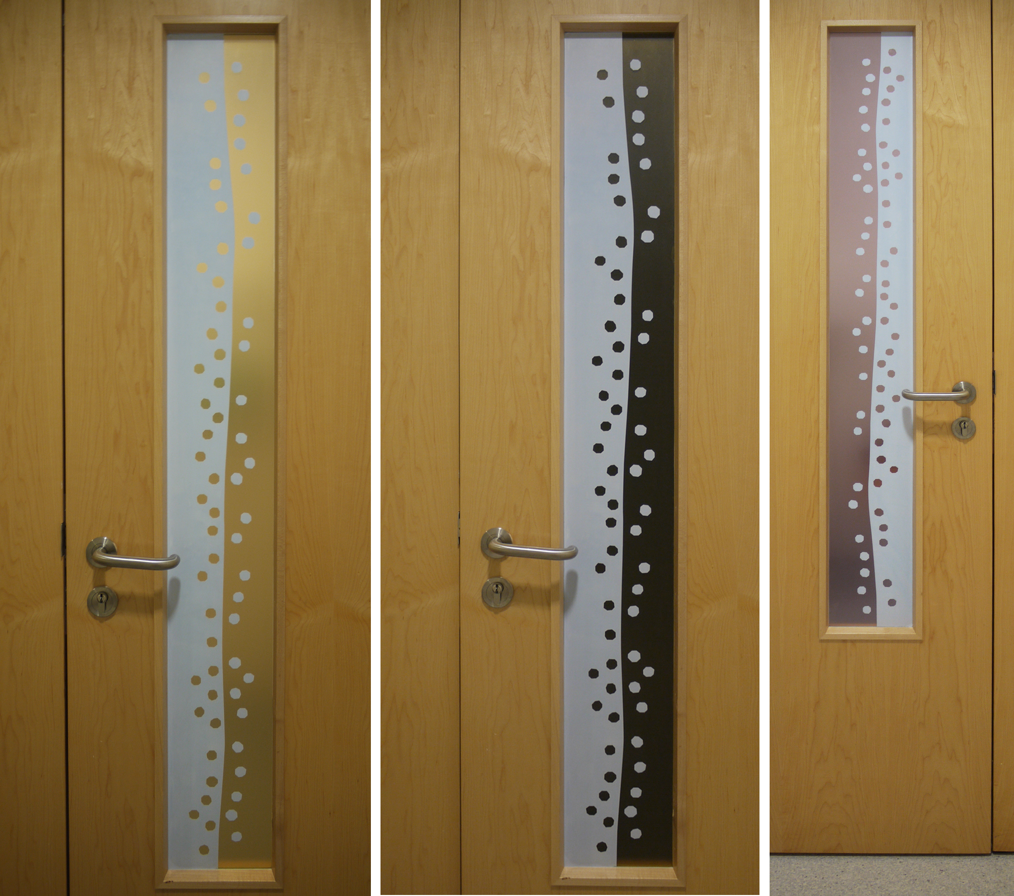
Door at back of babies’ room with lights on and off: Back of children’s room