This is the third consecutive year of my Christmas card analysis, see the previous results here and here. Thinking about it, I've realised that some of my categories are a bit arbitrary - the only certainty is the shape of the card itself. This year the square ones have leapt up to 49% as shown in the chart below.

Portrait shaped cards look the best on the mantlepiece, but they were in the minority this year.
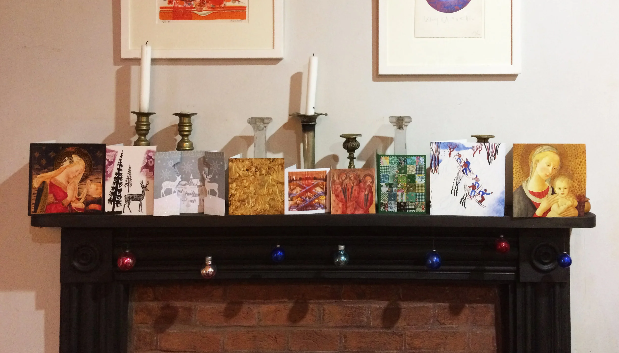
Some good ones on the mantlepiece, in case you're in doubt - square, portrait, other, sq., sq., sq., portrait, sq., sq.

Cards go sideways on the walls.
Last year, I was sad about the dropping off of home made cards, as opposed to home (digitally) printed cards. This year I've stopped being so picky and the category title is "a card made by the person who sent it" (31%), not must change over the survey period for this homemade category.

Twin robin cards and some pigeons
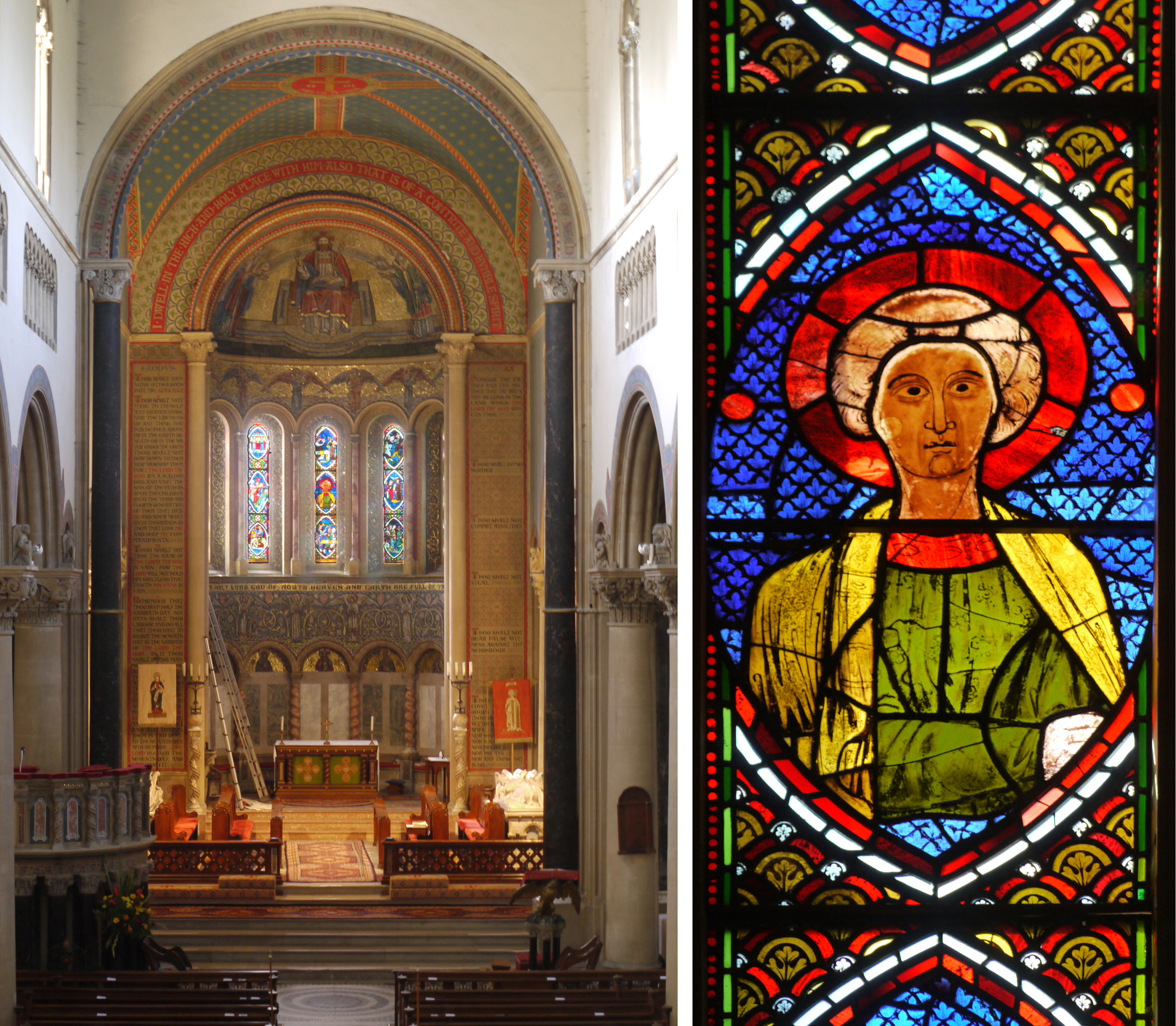
In terms of subject categories, there were more birds than ever (11 including 4 robins) and 6 cards that included pictures of deer. Only 1 with angels, 2 of the virgin & child and 2 nativity scenes - one of them in stained glass - hurray! But, as I said, my categories are getting confused. In the past I've had "reproductions of well known artworks" and "snow scenes". There are some obvious category-straddlers here, with the robin in the snow (above) & the Edward Bawden deer (below).
I hate to choose an overall winner, although I don't think there is a big overlap between people who send me cards and those who read this blog. Four favourites below are Robert Rauschenberg's Gold Painting, Janina Konarska's Skiers, Edward Bawden's Deer and Trees, and a mistletoe print - there is such a lovely texture on this genuine handmade item.